

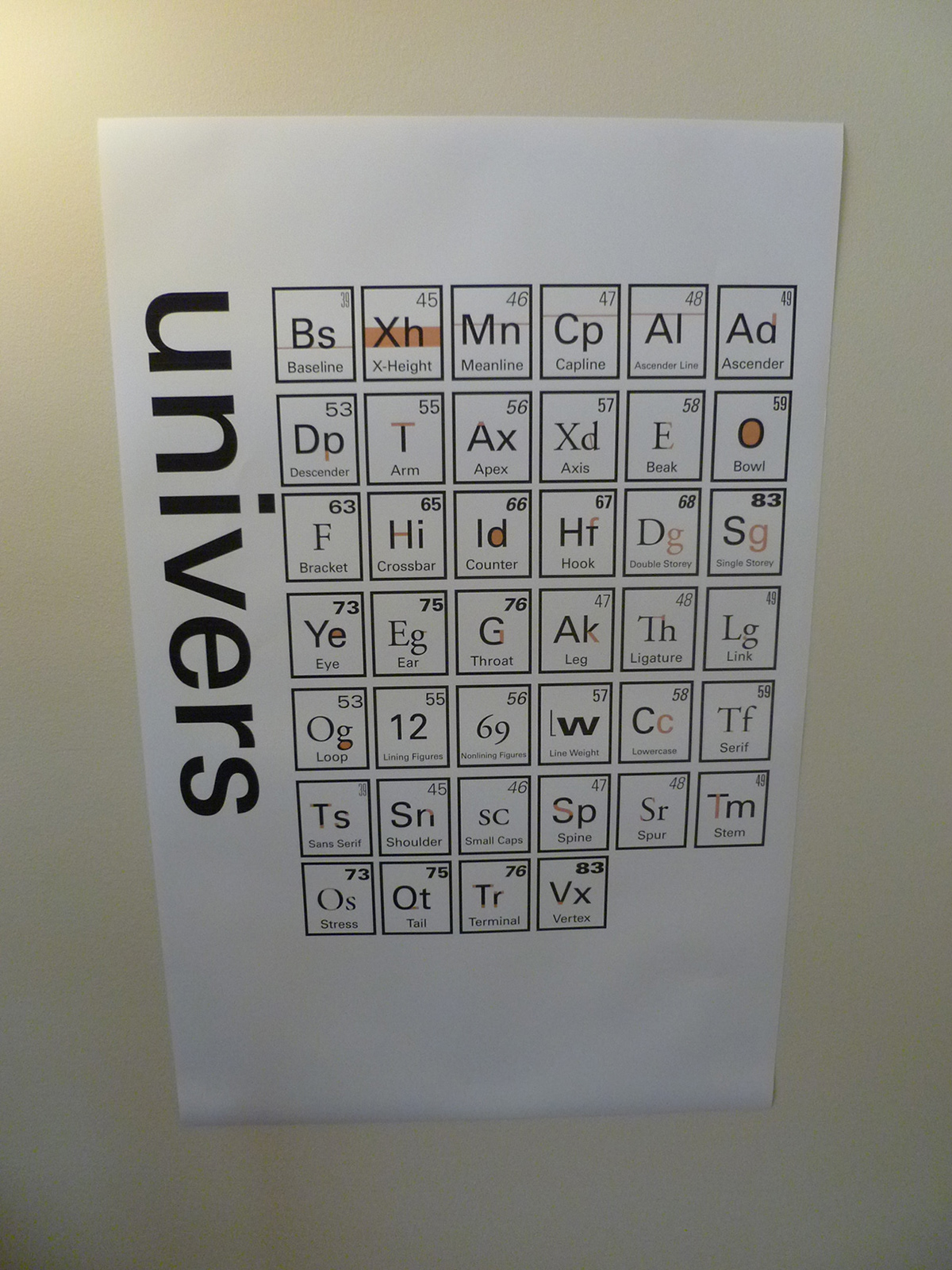
Table of Typographic Elements Poster
I'm passionate about typography, and Univers is one of my favorite faces. Besides being clean and unobtrusive, it's just so well thought out. It's a system that works together. The different weights and variations are assigned numbers to distinguish themselves. That always reminded me of the atomic numbers on the periodic table.
I created my own periodic table, comprised of elements of typography. Each 'element' illustrates a particular trait of typography in its abbreviation. I used Univers whenever possible, but switched to more appropriate faces (mainly Garamond) to illustrate features that simply were not available (such as ligatures).
I wanted to keep the poster as clear as possible, so I kept to a two-color scheme of black and pink. The atomic numbers are all different weights and widths of Univers, expressed in those particular weights and widths. I opted to repeat some numbers in the grid rather an include some of the more extreme fonts that might overwhelm/distract from the main features of the elements.
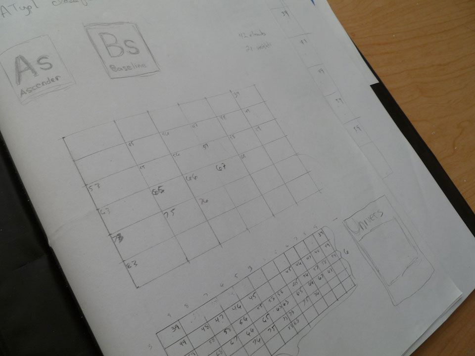
Early sketches.
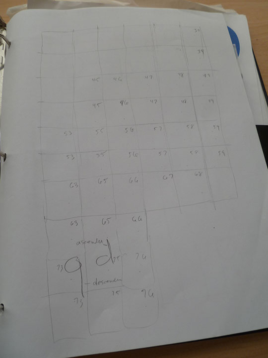
More sketches and early layout.
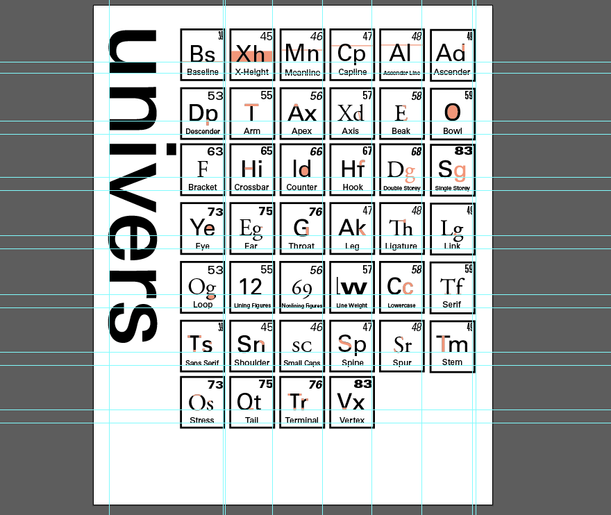
Taking the whole thing into Illustrator and working the kinks out of the grid.

Printed out an early version on basic stock 8.5 x 11 and tiled together, just to get an idea of what it was going to look like. Still a lot of changes to be made!

The full-sized, final poster.
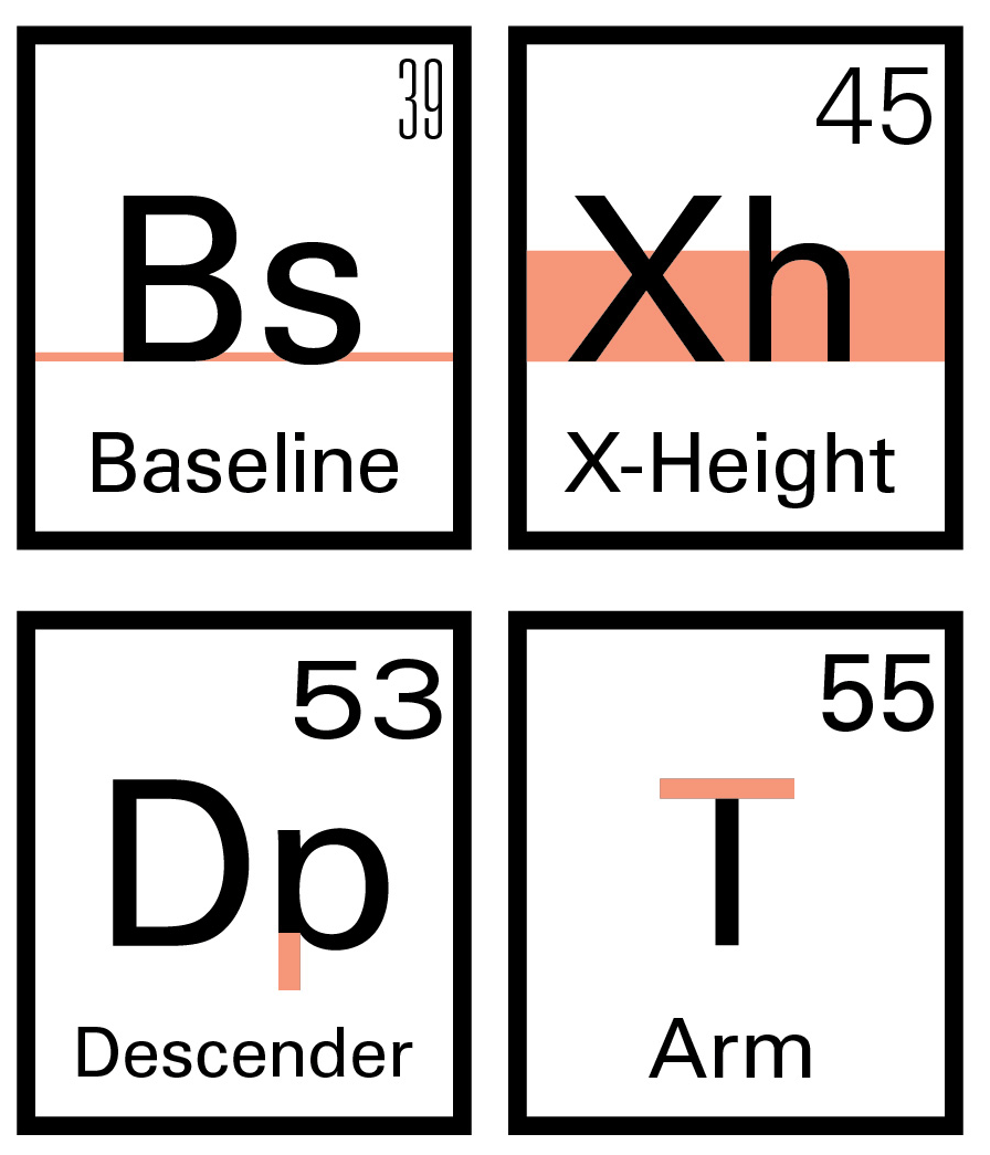
Close up detail of part of the poster.
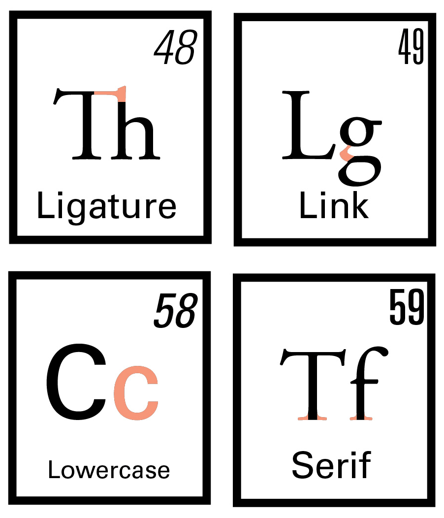
Another detail of elements that couldn't be expressed entirely in Univers.
The final print, 24" x 36", produced on an Epson Stylus Pro 7600.


