TAPS BAR & RESTAURANT
Brand Art Direction
Brand Art Direction
With over 250 variations of beers and over 100 bottles of wine, Taps certainly speaks to the choices
of liquor available. If TAPS has the best of the best selections, that’s what is going to make people
initially come to the establishment. But if they come for a drink, they are likely to stay for a meal
with eclectic menu items such as Chipotle Apricot BBQ Chicken sandwich or Belgium Waffles
with Nutella for dessert. That’s the extra add-on that puts Taps above the typical wine bar.
And that unexpected fun on a more sophisticated level should be played up by Taps a bit more.
But from the outside looking in, the TAPS brand should visually communicate this message.
In terms of tone, Taps is not a place for the wine snob nor is it a sports bar – so we have to be
careful here that we tread the right line as far as tone. Instead, Taps is just the sort of place
where a young couple can go in the middle of the week and settle in for a few hours. He can
order up a Stone IPA, she can order a terrific Cabernet she’s never tried before that doesn’t break
the bank. It’s a place for down-to-Earth people to explore, guided by a very knowledgeable staff
that knows every brand on the shelf and knows how to pair a terrific plate off the menu with the
liquor selections.
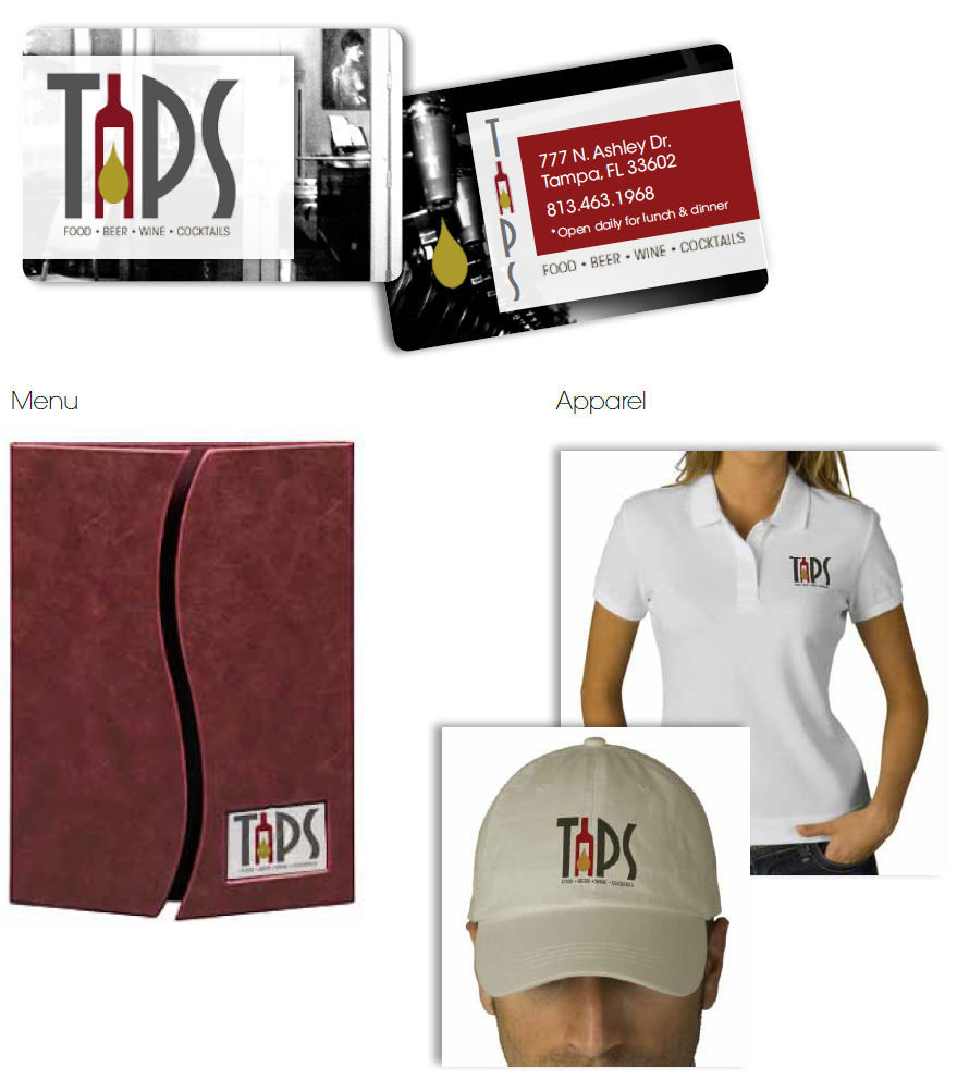
The following design options are just a taste of what we feel could be a great way to stand out
amongst the many bar and restaurant establishments within the area, and provide a look and feel
that appeals to the TAPS target audience.


