Personal Brand Identity
By Maria Gasan
By Maria Gasan
In aiming to constantly reinvent myself, I felt it was about time to create a new personal Brand Identity as I am currently in the process of revamping my portfolio. Updating ones portfolio is the BEST way to judge how much you have changed as a designer, as you see things you have improved in and remember a few skills you may have forgotten. The following was my OLD brand identity:

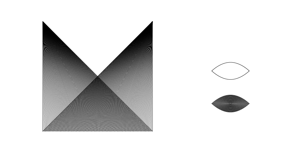
The concept of the logo, is to have the letter "M" for my name, an innovate shape like a "Triangle" and something personal that resembles me... with is the presence of an "Evil Eye" for protection and luck.
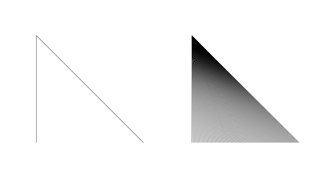
So to start the logo, open Adobe Ilustrator CS6 (you can use up to CS3), I created my basic shape (keeping in mind what the final shape I want). As you can see from the below image, I created a downwards triangle. You can create any shape you wish, as long as your shape is divided into two separate parts. For example, the vertical line and the diagonal line are two separated pieces. Select the shape and going into "Objects" then "Blend" and click "Make". Once you've done that, go back into "Blend" and click on "Blend Options", select "Specified Steps" from the drop down menu and type in 80. (In CS6 you are able to preview the blend, note if you are working with a small shape, you will need less steps, perhaps 30-40 only).
Once I have my Blended shape, I created the full shape I wanted. As you can see, the triangles now have created an abstract letter "M" and I have prepared my abstract "Evil Eye" for my design.
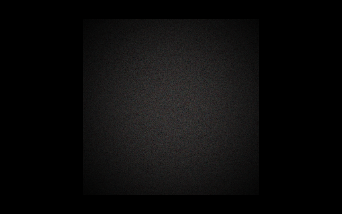
Once you are happy with your shape, you can move onto Adobe Photoshop to finish up the design. Open a document, Fill the Background with Black and with the Brush Tool then dab a spot of grey (I used about 40% Black) in the center of your artboard. After that go into Filter, Noise, Add Noise and then add as much noise as you like, just note to use the Gaussian setting for the Noise.
Once the background is done, Copy and Paste your shapes from Illustrator to Photoshop, make sure you paste each shape separately so you have more control on the design. Move, resize or place the shape as you wish on your document, to get prepared to start addi some colour.

The next step may seem a little technical, but it's very simple and once you have done one, you can easily do the rest quite quickly. On a new layer, with a large soft brush dab colour on a section of your shape, then change the Blending Mode to "Dissolve". This may look strange at first, but what you will then need to do, is create another layer, and then merge the now Dissolved Colour layer with the blank new layer. By doing this, the colour layer will have a smoother grain look to it, then the previous harsh look with the dissolved setting.
To control where the colour will fall on your shape, Load the shape you pasted into photoshop, (so you shape is fully selected), and then create a clipping mask over the colour layer. With this you should be able to see colour ONLY on your shape and not on the background. Repeat this process until your shape is fully colored.


To make your design more dynamic, you can add dark areas to your shape. On a new layer, with a soft brush, paint Black and change the blending mode to "Soft Light". You will see the colour of the design intensifies.
I used this technique, not only on top of my shape, but underneath it to act as a sort of drop shadow.

The last steps to completing your design, is to then create a new layer and dab spots of colour on your artwork with a large, soft brush. I kept close range with the colour of my shapes, but you can add contrasting colours to create a whole different look. Once finished with colour dabbing, change the Opacity Mode of the layer to "Soft Light" and see your design come alive as the colours of the shape is now more vibrant.
An interesting detail you can add is a thin line of light around the shape, to do this, first create a new layer and then select a small soft brush in white. Then select your "Pen" Tool and draw a path around the shape (almost like an outline). Once done, right click on the path and select "Stroke Path" and change your Tool to "Brush" (The brush you had selected before using the Pen Tool) and select "Simulated Pressure". Click "OK" and delete the path, so all is left is the layer with an outline of white. Change the Blending Mode to "Soft Light"
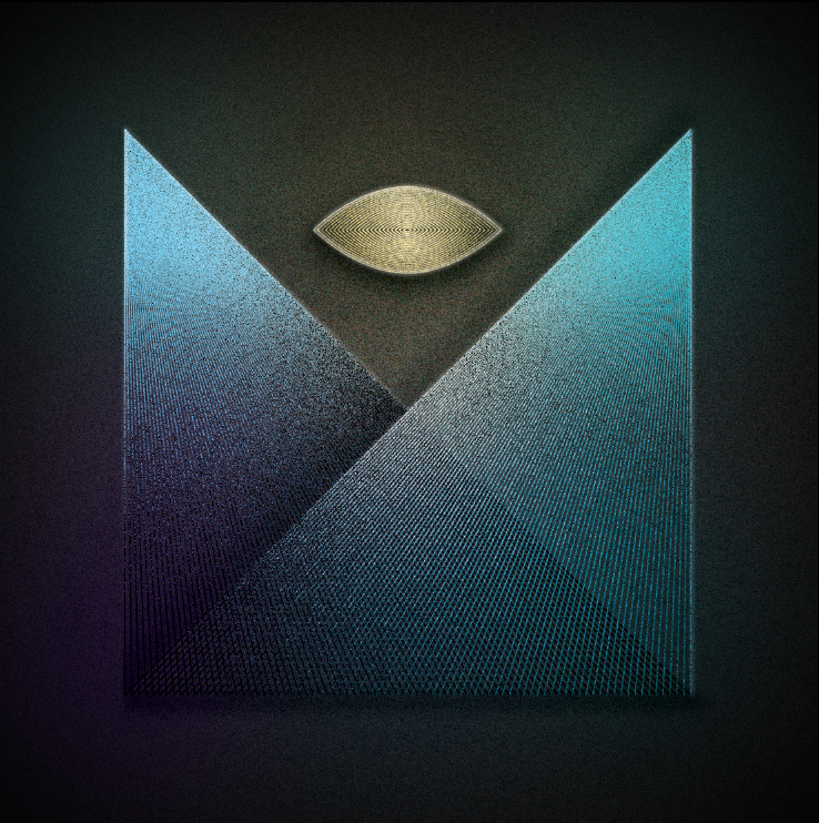
And there you have it... your design is complete. You can add additional effects or experiment by playing with the Blending Modes. But this is how I created my dynamic Brand Identity, however this will only be used for my online portfolio and digital portfolio. So make sure you keep a vector format of the Identity for other collaterals.


