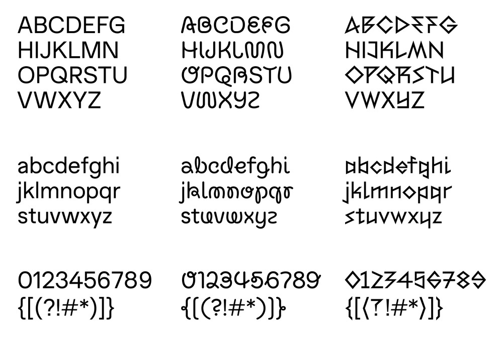
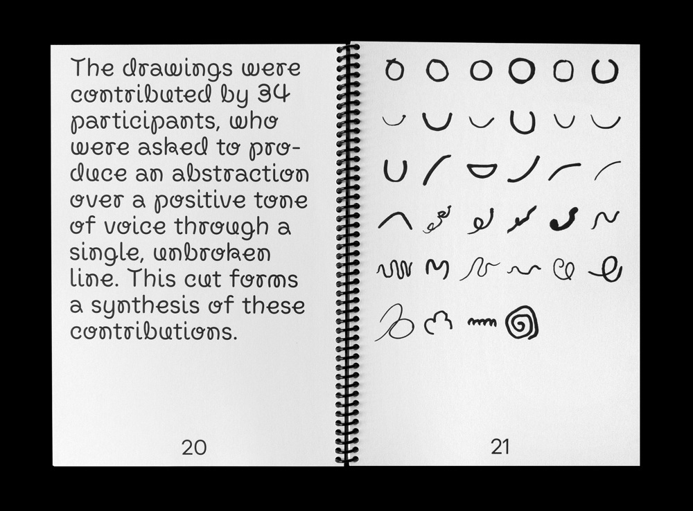
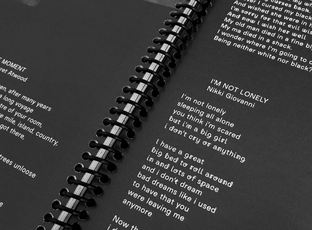
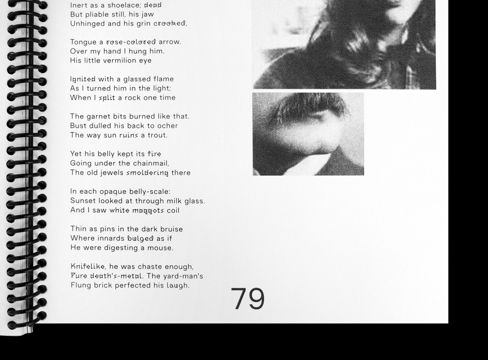
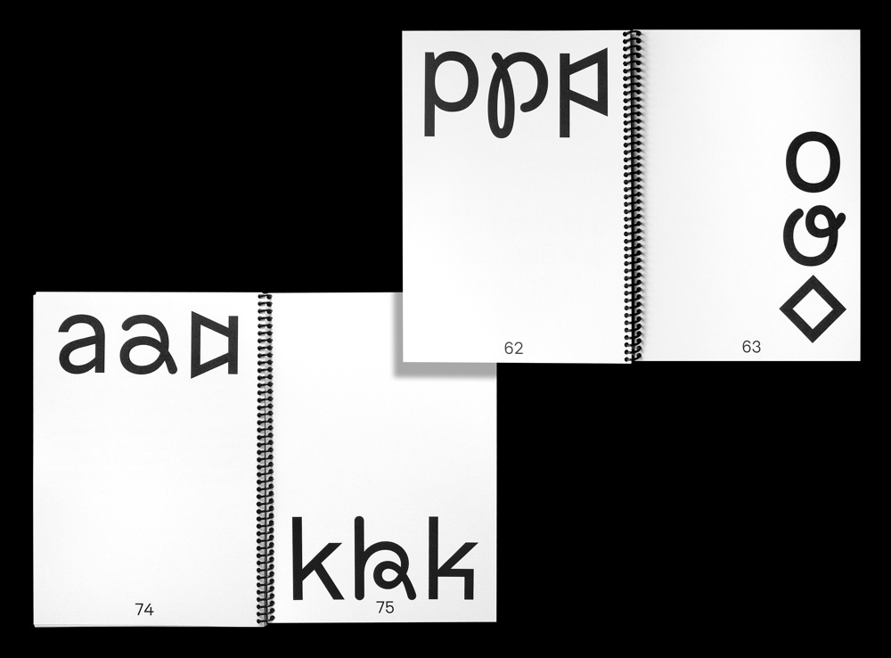
My MA graduation project deals with the dichotomy and transformation of speech and text. The transcription from spoken to written word leaves an immediate void where mainly the tone of voice existed. This project attempts to fill this void with a typeface that possesses three unique cuts: A “friendly”, an “unfriendly” and a “toneless”. These are based on a series of drawings/abstractions contributed by 35 research-participants and are, despite their contrasting appearances, tied together through their proportional relationship. By combining the three cuts it is possible to add nuance to a text and increase the reader’s understanding of its emotional agenda. In conclusion, this project is as much a functional tool as it is a reflection on how fonts can communicate on a micro-level.
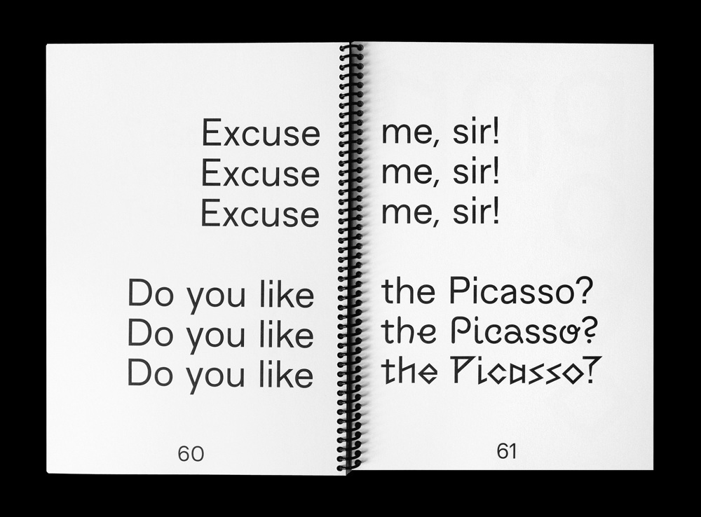
As a means of testing the effect of the typeface, six professional voice actors were asked to read aloud sentences combining the three cuts. They were not told what the cuts signified, but asked to give their own interpretation.
As a means of testing the effect of the typeface, six professional voice actors were asked to read aloud sentences combining the three cuts. They were not told what the cuts signified, but asked to give their own interpretation.