Shimada Co., Ltd. / Brochure(B5 size / 20 Page / Cover: Mat PP)
大阪市西淀川区に本社を置く島田株式会社。1921年創業の老舗企業として家具材料・内装材料の販売や、家具製作などを行っています。
tegusuでは同社のCIのリニューアル開発に続き、会社案内の制作を行いました。
Shimada Co., Ltd., an old firm established in 1921 and based in Nishiyodogawa-ku Osaka city, sells furniture materials and interior materials, as well as makes furniture. tegusu handled the development of Shimada’s renewed CI, and subsequently produced their company brochure.
CI renewal project : http://www.behance.net/gallery/30508259/Shimada-Corporation_CI
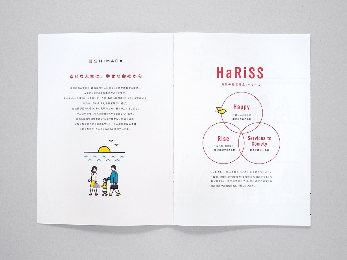
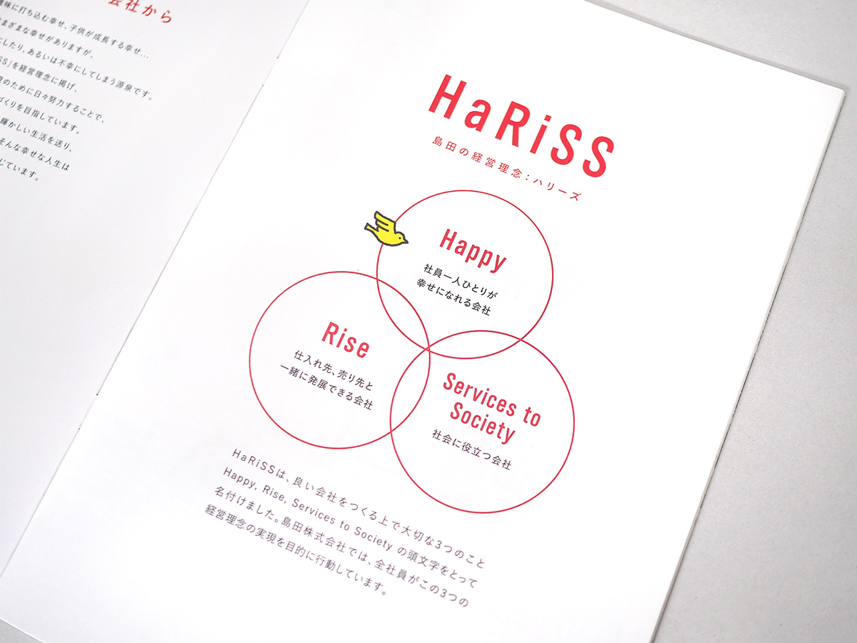
制作にあたっては、いくつかの編集コンセプトを提案・検証しました。その結果、CI制作でもキーワードとなった「信頼」「実直さ」が全体を通して感じられる冊子を目指し、経営理念である「HaRiSS」の紹介を軸としたページ構成が採用されました。
For the production of the brochure, we proposed and examined several different editing concepts. As a result, we set our goal of making a brochure in which the ideas of “confidence” and “conscientiousness” are present on all the pages. These two words were also keywords for the CI development. We also adopted the page structure with the main focus on introducing their business philosophy “HaRiSS.”


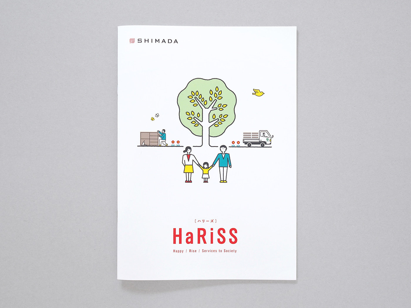
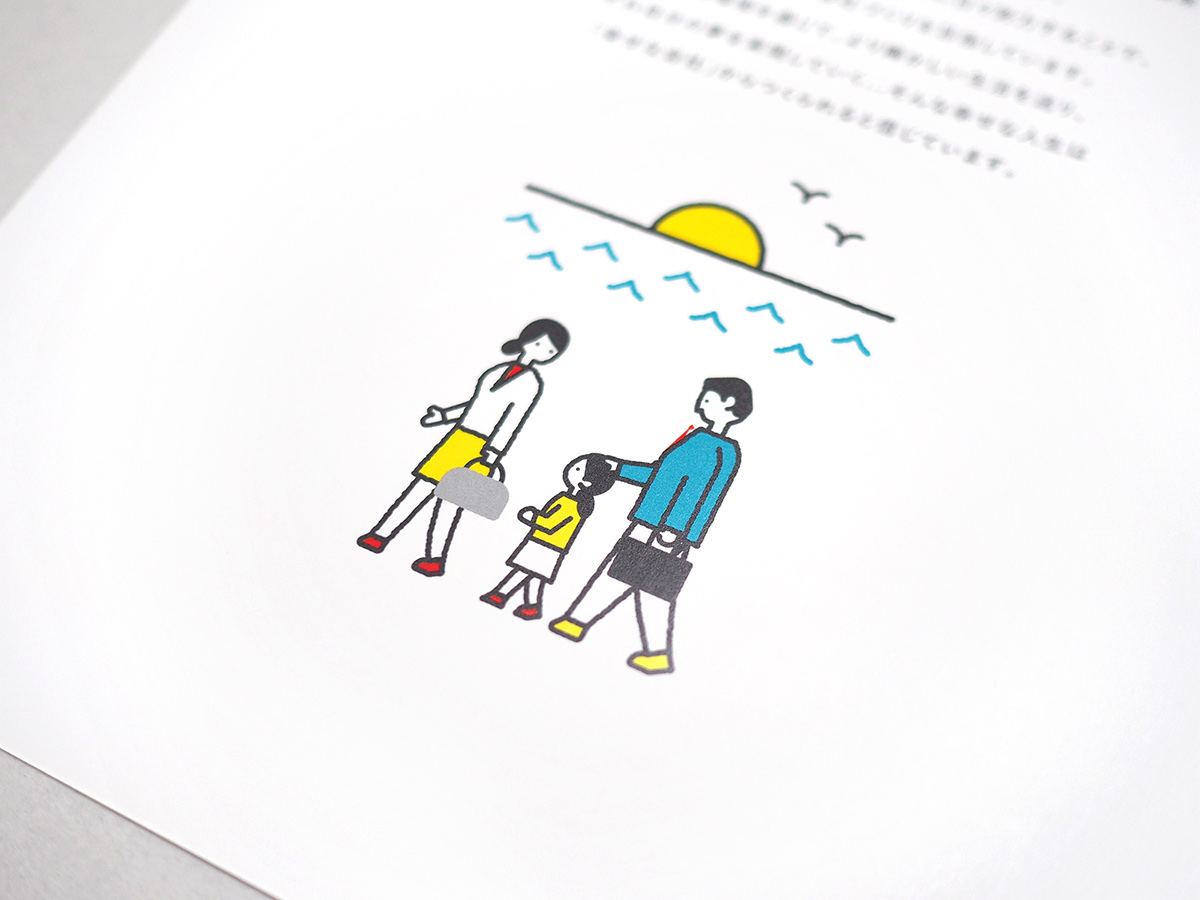
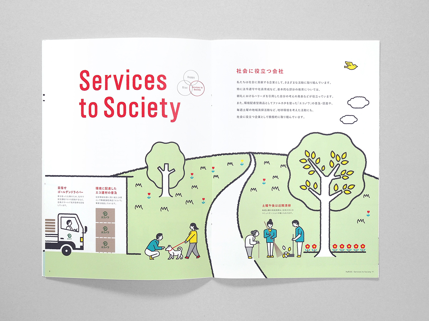
これまで親しまれてきた「HaRiSS」を、企業カラーを用いてシンボル化し、理念を表す文章についても言葉を選び直し再編集を行うことで、新しくなった会社のメッセージを整理しました。また会社案内のキービジュアルにはオリジナルで制作したイラストを用い、社員同士がどのように関わり合っているか、また取引先や地域の人、家族とどのような関係を築いているかを可視化しています。仕事に取り組む姿勢や、同社が大切にしている「人同士の関わり合い」を、楽しい雰囲気と共に感じられるようにしました。
The corporate philosophy “HaRiSS,” which had already been well known among their customers, was symbolized using the company’s symbol color. The sentences that explain the philosophy were refined and edited, so that they would properly reflect new messages from the renewed company.
Our original illustrations were used for the main graphics of the brochure to visualize how the employees interact with one another, and the kind of relationships they have built with their business partners, local people and family members. The readers will get to know how Shimada’s staff members are committed to work and how they value “interaction between people,” as well as the fun atmosphere of the workplace.
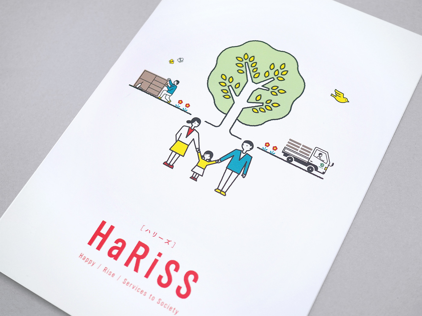
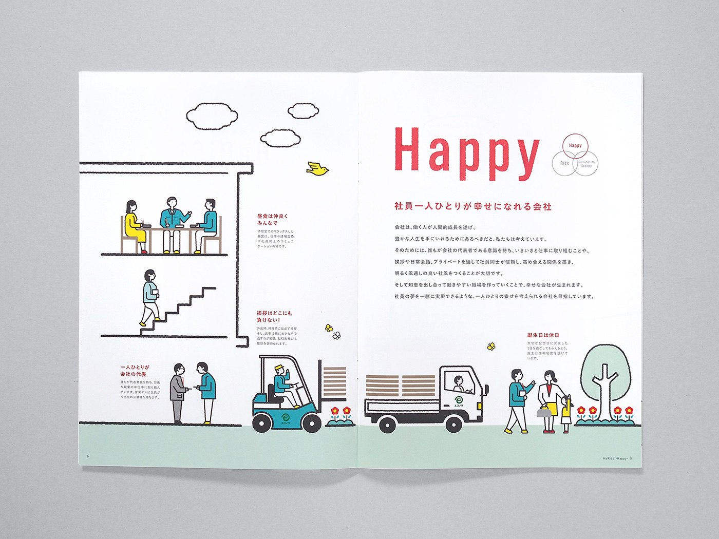
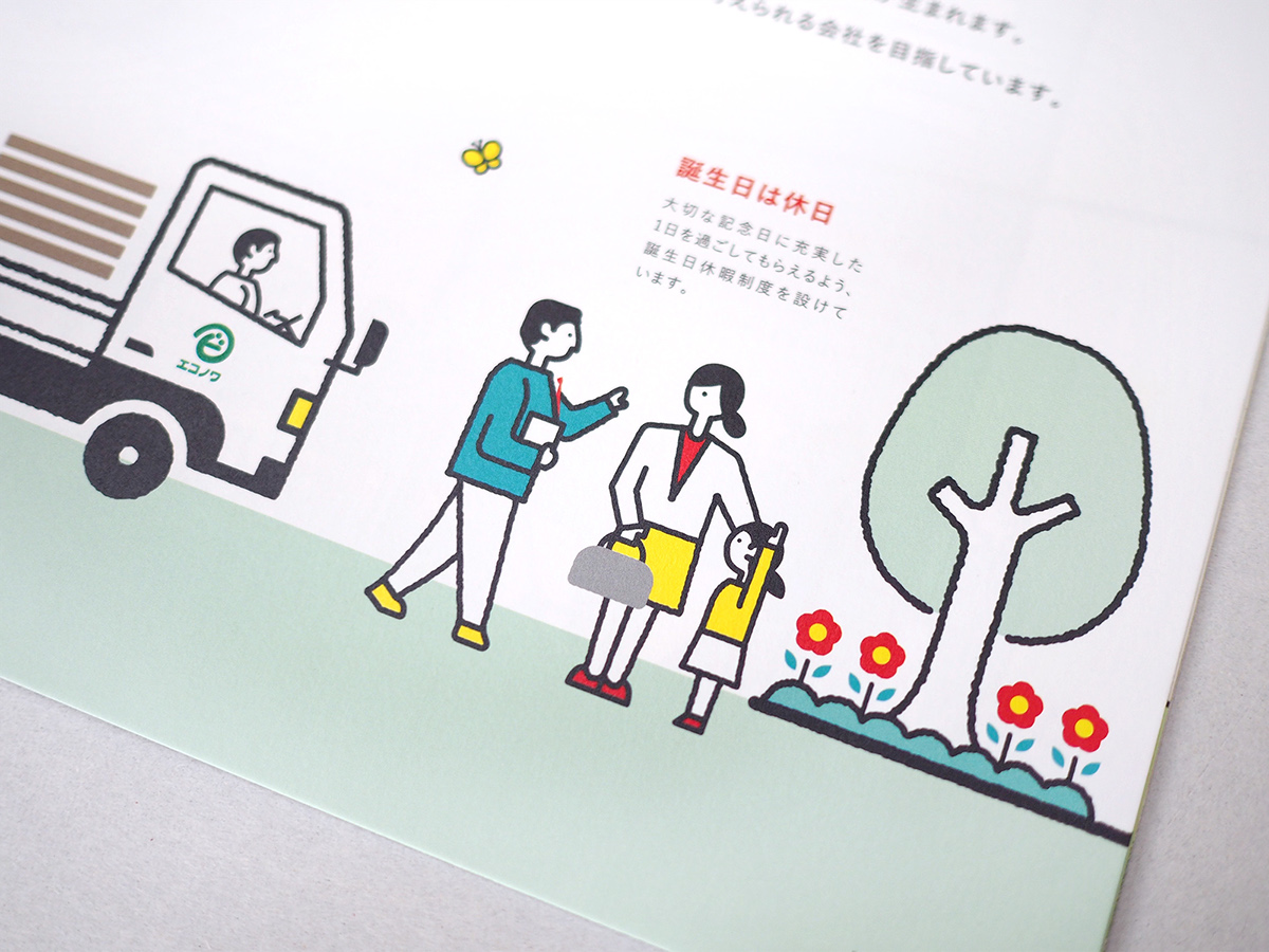


会社のTOPICSや部署の紹介、沿革や代表の挨拶などは、後半ページにコンパクトにまとめています。よく見ると、冒頭に登場する黄色い鳥が最後のページまで飛び続けて登場します。どんな場面においても「HaRiSS」の理念が貫かれていることを、そっと表しています。
Topics of the company, introduction of each department, company history, and greeting from the president were put together and presented on the pages in the latter half of the brochure. If you take a close look, you will realize that the yellow bird you see at the beginning of the brochure keeps flying through to the last page. This implicitly shows the company’s commitment to the philosophy “HaRiSS” in any situation.

Client : 島田株式会社/Shimada Co., Ltd.
Planning, Art Direction, Design, Illustration : 藤田雅臣/Masaomi Fujita(tegusu Inc.)


