Parks & Points —
Leading the trail.
Details —
Husband and wife travel and National Park enthusiasts, were onto something new in the travel blog industry. By combining their two passions, travel and parks, there was a unique opportunity to provide travel tips on how to visit the National Parks through the use of reward points programs along with park itineraries.
The challenge was to create a branded concept to compete in a market with more established blogs.
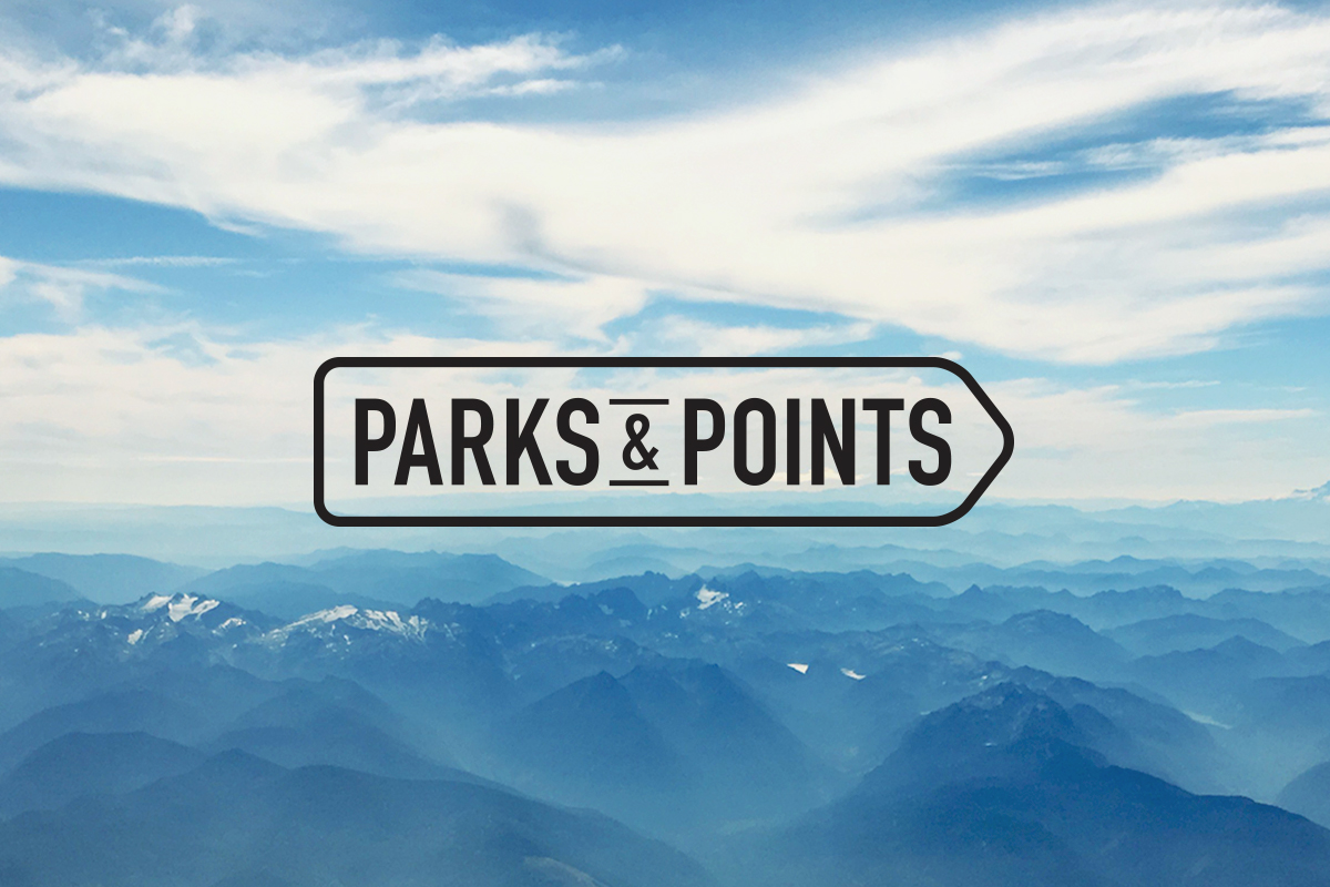
Solution —
My intent was to imbue the grandeur feeling of National Parks while infusing their passion for travel and writing. The outer shape of the brandmark represents not only a pencil but also signage one would find in a park. The blue color is reflective of the one entity that ties both travel and parks together, the sky.
The new visual identity has helped transform an idea into a trusted resource for visiting the National Parks.