FF Seria and FF Seria Arabic in Reflections on Islamic Art
One of our multi-script typefaces, FF Seria, in action. A new book edited by Ahdaf Soueif comes in two editions: Arabic and English.
One of our multi-script typefaces, FF Seria, in action. A new book edited by Ahdaf Soueif comes in two editions: Arabic and English.
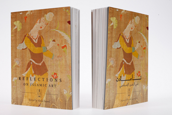
Reflections on Islamic Art is a new book edited by Ahdaf Soueif. It is available in two editions: Arabic and English. Both are typeset in FF Seria, one of our multi-script typefaces.
FF Seria started as a Latin script family; Martin Majoor began the design in 1996, and we released it in 2000. Nine years later, we brought FF Seria Arabic onto the market, which Majoor developed together with Pascal Zoghbi, a Dutch-trained type designer based in Lebanon. Their tandem Arabic family was the first Arabic typeface published by FontFont; it grew out of an earlier collaboration named Sada, which had been designed as part of the Khatt Foundation’s Typographic Matchmaking project.
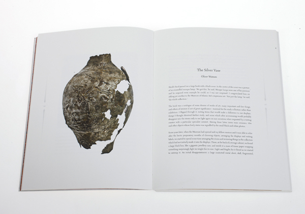
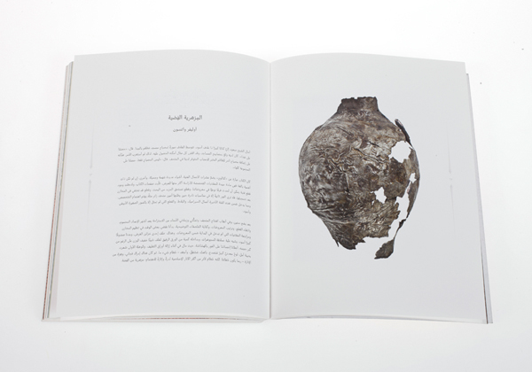
Both the Arabic and English editions of Reflections on Islamic Art were designed by Muiz Anwar, a graphic designer based in London – and also a former intern with us at FontFont. Anwar’s solution for these books is reduced and thoughtful. Each edition is a mirror of the other. Images play the primary role in the design, often taking up full pages, or half of a spread.
FF Seria started as a Latin script family; Martin Majoor began the design in 1996, and we released it in 2000. Nine years later, we brought FF Seria Arabic onto the market, which Majoor developed together with Pascal Zoghbi, a Dutch-trained type designer based in Lebanon. Their tandem Arabic family was the first Arabic typeface published by FontFont; it grew out of an earlier collaboration named Sada, which had been designed as part of the Khatt Foundation’s Typographic Matchmaking project.
Both the Arabic and English editions of Reflections on Islamic Art were designed by Muiz Anwar, a graphic designer based in London – and also a former intern with us at FontFont. Anwar’s solution for these books is reduced and thoughtful. Each edition is a mirror of the other. Images play the primary role in the design, often taking up full pages, or half of a spread.
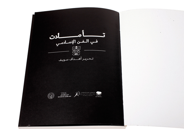
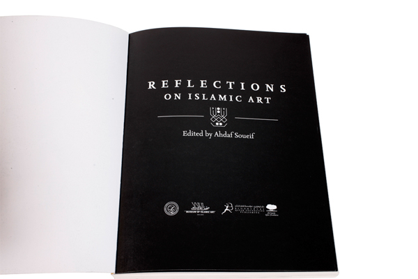
In order for the Arabic and English titles to take up the similar amounts of visual space, the Arabic title employs long kashidas – or lengthening strokes. However, the English title makes use of additional space, too. Had Anwar set the English title in upper and lowercase, its words would have been much shorter; by switching to all caps, letterspacing may be applied. The combination of tracked capitals in English and kashidas in Arabic is an interesting solution.
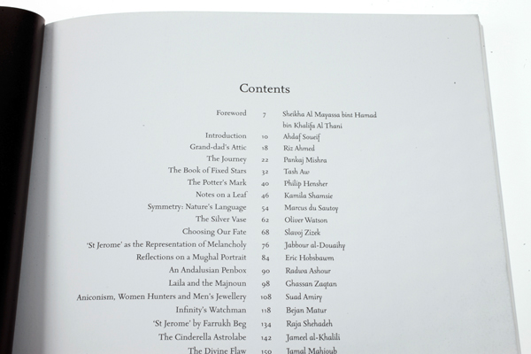
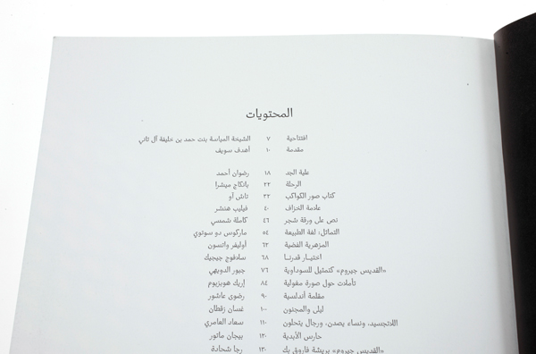
The books’ colour palettes are reduced, drawing more attention to the images themselves when their appear. Text in the Reflections on Islamic Art editions is always either black-on-white or white-on-black. The tables of contents are handled in a similar way as the books’ title pages. Yet the typographic hierarchies are not identical in each edition: for the English-language, author names are set in FF Seria Italic, setting them apart from the main text in FF Seria Regular. This subtle differentiation isn’t applied to the Arabic typography, leaving the Arabic text slightly more even in feeling.
FF Seria Italic is an upright italic. Its letters have only a minimal slant. This sets it apart from the italics in Majoor’s other typeface families; FF Nexus Italic and FF Scala Italic both feature a steeper slope.
FF Seria Italic is an upright italic. Its letters have only a minimal slant. This sets it apart from the italics in Majoor’s other typeface families; FF Nexus Italic and FF Scala Italic both feature a steeper slope.

Anwar is a type designer and letterer himself, and he contributed more to Reflections on Islamic Art than just its typesetting. Each chapter opens with a very short text in a thin, dotted-line constructed Arabic script that he designed for the purpose. The hard geometry and ‘digital’ nature of Anwar’s lettering in these books contrasts well with the pen-shaped form of FF Seria Arabic.
Regarding his design, Anwar wrote to tell us that he aimed ‘to reflect the architecture of the Museum of Islamic Art, an environment with an amazing collection of unique and intricately wrought works of art’. He continued, ‘the book is the building and its design is the architecture; its job is to maximize the impression the words and the images make on the viewer/reader. My design is rooted in the grid system traditions evident in the layout of Qur’anic and other Islamic manuscripts. Margins are wide and generous to allow the eye space to appreciate the variant detail of each piece of work. The reduced colour palette for the book is an extension of the architectural aesthetic I.M. Pei established for the MIA building.’
Regarding his design, Anwar wrote to tell us that he aimed ‘to reflect the architecture of the Museum of Islamic Art, an environment with an amazing collection of unique and intricately wrought works of art’. He continued, ‘the book is the building and its design is the architecture; its job is to maximize the impression the words and the images make on the viewer/reader. My design is rooted in the grid system traditions evident in the layout of Qur’anic and other Islamic manuscripts. Margins are wide and generous to allow the eye space to appreciate the variant detail of each piece of work. The reduced colour palette for the book is an extension of the architectural aesthetic I.M. Pei established for the MIA building.’
Great care has been taken to ensure that the harmony achieved and evident in anArabic spread is reflected with equal beauty in a Latin spread – with particular elementsreflected/reversed to conform to Arabic and Latin reading patterns. The grid layout for internal spreads is based on the proportions of early Arabic manuscripts, which characteristically featured expansive borders. Although these borders were often used for annotation, commentary and illumination, in many cases they were left blank, allowing greater emphasis to be placed on the content centralised on the page.
Anwar’s approach reserves the book’s margins for minimalist navigational elements:page numbers, running titles, etc. By keeping the margins relatively free of superfluousdecoration, he ensured that the book remains an unobtrusive, spacious vessel tohouse and display its content.
Anwar’s approach reserves the book’s margins for minimalist navigational elements:page numbers, running titles, etc. By keeping the margins relatively free of superfluousdecoration, he ensured that the book remains an unobtrusive, spacious vessel tohouse and display its content.
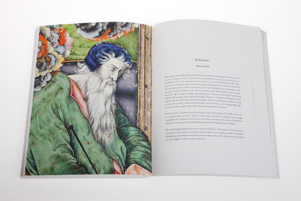
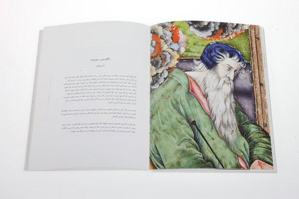
The two photographs above show a similar spread layout across the two editions. The mirrored reading directions of the Arabic and Latin scripts create a different feeling on these double pages, due to the particular artwork selected. On the Arabic spread, St Jerome looks away from the text, while his eyes lead the viewer over toward the text in the English-language edition.
‘The objects pictured, and the narratives inspired by them, become the definitivefeatures and decorative elements of the book,’ continued Anwar, ‘giving them spaceto shine without distraction or competition. The object itself dominates the spread asthe primary visual feature. The design of the book is purely functional, aestheticallyminimalist, and serves to accent the objects – not to compete with them. The layoutin Arabic edition is proportionally the same as on the English spreads, with navigationfeatures reversed to adapt to the right-to-left reading pattern. My design is anorganic extension of my working ethos in the field of Arabic design. The book designdoes not intend to imitate traditional Islamic art – it intends to honour the contributionof master craftsmen and women by facilitating the technical principles theyestablished as a foundation upon which to engineer a contemporary and culturallyrelevant visual language. The design is entirely at the service of the content.’
‘The objects pictured, and the narratives inspired by them, become the definitivefeatures and decorative elements of the book,’ continued Anwar, ‘giving them spaceto shine without distraction or competition. The object itself dominates the spread asthe primary visual feature. The design of the book is purely functional, aestheticallyminimalist, and serves to accent the objects – not to compete with them. The layoutin Arabic edition is proportionally the same as on the English spreads, with navigationfeatures reversed to adapt to the right-to-left reading pattern. My design is anorganic extension of my working ethos in the field of Arabic design. The book designdoes not intend to imitate traditional Islamic art – it intends to honour the contributionof master craftsmen and women by facilitating the technical principles theyestablished as a foundation upon which to engineer a contemporary and culturallyrelevant visual language. The design is entirely at the service of the content.’
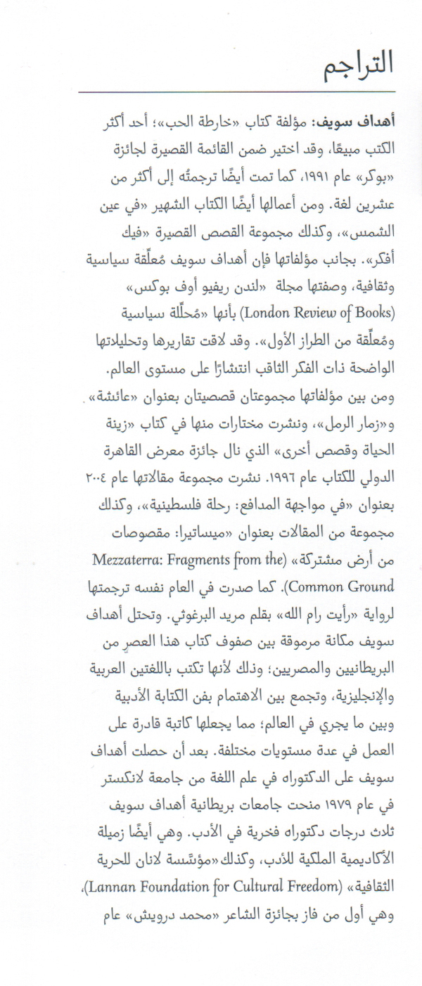
The image above shows Ahdaf Soueif’s biography in Arabic, featuring two weights of FF Seria Arabic – Regular and Bold. The family also includes a Light and Black weight for additional contrast (there isn’t an ‘Italic’ version of FF Seria Arabic). The English text in the sample is set in FF Seria Regular Italic, rather than FF Seria Regular, both because some of the English-language names are set in that font in the English text, but also because the Italic’s forms stand out from the Arabic text as well as they do from the English.
More micro-typographic details appear towards the end of the book, after the text splits from a single column into two. The image above shows the particular finesse of the FF Seria family, with text set in two sizes of FF Seria Regular, along with elements set in FF Seria Bold and FF Seria Regular Italic. The typeface’s oldstyle figures blend in with the main text well. Small caps – included in the FF Seria family – are not used here.
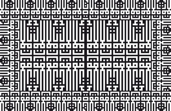
This final geometric motif, also designed by Anwar, is used in the hardcover edition’s endpapers. Its angularity is a fine counterpart to FF Seria’s softer, more handwritten forms, striking another fine contrasting note.

