


Our company brand was starting to get a little stale. I wanted to take some spare time between projects and reinvigorate the brand around a more iconographic logo while still maintaining a use of the font that our customers had come to recognize.
The brand now has a broader reach and higher impact with a new logo, secondary font treatment, animated splash screen, marketing screenshot border, app icon tags and brand style guide.
Check out our new website to see more about the brand and the company that I used to work for: www.concretesoftware.com
Comparison

Splash Video Intro for All Games
Videos rendered at all necessary screen sizes and encoded for maximum quality/size balance. All graphics, animations and VFX by Dave Rowley
Marketplace Icon Tag

Useful for cross promoting within app marketplaces. All icons and icon tag by Dave Rowley
In-Game Messaging Service
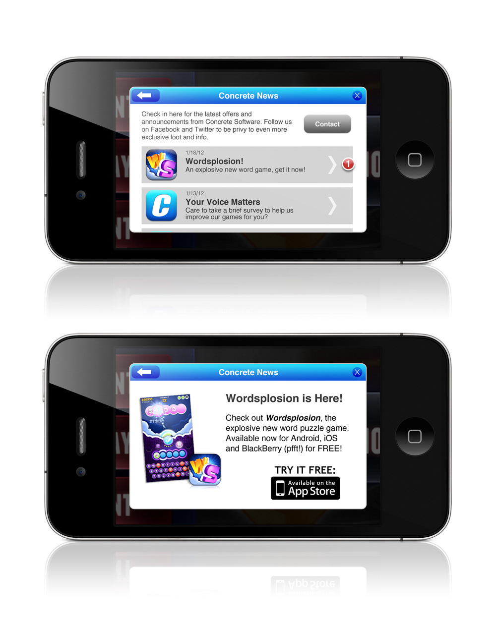
Making the voice of our brand heard by implementing a server-run messaging service across all games on all platforms. Layouts and UI design by Dave Rowley
Styleguide
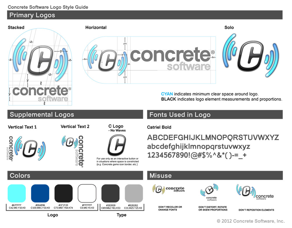
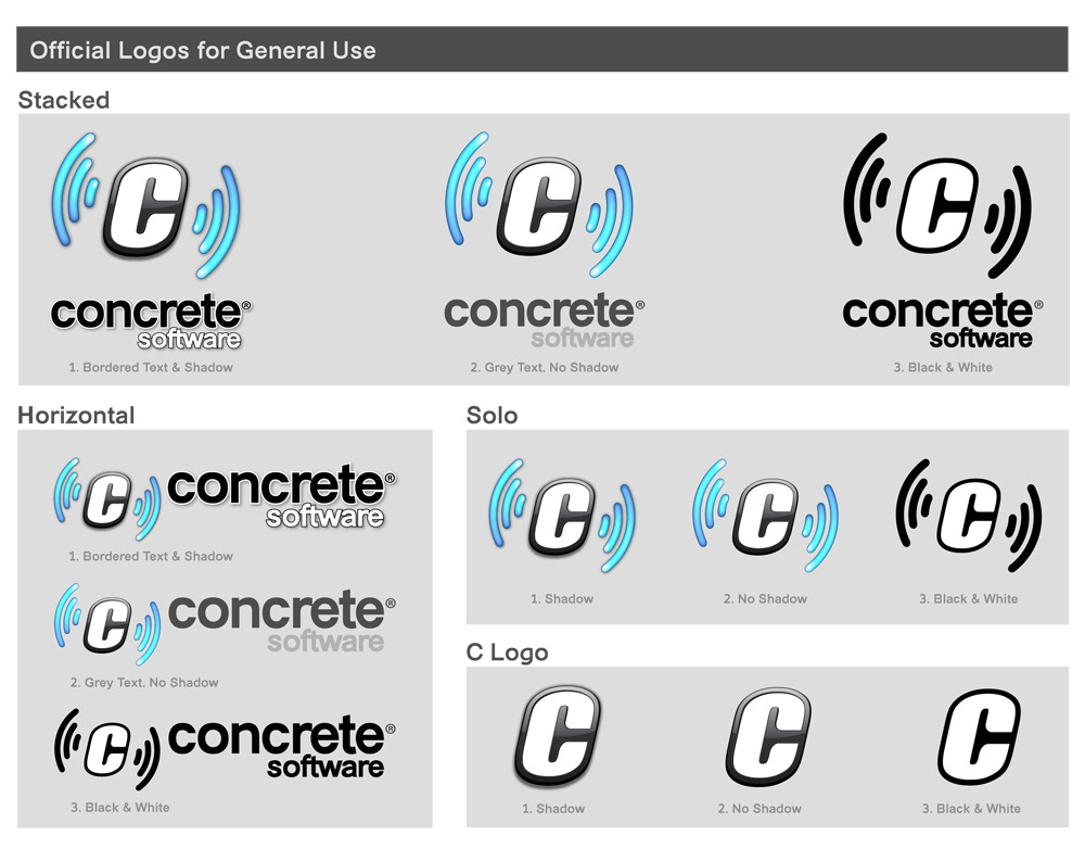
It's a styleguide!


