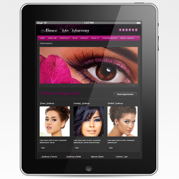
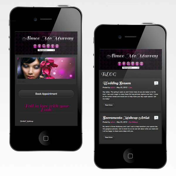
Aimee McMurray, Blog and Porfolio of Makeup Artist Just finished working on beauty website with "responsive design" (fluid proportion-based grids, to adapt the layout to any screen size, and use flexible images. As a result, users across a broad range of devices and browsers will have access to a single source of content, laid out so as to be easy to read and navigate.
Responsive design and layout, scalable to any screen width.
Responsive design and layout, scalable to any screen width.

Alleventmakeupart.com


