SDSU 2012 Open Studio Show

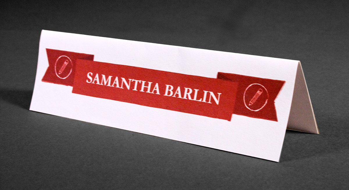
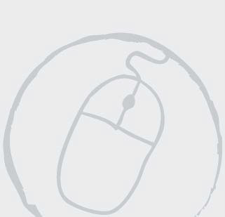
This name placard would be placed on a table in front of the students work. It is very simple to let the students work stand on its own while still drawing attention to their name. The ribbon is taken from the poster, and the icon notes what type of project is being displayed. In this case, the pencils represent illustration.
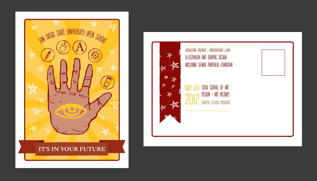
The image on the left is the front of the postcard for the Open Studio Show. It is very similar to the main poster and remains vertical, as the open palmed hand is very difficult to change into a horizontal layout. It is simplified, taking some of the extraneous information text and moving it to the back so that it is still easily readable. On the right is the back of the postcard. This diverges quite a bit from the poster. The ribbon is reused from the poster, though there is only one chunk on it, and is reminiscent of bookmarks in old texts. The stars are also reused from the poster. The information text aligns next to the ribbon, using color to create visual interest and differentiate the text.
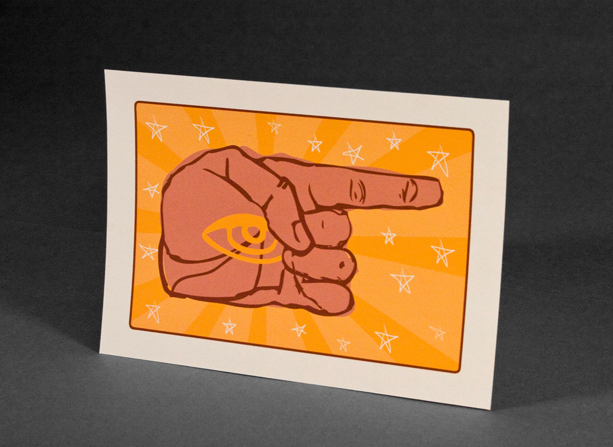
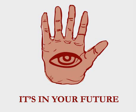
This piece is a navigational sign, and the hand has been redrawn in a similar style to point the way to the final location of the show. The radiating background and stars are reused, as is the eye, which is tucked into the enclosed palm.
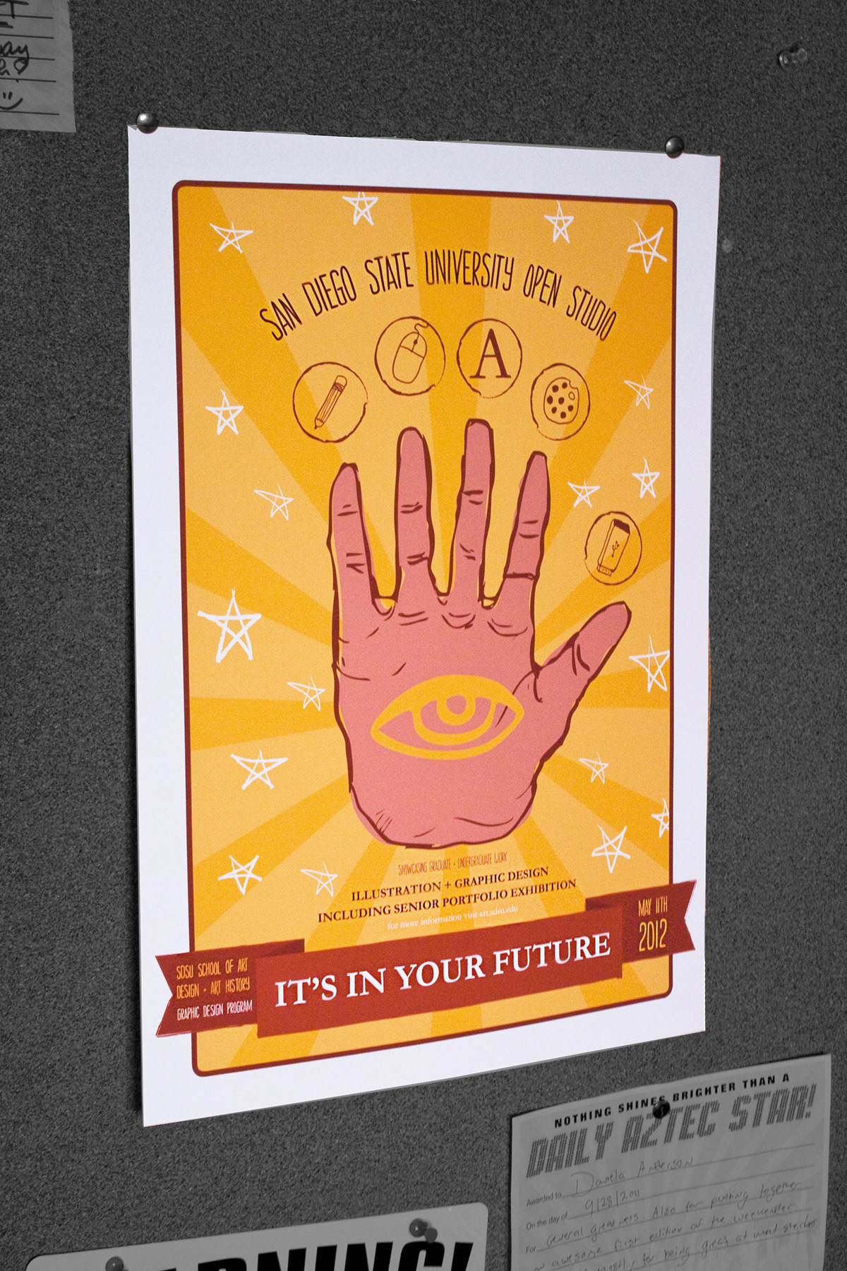
The final poster is shown in its natural habitat, the corkboards that littler the campus art buildings. The poster is vibrant and bright against the wall with the white border creating space between it and the background, while also communicating the feeling of a taro card.