

Common Goods Co. Sugar strives to fill a missing gap in the sweetener market. At the moment a consumer has few options: purchase a 5lb paper bag, a box of individual packets, or plastic bagsof artificual sweeteners. Common Goods Co. Sugar provides a product that consumers don’t need to hide or repackage; they can easily be dispayed on a shelf or countertop. The quanity of sugar meets the demands of a demographic looking for a little sweetner simply for their morning coffee or tea.
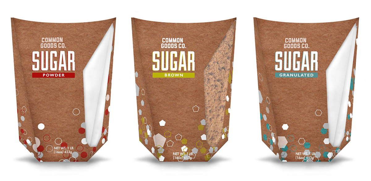
Renderings of sugar packaging: powder, brown, and granulated.
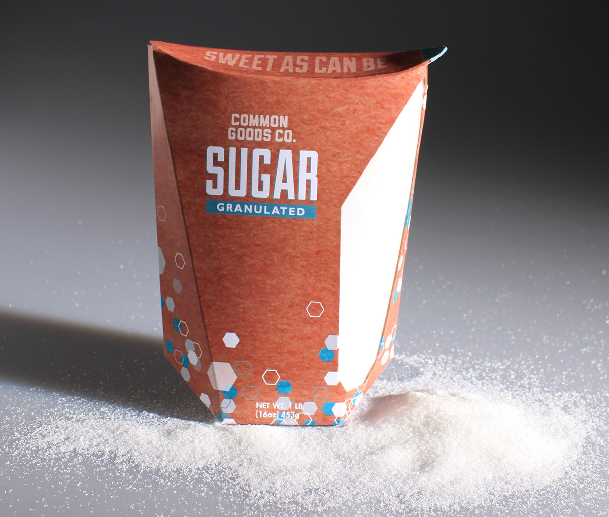
Final Packaging Prototype
Striving to give the consumer a more exciting sugar experinece, the packaging uses a strikingly geometric shape allowing the packaing to add to the overal brand image and differentiate itself from the current market. The structure of the packaging would be made of 100% recycable carboard and printed on with soybased inks. The diecut window would utiized corn-based compostable plastic produced by Ingeno. The inside would be lined with an Ingeno film to prevent contaimination of the product.
Striving to give the consumer a more exciting sugar experinece, the packaging uses a strikingly geometric shape allowing the packaing to add to the overal brand image and differentiate itself from the current market. The structure of the packaging would be made of 100% recycable carboard and printed on with soybased inks. The diecut window would utiized corn-based compostable plastic produced by Ingeno. The inside would be lined with an Ingeno film to prevent contaimination of the product.
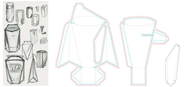
Initial Packaging Sketches and Final Dielines
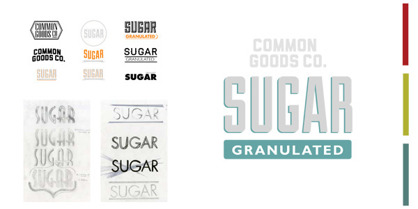
The Common Goods Co. strives to be fun and energetic for its consumers, utilizing playful patterns and bright colors to identify the three varieties of sugar: granulated, brown,and powder. The color palette was developed to stray away from primary colors, which currently oversaturate the sweetener market. The logo pays homage to the natural qualities and nature of the product, utilizing a more Art Deco font referencing they handcrafted lettering of small town markets.


