Have you ever asked yourself if there is a link between type and booty? Me neither—until I participated in an open call from a recent german graphic design magazine in early 2016 …
Last year I stumbled over an interesting post from a new magazine called “fount”: In
a first open call they asked artists and designers from various fields to send in their artworks. In the next step they asked for other artists and designers to remix these sent in artworks from the first round. As this sounded interesting I got in touch with the guys from the magazine and was really excited to see what’ll come in for me—finally the artwork arrived:
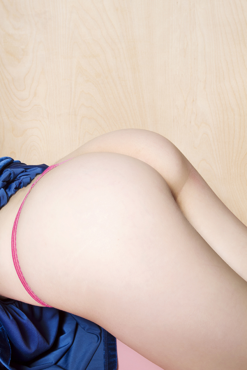
“SClarken_Annelise_4-14-14_edited-2.jpg“ © Sara Clarken
“Really—they send me a photograph of a naked ass!?”
At this point I had no idea if I should laugh or cry about it ... But then I immediately started convincing myself: “Hey, this could be an interesting challenge and actually this could be fun, so of course I’m in!” And suddenly I found myself in a job making something out of a female backyard.
When I read the magazines announcement, as a type-lover of course my plan was to do something with type or typography. And especially after seeing this astonishing picture, I totally wanted to stick with this plan. Therefore I was contemplating quite some time
before ending up with an interesting link combining these two pieces: Actually type has more in common with booty than someone might think in first place, because
obviously curves and weight do play a big role in both!
So very early I decided to design at least one character, inspired by the content of the
photo I received. Because I love the minuscule a and on top of this, the word ass starts with this letter, my choice was made. After some time went by I finally found the idea I was somehow searching for: Let's not only make one single letter but different weights, also create booty pictures matching the weight of the letters and layout everything in the style of a type specimen!

First pencil scribbles and digital sketches
For the final artwork I teamed up with my mate Fábio Duarte Martins, a professional type
designer from Portugal. We sat together defining the letter style before I roughly pencil
sketched some a’s, digitized the best looking result, created the two more or less extremas
(thin & heavy) and passed it over to the expert:
designer from Portugal. We sat together defining the letter style before I roughly pencil
sketched some a’s, digitized the best looking result, created the two more or less extremas
(thin & heavy) and passed it over to the expert:

Further developed letters by Fábio Duarte Martins
Fábio redrew the characters properly, added some more curves, generated the interpolations and sent it back to me, while I was pixel-massaging those arses to match the type weights and layouting the final poster:

The final poster
The final artwork didn’t make it into the magazine, butt Fábio and I really had a lot of fun joining forces on this asssome project—not only because of all the hilarious chats, integrating all sorts of butt designations into words.


