


Earlier this year, Uber rebranded themselves.
'Have you ever looked at someone’s hairstyle and thought “oh my, you peaked in the 1990s?” Well, that’s a bit how we felt about Uber’s look. It’s not just that we were young and in a hurry when we replaced our red magnet logo with the black “U” badge four years ago. It’s that we have become a fundamentally different company.' - Travis Kalanick / CEO
With a new bold and playful identity, Uber wanted to bring two stories to life to delight and educate their audience. They also to create a consistent animation language that matched their design identity for consistency across all media.
This is where we came in.
'What is Ubers animation identity?'
One of the concepts behind Ubers branding is the atom and the bit. They represent the idea of human travel made easy with effortless technology. To us, that meant an animation language rooted in the idea of getting from point A to B in a very fluid and playful way. This reflects the dots and squares seen in their brand film inspirationally. It also deliberately uses this A to B idea to transition from shot to shot graphically. It also means the characters move in a left to right type motion as seen in the illustrations from their brand identity.
The Bit and the Atom.
With a vision and tone in mind, our first order of business applying the atom and bit concept to the logo motion wise. It needed to be simple and clear, but also playful to match our motion mantra.
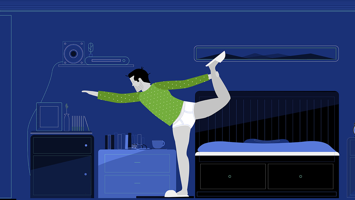
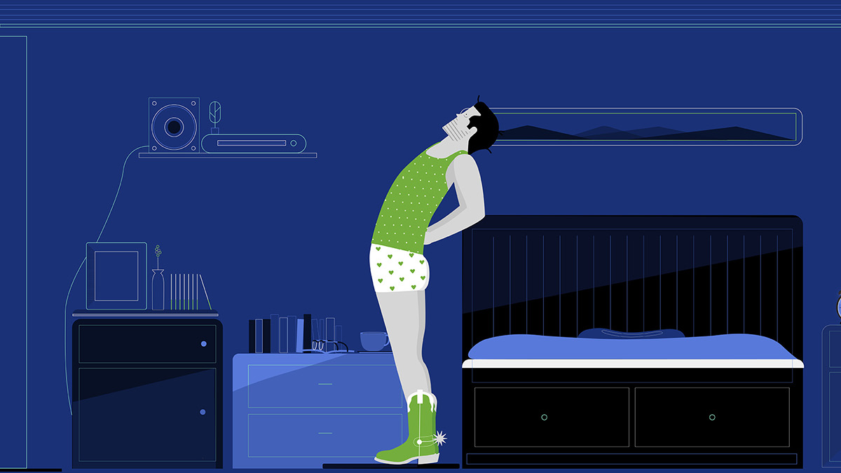
After that, it was finally time to illustrate then two stories the Uber team developed called 'Late' and 'Snooze'. The goal was to establish tension by visualizing a race against time. The story wanted to build up to an intense crossroad where you think the hero character will run late, but Uber saves the day. The client was smart, Uber isn't a novelty, but something everyone can use to solve problems, sleep in more, and make life a lot easier.
Design & the target audience.
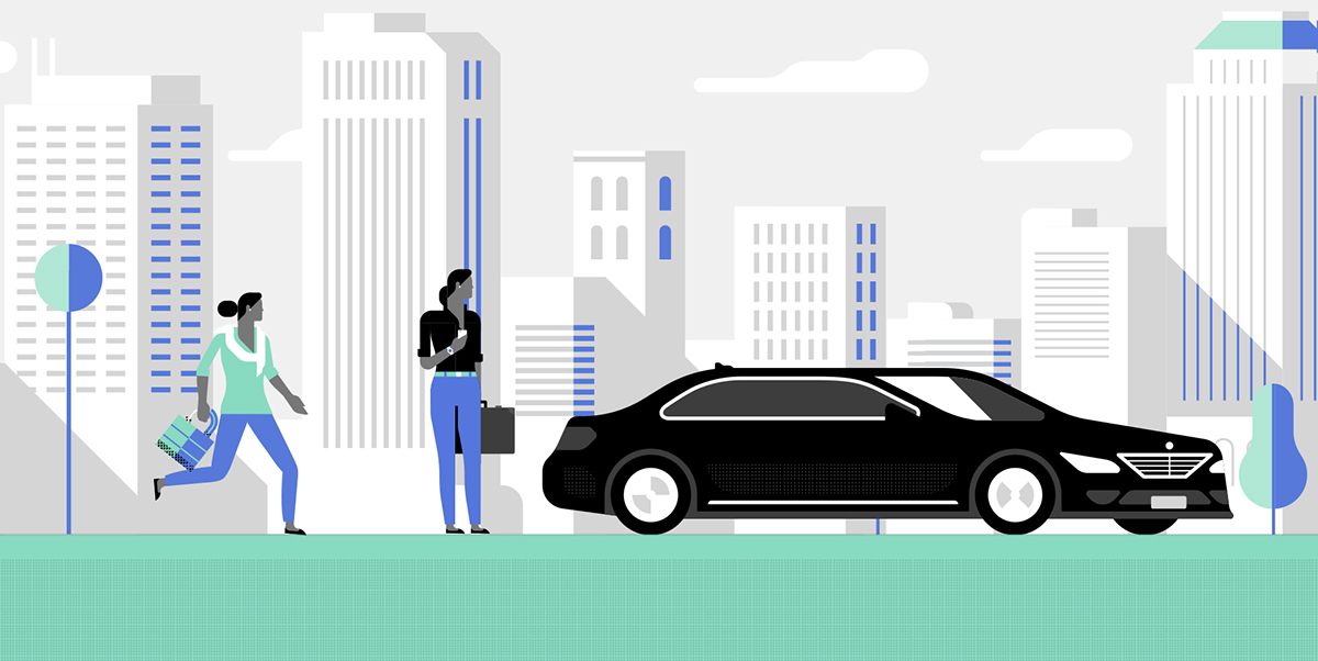
Our very first illustration pass echo'd the first look we found in Ubers style guide. A few problems jumped out. Most users would watch these animations on mobile devices. if you scroll, all you'll notice is a really white sky and a very black car. You see neither people nor the setting which are the core of the story. Additionally, Uber distinctly wanted to get away from the black car messaging at the root of the re-brands entire core. Luckily, their new branding was very rich in color illustration options that gave us flexibility to get around that.
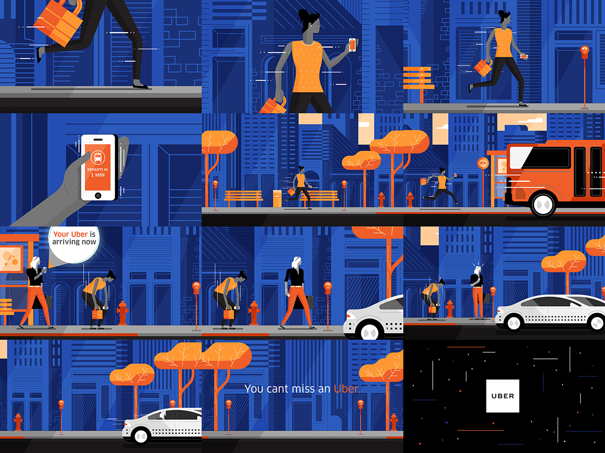
'Late' Concept art + Storyboards
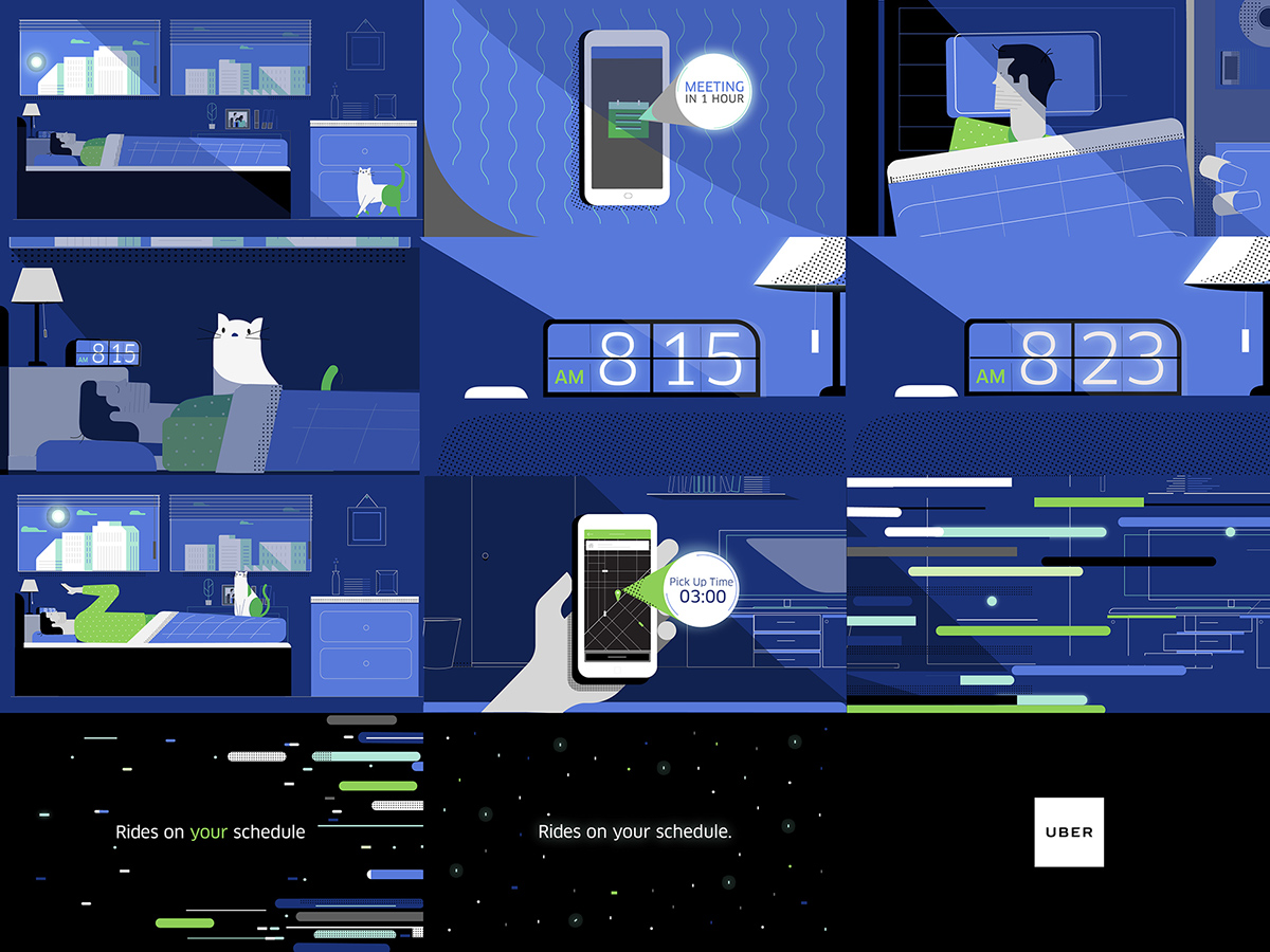
'Snooze' Concept art + Storyboards
The pivot.
This is where the project went from good to great. Near completion, the animations just weren't 100% there. The Uber creatives were the first to notice to their credit, and with fresh eyes pointed out that both endings lacked an entertaining payoff and call to action. On 'Snooze' in particular, to sleep in was less exciting than getting out of bed ready for the day. We went back to the drawing board, redesigning what that might look like for a more entertaining ending. Tighty whiteys saved the day.

Conclusion.
What did we learn? Be brand consistent so users know who's telling the story. Entertain them so they don't get bored at all costs. Graphic approaches really stand out on mobile. A great script can be improved in animation narratively, but you make it first to know. Finally, clients knowing nothing is a myth, the Uber team really understood how and where to push the creative to improve the story and it did. Really well.
And finally, when it doubt, add a cat.


