
In this last days I’ve been working on the rebranding of the very well known website dafont.com.
The idea behind this exercise is to enhance this great free source tool for designers and give it a new identity, since the one they have is, in my opinion, quite poor.
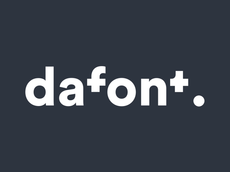
The font used is Circular, from Lineto, one of my favorites.
The new logo
I based the conception of the logo in this these 3 pillars:
1- Dafont is a typography tool, so it makes sense to make a logotype (instead of an icon).
2 - At the same time, we wanted this logotype to have it’s own personality, is “soul”, like any icon as (more than just some letters put together).
3- The logo should follow the new visual identity of the web redesign concept: minimal, fresh and modular.
How to bring this mix to an actual design?
In order to have a sort of anagrama (icon) based on typography I thought the best way to do it was to play around with the balance between cuts in the letters and white spaces.
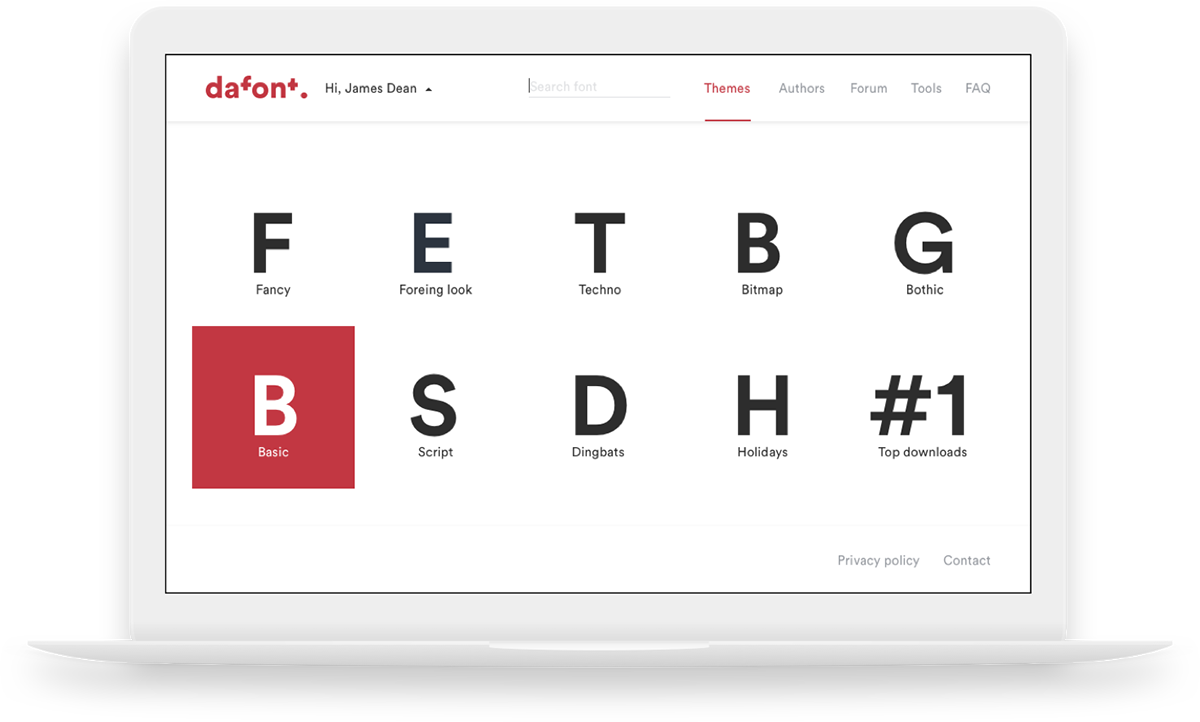
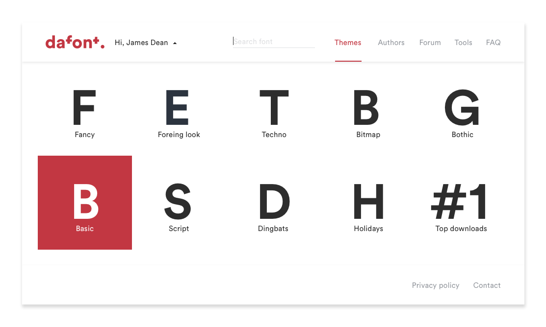
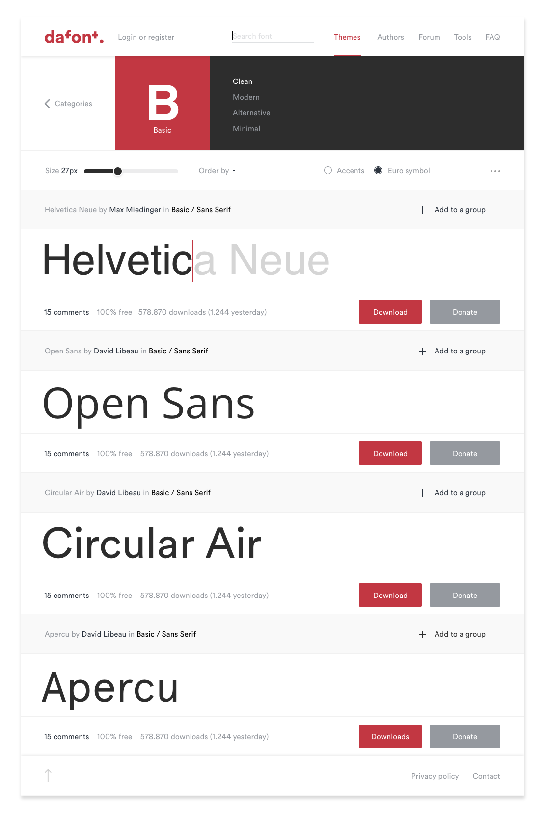
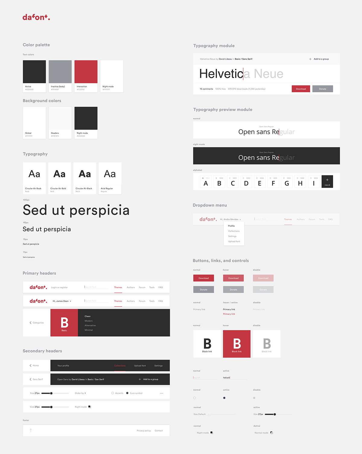
The modular system
Designing with a system helps to unify all the visual and functional elements, providing a consistent and simple interface.
Benefits of using a Modular System?
Easier to organize all the information (typographies) on the website, easier to make it responsive and easier to develop.

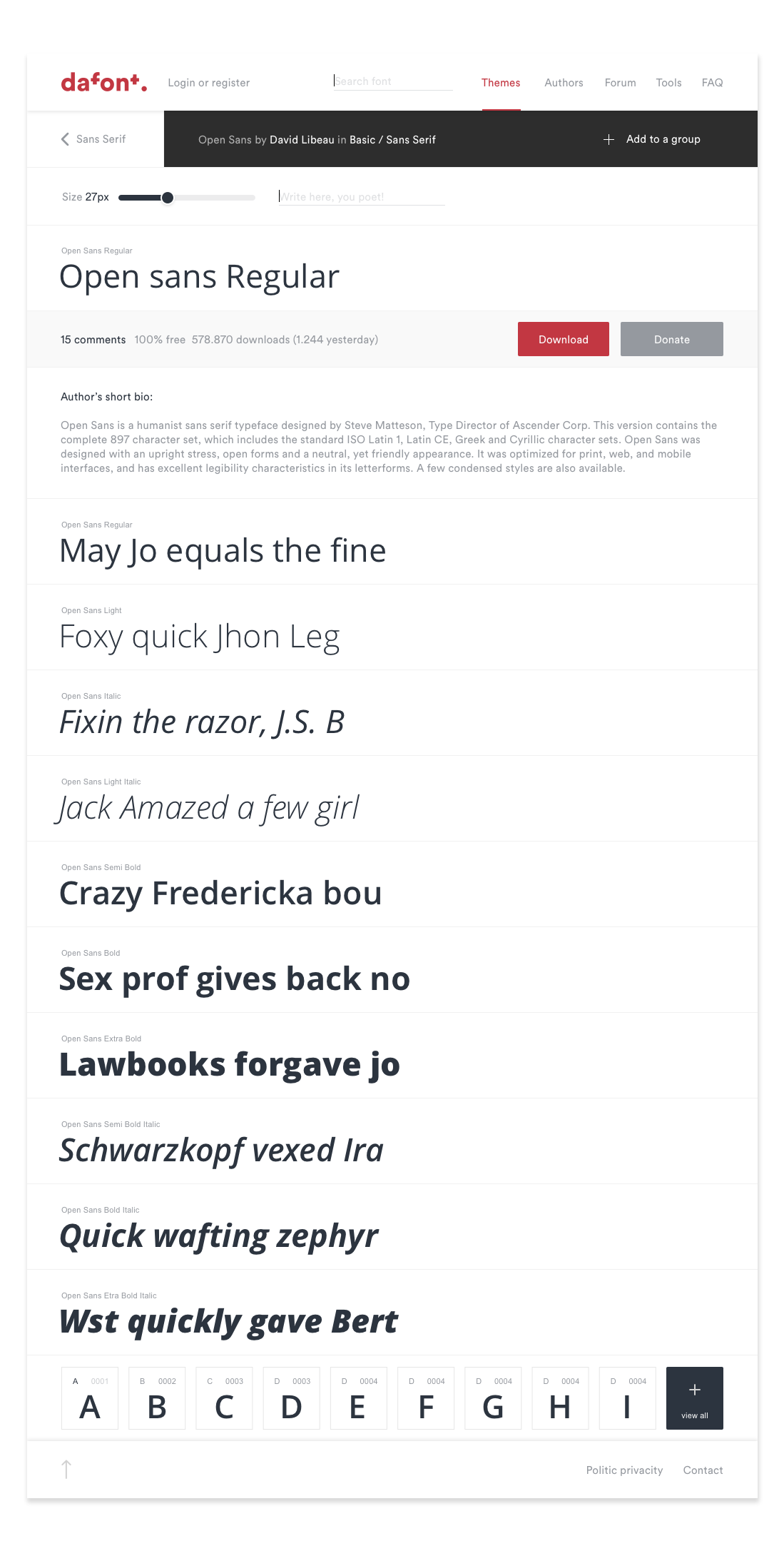
The website
The modular system
@ Special thanks to Juan Camilo, who helped me in the interface design and getting this project into the light and to my bro Danny for his love to share his knowledge and to introduce me to the modular systems world. (check here is medium account, he is a poet).


