

Logos
Various and Sundry
Various and Sundry
Logo design is like the bread and butter of the graphic design world. Not only do I get to do vastly different work from one company to the other, both real and imaginary, but I get to immerse myself in different worlds that I wouldn't normally get to.

My friend Janice has recently started selling plush monsters that she makes on Etsy. She gave me one of them for Christmas and I love him (aka Bertie) so much I told her I'd be willing to brand her business 'Sew Sweet Monsters' in exchange for more monsters. The tricky thing about the logo was we agreed it needed to be representative of her style but also a generic enough monster so that he could be all the monsters mascot. Also I really wanted to capture how she does the monsters eyes, because I feel that this is her trademark style. The little stitches were added for additional craftiness and sweetness.
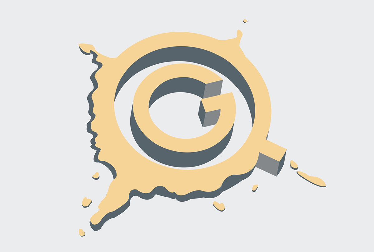
The mark for Grail Quest is one that took some time to evolve. Grail Quest is a philanthropic consulting firm that will help those who are interested in donating money to a worthy cause to find the right cause for them. This is not just a placement service but a journey to find what you want your legacy to be. I spent many hours researching historical navigational means from compasses to astrolabes. I finally got this mark by combining many of my ideas, but in it's barest essence it is a compass within a land mass to signify the journey into the unknown.

For the full details of this logo and the accompanying project, go here.

For the full details of this logo and the accompanying project, go here.

For the full details of this logo and the accompanying project, go here.

Safe Crackers is a fictitious copy I created for a project where I had to repackage an item that was overpackaged. When I was wandering about Target I came upon the combination locks. The fact that an item that is designed to protect your belongings is so protected with packaging seemed like the greatest of ironies. So I instantly knew I had to repackage a combination lock and Safe Crackers was born. I just think this design stems from the fact I've always wanted to be a jewel thief, and thus I started playing with logos with tumblers and dials, going for a clean yet styalized look. I was also heavily influenced by the opening credits to the show 'The Invisibles' which is about retired thieves.
For the full details of this logo and the accompanying project, go here.
For the full details of this logo and the accompanying project, go here.
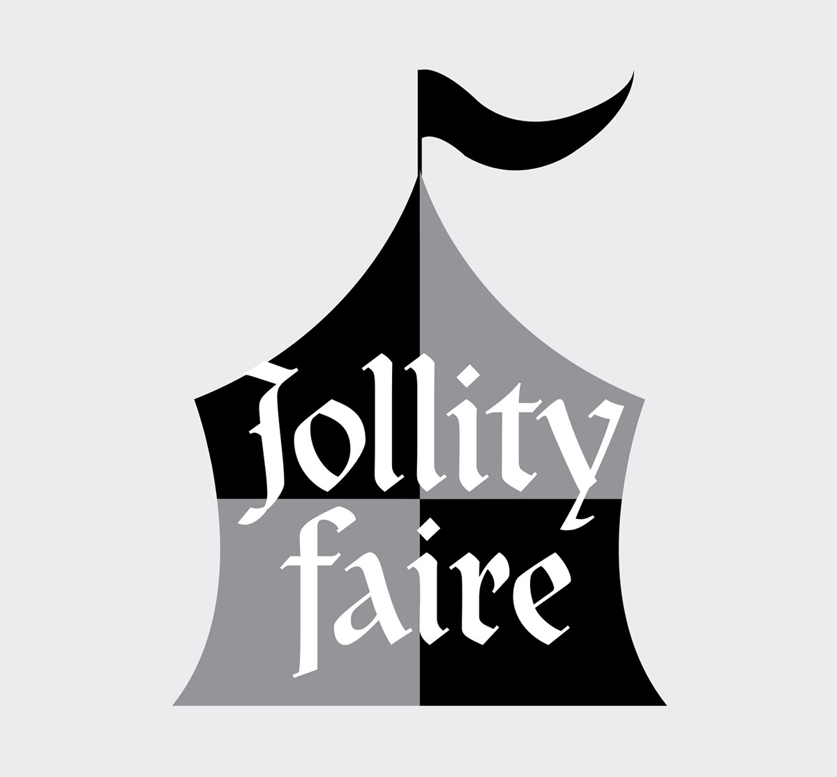
In my Graphic Design class we had to randomly draw an event to create way-finding signs. I will agree with my teacher and classmates and say that it was unfair that I drew something so me, aka, a Ren Faire. I then had to create a logo for the business that would fit with all the way-finding signs I had drawn. I wanted the logo to be clean and clearly reading Ren Faire. I also spent a lot of time picking the perfect font. I wanted it to be calligraphic, but legible, which is a hard thing if you've spent any time looking at calligraphic fonts.


