Bath and Body Packaging
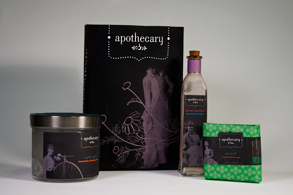
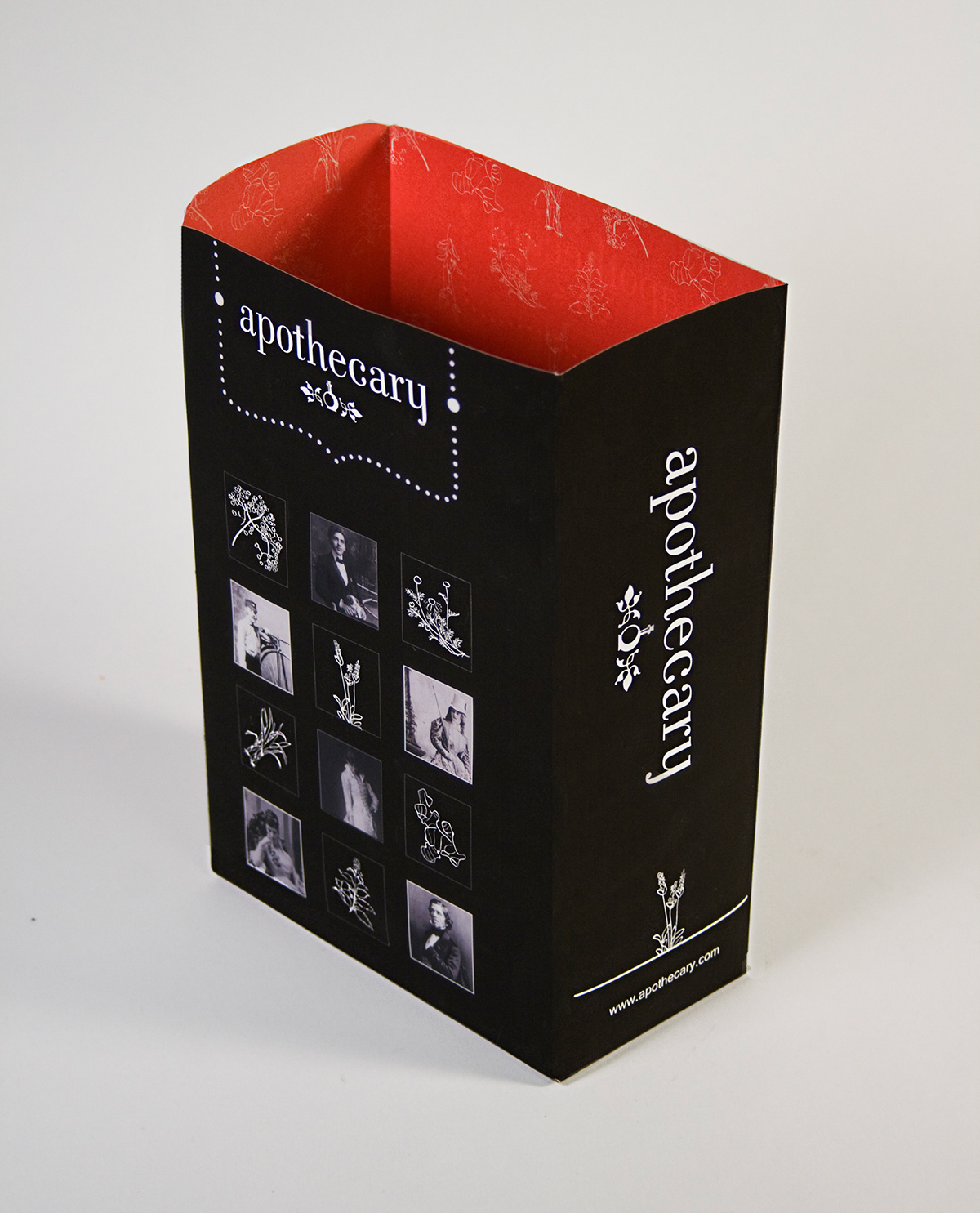
This project was created for the packaging class at SDSU. We were asked to create a company from scratch, to design logos, decide what products the company sold, create packaging, and create a shopping bag. My company was called Apothecary, an all natural body and bath company. Its design aesthetic is a modernized Victorian look, combining line drawings of plants with vintage black and white photos with a few bursts of bright colors. The color choices coincide with the herb that is the main ingredient in each package. For example, when thinking about chamomile, people think of the bright warm yellow of the flower. This yellow was tweaked slightly into an orange, and given a color compliment in the teal blue that accompanies it on the package. The secondary elements in the main typeface head were created out of parts of drawings of the herbs, to give them more prominence and visual interest on the labels.

A canister of shaving cream. The color scheme is taken from the chamomile ingredient, using a marigold orange with a contrasting blue. The pattern of the lid is a reflection of the bicycle wheel of the penny-farthing on the front of the package.
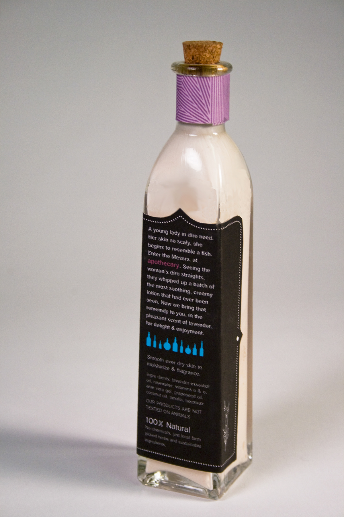
A bottle of lotion using lavender as the theme. An image of a lavender flower is on the side. The striped label around the neck is a reflection of the stripes and patterns featured on the skirt of the woman on the bottles front. The purple color use is a reflection of the color of the lavender flower, while the blue creates an appealing contrast color.
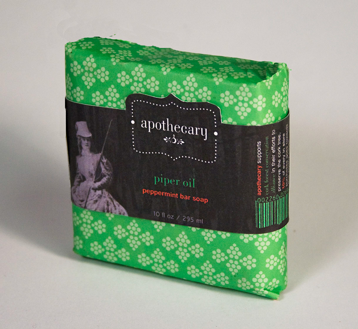
A view of the soap package. The pattern on the wrapper is similar to the spotted floral patterns on the dress of the woman at the front of the package. The red color is taken from the Western world’s traditional association of the color red with peppermint, using a green as a compliment to the red. This package uses a bellyband to display the information for the package.