
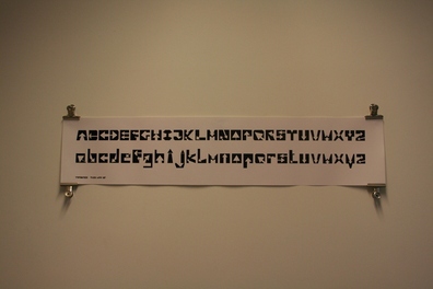
This Way up is an alphabet that I have generated, based on the symbol used with the Royal Mail. The project is about a fusion and of type and symbol.

I wanted to take this typeface further, so i went on to create a variety of supporting delieverables.In the above you can see a Gold Foiled limited edition print, with the letterforms placed into a stamp stamp shape. (top)Below that you can see a variety of stamps and postcards I have created.

Here you can see a close up of the sheet of stamps. I wanted to make the stamps realistic and workable. I printed the design on to some sticker paper and used a vinyl cutter to cut out the intricate zig zag design.

This is a close up of the Gold Foiled print.

To support the typeface further, I create a promotional booklet, to act as a give away. I used the red paper to enhance to concept of the Royal Mail. I was able to use the stamps I created to seal the booklet.

Working with red ink on red paper proved quite effective, this is something i will continue to use in more of my work.
