Better Half
Brand Identity & Packaging
Brand Identity & Packaging
Better Half is a fictional wine brand launching on to the market with an alternative target audience to conventional traditional brands. They're target market is young males aged 18-28. The brands ideals and values lean towards a more casual approach to wine drinking, with the intention of introducing a less intimidating approach to wine with regards to product description.
The idea behind the brand identity I created was to link visuals within the branding back to the idea of food; introducing food pairing as a concept to new drinkers rather than saturating the audience with information about the source and status of the product.
From start to finish the presentation of the product and the construction of the identity has been configured with the intention of presenting a juxtaposition of visual styles; combining tradition with modern design to represent the way in which the brand and the product identify the requirement within the industry for an increased awareness with regards to the diversification of consumers needs.
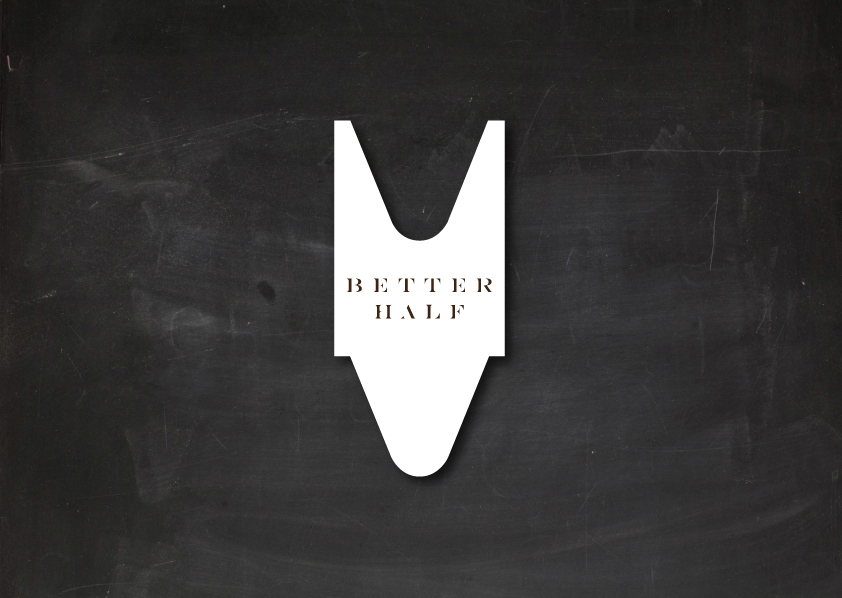
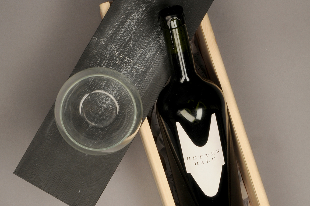
The idea behind the shape of the label refers directly to the silhouette of a queue ticket used in traditional butchers or deli's in the UK. Every aspect of the branding includes the consideration of subtle references to masculinity too, so introducing a connection to meat creates an automatically masculine tone within the product. The placement within the brands visual style and identity of the blackboard creates another references, as well as being a POS tool within stockists and bar's as functional items to help promote the brand naturally without the use of external advertising.

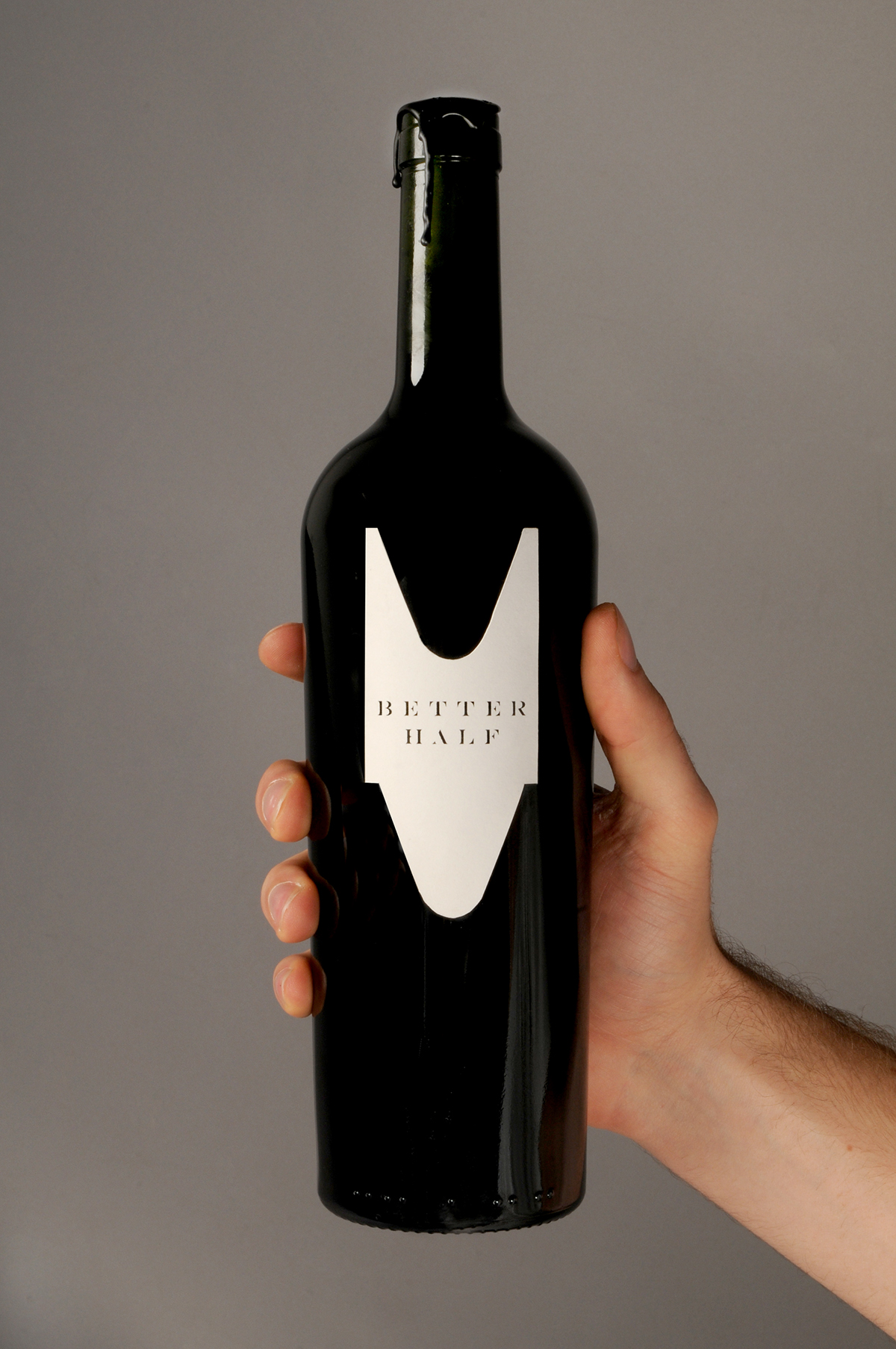
This bottle shape was selected for the branding because of its subtle shape. Rather than having parallel sides, the bottle tapers by 10mm at the base creating a gentle slope up the bottle emphasising the bottles shoulders giving it a desecrate, but masculine appearance. It was also selected because of the density of the glass, leaving a stark black shade when the bottle is full. This creates a higher contrast and higher impact visual. It is because of this high level of contrast that the subsequent colour palette of the brand remains monochromatic. The entire branding features no colour what so ever. All the physical elements within the branding feature only pure #FFFFFF or #000000. The only time within the branding that alternate tones of grey or black are used is within the website and print advertising, simply to maintain balance.


Better Half, unlike most wine brands, also has its own bespoke glass. Going with the theme of combining tradition with modern design Better half provides all its stockists with stemless wine glasses. The glasses are oversized and can technically hold up to 500 ml of wine, with the obvious serving suggestion of between 175ml and 250ml. The idea behind the glass is that by removing the stem it generates a more masculine silhouette. As the only practical purpose of the stem is actually specific to white and rose varieties, Better Half's red products would be unaffected by the lack of a stem and it creates a more modest and subtly masculine feel.


The brands business cards a 3 layer ply card. The reverse of the card features an entirely laser printed black background which with time degrades as the toner rubs away. The result of these marks is an aesthetic not dissimilar to that of the chalkboard, creating a nice link back into the bran dings origins; something that I think something as dry and practical as a business card often requires.
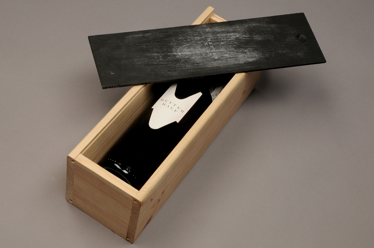
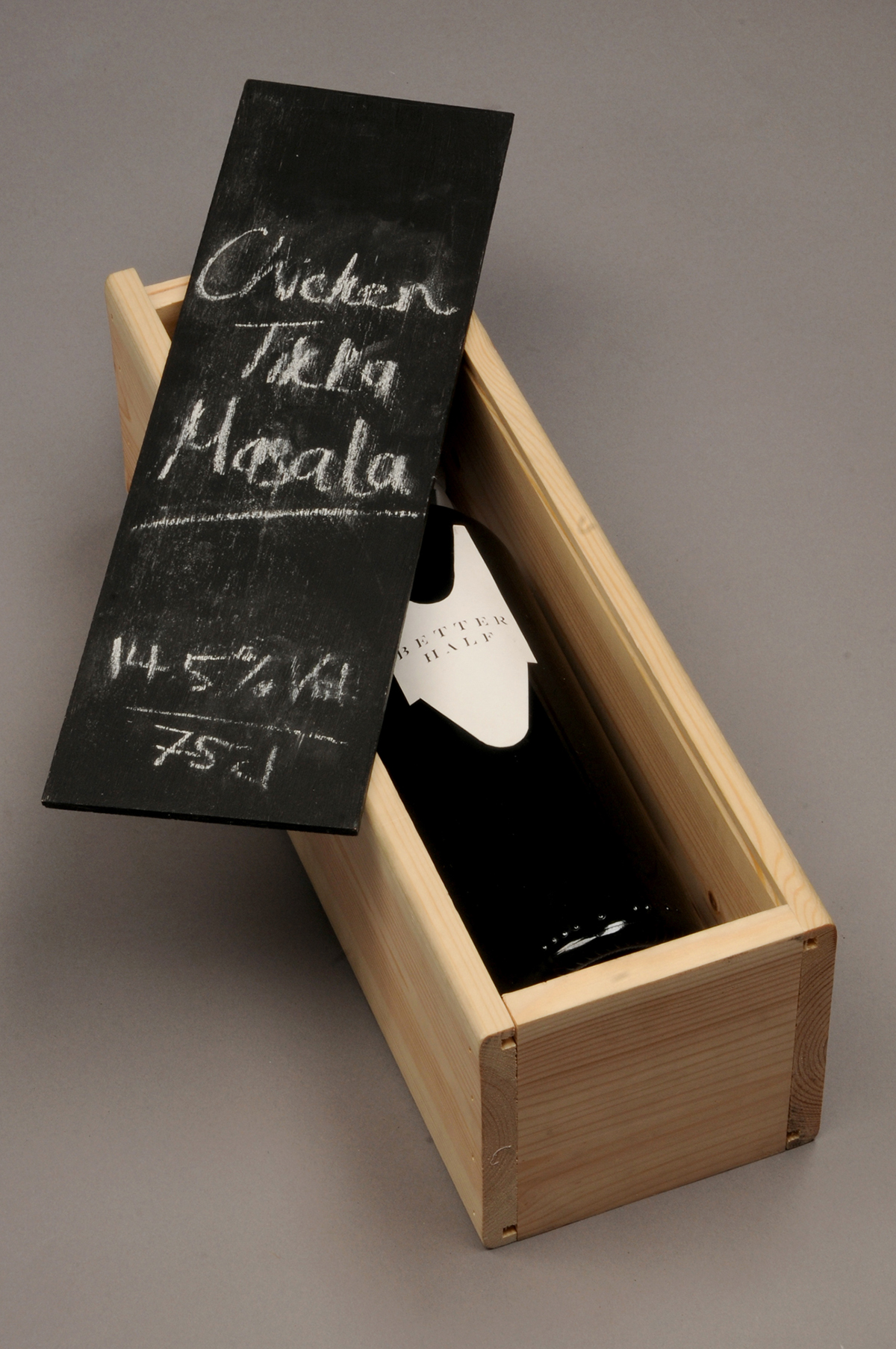
As an additional packaging peatier for the product I have introduced a boxed version designed to serve as a gift. The box, much like the bottle, features very little branding of information. The sliding cover features subtle rendition of the labelling on the bottle itself, at the same scale. The distressed and one of a kind finish to the packaging means that no two box's will be the same, with the chalk dust disposing differently based on the age of the box and the grain direction of the wood. The reverse of the box displays all of the information about the product, hand written. This consists of the wine variety (according to Better Half's way of thinking) as well as the ABV of the wine and the measurement. This covers all of the information wine manufacturers have to legally provide consumers.

As a secondary branding format, I had a custom brass wax seal stamp made with a repeat pattern consisting of the label outline. With a relatively modern visual style to the label and the typeface themselves, the wax seal offers an opportunity for another link back to the juxtaposition of old and new within the identity.

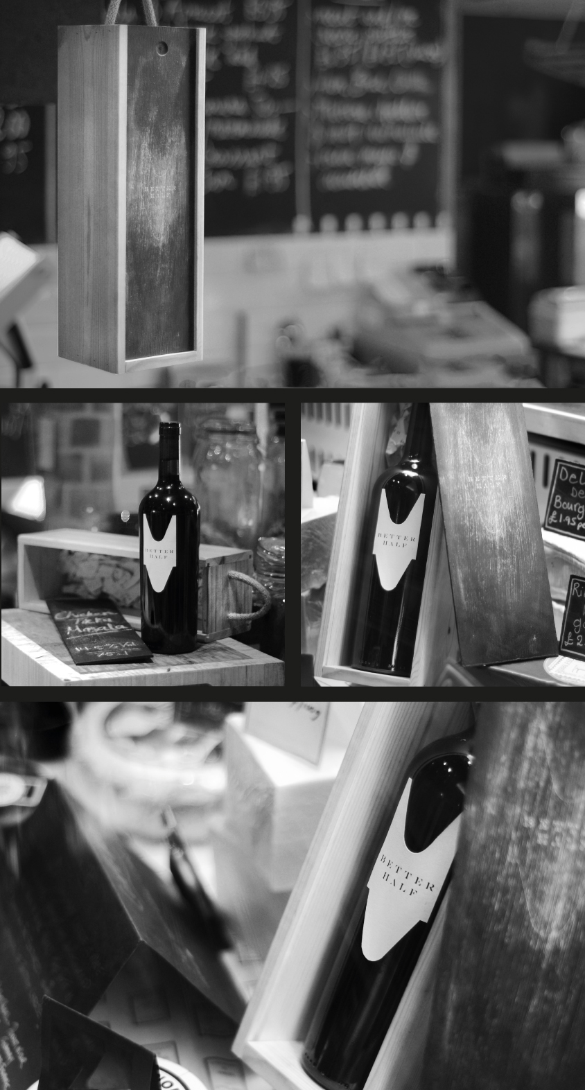
I did a brief brand style representation shoot showing the wine in a deli in Winchester, UK. The idea is for the images to give a visual connection between the product and the branding concept in a way that isn't stipulated within the brand guidelines.

As a part of producing the identity I also compiled a comprehensive branding guideline book consisting of 80 page of detailed information about all the various aspects of the identity and exactly how they should be implemented within future design work. Everything from the production of the logo design and the typeface origins all the way through to the exact pt size of body text in relation to document scale as well as how to organise the negative space surrounding the logo. The book is printed on the same paper stock as the rest of the branding and stationary and is perfect bound.


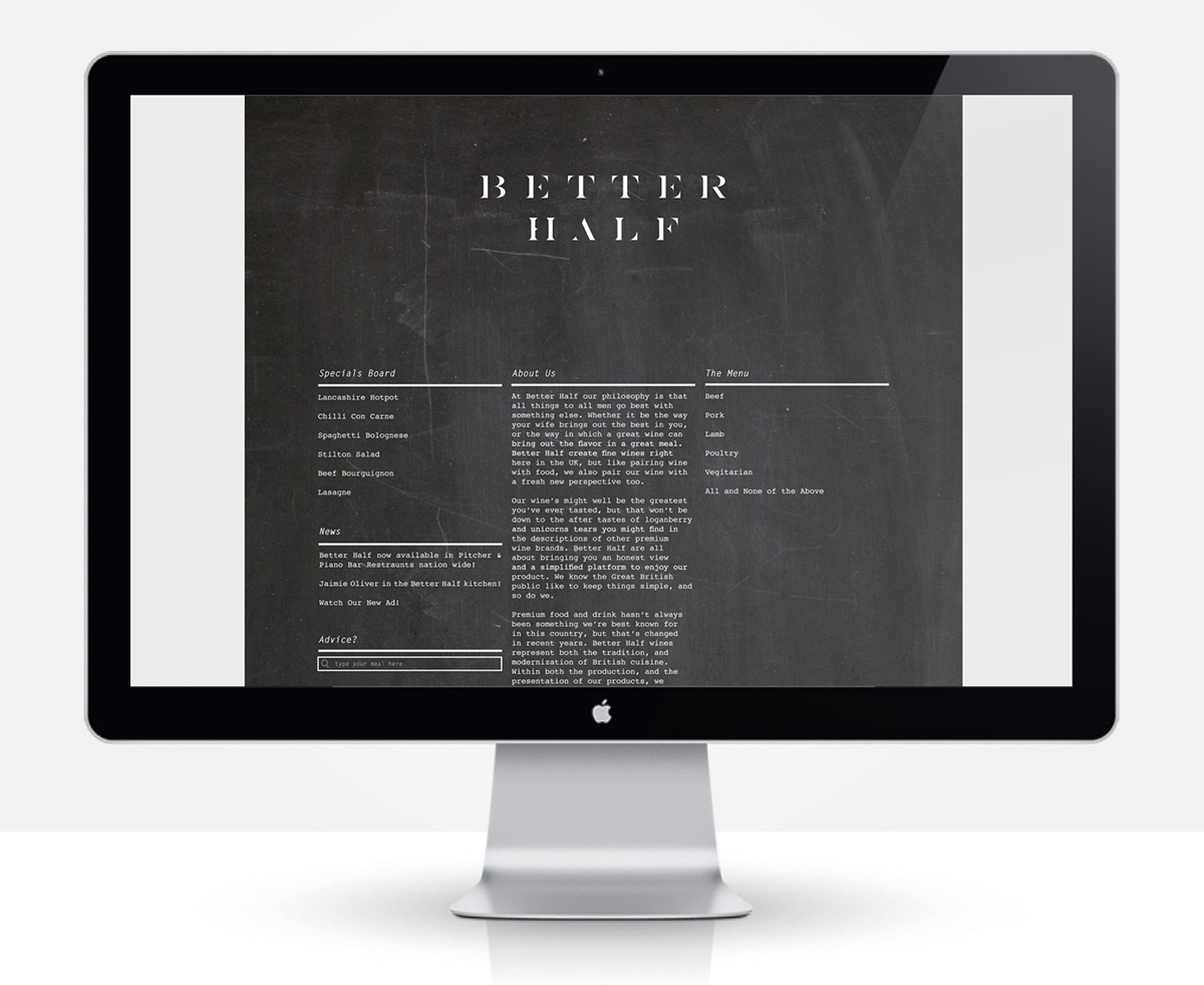
I've also produced a web specimen template outlining the web presence of the brand as well as introducing some additional advertising tools that the brand could use in order to generate an online presence through social networking.
Using instagram and twitter as a method of customers publicising they're experiences of the product will not only help advertise the brand but also strengthen the youthful identity of the company. Instagram in its self also brings connotations of old and new too. The digitisation and forgery of photography creating a tradition film camera aesthetic to the images falls perfectly in line with the methodology behind Better Half.