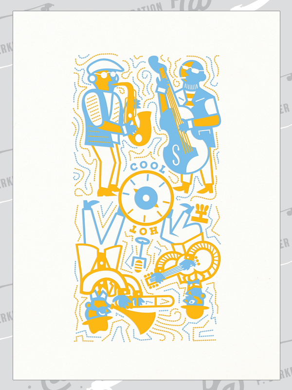

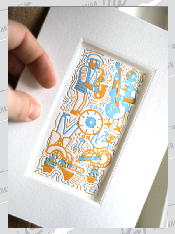

Jazz Thermostat Card-To-Art Illustration
I created this illustration for the first series of Card To Art cards produced by Bennett Holzworth (a great friend who's loaned the use of his Chandler & Price press to my wife and I for numerous past projects). The Card To Art concept is a series of greeting cards that are printed with original artwork, diecut with a framing window and folded so that the card recipients can simply flip the back panel around to create a matted artwork suitable for immediate framing.
The series concept was "Hot & Cool," which immediately reminded me of two schools of classic jazz: 1950's "cool" jazz (think Miles Davis, John Coltrane + smokey clubs) and pre-1930s "hot" jazz (think Django Reinhardt, Louis armstrong + swing mixed with some stride piano). I also thought immediately of a lot of great, illustrated vintage jazz album covers and this illustration came together quickly. Spin the dial to pick your top style...
Printing: Type B Press / Bennett Holzworth


Typographic Cowboy Print Series
These typographic cowboy prints were generated in an edition of 25 per image, initially created for sale at an annual Nebraska festival called the Cattlemen's Ball.
The text of each cowboy is taken either from a classic Western song or from a section of cowboy poetry, and all the letters composing each cowboy come only from the set of letters featured in the quoted text (i.e. if there was no "X" in the quote text, there's no "X" in that cowboy either).
Printing Plate Generation: Pella Engraving
Printing: Coryn & Paul Berkbigler
Press: Type B Press / Bennett Holzworth
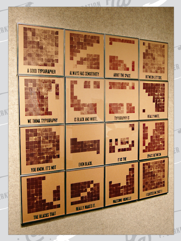

Vignelli Quote Block Prints
This large scale, multi-print grouping was generated at an annual letterpress party thrown by good friends in Lincoln, Nebraska. Using a set of 64 identically sized wooden cubes and one weight of a condensed woodtype font, each person attending the party to print was invited to come up with their own designs utilizing the same basic elements.
I'd just rewatched Gary Hustwit's Helvetica, and was struck again by Massimo Vignelli's comments about typography within it. Having already started experimenting with other images composed of smaller textual / graphical elements, I was intrigued to see if I could pull off a giant letterform made up of a minimum number of individual prints.
Working with a tiny bitmapped file as a "sketchbook," I figured out that complex blackletter characters were still very legible when reduced to a 36 x 36 pixel grid. I swapped digital bits for wooden ones and ultimately generated an edition of 16 printed letter sets.
Printing: Paul Berkbigler
Press: Type B Press / Bennett Holzworth

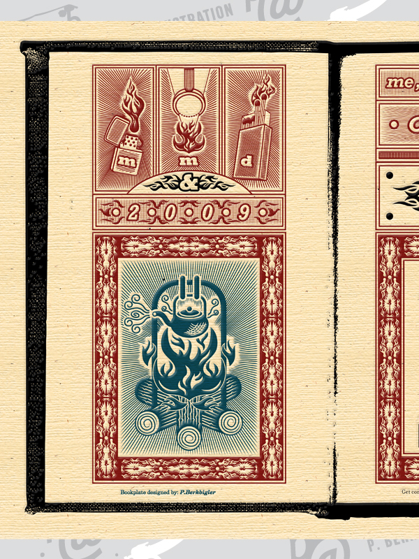
Me, Myself & Design 2009 Commemorative Poster Prints
This poster was created as a limited-edition (100 prints) commemorative item promoting Me, Myself & Design 2009, Chapter 2, a second one-day design conference that AIGA Nebraska hosted in the Fall of 2009. The conference was themed around the idea of igniting various designer passions and featured various sessions devoted to design writing, after-hours for-the-love-of-it work designers do, how drawing integrates into design practice and design devoted to societal good.
The poster designs began their life as Adobe Illustrator files converted into magnesium plates mounted type-high for letterpress printing.
Printing Plate Generation: Pella Engraving
Printing: Paul Berkbigler & Bob Hankin
Press: Type B Press / Bennett Holzworth


Letter Pressmen Test Monoprints
These monetary "pressmen" were created as demonstration monoprints by inking several woodtype blocks individually and then grouping them on the bed of a proof press for single-pass printing. They additionally served as inspiration and a bit of a sketch for digital design work I did on a pair of posters promoting a visit by Jim Sherraden from Hatch Show Print (you can find the final poster designs at the base of my poster set here). They serve as further exploration into the illustrative qualities of both letterpress printing and combined typographic imaging.
Printing: Paul Berkbigler
Press: Type B Press / Bennett Holzworth


ABC Folk Monoprints
Continuing in the typographic illustration theme that I kicked off via the Letterpressmen monoprints, I generated these three prints to serve as donated art for a silent auction supporting the Plum Creek Literacy Festival (hosted annually by Concordia University, Nebraska.)
I continue to be fascinated by just how much caricature can be accomplished through typographic characters + continue to enjoy translating imagery into these typographic illustrations. When time allows, like it did on these three prints, I particularly enjoy working directly with wood or metal typeforms and "drawing" via stamped ink.
Printing: Paul Berkbigler
Press: Type B Press / Bennett Holzworth


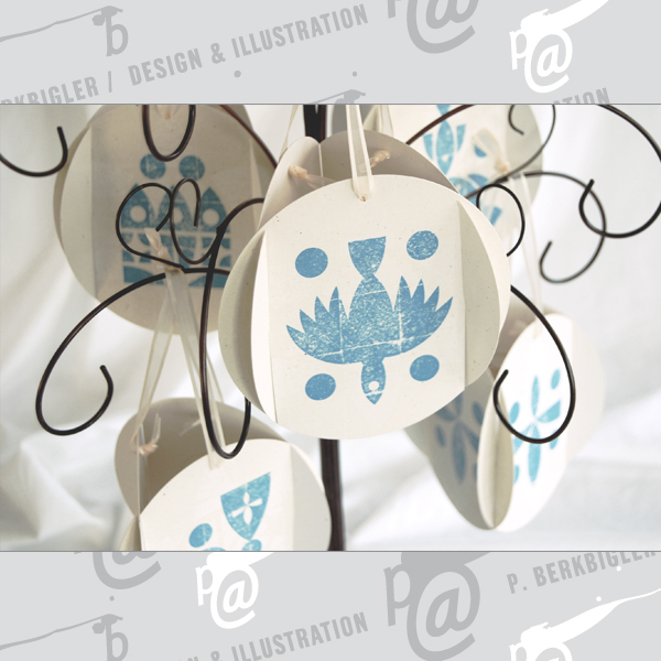
Chrismon Printed Christmas Ornaments
Chrismons are a type of Christmas ornament often featured in traditional church decorations. They're typically designed to resemble any of several iconic symbols for the identity of Christ and of the Trinity: a dove, a cross, the Chi-Rho, one or more fish, etc.
My wife and I designed the iconography and form of these Chrismons as a Christmas gift that we gave to our friends and family - a gift idea that she and I had already when we were first married, but finally had time to execute when we printed and produced this set of five ornaments.
Printing Plate Generation: Pella Engraving
Printing: Coryn & Paul Berkbigler
Press: Type B Press / Bennett Holzworth
