

See Through Sound
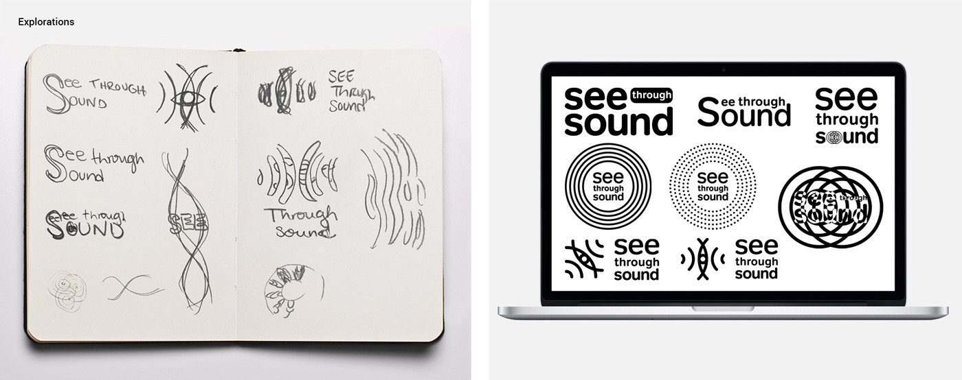
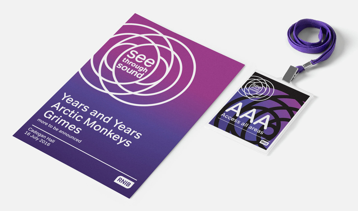
The brief was to come up with concepts for ‘See Through Sound’ a new music event launched by RNIB. We were allowed to go outside our brand colours but the font had to be kept for identity and accessibility reasons. The following is what I presented to the client.
The ‘ripple effect’ concept is based on the visual representation of sound. The overlapping of two sound ripples creates an eye-like shape, which ties the logo with the name of the event.
The ‘ripple effect’ concept is based on the visual representation of sound. The overlapping of two sound ripples creates an eye-like shape, which ties the logo with the name of the event.
______
Role: Art direction, Graphic design
Client: Royal National Institute of Blind People
Field: Graphic design, Events, Festival
Year: 2016
Client: Royal National Institute of Blind People
Field: Graphic design, Events, Festival
Year: 2016


The images taken from sources outside RNIB are used only for project presentation purposes. All rights to images belong to the respectful owners


