

BRAWN & BEAUTY
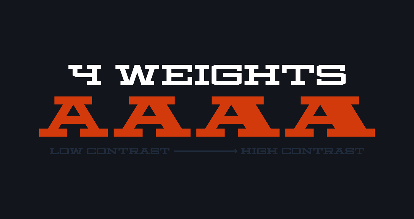
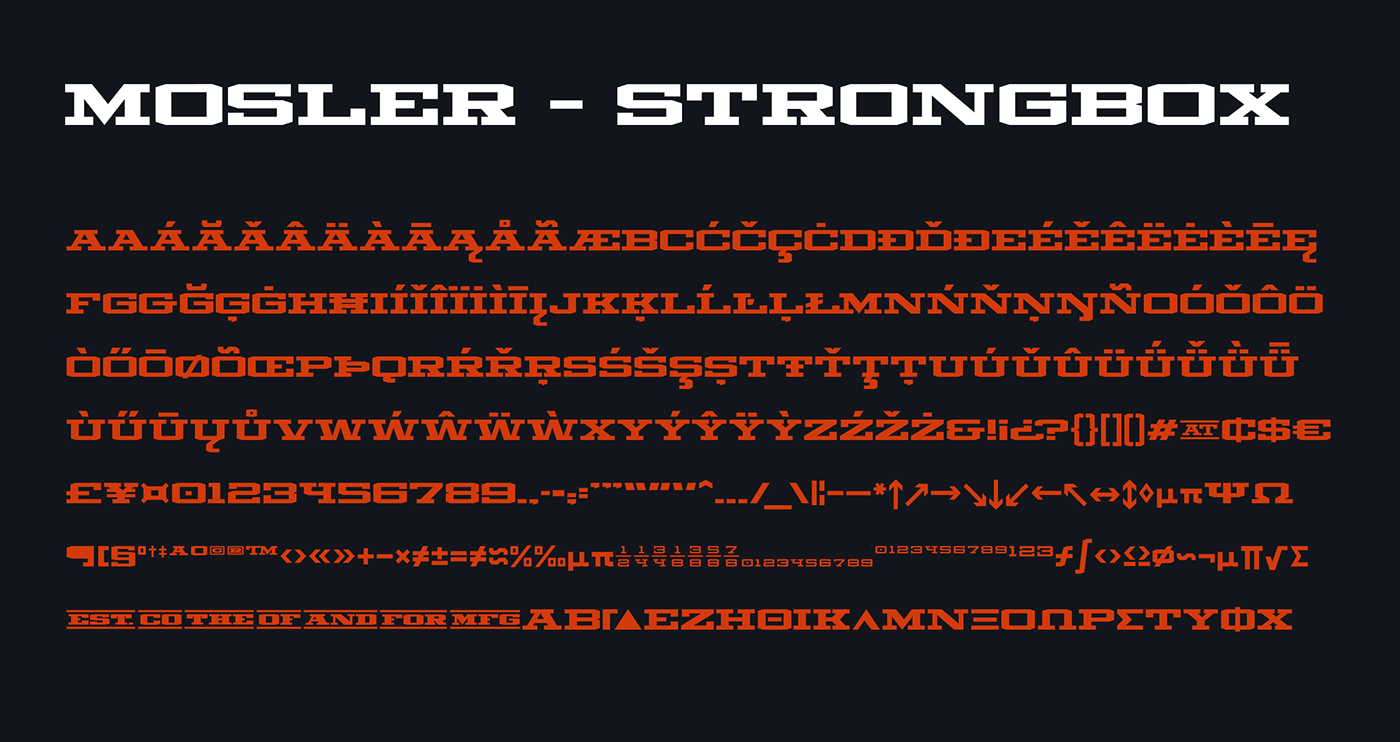
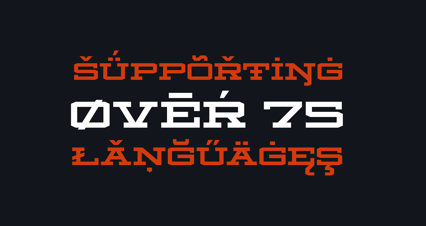
Inspired by the interior of a now defunct Mosler Safe Company bank vault door located inside of what is now an Irish Pub in Stroudsburg, Pennsylvania, Mosler is a typeface that is impenetrability incarnate. This all uppercase, slab-serif brawny beauty comes in four weights - Safe, Strongbox, Vault, and Fortress, and each one is more powerful than the last. Each weight has 450 glyphs included, making for a whopping 1800 glyphs for the full family, complete with small capitals, total support for nearly 80 different languages, decorative word glyphs, and a handful of select alternates. Ranging from the low contrast of the "Safe" weight to the extreme contrast of the "Fortress" weight, Mosler is effective in a wide array of applications but serves best as a titling, headlining, or display face that need to make a mammoth statement.
Features Include:
4 Weights
Uppercase Only with Small Capitals
Numerals, Punctuation & Symbols
450 Characters per Style
Stylistic Alternates and Word Glyphs
Supports 75+ Latin Languages
OTF files
Designed and Developed by Jason Carne
Uppercase Only with Small Capitals
Numerals, Punctuation & Symbols
450 Characters per Style
Stylistic Alternates and Word Glyphs
Supports 75+ Latin Languages
OTF files
Designed and Developed by Jason Carne


Not ready to buy? That's alright, we know it's only the first date. Don't leave empty handed though, we're offering one free weight of Mosler for the first 150 people who pay with a tweet. Click the button below and follow the prompts to get access to Mosler's "Safe" weight, on the house.


