

Case Study: Dozen Flours
Baking blog visual identity development
Baking blog visual identity development
Overview
Client
Passionate baker from Seattle, Washington, USA, who curates a baking blog called 'Dozen Flours,' on which she shares her wonderful creations with the world.
Objective
Develop a visual identity for baking blog.
Background
My client has a full-time day job but her real passion is baking, and she loves spoiling people with her baked treats. Curating Dozen Flours is a way of sharing her creations with the world. She is often commissioned to bake for others, but in her words, the baking business and blog isn't about making money; it's about making people happy, celebrating special events, and learning about food.
Six years ago, when my client was trying to decide on a name for her blog, she was watching the movie, 'Stranger Than Fiction,' and, there's a scene in which the two main characters reach a turning point in their relationship. Mr. Crick, an IRS auditor, is infatuated with a baker whom he's auditing, and in an attempt to win her over, he brings her a 'dozen flours;' a tray filled with 12 little bags of flour. Click here to watch the scene.
This scene struck my client as being so incredibly romantic and sweet, and the name for her blog was set.
Target Audience
Predominantly women of all ages, but majority are 20–45.
Tone
Creative, quirky, joyful, homemade, comforting, and approachable. Feminine and playful, optimistic and loving. "Like a hug you can eat."
Notes
Client usually gravitates towards asymmetrical designs, is not afraid of color, and loves clever logos. She has a tagline, "Sincere acts of sweetness," that could be incorporated. Client hopes that logo is colorful but that it would still be recognizable in black and white. She loves "swashy, swirly fonts that are rich with movement." Also, she uses little red hearts as a signature on her baked goods when it's appropriate so she thought it would be great if a heart could be be incorporated somehow into the logo, even if just in a tiny way. Finally, client specified that she DID NOT want a cupcake.
Development
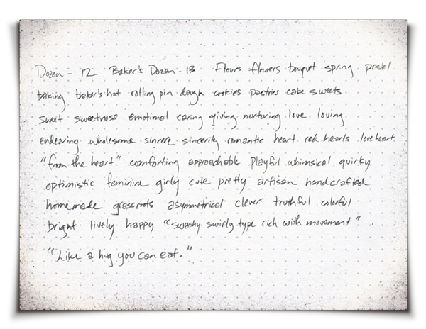
Step 1: Wordmap Exercise
After familiarizing myself with a client's business, objectives, industry, target audience, and competitors, the first step of my creative process is to conduct a wordmap exercise, during which I write out any words or phrases that come to mind. This helps me establish launch points for visual exploration.
Step 2: Inspiration
After revealing creative pathways of exploration through the wordmap exercise, the next step is to seek inspiration. This mostly comes from visuals, but can come from music, food, traveling, or anything else that will help establish an emotional connection to the material.
After revealing creative pathways of exploration through the wordmap exercise, the next step is to seek inspiration. This mostly comes from visuals, but can come from music, food, traveling, or anything else that will help establish an emotional connection to the material.
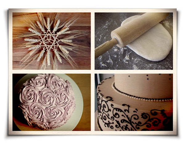
Obvious imagery that initially came to mind was that of wheat, flour, dough, and baked goods. I became very inspired by the expressiveness of decorative cake piping.

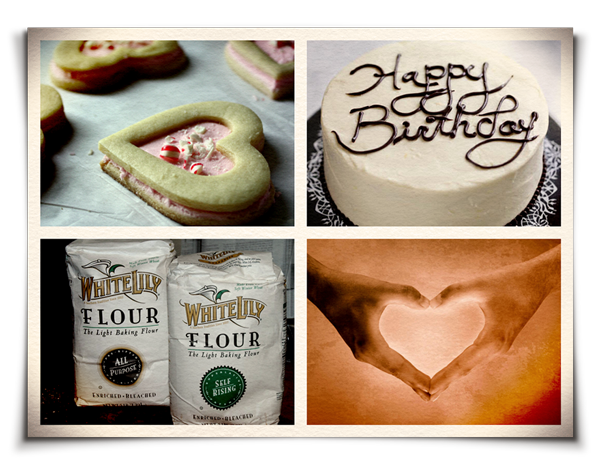
My client's own baked goods were an obvious source of inspiration. I also became inspired by the imagery of "heart hands" as a way of expressing the concept of "handmade with love."


One image that stuck in my head was that of the iconic, wholesome 1950s American housewife, happily baking in the kitchen. I became very inspired by the whimsical illustrations, colors, and design aesthetics evocative of this era.
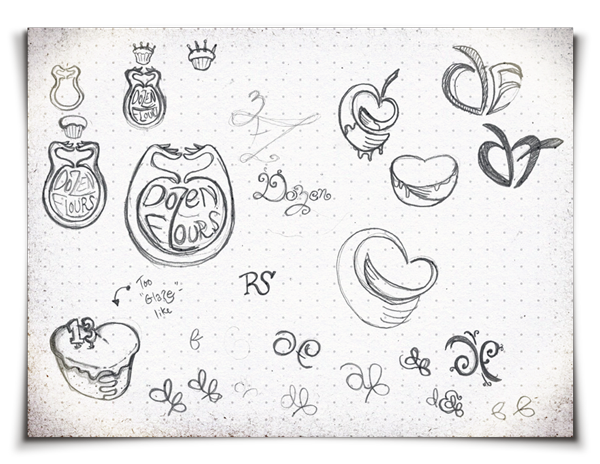
Step 3: Thumbnail Sketches
Once I have become sufficiently inspired, I launch into a thumbnail sketching phase. The objective here is to employ free association mechanics to visually build upon the creative pathways derived from the wordmap exercise. In the thumbnail stage, no idea is a bad idea; no sketch is a bad sketch. It is important to visually explore all avenues; to leave no stone unturned. Selecting solid concepts for further development occurs once all ideas have been exhausted.
Once I have become sufficiently inspired, I launch into a thumbnail sketching phase. The objective here is to employ free association mechanics to visually build upon the creative pathways derived from the wordmap exercise. In the thumbnail stage, no idea is a bad idea; no sketch is a bad sketch. It is important to visually explore all avenues; to leave no stone unturned. Selecting solid concepts for further development occurs once all ideas have been exhausted.
Exploration of imagery inspired by decorative cake piping.

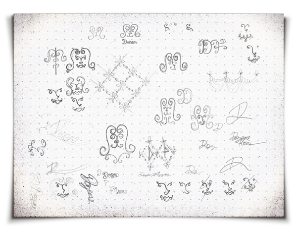
Exploring several concepts: visual of heart hands symbolizing the concept of "homemade with love;" literal interpretations of the Dozen Flours name; numerical association of the word "dozen," as it relates to both the standard measurement of 12 units, as well as a "baker's dozen," which is 13 units; typography.
Fleshing out the heart hands idea; playing with monograms; exploring ways of visually representing "a hug you can eat."
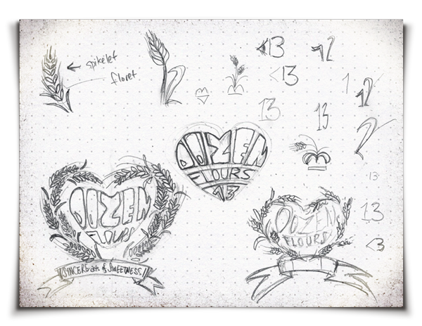
Exploring crest-like designs inspired by wheat wreaths; more numerical associations.
Expanding the concept of heart hands to make it less abstract; playing with the concept of the letters being cut out of dough; beginnings of '50s-style character development, inspired by the wholesome, plucky visage of a housewife happily baking in the kitchen.
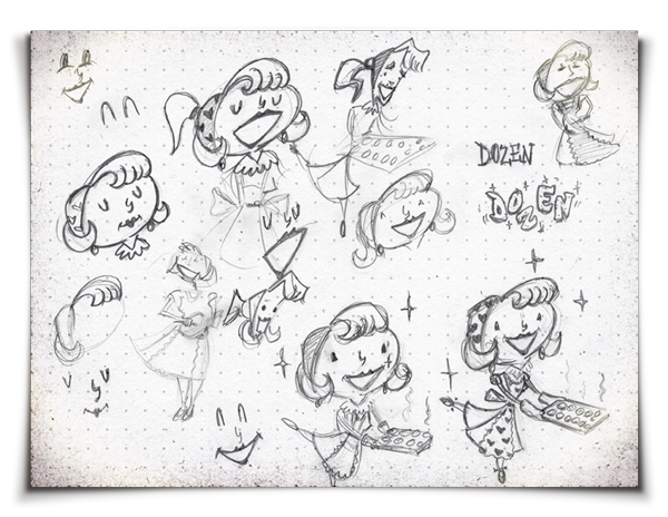
Developing the '50s-style character concept.

Exploring a circular typographic design, inspired by the spiral-like open petals of a rose.
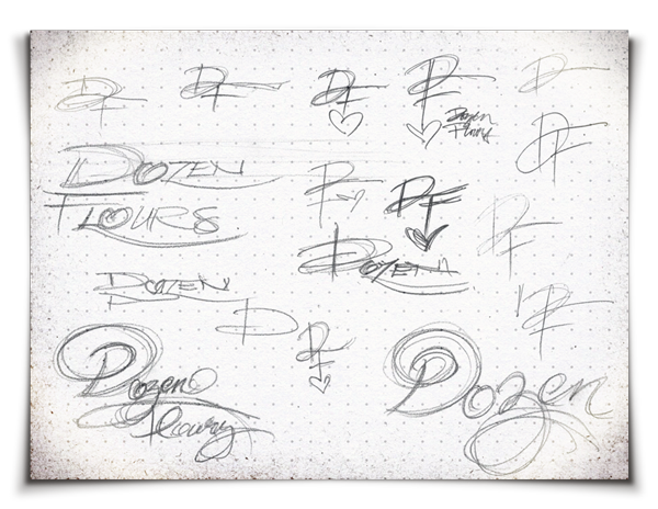
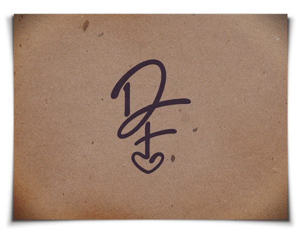
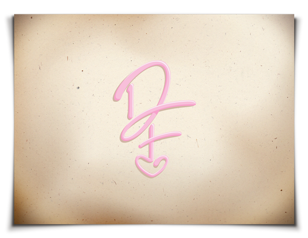
Exploring expressive typography inspired by type written in cake icing; the beginnings of a DF monogram, inspired by client's use of a heart as her personal signature on her creations.

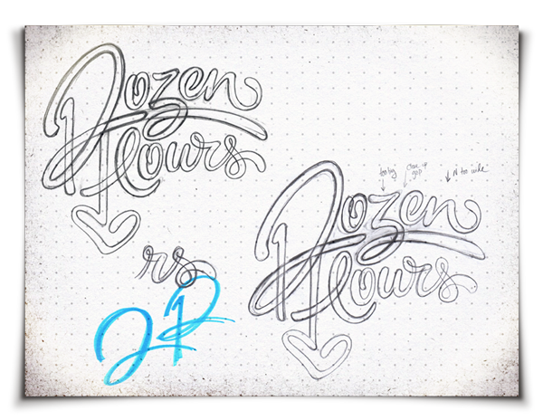
More typographic exploration; discovering that the D in "Dozen" could be formed from a 1 and 2 pushed together, thus making "12."

More typographic exploration of the "12-D" concept; trying to work out solutions for the inclusion of a heart; working out a solution to a "12/DF/heart" monogram.


Fleshing out the "12-D" typographic concept. What you see here is a fraction of how many times I wrote this out. Post-It Notes, napkins, scraps of paper... I even found myself tracing it in the air with my finger.
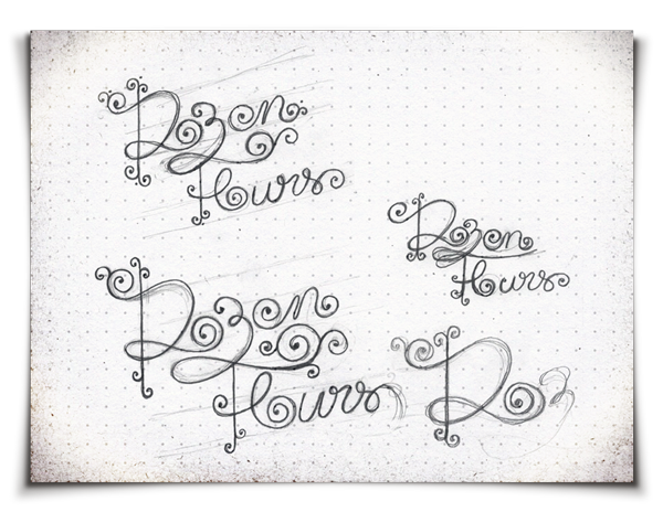
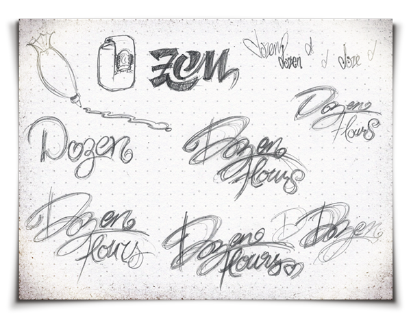
Exploring very swirly, swashy type, inspired by decorative cake piping filigree.
Step 4: Refining Ideas
After exhausting the thumbnail stage, the next step is to pick the standout concepts, and develop them further. Often, some concepts that may seem worthy to explore ultimately end up going nowhere, and are abandoned in lieu of pursuing only the absolute strongest of ideas.
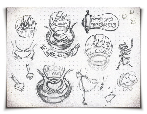
Concept 01: Rolling Pin & Dough
After exhausting the thumbnail stage, the next step is to pick the standout concepts, and develop them further. Often, some concepts that may seem worthy to explore ultimately end up going nowhere, and are abandoned in lieu of pursuing only the absolute strongest of ideas.
Concept 01: Rolling Pin & Dough
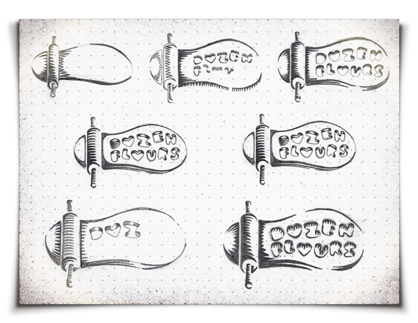
While possessing some graphical merit, I felt that this concept was too one-dimensional, and the idea was abandoned.
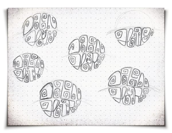
Concept 02: Circular Type Design
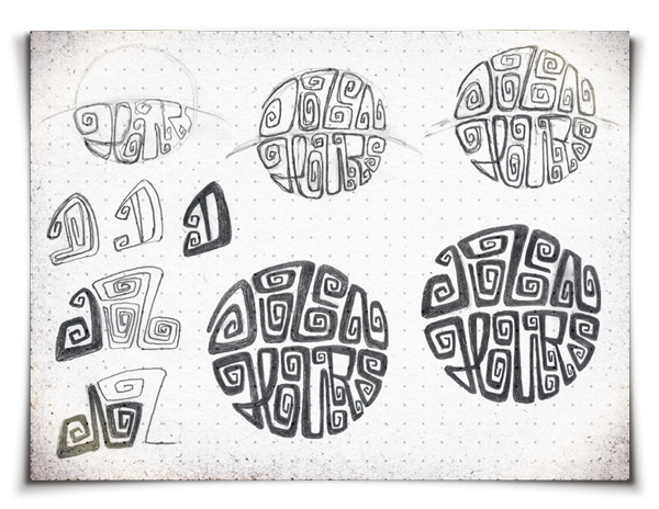
While I really loved where this was headed graphically, it proved to be completely illegible, and was too reminiscent of Aztec or early Native American art, which was not the right direction for this project. This idea was abandoned.
Concept 03: Swishy-Swashy Type


While I thought this expressive option had tremendous potential, there were some legibility and symmetry issues that I could not resolve in a timely manner. It felt like I was trying too hard to force an idea, and ultimately, I abandoned this concept to put forth all my effort into the development of three other concepts that I felt were the strongest.
Concept 04: Script Typography

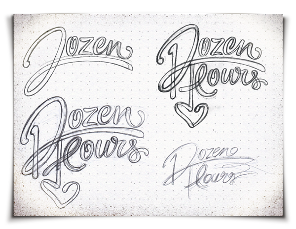

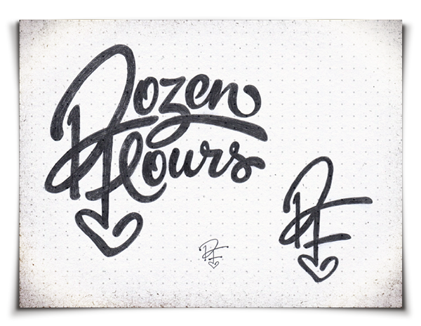

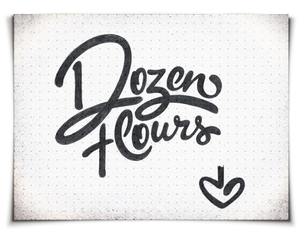
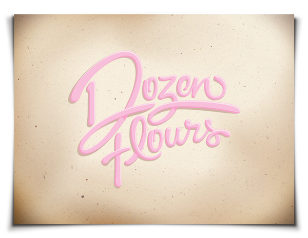
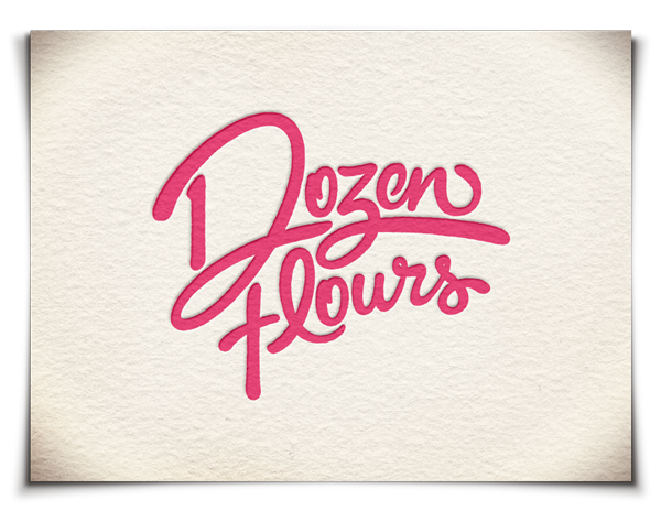
This typographic concept showed serious promise during both the thumbnail stage and the refinement stage. Its dynamic, expressive movement and versatility of application were major considerations for pushing it forward. The type possesses a very strong hand-rendered aesthetic, which coincides well with information gained from the creative brief. It could be painted with a brush or written in Sharpie, in icing, or in flour with one's finger. Also, an accompanying "12/DF/heart" monogram seemed to evolve very naturally out of this concept. Since my client currently uses little hearts as her signature, I thought this monogram would be an excellent way of giving her a new signature that is both meaningful and also reflects the design aesthetics of the main logotype. It is something she could learn how to write and use on her baked goods, as a stamp, or on stationery. This multifaceted expandability proved to be a very big idea, overall. Sketches were tightened up adequately, scanned, and then developed electronically.


Electronic development.
Concept 05: Heart Hands


A concept that showed serious promise due to its multi-layered symbolism. From the very beginning, the heart hands seemed applicable for conveying the concept of being handmade from the heart — a fundamental tenet of my client's baking endeavors. The concept visually depicts two hands forming a heart shape while mixing dough, and another heart shape is formed by the combination of the top typography, and the curves of the arms. The graphic quality of the visual and the hand-rendered type both suggest a very hand-crafted, artisan approach — aesthetic properties well suited to this client. The layout of this concept allowed for easy integration of my client's tag line.

Electronic development.
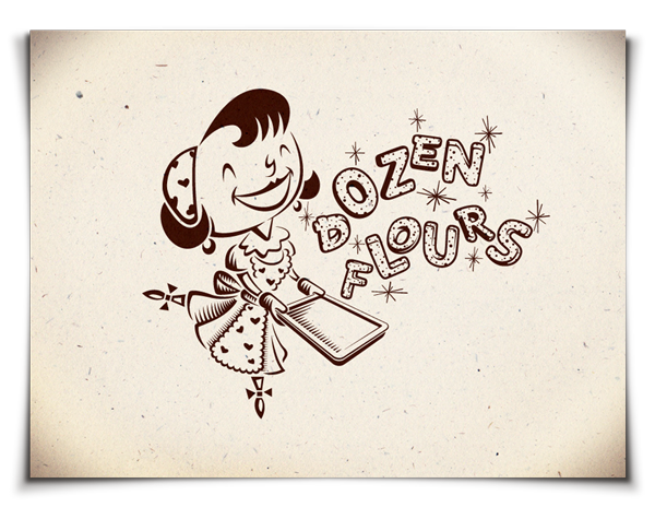
Concept 06: '50s Housewife Character Design
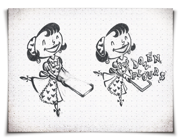
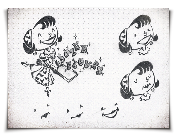

This concept stemmed from a very early vision I had of a 1950s-era housewife happily baking in the kitchen, and it has remained a constant throughout all stages of development. This concept depicts a plucky housewife playfully flipping up cookie letters that spell 'Dozen Flours' from her baking sheet. Wholesome, quirky, warm, and feminine, this imagery seemed very apropos as it touched on virtually every major component of the creative brief. With this option, I wanted to create a very illustrative, all-encompassing approach to identity design, rather than just focus on a single, contained mark. The illustration establishes a strong visual voice, with an aesthetic style, colors, patterns, and supporting graphic elements that can be extracted and used across a wide variety of possible future branding suite materials.

Electronic development.
Step 5: First Drafts
After developing the standout concepts, and weeding out those that don't work, it's time to move ahead with the electronic refinement and presentation of 3-5 of the absolute best concepts.
Concept 01: Script Typography
While this concept is dynamic and expressive, and employs a clever hidden meaning, the real beauty of this design lies in its versatility of application. Stylistically rooted in artisan craftsmanship, it can be written in pencil, pen, Sharpie, or cake piping, or it can be letterpressed, stamped, or silk screened. I would encourage my client to learn how to write both the full script as well as the monogram, so that she can actively participate in this identity's propagation in her own hand.

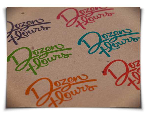
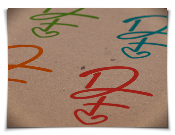
Examples of logo written in colored Sharpies.


Examples of logo written in cake piping.


Examples of letterpressed logo.


Examples of silk screened logo.
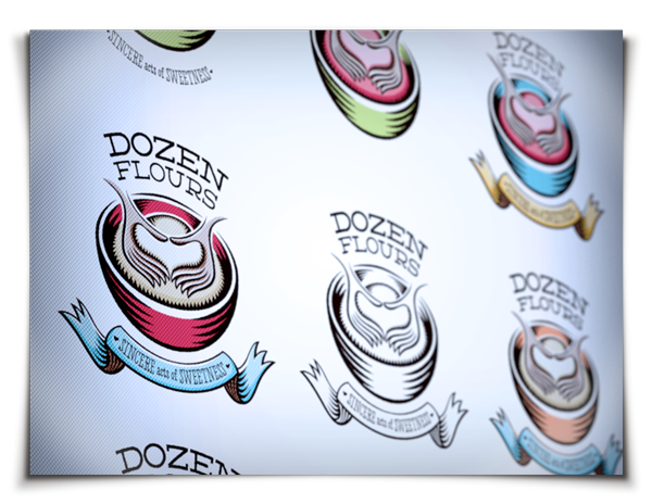
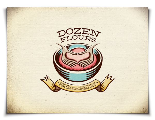
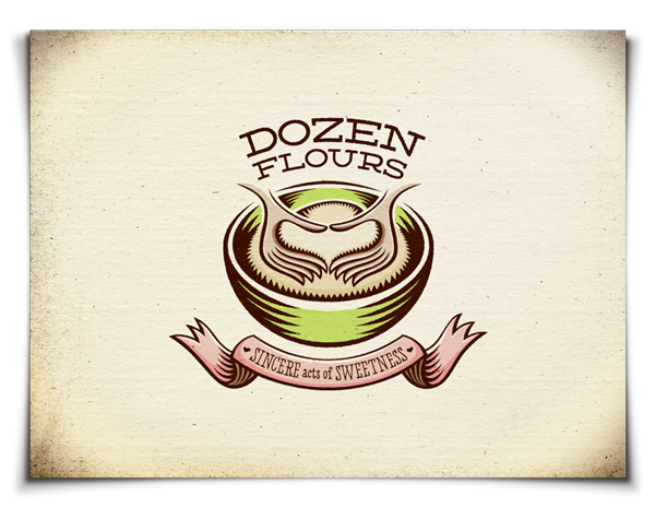
Concept 02: Heart Hands
This concept is quite complex in its juxtaposition of themes. The whimsical illustrative style presents an outwardly playful aesthetic, yet its crest-like lockup and deeply symbolic visual metaphor give it structure and balanced strength. It conveys messages of warmth and sincerity, as well as passionate artisan hand-craftsmanship. This concept works as well in one color as it does in multiple colors, thus ensuring its versatility of application. Due to its heavy line work, this logo would make an excellent etching, embossing, or stamp.
This concept is quite complex in its juxtaposition of themes. The whimsical illustrative style presents an outwardly playful aesthetic, yet its crest-like lockup and deeply symbolic visual metaphor give it structure and balanced strength. It conveys messages of warmth and sincerity, as well as passionate artisan hand-craftsmanship. This concept works as well in one color as it does in multiple colors, thus ensuring its versatility of application. Due to its heavy line work, this logo would make an excellent etching, embossing, or stamp.


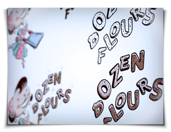
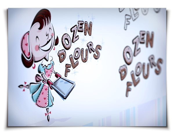
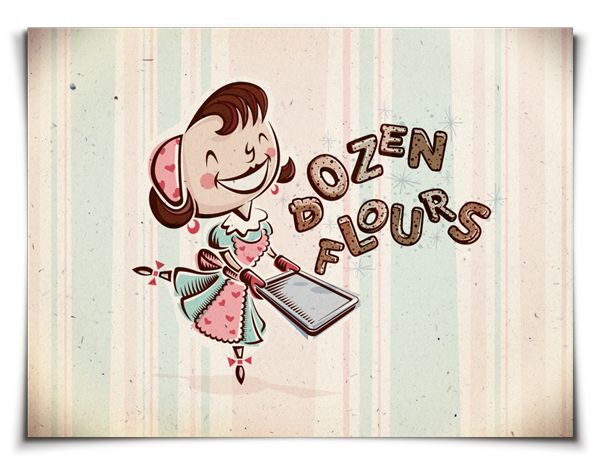
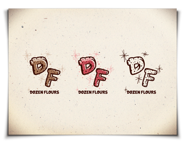
Concept 03: '50s Housewife Character Design
Much more than just a logo, this illustrative concept delivers a comprehensive visual language through the collective assemblage of unified, supporting graphic elements. Cheerful, wholesome, fun, quirky, and feminine, this concept perfectly aligns with the majority of touchpoints raised in the creative brief. Extremely versatile, this concept employs a main mark and several secondary marks that all share the same aesthetic properties, thus ensuring maximum brand retention in any application. This concept can be expanded upon over time to include various character poses or simple animations.
Much more than just a logo, this illustrative concept delivers a comprehensive visual language through the collective assemblage of unified, supporting graphic elements. Cheerful, wholesome, fun, quirky, and feminine, this concept perfectly aligns with the majority of touchpoints raised in the creative brief. Extremely versatile, this concept employs a main mark and several secondary marks that all share the same aesthetic properties, thus ensuring maximum brand retention in any application. This concept can be expanded upon over time to include various character poses or simple animations.


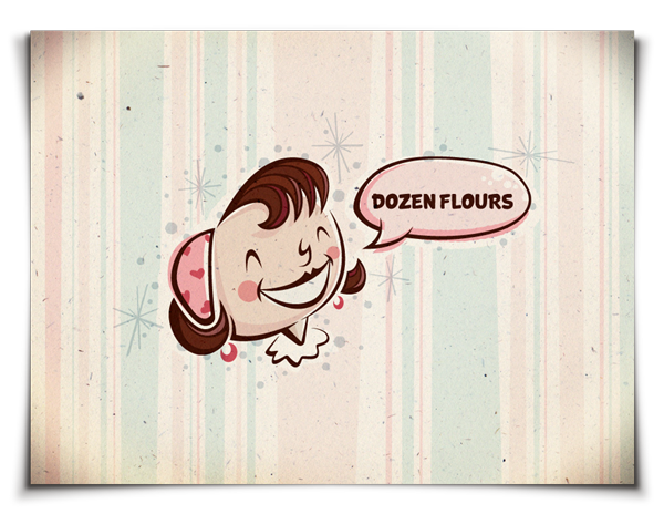
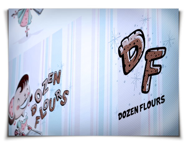
Secondary mark.

For situations in which extremely small reproduction is required, extra details can be stripped out without ruining the integrity of the original artwork.


Secondary monogram-style mark.


