This magazine was designed to evoke curiosity in an individual. As the reader views the cover, there is evidence of names and titles but they don’t fully discover the information until they turn over the transparent cover to reveal the full names and titles of the magazines articles.


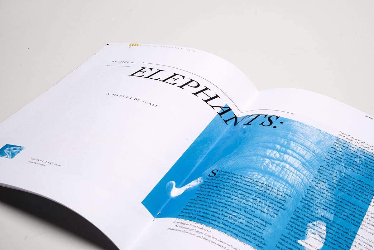
The last article of the magazine is about a the scientific theory of scale. This layout was designed to help the viewer feel the difference between both large and small scale. The second layout of this article was meant to portray traits of large scale objects. This was accomplished by leaving very little negative space on the page and overlaping images with text. In contrast, the last spread introduced lots of white space and little images to give the reader a feeling of small scale.


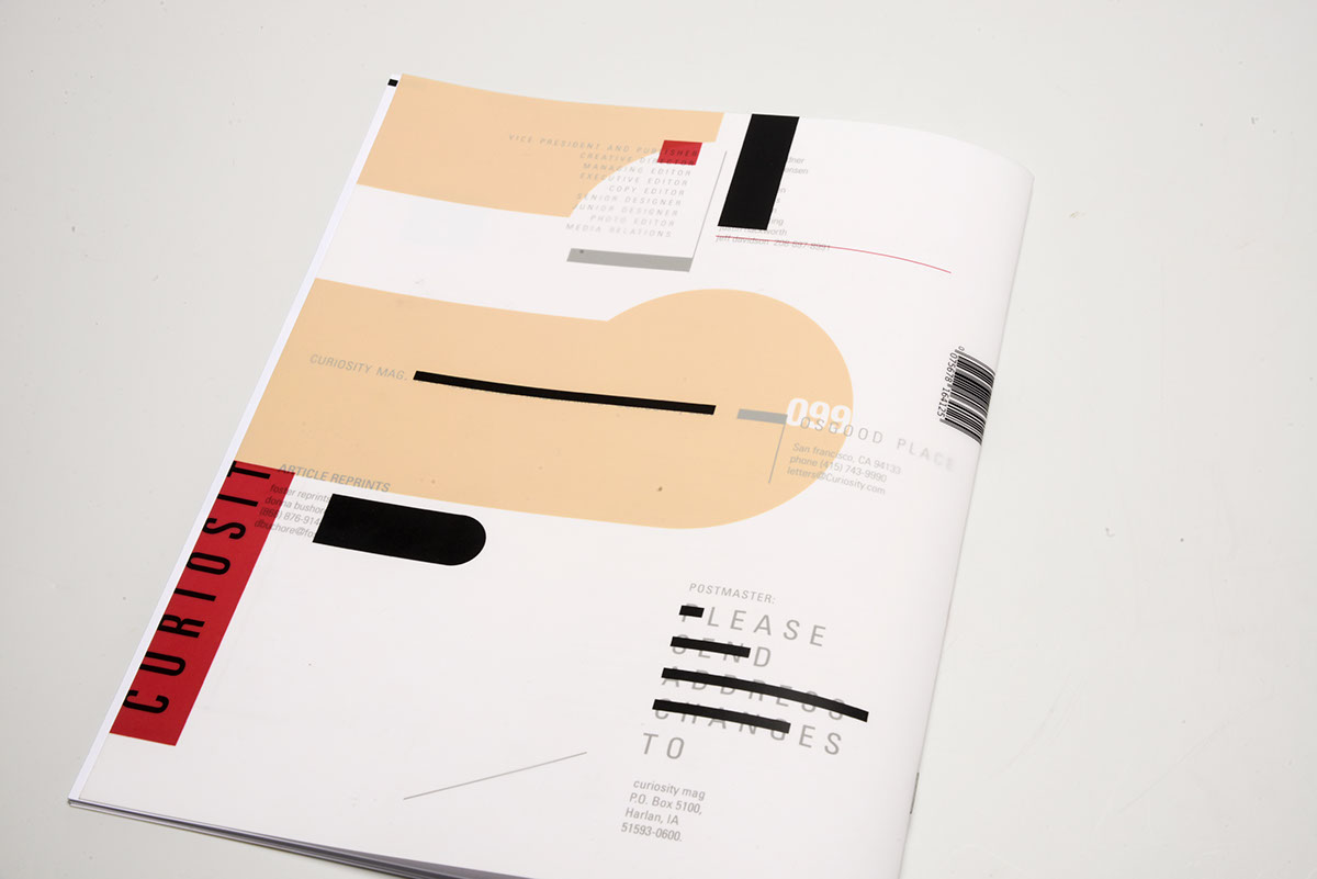
The back cover is a reflection of the front cover, showing consistency with variation to make it interesting. There are similarities in color and concept but variation is shown through type texture and reflecting shapes.