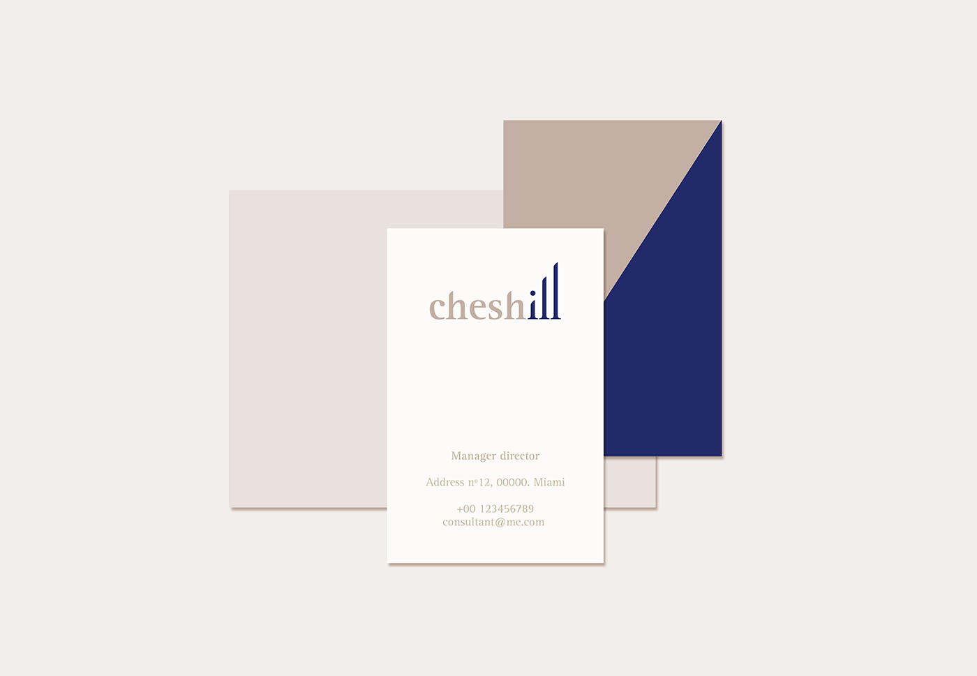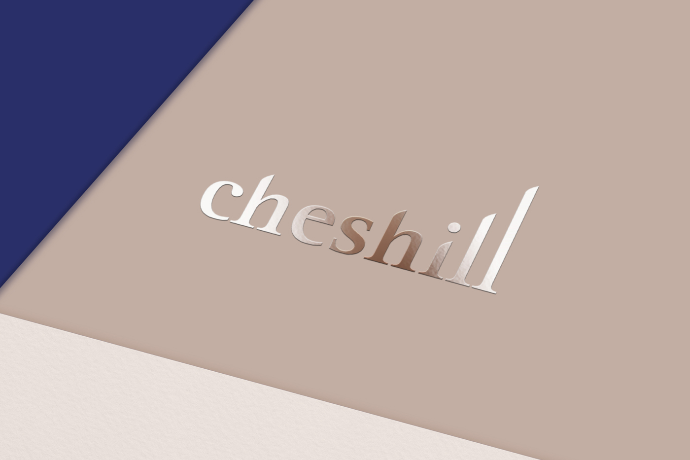
Branding for a financial entity.
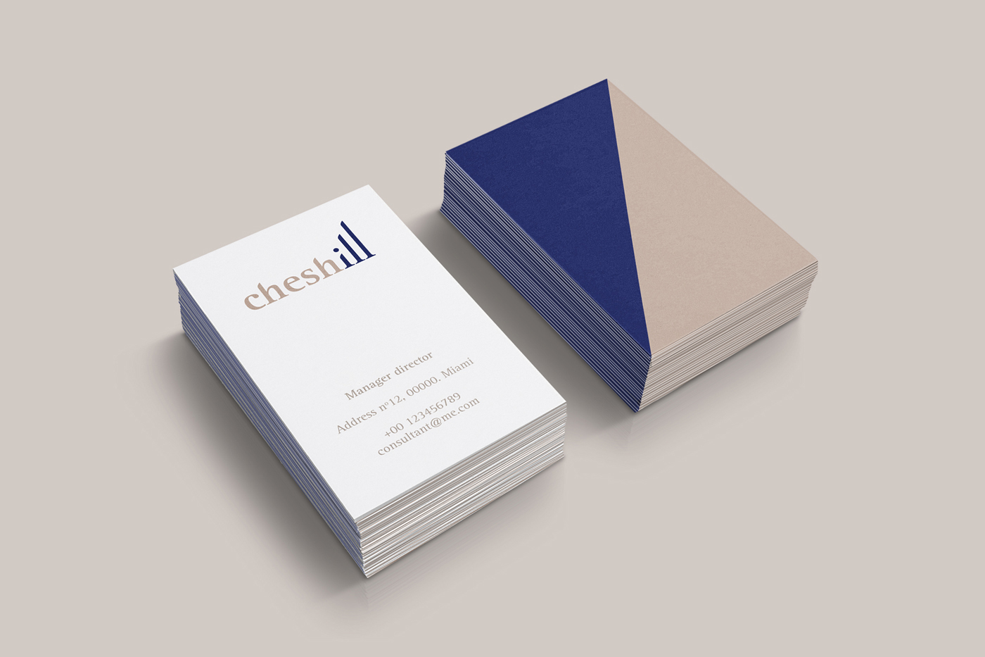
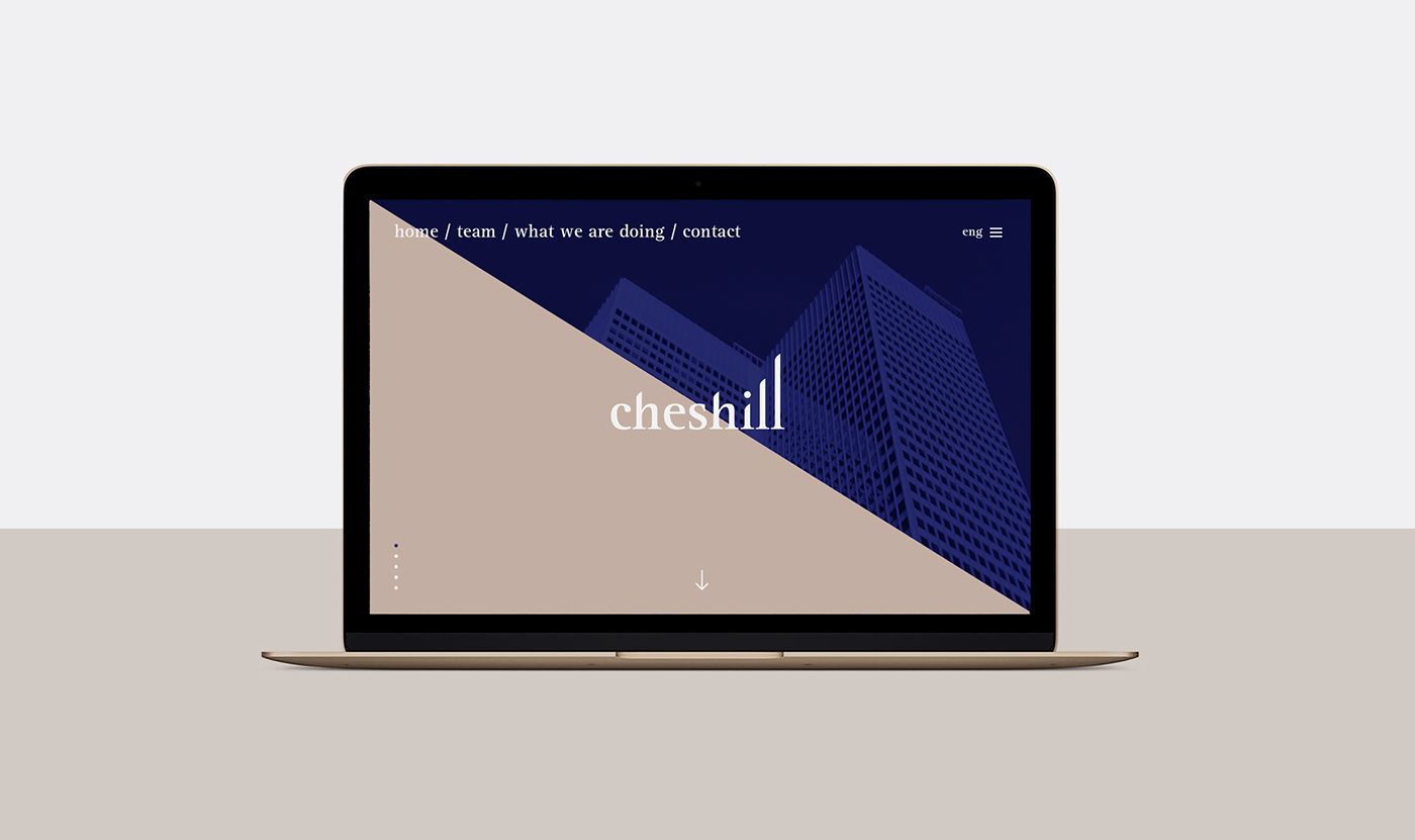
The brand represents the corporate values, the seriousness, the austerity and the elegance in each of its communications. The chromatic palette, formed by several earth tones and a navy blue, reinforces the quality, the seriousness and the spirit of the entity.
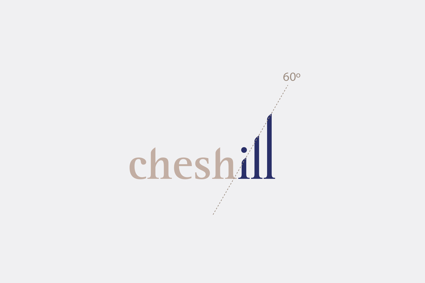
The identity proposes an element that symbolizes the sustained and responsible growth, an upward graphic that is part of the visual language. By merging typography with financial graphics, a symbol has been obtained that represents optimism and generates a sense of progress and growth. The symbol is a diagram of the process of achieving success.
The visual identity pretends to be modern, dynamic and recognizable, with a graphic universe that projects image of strength. A fair mix between the classic and the current by combining serif fonts with a modern layout.