MUSIC JACKET AWARDS 2011(JAPAN)-Associate Grand Prix
D&AD Professional Awards 2012-in book
D&AD Professional Awards 2012-in book
This album is the band’s first major album release, and as such represents an important stage in its career.
The name “door” reflects this, as well as the band’s wish for it to provide an “opening” by which as many people as possible can encounter its distinctive sound. As something that either allows or disallows access to something, the door has a significance that is nevertheless visceral for all its basic simplicity of form and operation, and, as such, lends itself admirably to graphic design.
The name “door” reflects this, as well as the band’s wish for it to provide an “opening” by which as many people as possible can encounter its distinctive sound. As something that either allows or disallows access to something, the door has a significance that is nevertheless visceral for all its basic simplicity of form and operation, and, as such, lends itself admirably to graphic design.

The album comprises eight pages (one for each track), formed of plain, white heavy paper. Each page features a square hole in the center, all concentric, progressively smaller by the page, at a fixed ratio of diminution. These represent eight doors.


When closed, the eight pages form a solid whole: a single “door”, expanding up and outwards from the center or, conversely, leading the viewer’s eye into the middle. Standing the album up and opening it to let the pages splay more or less evenly creates a curving sequence of squares, making for an even more three-dimensional impression. The pages’ being white is primarily an invitation to the listener to “colour” the album with his or her thoughts or imaginings while listening to it, leafing through it “door by door.” At the same time, that whiteness also invokes the idea of “freshness”, “expansion”, and the achieving of “stages of newness”. Also, in a work that relies partly on the play of light and shadow for its effectiveness, white is the best colour for this purpose, reflecting light cleanly or accentuating its absence.

To further emphasise the simplicity and minimalism that informs the design concept, the band’s logo is embossed in lacquer on the back of the album in just the basic, prescribed font.


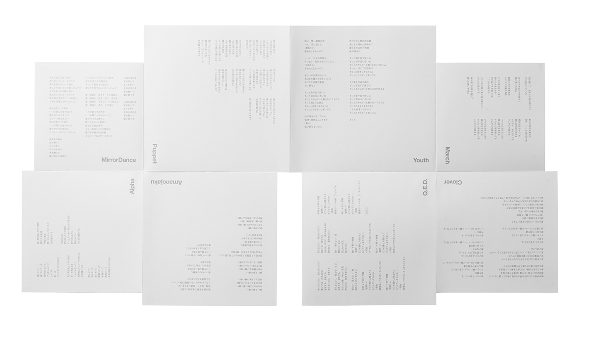

The lyrics booklet follows the design of the overall package in being based on the image of a door.It is formed of four sheets of paper of a uniform ratio of size difference, making for eight pages, left and right, each printed with the lyrics of one of the songs. Giving even the lyrics pages a feel of the opening of a door adds further depth to the overall concept and an even more tangible user experience of that concept.

Finally, the door motif extends to the compact disc itself, on which a door is printed in both gloss and matte finish, with the design incorporating just a single keyhole. The key to opening the door is, therefore, playing the album.
androp official website(JAPAN)


