
Blackburd Pastries
Modern logo design for a D.C. pastry company that plays off the name without using... a bird? yeah, I think I can do that.
I really fell in love with the idea of not incorporating an actual bird into this logo. I always enjoy logos that goes beyond the surface and create a deeper meaning.
One main aspect of this design, was color. As the pastry chef's last name is Blackburd, using black was the natural choice. In most fruits and even vegetables labeled as being black( i.e. blackberry, black beans ), the color is actually not black and has more of a purple of red hue. I channeled that into this logo by not only using an 85% black but also infusing it with a touch of purple. I felt this gave the logo what it needed to stand out.
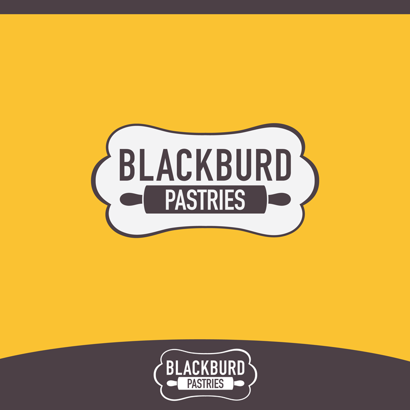
Final logo
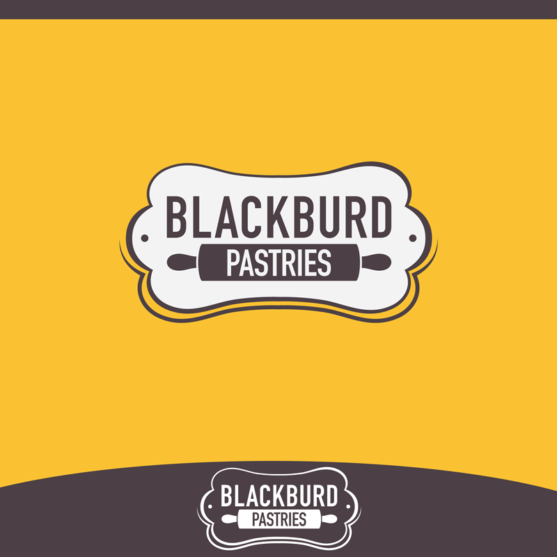
Final logo variant

Initial logo comp: the icon was derived from a French Apple tart

Abstract wing comp: sticking with the idea of not directly incorporating a bird

rebel comp: At this point the client began having a change of heart somewhat and wanted to see an actual bird used in the logo. This made me unhappy so I sloppily threw this together :P

this is my attempt at being crafty. It's a helluva stretch but, there is a silhouette of a bird in profile within the space between the K and B in the word Blackburd.


