AIGA: Paul Rand Exhibit Poster Concept
Created at Chapman University Fall 2009
Created at Chapman University Fall 2009
Problem
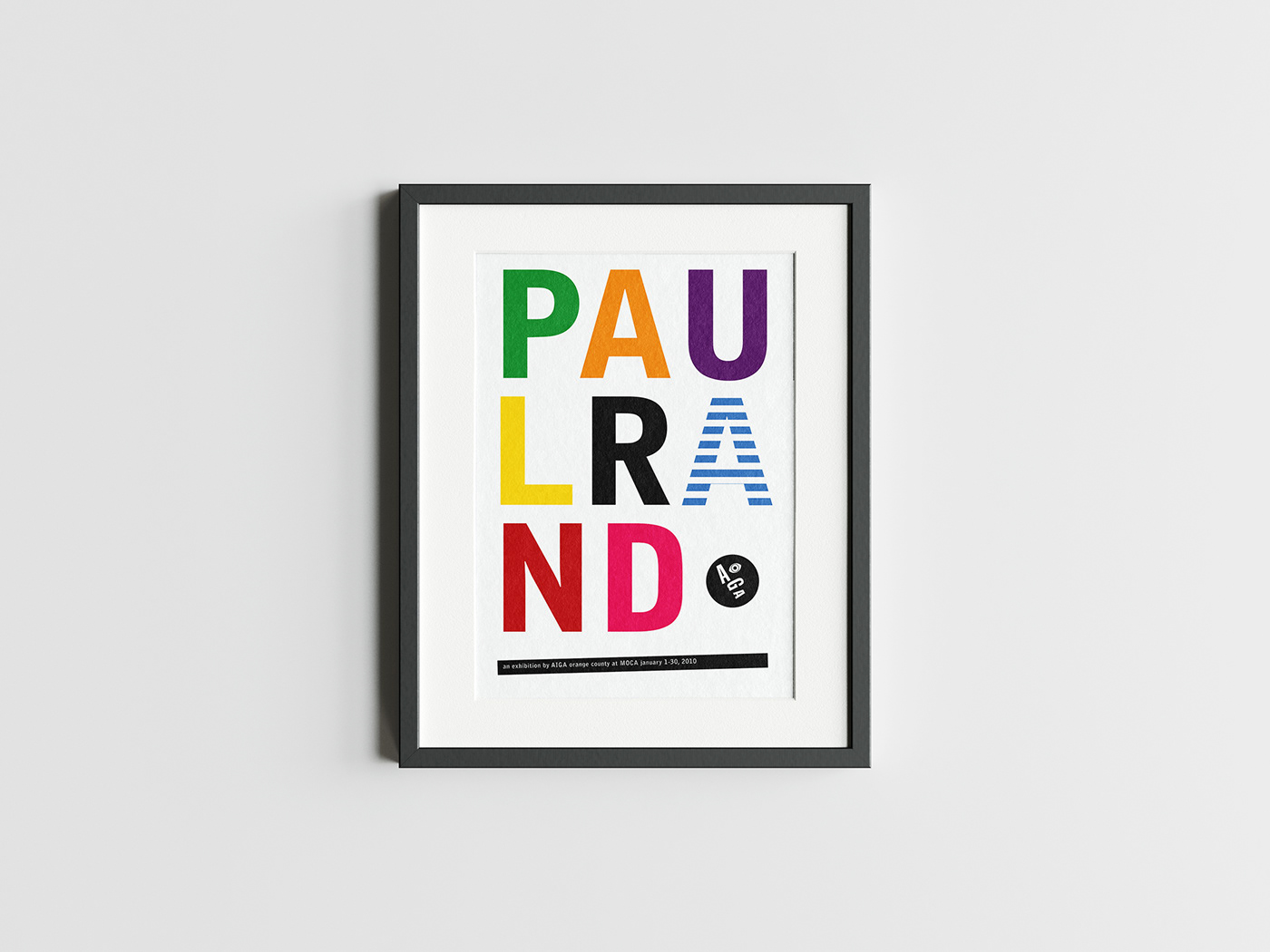
AIGA is commissioning commemorative posters to advertise an upcoming exhibition of Paul Rand’s best works at MOCA. The poster should embody the range of Rand’s extensive body of work as a whole, instead of duplicating any one piece.
AIGA is commissioning commemorative posters to advertise an upcoming exhibition of Paul Rand’s best works at MOCA. The poster should embody the range of Rand’s extensive body of work as a whole, instead of duplicating any one piece.
Concept/Solution
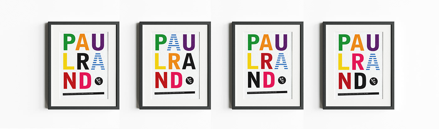
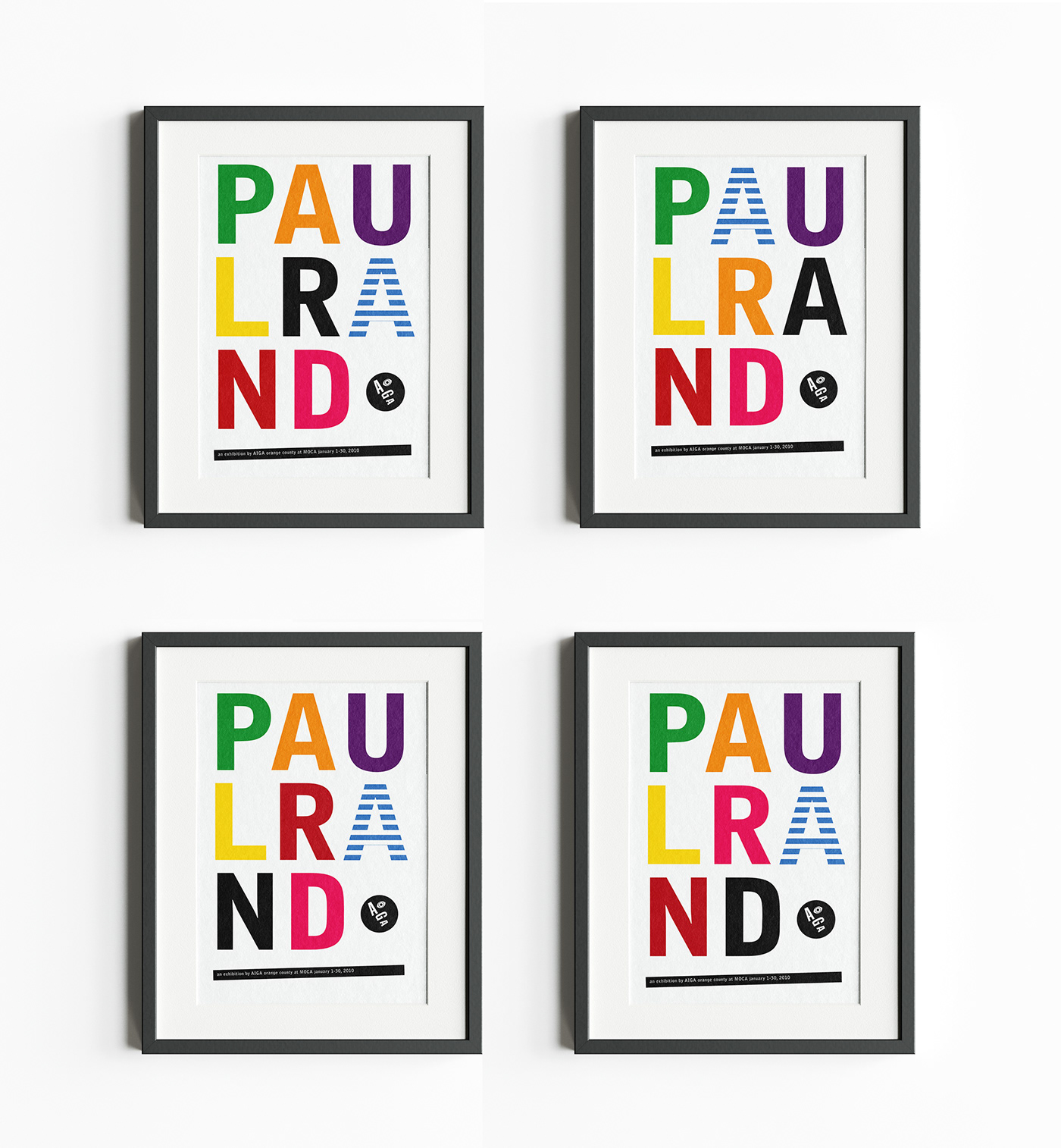
After extensive research from 50 years of Paul Rand’s body of work, certain characteristics such as color, layout, and overall sensibility began reoccurring. These reoccurring traits were then incorporated to create four serial posters inspired by Rand’s work with the Dubonnet man, originally created in A.M. Cassandre’s 1932 serial poster. Using a broken-word structure and all caps sans-serif font choice is representative of Rand’s 1975 MINUTEMAN design for the US Department of the Interior. The colors are then updated in bright green, orange, purple, yellow, black, blue, red, and pink favorites during Rand’s years designing for UCLA. The second “A” repeats the now famous alternating blue and white stripes of Rand’s IBM logo. The final white space after the “d” is balanced with Rand’s AIGA logo, which was commissioned but never used. A slanted black bar, inspired by Rand’s unpublished cover for Trademark Design in 1951, grounds the design and provides necessary information on the exhibit at MOCA.
After extensive research from 50 years of Paul Rand’s body of work, certain characteristics such as color, layout, and overall sensibility began reoccurring. These reoccurring traits were then incorporated to create four serial posters inspired by Rand’s work with the Dubonnet man, originally created in A.M. Cassandre’s 1932 serial poster. Using a broken-word structure and all caps sans-serif font choice is representative of Rand’s 1975 MINUTEMAN design for the US Department of the Interior. The colors are then updated in bright green, orange, purple, yellow, black, blue, red, and pink favorites during Rand’s years designing for UCLA. The second “A” repeats the now famous alternating blue and white stripes of Rand’s IBM logo. The final white space after the “d” is balanced with Rand’s AIGA logo, which was commissioned but never used. A slanted black bar, inspired by Rand’s unpublished cover for Trademark Design in 1951, grounds the design and provides necessary information on the exhibit at MOCA.