The Brief
While pink gin dates back to the 1800s, Edgerton pink gin is a relatively new phenomenon. So to give the brand authority,
we needed to give it heritage – a look borne out of quality and history. Done well, this enticing new tipple could stand out
(as well as blend in) among the better-known premium spirits on the shelf.
...........................................
Our Approach
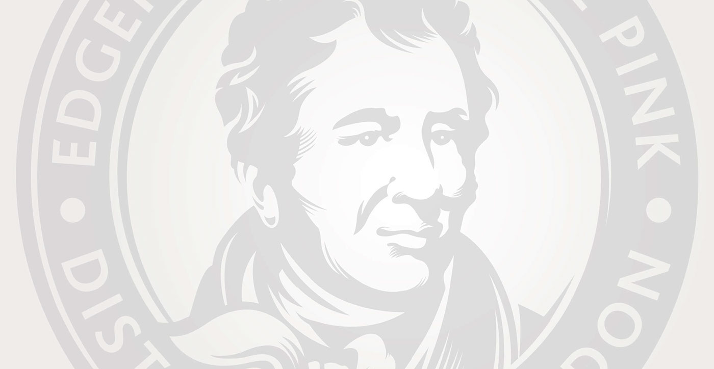
We wanted to give the brand a visual stamp of authenticity. So we set about reworking the image of our pink gin creator,
Lord Edgerton, in the style of a traditional woodcut portrait. The look was instantly iconic. We then created delicate leaves,
swirls and curlicues to hint at the fifteen exotic ingredients used to create the drink’s complex taste and striking colour.
This was now a spirit to be reckoned with.
...........................................
The Results
Edgerton Original Pink has been a giant success, scooping up loads of awards, including the coveted Masters Medal
in the 2014 Spirits Business Gin competition. We hope we’d be forgiven for saying that we’re all tickled pink.