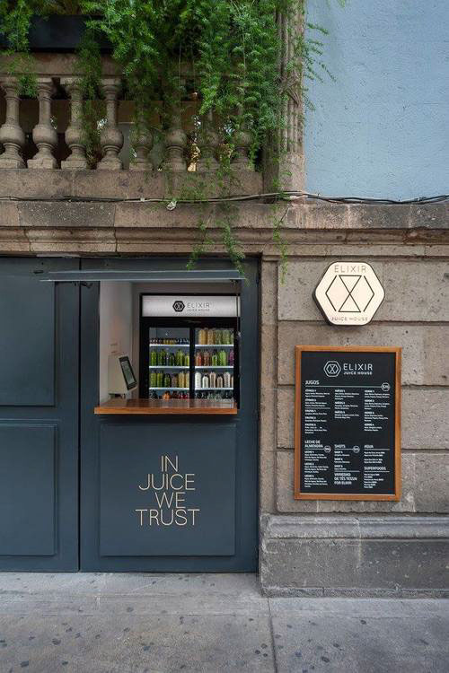
ELIXIR DETOX
Brand, packaging and e-commerce redesign for Mexico’s #1 cleanse juice.
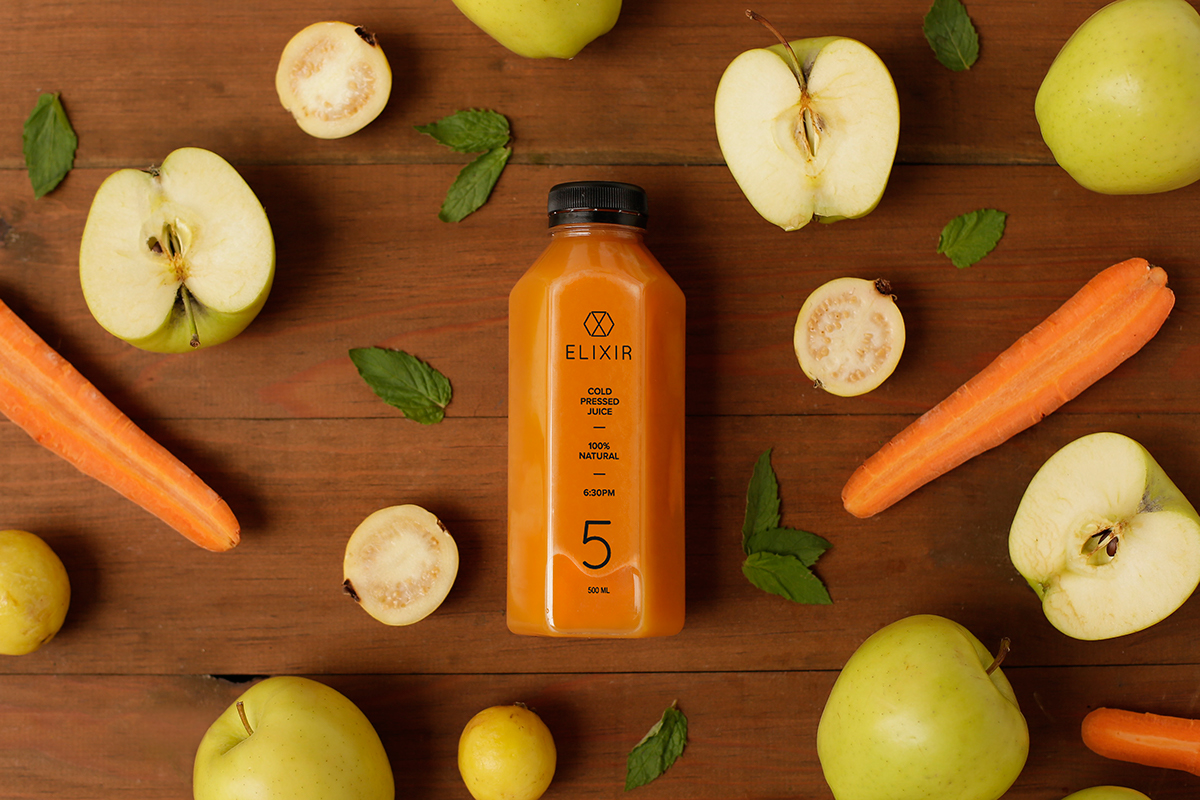
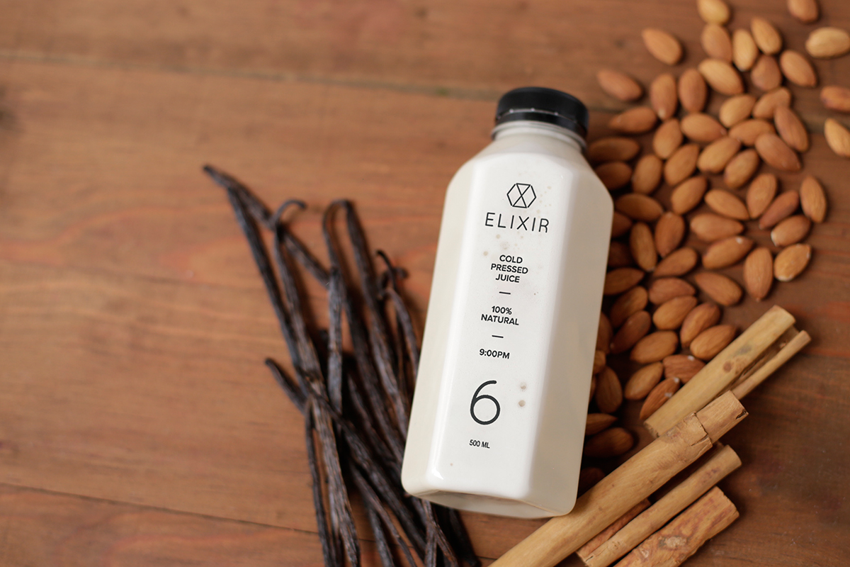
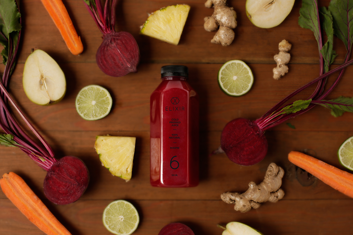
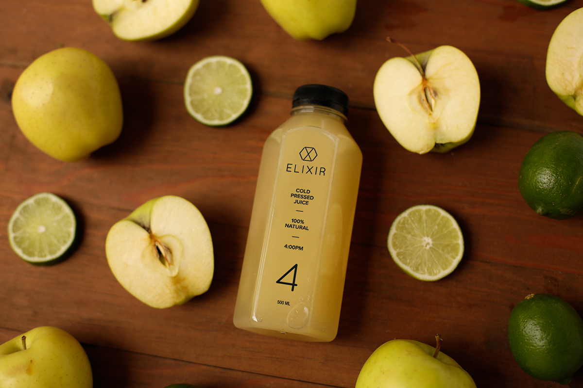
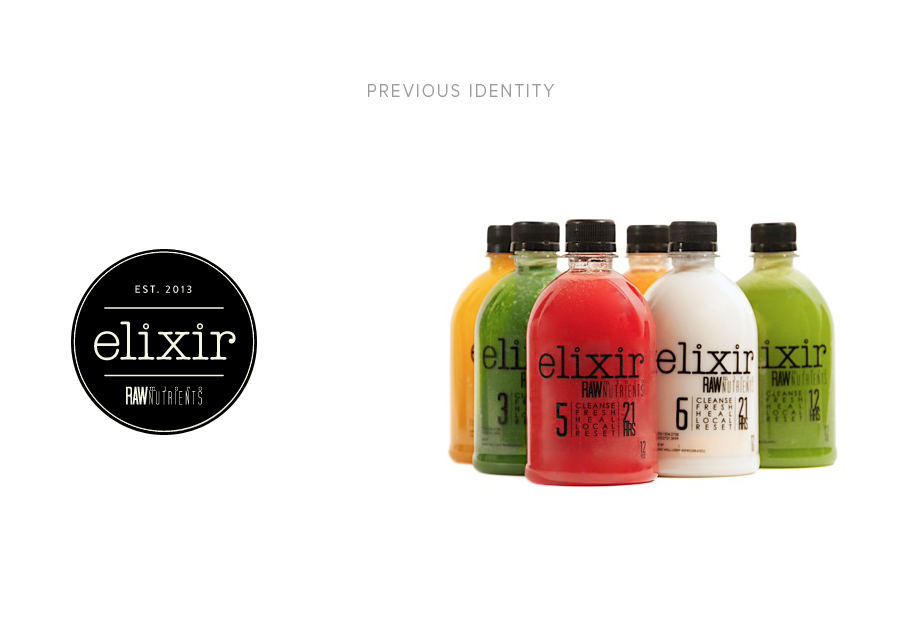
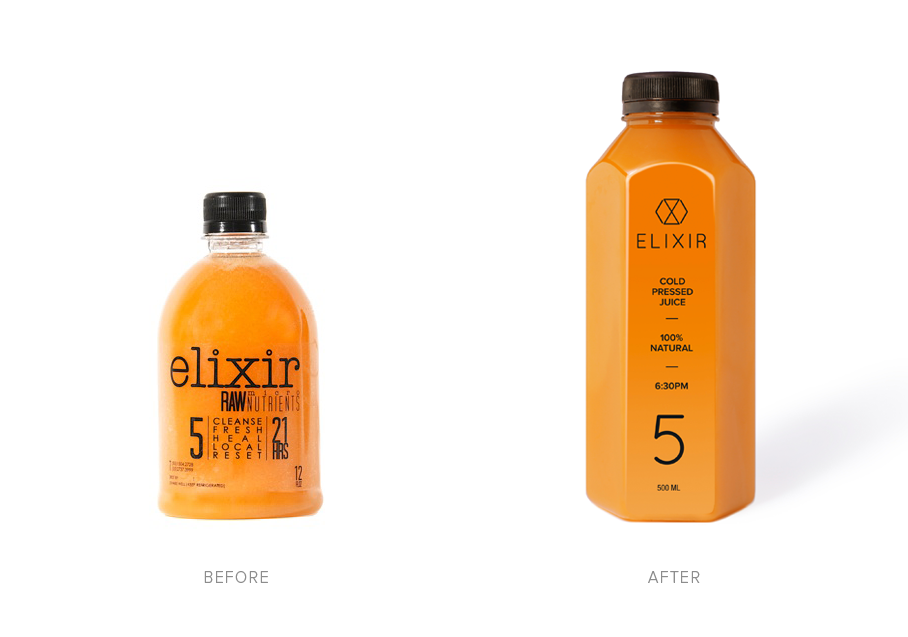
We started by suggesting the manufacturing of a unique iconic bottle that would give the brand a much better positioning. The bottle that was previously used was a generic shape commonly used for other industries such as liquid soap or shampoo. It had the appearace to be short and chubby instead of a more thin and strong approach. The former small bottle also gave the wrong signal of fewer product, and as the juice is the only thing detoxers are supposed to eat during a day, we thought it was a better idea to make it look bigger within the same amount of milliliters.
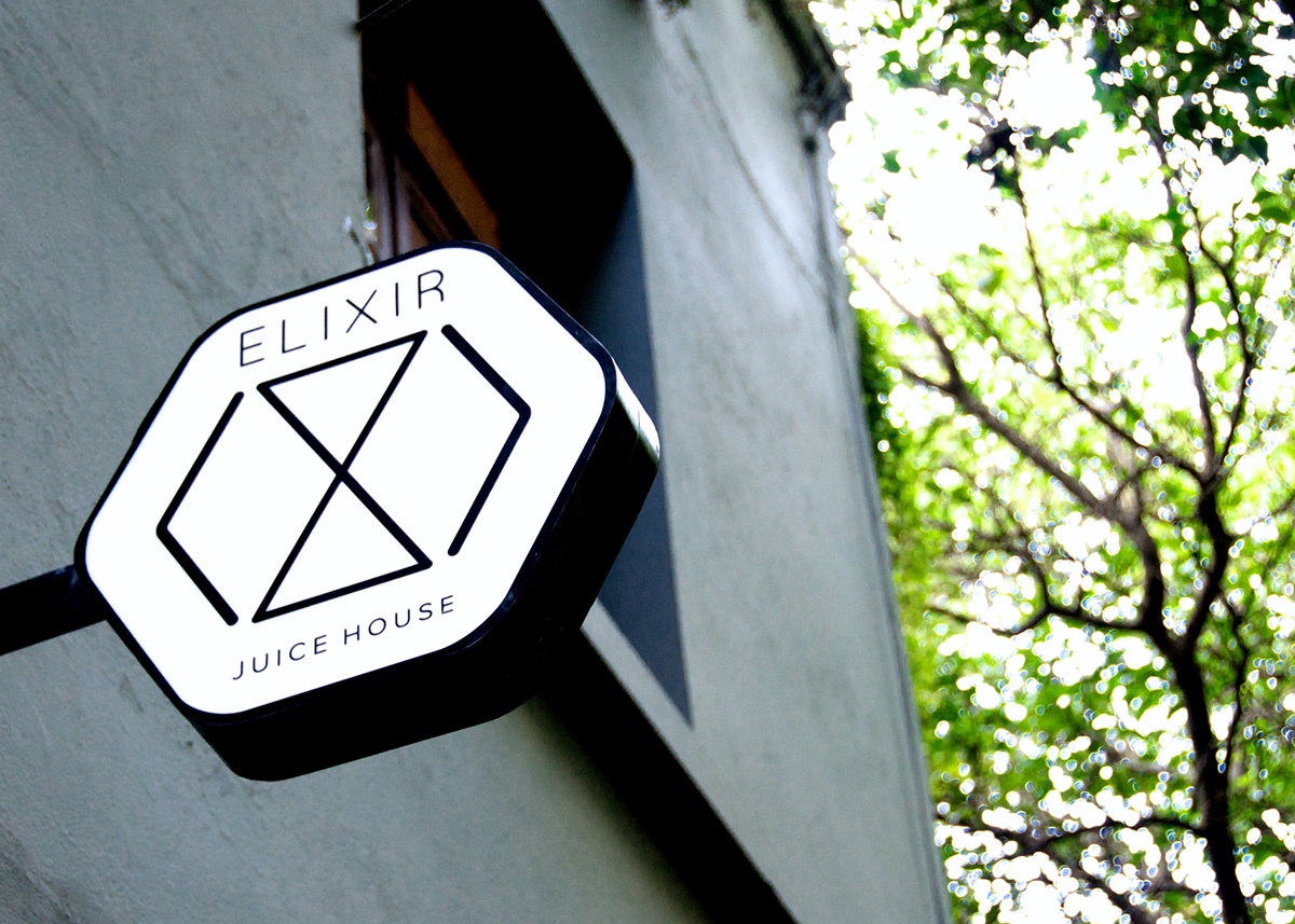
We decided to change the logo to capital letters to give a more sophisticated look to the brand. We also created an icon that was inspired by three main elements: First, the hexagonal shape of the bottle where the 6 sides stand for the 6 juices the detoxer drinks per day on a cleanse; Second, a sand watch that represents the time challenge of every cleanse juice program: either is 4, 6 or 10 days program. The third element is the two opposite triangles that simulate a slim waist shape. The icon also contains the letters "E" and "X" of Elixir.
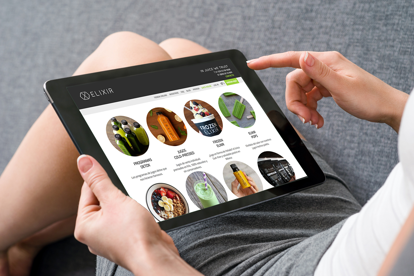
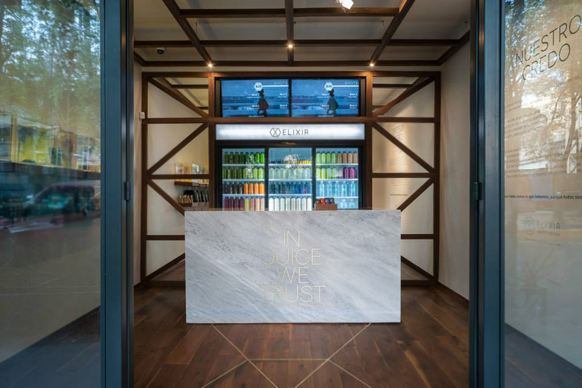
The new image and packaging has had great reception by their former and new clients. It´s been a thrill to see Elixir grow in sales so fast.
Product photography by Ana Hinojosa.
Art Direction by Mar Reyes.
Check out more of our work on www.dbmstudio.mx