This work was produced in the Typography module at NID Bangalore. It helped me gain a better understanding of the anatomy of type, and how it translates into certain characteristics which then define ideal use cases and the personality of that typeface.
There are three outputs of this module - a poster, a brochure and a website.
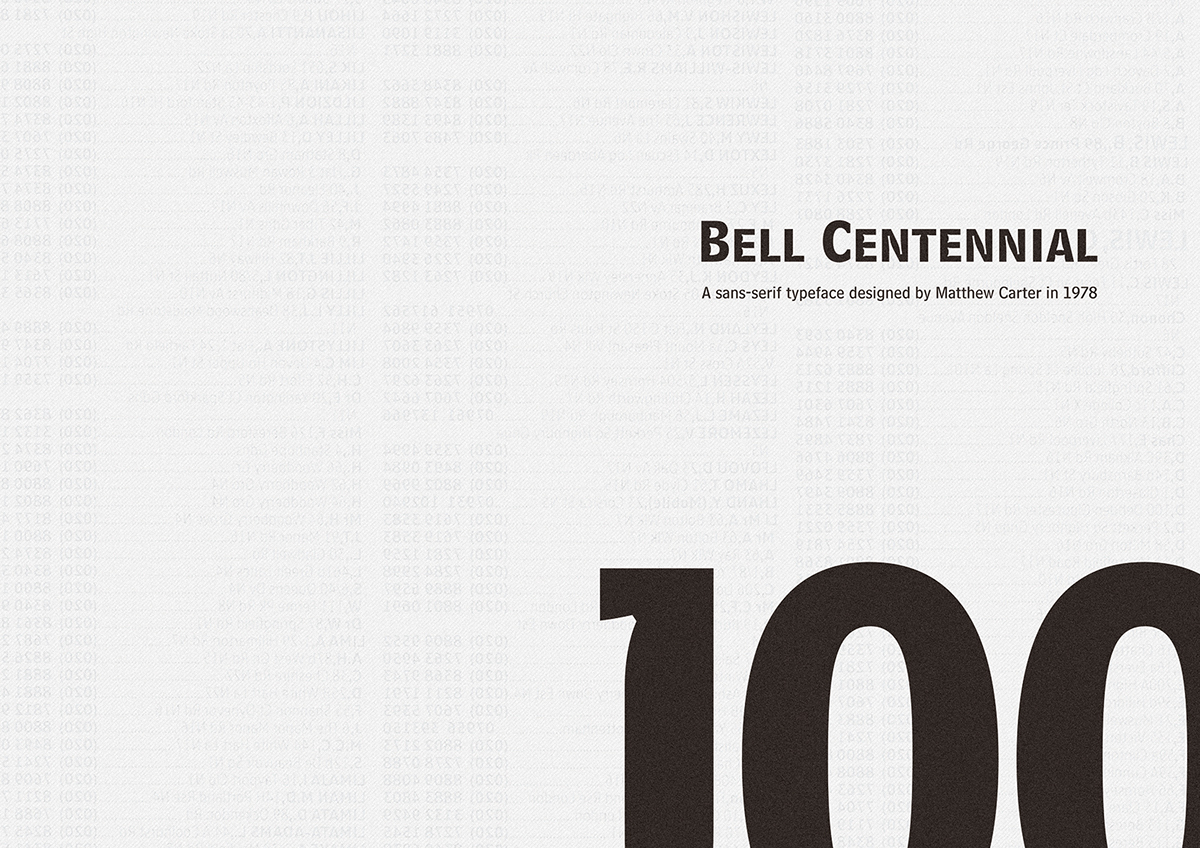
The typeface I chose for analysis was Bell Centennial.
Understanding the Typeface
Bell Centennial is a typeface designed to meet very specific requirements – to be a typeface better designed to play well with technological advances in printing, and to save costs on ink by printing smaller characters. It had a specific use case – AT&T phonebooks.
I read as much material on Bell Centennial as I could as I wanted to understand the quirks of the typeface. I then made it my goal to highlight these quirks to bring it to the audience's attention. Once their attention was captured, I intended to expound on the reasons behind these quirks, and how they translated to real world benefits.
I designed the poster to draw attention and communicate some information, and designed the brochure to go deeper into the story of the typeface and the reasons for its creation, hence capitalizing on the attention or curiosity generated by the poster.

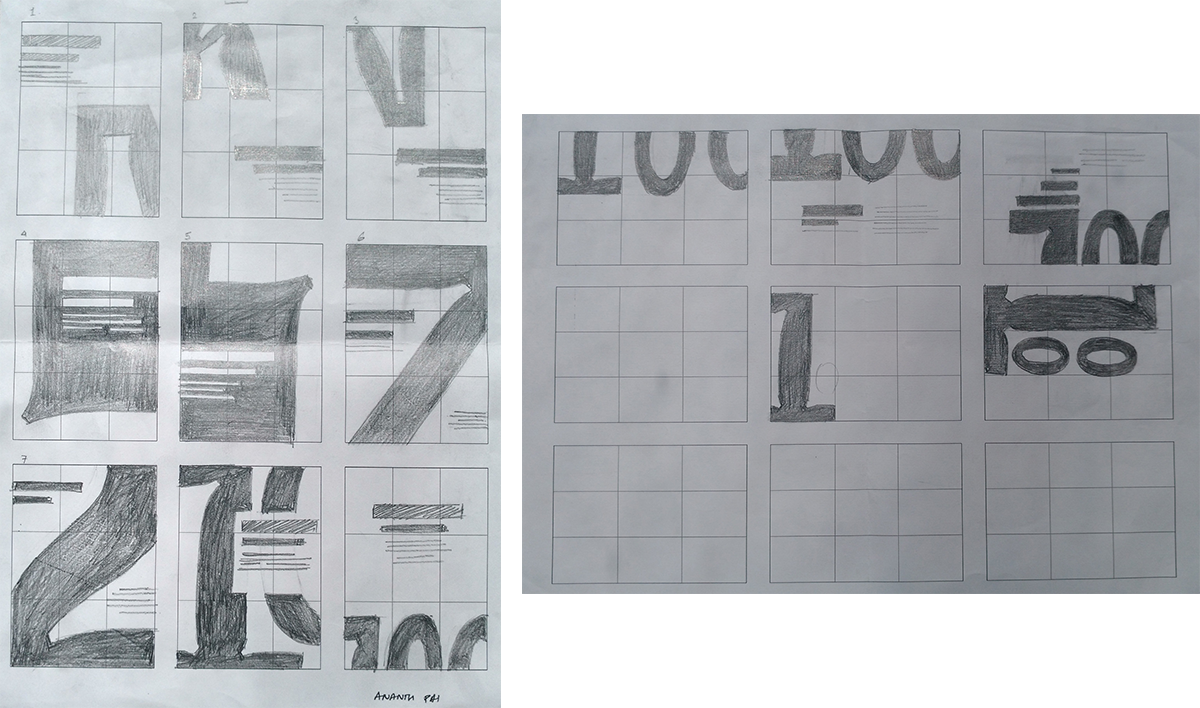
Designing the Poster
Final A3 Poster


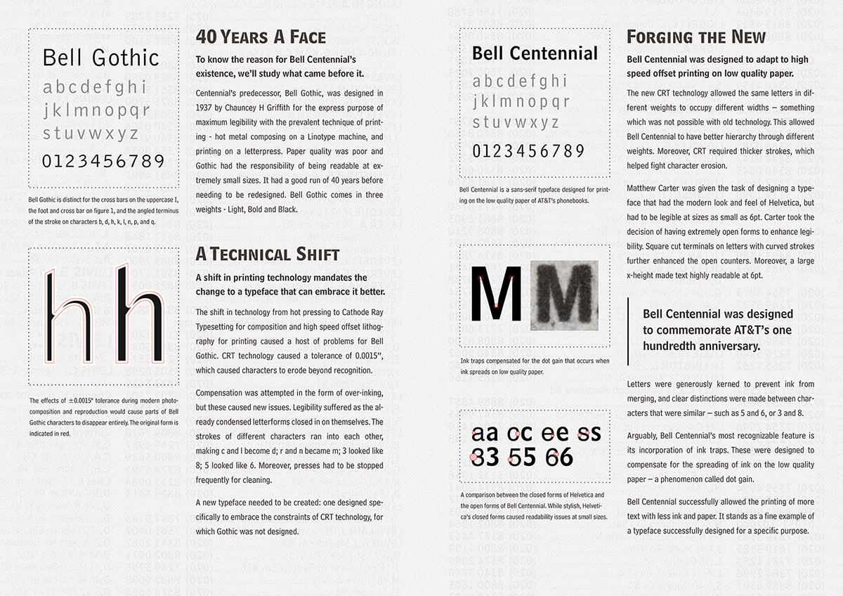
Brochure

Website

To view the responsive website, head over to ananthpai.com/bell-centennial


