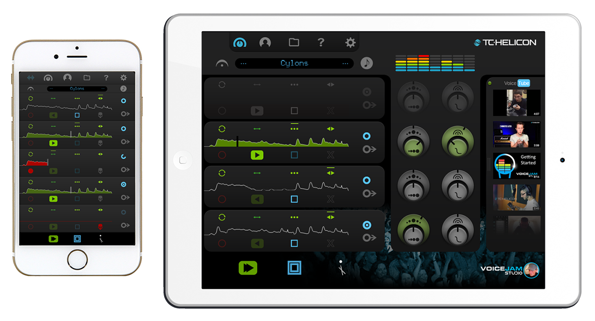
UI/UX concepts for a mobile music app
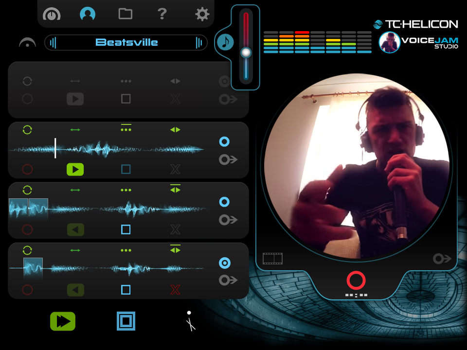
These screens represent my entry into a "re-skin challenge". I wasn't required to suggest any functionality enhancements, but after using the actual App for a few minutes, I quickly realized that there were a few things that I felt I could offer some interesting ideas towards in terms of usability. So I decided to just mock up everything that came to mind. I started with an iPhone screen, then decided that an iPad would offer more opportunity to mock up extra features, such as a tabbed effects dropdown with effects icons for: (from left to right) Modulation effects, Delay effects and Reverb effects. I created the effect names for the dropdown. Also featured is a circular video preview and new track syncing and exporting icons. All of these VoiceJam mocks (and more that aren't shown here) were done over a period of 2.5 days.
^^
The circular video preview, new track syncing and exporting icons, and a master pitch slider.
The circular video preview, new track syncing and exporting icons, and a master pitch slider.
^^
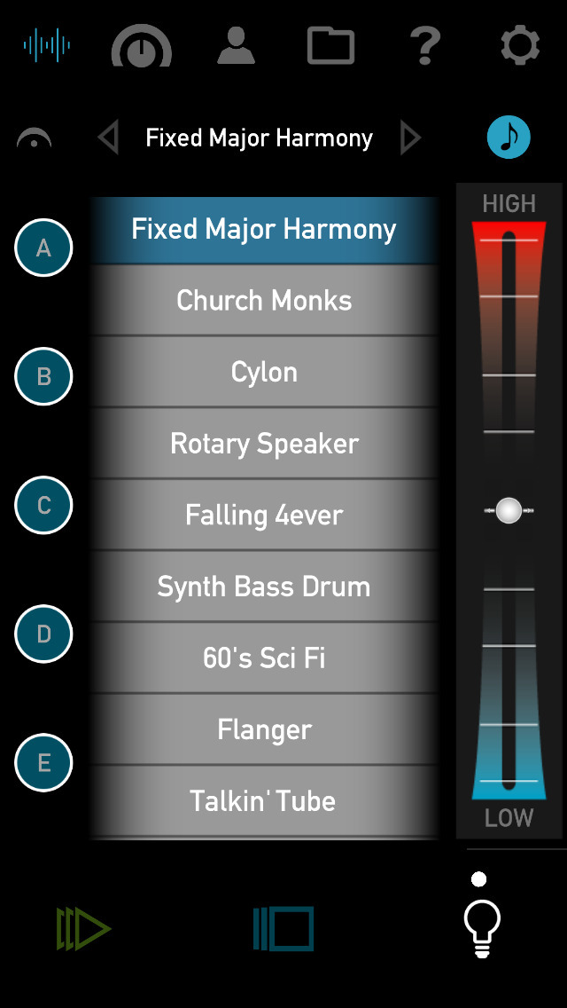
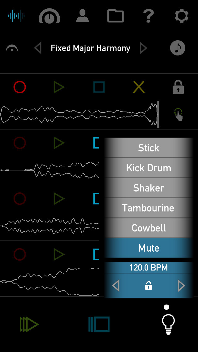
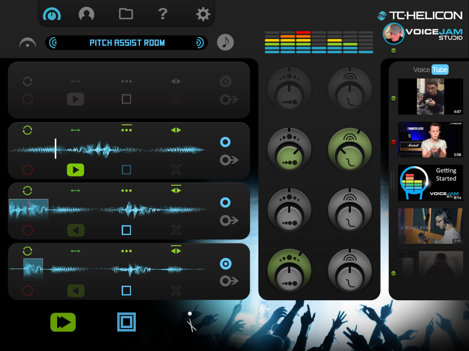
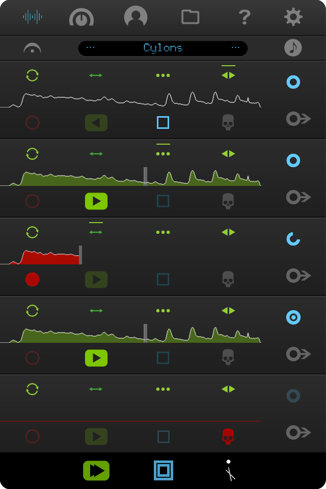
Some of the things that I found a bit difficult regarding UI/UX were things like the fact that the 4 track FX control icons were hidden. I wanted to be able to use them while recording, so I decided they needed to be surfaced and easily accessible. I decided that I liked the track controls at the bottom of the track pod, with the fx controls at the top for ease of use. That felt more natural to me. I also wanted a more consistent set of icons for the Sync menu, so I redesigned those as well. I got excited about my idea of being able to connect with other VoiceJam users via a “VoiceTube” link. I could see who else was online and/or using the App. I could also potentially view their latest videos without leaving the App. Potential battery-draining activities as well, but still worth considering. I also wanted to be able to see a categorized/tabbed pop list for all of my vocal effects. I wanted to see them at least grouped according to Delay, Reverb, and Modulation effects, with possibly length and type indicators at some point in the future. In keeping with the self- imposed “no text” initiative, I designed some basic icons for effects ID.
^^
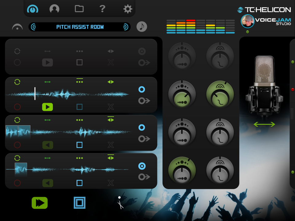
One of the first things I wanted to do when viewing the mixer section was to stack the controls. It just seemed a logical step to have the Level and Pan controls together, and the Filter and Q together. Not only would that make it easier to adjust on the fly, but would also free up screen space for other elements, such as my ideas for: an “Add On” pod area, a live video stream pullout, and a microphone chooser/visualizer. The mixer controls still need a bit more exploratory design and styling. I also added the collapsed empty track, thinking that the upper and lower controls would animate toward the center of the pod and align horizontally with the track Export and Sync controls.
I also challenged myself to devise symbols/icons instead of using text descriptors for most of the elements in the App, and I wanted to experiment with decorative/supportive photography and imagery.
^^
Some of the things that I found difficult regarding UI/UX were things like the fact that the 4 track FX control icons were hidden. I wanted to be able to use them while recording, so I decided they needed to be surfaced and easily accessible. To do this, I would need more space in each potential track pod, so I decided to chop the waveform graphics in half. This would allow me to keep them fairly large, and the bottom half is just a reflection of the top, and since we aren’t doing any fine zooming or granular editing, the wave fidelity change would suffice. I later changed my mind about this after looking at it for many hours, and decided that in my subsequent iPad mocks I would use a funkier- looking, more visually “organic” waveform. It felt like I needed to keep somewhat more to the norm with this element.
I liked the idea of the “me” icon following the circular theme and/or spotlight inference, so I altered that too; it fit well with the circular video screen idea. I Also played a bit with the fun idea of a skull instead of an X for a delete icon. The Save file icon needed to be surfaced too, and more consistent.
I liked the idea of the “me” icon following the circular theme and/or spotlight inference, so I altered that too; it fit well with the circular video screen idea. I Also played a bit with the fun idea of a skull instead of an X for a delete icon. The Save file icon needed to be surfaced too, and more consistent.

^^
I liked the idea of the “me” icon following the circular theme and/or spotlight inference, so I altered that too. That idea fit with the circular video screen idea as well. I Also played a bit with the fun idea of a skull instead of an X for a delete icon. The Save file icon needed to be surfaced too, and to be more consistent. I wish I had been given the opportunity to redesign the entire icon suite.
^^
A fairly quick mock up of a more minimalist, synthetic "gender neutral" (as requested by the client) skin (hence the name/title of the effect) ;), with some new icon ideas as well.
^^
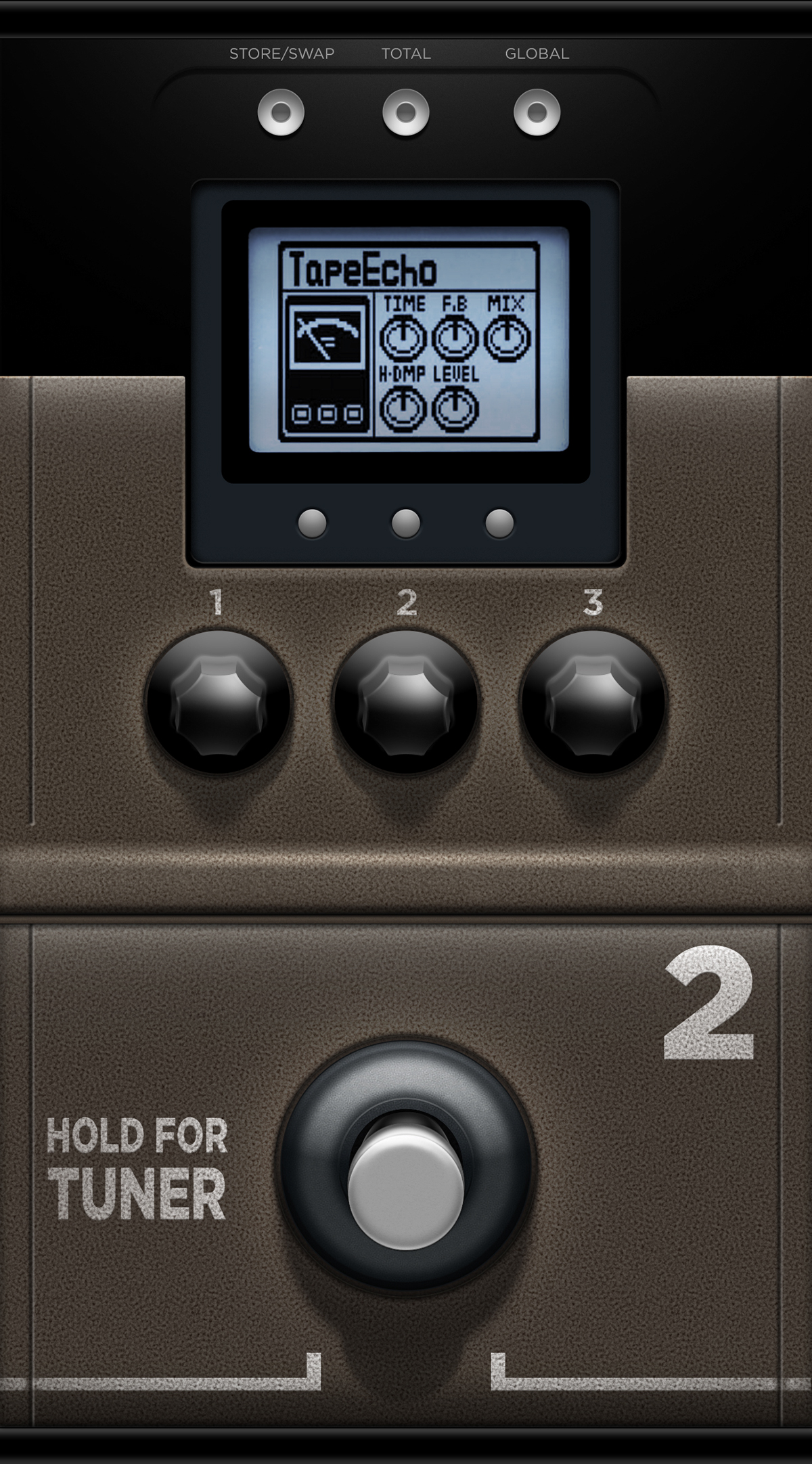
I added this high-res modular/effects pedal design to the challenge when I was asked for an example of a "GarageBand" style. A weekend creation using Photoshop.
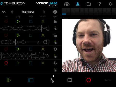
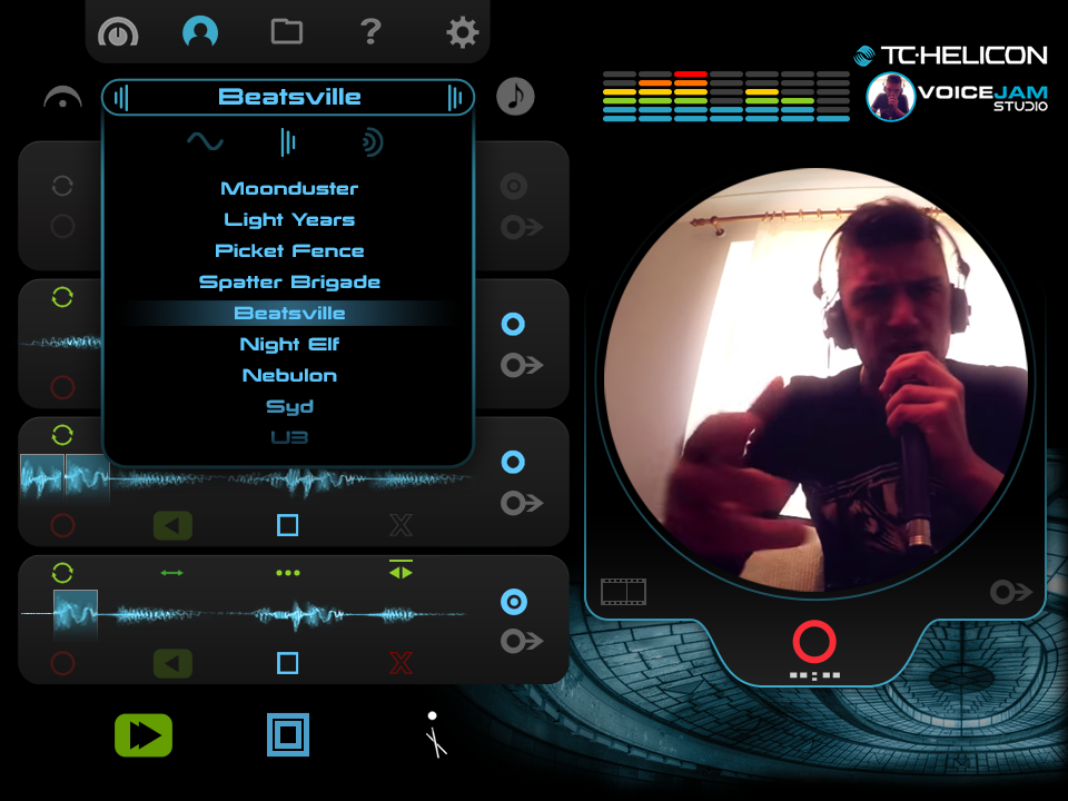
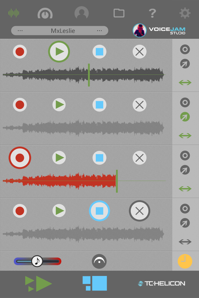
Below: 3 of the actual App screens that were the inspiration for the redesign
vvv