
Gracias a Dios is a Gastronomical Group based in Mexico, who is most oriented in the hand-crafted production of artisanal mezcal. For this project, they came to us with a new brand product, which aims to provide Ginebra connoisseurs, the first mexican Gin distilled from Agave. The group have infused this spirit with 32 mexican botanicals, representing, the now a days 32 states in the Mexican Republic; becoming then, the must botanical Gin in the entire world.
The main task was designing just the label, which then extended in the creation of a concept among design materials for the shipping service and the collateral; which of course, we wanted to create an extraordinary experience from receiving the crate, the bottle, till the joy of the last drop of Gin.
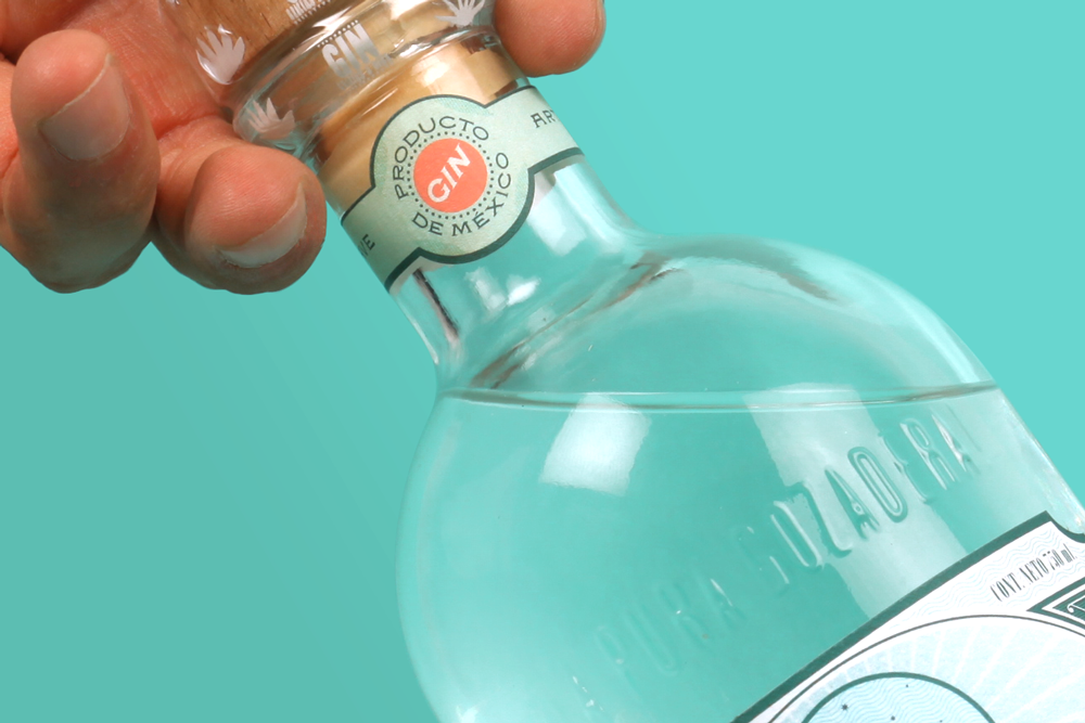
The tough task, our client ask us to use a previously selected die cutting, design the label for an already picked bottle, and first of all: "make the design add value to our product, standing it out, giving international looking, honoring Mexico, using our main logo "The Querubin with mustache" and gave power to the name Gracias a Dios Gin"; which left enough work on the road, since the logotype of the group will be part of the new logo and the word "Gin" isn't actually the name of this brand.
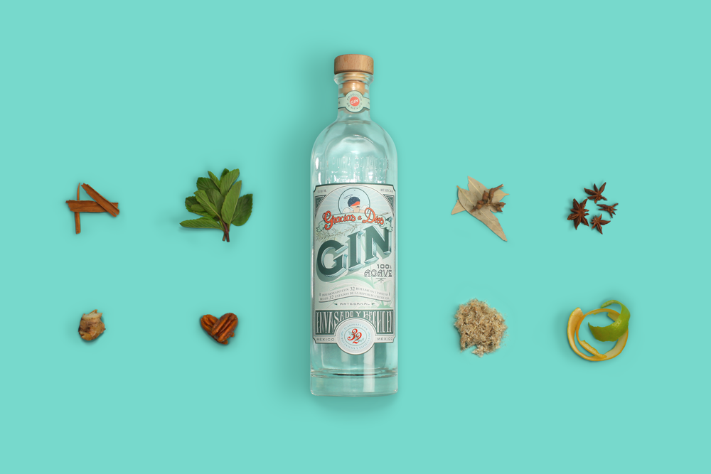
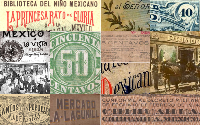
Since the project is mainly about botanics, designing away from the classic botanical ephemera was something to care about. Instead, the inception of the concept came up in a collection of a seemingly unrelated old objects, such as: post stamps, cantina facades, bills, folk song books, photo albums, book covers; served as analogy for the selection of the 32 botanicals and the contrast between agave and gin. Setting up the perfect scenario to express botanical melancholia and a fresh airy nostalgia.


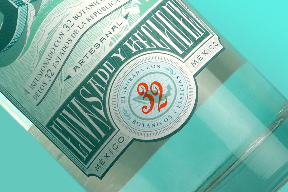
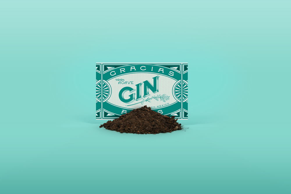
The use of scratch illustrations, the framed label inspired by mexican bills in the 20's, and the 32 botanicals rubber stamp, helped gain recognition of a bespoke label. The tridimensional lettering evoking an enamel classy sign in a chemist shop, the customized typographic work inspired by apothecary labels, and the ornaments, brought the tangible quality to represents what it contains. And finally, the selected color palette represents best the essence of the fresh botanicals, and allures the audience to think in "Gracias a Dios Gin", as a -Need to own- bottle.

Sketch #1 with notes

Sketch 2nd Idea based on "Porfiriato" and the cover of the National Anthem in Mexico
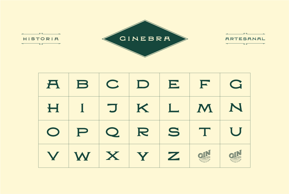
Costumized typography used for the label as well for the stationary and shipping box

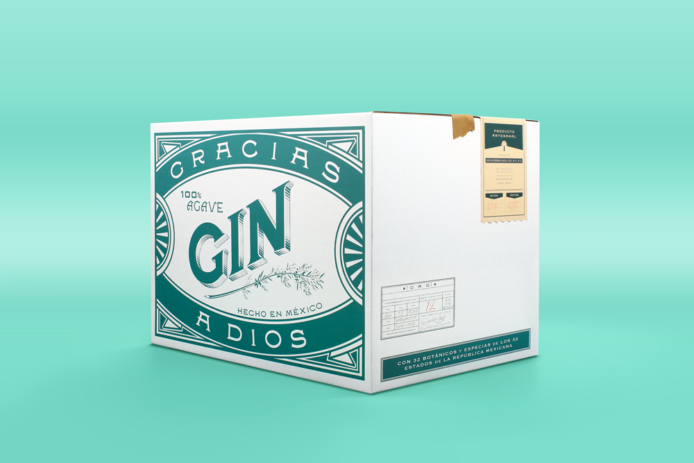
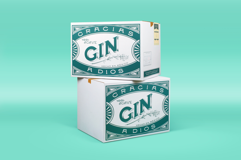
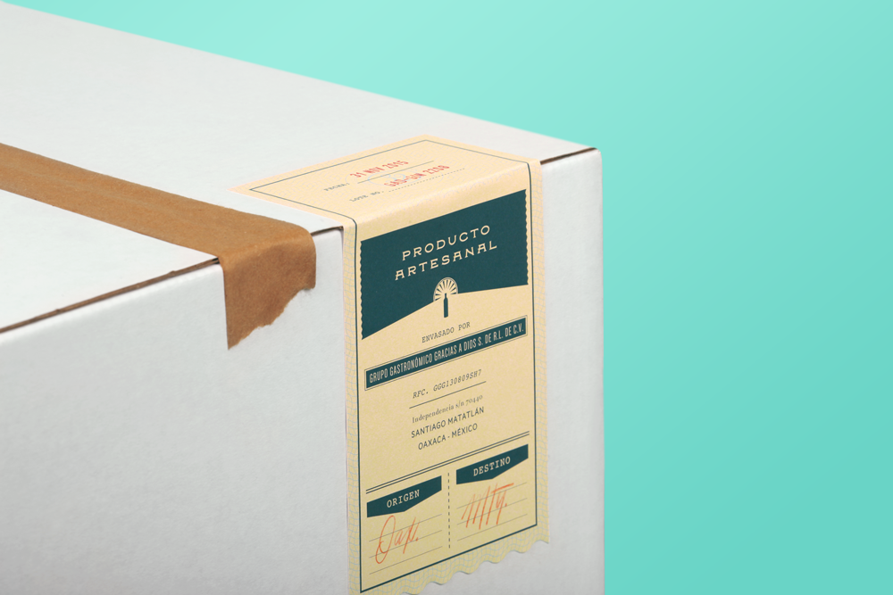
Box for a set of 12 bottles with two labels; one with the artisan in charge notes, and the other one with a summary of the shipping destination
The design brought a unique value of differentiation, giving something spectacular and unordinary for a consumer seeking for new choices, speaking a language of elegance as well as a contemporary laid-back mexican pop culture. The label perform giving the consumer the knowing of how this will taste also before they've taste it, and after we have perform at our best all the previous demands, we can guaranteed that Gracias a Dios Gin, will conquer the most refined tastes.

Business card front side
Business card back side


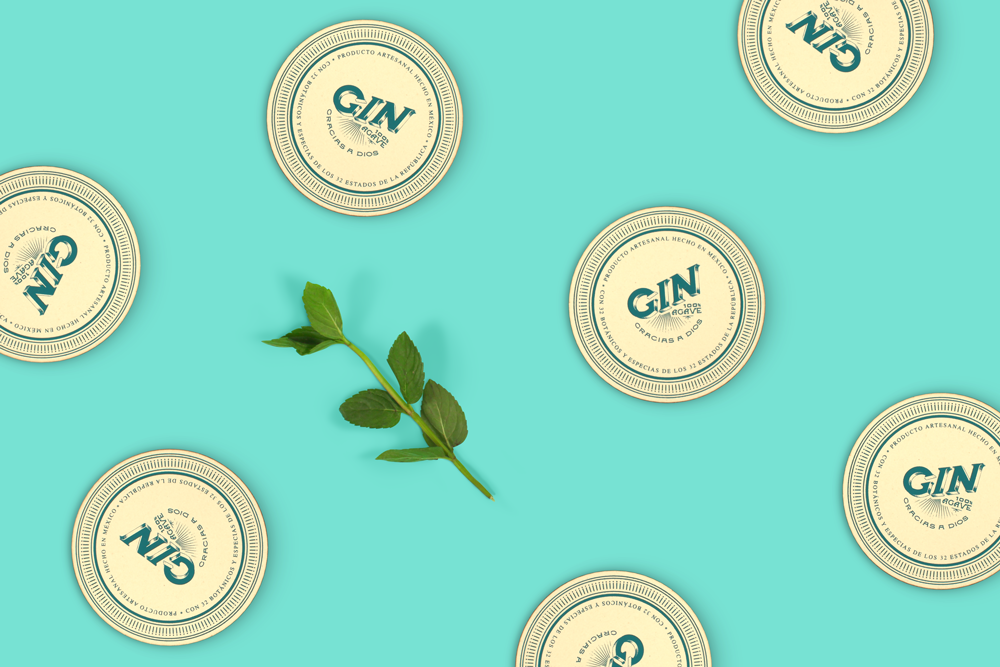
Coasters


