


TETRIS CLUB —
SEASON 2012/2013
Tetris is an independent music club located in Trieste (Italy). Staffed only by volunteer workers, its statute is based on 'non profit' and 'do it yourself (DIY)' mentality. Being myself a long time goer of the club I was involved (together with Giovanni De Flego, Michele Zazzara and Marco Boncompagno + music photographer Chiara Gulin) in the creation of the 2012/2013 season's identity. We decided to design with an imaginary that plays with a soft and smart reinterpretation of the club mark/logo (a T composed by four squares). We made some 3D perspectives of that mark, making it a kind of brick, similar to those found in the homonymous game 'Tetris'. Later we used - in a game of 'different perspectives' - this 3D mark as a texture element. A texture that is not symmetrical, it looks pretty confused and punky, which reflects both the DIY spirit of the club and the melting pot of musical styles proposed in the various events through the season (going from black metal to hipster indie pop). The Tetris Game needs strictness to be played well; Tetris Club needs genre confusion to work well.

To empathise and highlight the events headliners, artists, dates and informations we have choosen a shiny yellow color - proposed with some hatches - used as a covering over the texture in black and white. A signal color that contrasts with the dark environment inside the room.
The typography used is simply and clear: a slender combination of a western font for the heading and of a typewriter font for the text. All the promotional materials (with the exception of the single gig posters) were printed in one color, mostly on low budget digital printers or photocopier - on white or yellow coloured natural papers. The rough technique of 'pasting over' different sheets made it merely and deliberately 'rude'.
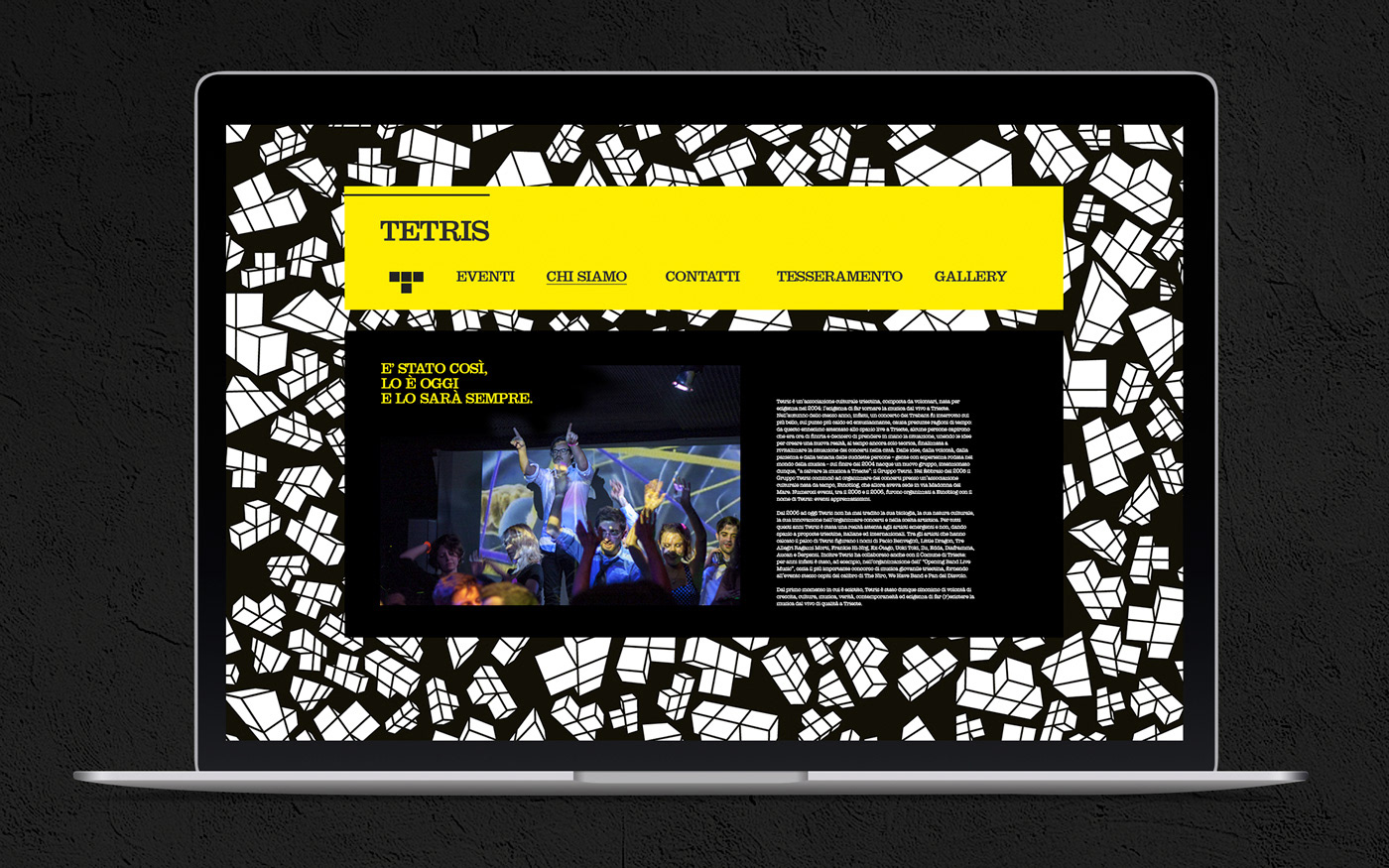
With this concept we designed the main A0 calendar (which showed monthly all the events of the club), a monthly distribuited A4 leaflet, an A7 flyer, the members cards, shoppers and website.
The texture —


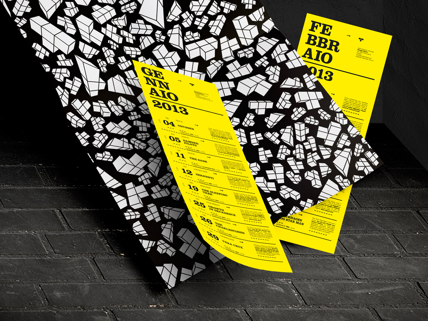
The calendar —

Printed matter —


Website —


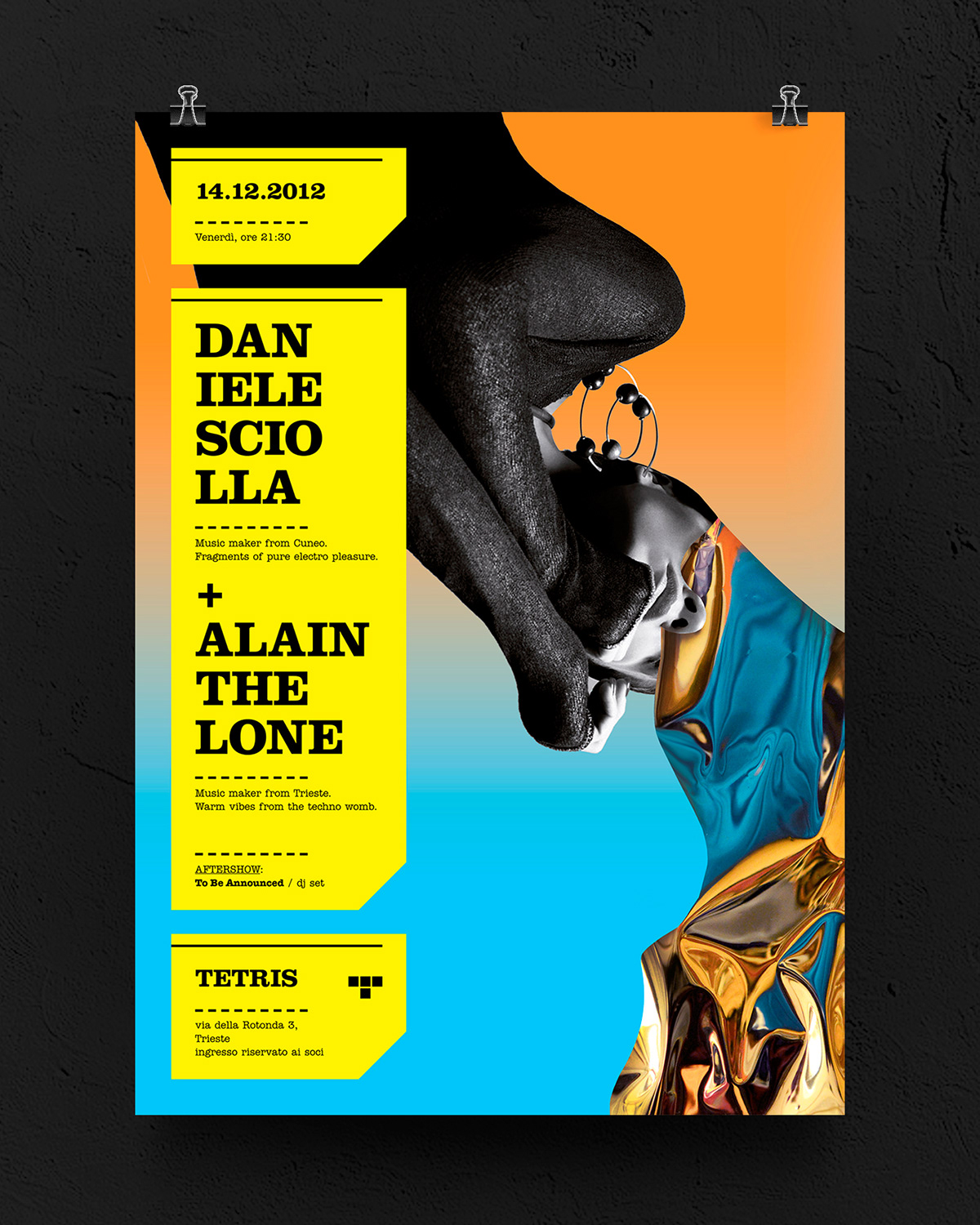
The singularity
of the single event posters —
of the single event posters —


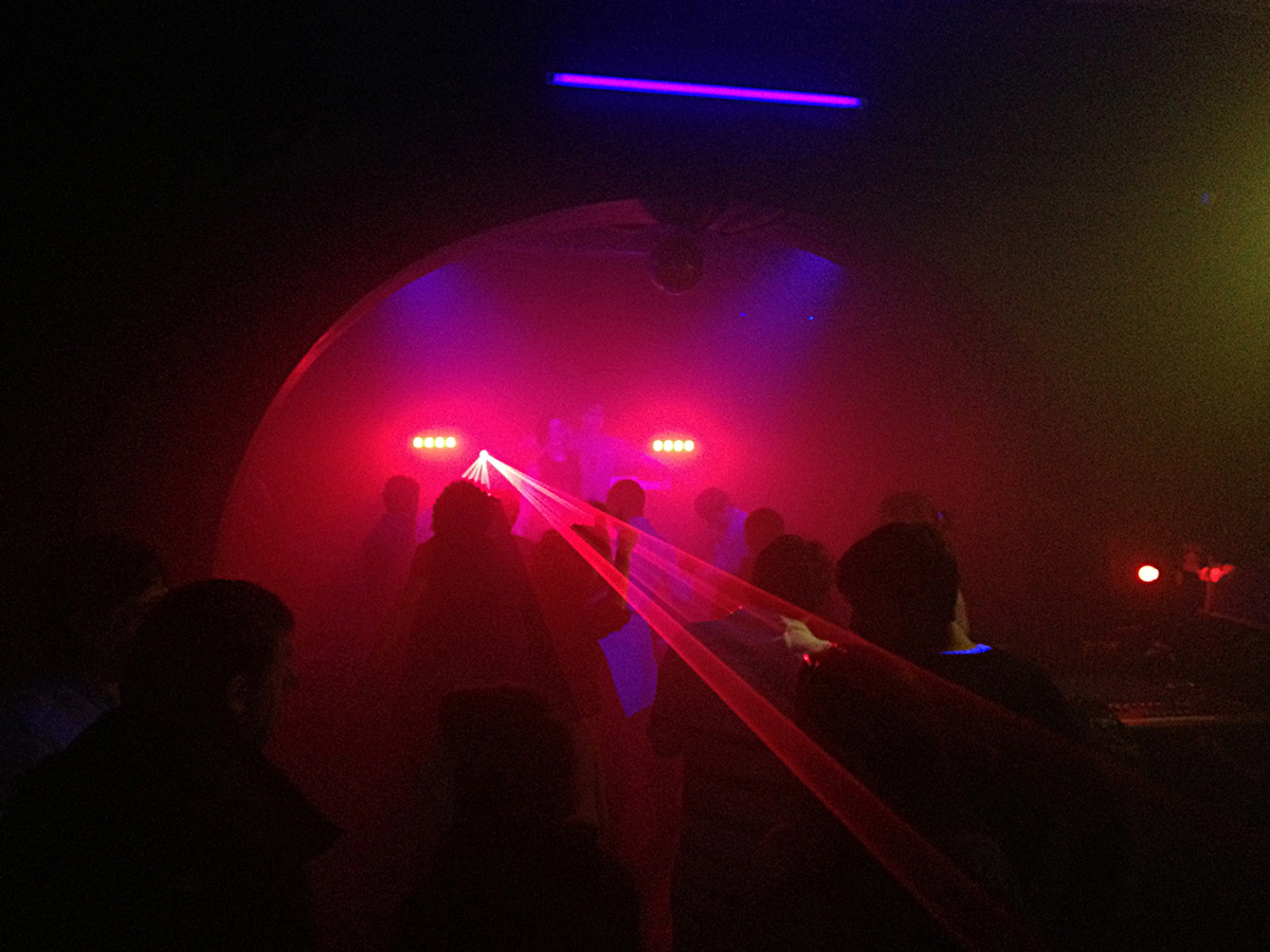
The location —
Notes:
There was no remuneration for these works, all the stuff shown here is non commercial. The original images used for the gig posters are of Kate Moss (The Academy), Victoria Adams (Daniele Sciolla), Gisele Bundchen (Stoner Kebab), Anja Rubik (The Sleeping Tree), Candice Swanepoel (The Charlestones), Naomi Campbell (Platonick Dive), Keira Knightley (Cleo-T), Bar Refaeli (Rorcal), Karlie Kloss (Sus Dungo), Alexa Chung (Alkene), Heidi Klum (Welcome Coffee), Sheila Marquez (Call Me Kat). The retouching made on these model’s pictures was intended as a homage, no profit earned by me from their processing. All the other photos in this presentation are property of Gruppo Tetris and some are made by Chiara Gulin.


