WHY RE-BRAND THE THUNDER?
The Oklahoma City Thunder primary logo is one of the most hated logos in professional sports. Fans have given the team the nickname "Team Doritos" in reference to the styling of the logo. While general public opinion is not often the right reason to re-work a team identity, in this case, I believe the fans have a point.
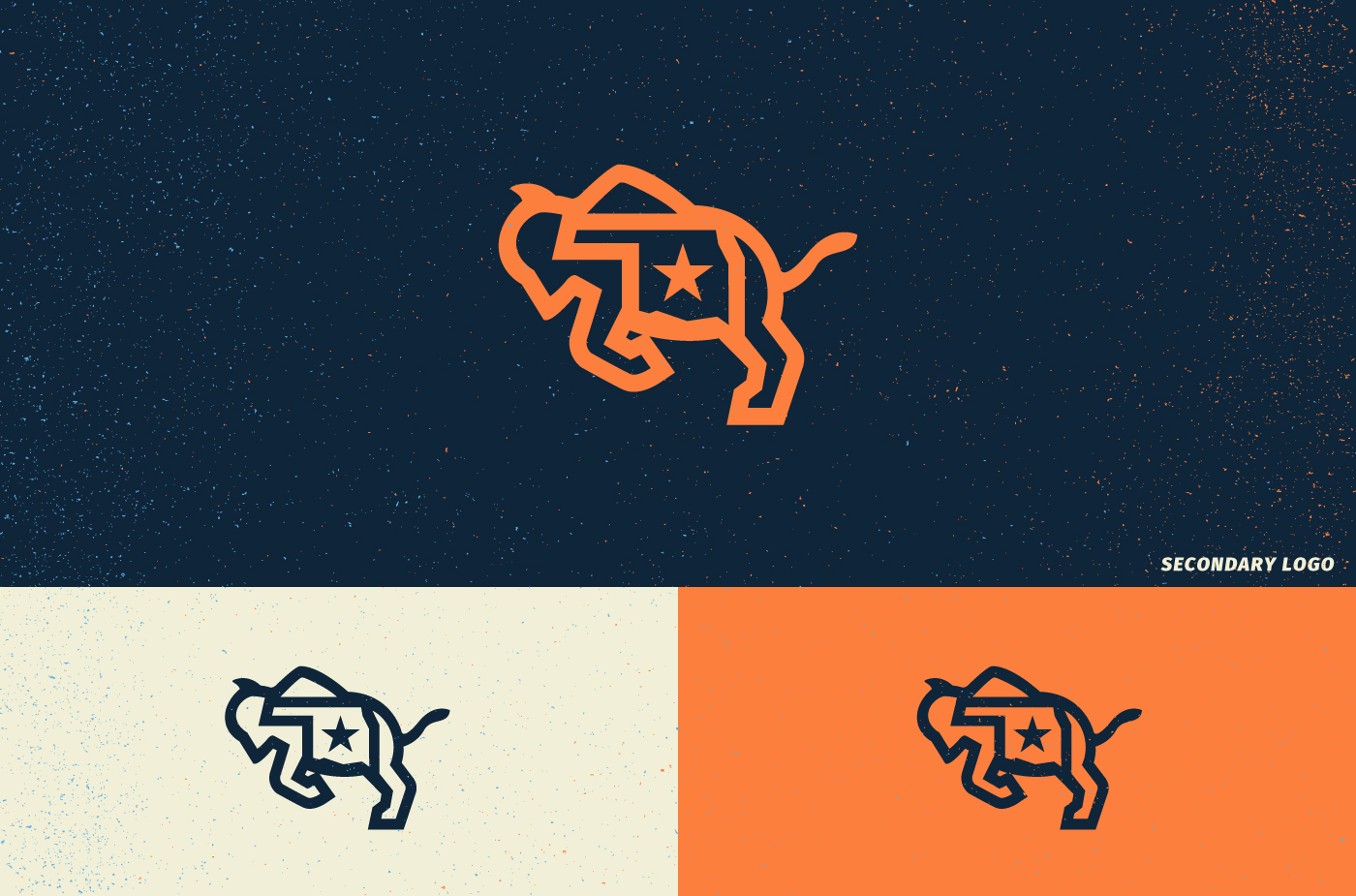
The team has said they didn't want to commit visually to storms or rampaging bison for the logo, didn't want to have their players represented by an animal, and "We're open to modernizing the logo, but we don't have an appetite to overhaul it."
I believe this is the wrong way to approach the Thunder's team identity.
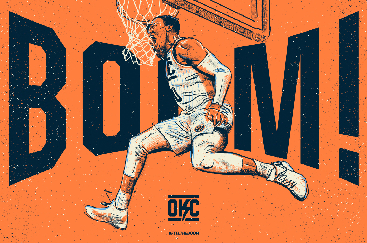
The Thunder's design direction was a roadmap to failure. Sports identities are part entertainment and are meant to invoke a sense of pride and delight in the fanbase. This logo should be something fans want to wear on their chest, stick on their cars, and even tattoo on their bodies. The team has purposefully avoided the visual connotations of their name and created a generic, lifeless, poorly executed identity. In their attempt to avoid what they might consider cliche', have ended up with a meaningless collage of contrived graphic elements.
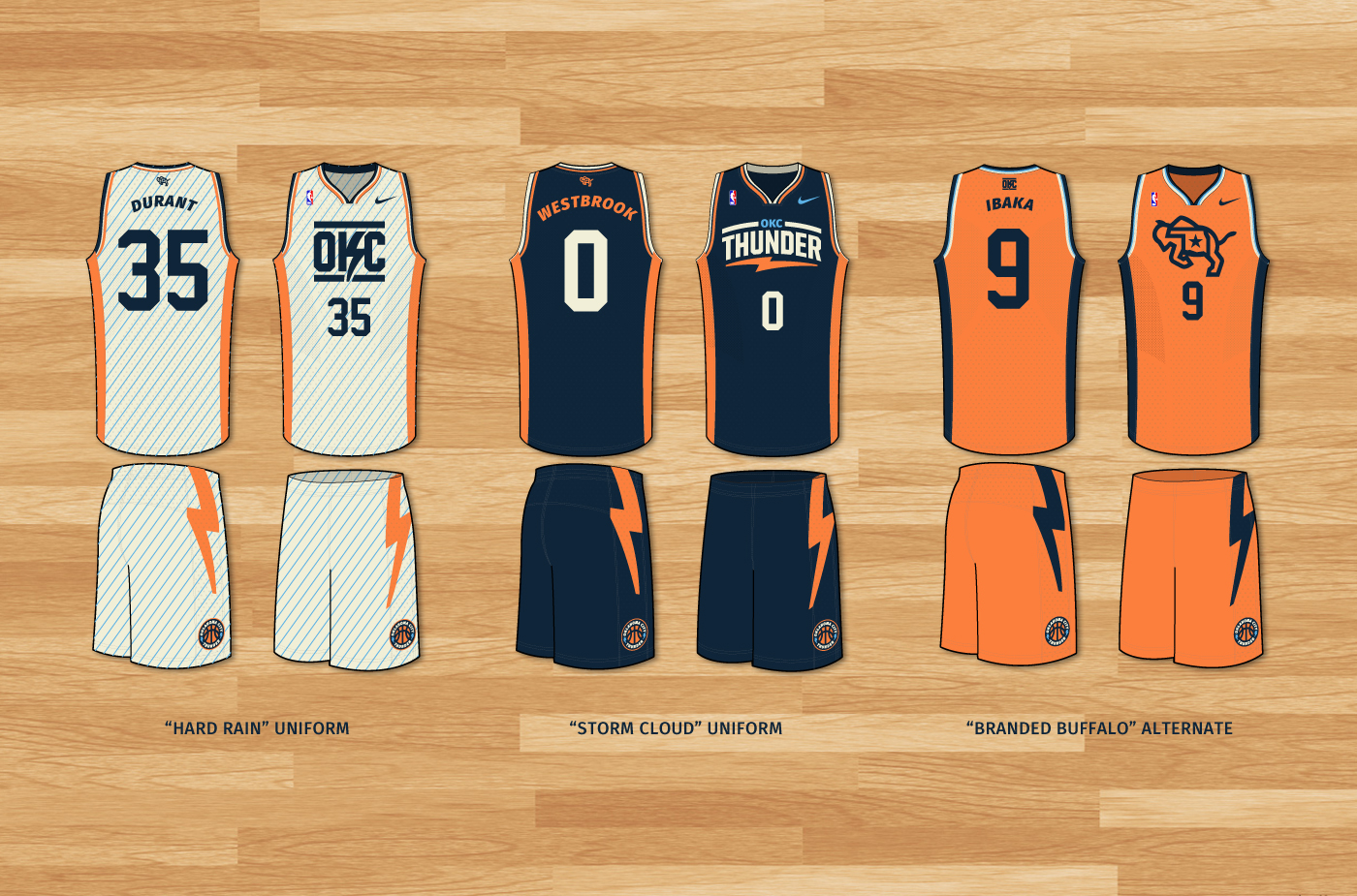
UNIFORM TEMPLATE BY BRANDON BROOKS