
Based in New Delhi, Shuddha is a new venture which aims to encourage a wholesome and healthy living through their foods.
Currently Shuddha is in the process of launching vegan juices, nut milks and some smoothies.
Currently Shuddha is in the process of launching vegan juices, nut milks and some smoothies.
They hope to expand to a range of foods like butters, granola mixes, yogurts, salads, tonics and elixirs over time.
My graphic design graduation project at NID, sponsored by Green Goose Design involved developing the
branding and package graphics for Shuddha products.

We started by reading into the brief and identifying the main keywords.
Raw, Vegan, Natural, Healthy, Lifestyle, Local, Green
Our understanding of the brand evolved over time.

Brainstorm.
I thought of various visual routes we could work with, raw, earthy forms, explored bilingual options, thought of representing a healthy lifestyle through the identity.

We decided to push for a devanagri logo, because the brand is called Shuddha, a hindi word which means pure.
Shuddha is an Indian brand catering to a local (currently Delhi) Indian audience,
and the very fact that the name it self is in Hindi, drove us to explore Devanagri letterforms.
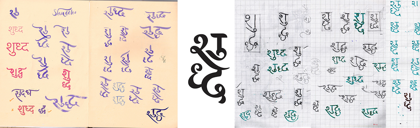
After various rounds of iteration, and using various tools, we narrowed down to an elegant brush script logo.
It was at this point this point that we realised that our logo was not communicating two important keywords that we had overlooked.
Our logo was looking too traditional and not modern and high end.
It was at this point this point that we realised that our logo was not communicating two important keywords that we had overlooked.
Our logo was looking too traditional and not modern and high end.
It also did not match with the visual language we had been developing parallely (shown below)
To communicate that, and to convince our clients that hindi can be cool too, we started deconstructing the logo.
To communicate that, and to convince our clients that hindi can be cool too, we started deconstructing the logo.


The final logo
Teal was chosen as the primary brand colour to signify health and wellness.

Next, I started working on the visual laguage which would accompany the logo.
We decide to go ahead with the idea of communicating the importance of a healthy lifestyle.
I tried to emphasise the importance and impact of the food that we consume everday on our lives
. Using this illustration as a base idea, I stared refining the forms to match the monolinear logo and make them scaleable, on Illustrator.
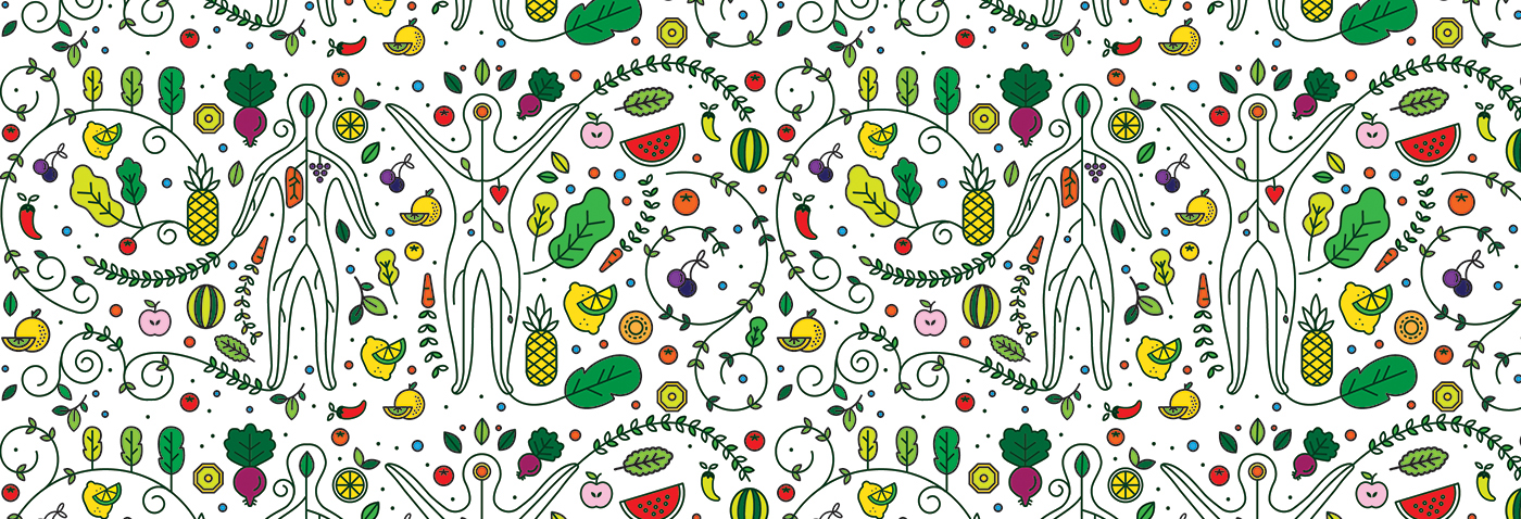

Stages of refinement. We took inspiration from yoga postures for the human forms.
We realised that the pattern was looking to heavy and cluttered, so we broke down the illustration to individual units.

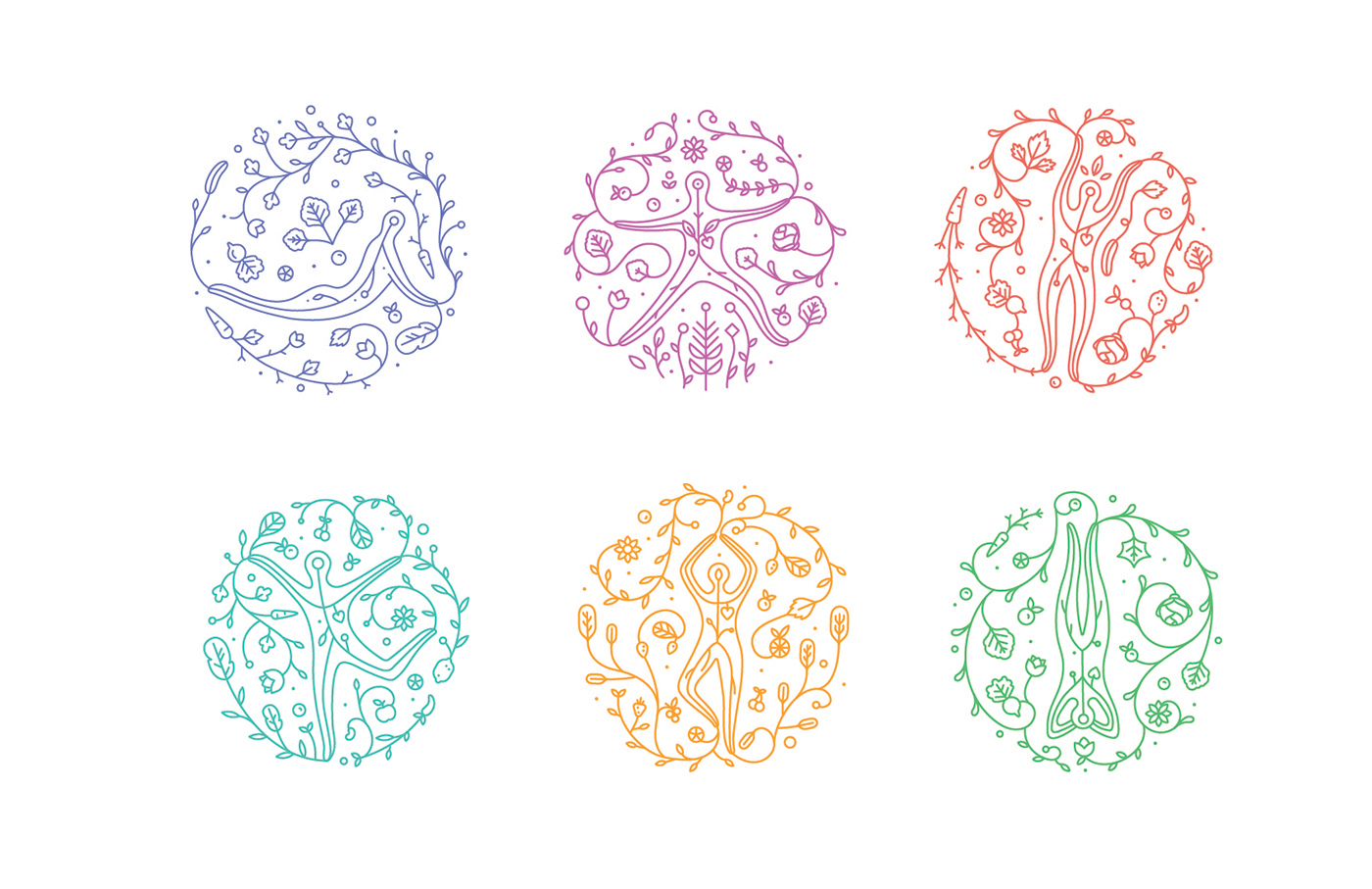
The final units. Each illustrative unit is for a different attribute of
Energy, Relaxation, Weight Loss, Immunity, Strength and Detoxification;
which is how the juices are planned to be.
Each unit is inpsired a yoga posture for that very attribute.
Even the colour for each unit has been selected on the basis of the principles of colour therapy.

Inky blue for weight loss, purple-lavender for relaxation, red for energy, teal for immunity, yellow-orange for strength, green for detoxification.
We decided to use Teal as the primary brand colour because it often used to signify health and wellness,
and it also lies between the cool and warm range of the selected colour palette.

Sampling the ingredients

The juice bottles.
We proposed glass bottles to reinforce the idea of purity.

The milk bottles

The information architecture

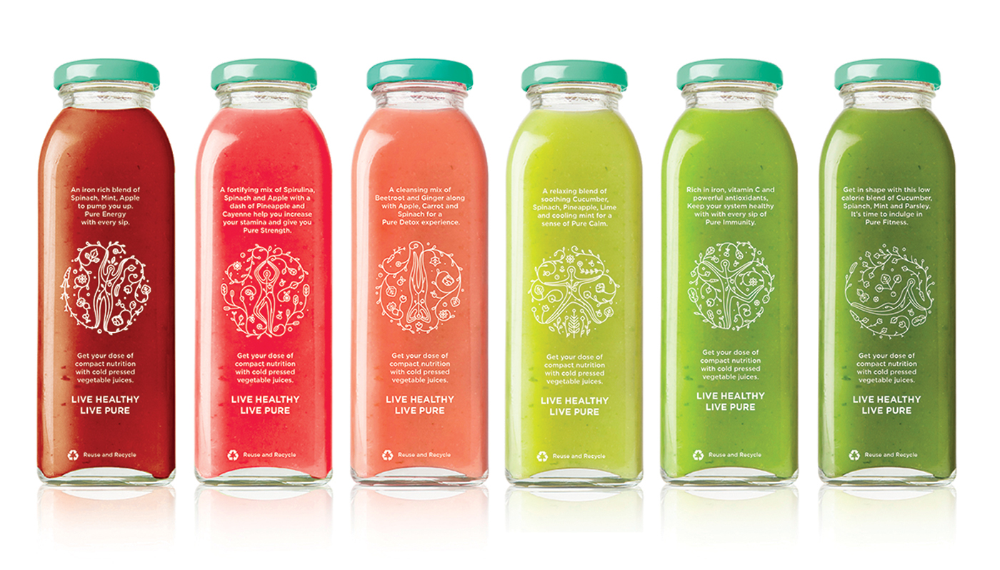
The range of Shuddha juices
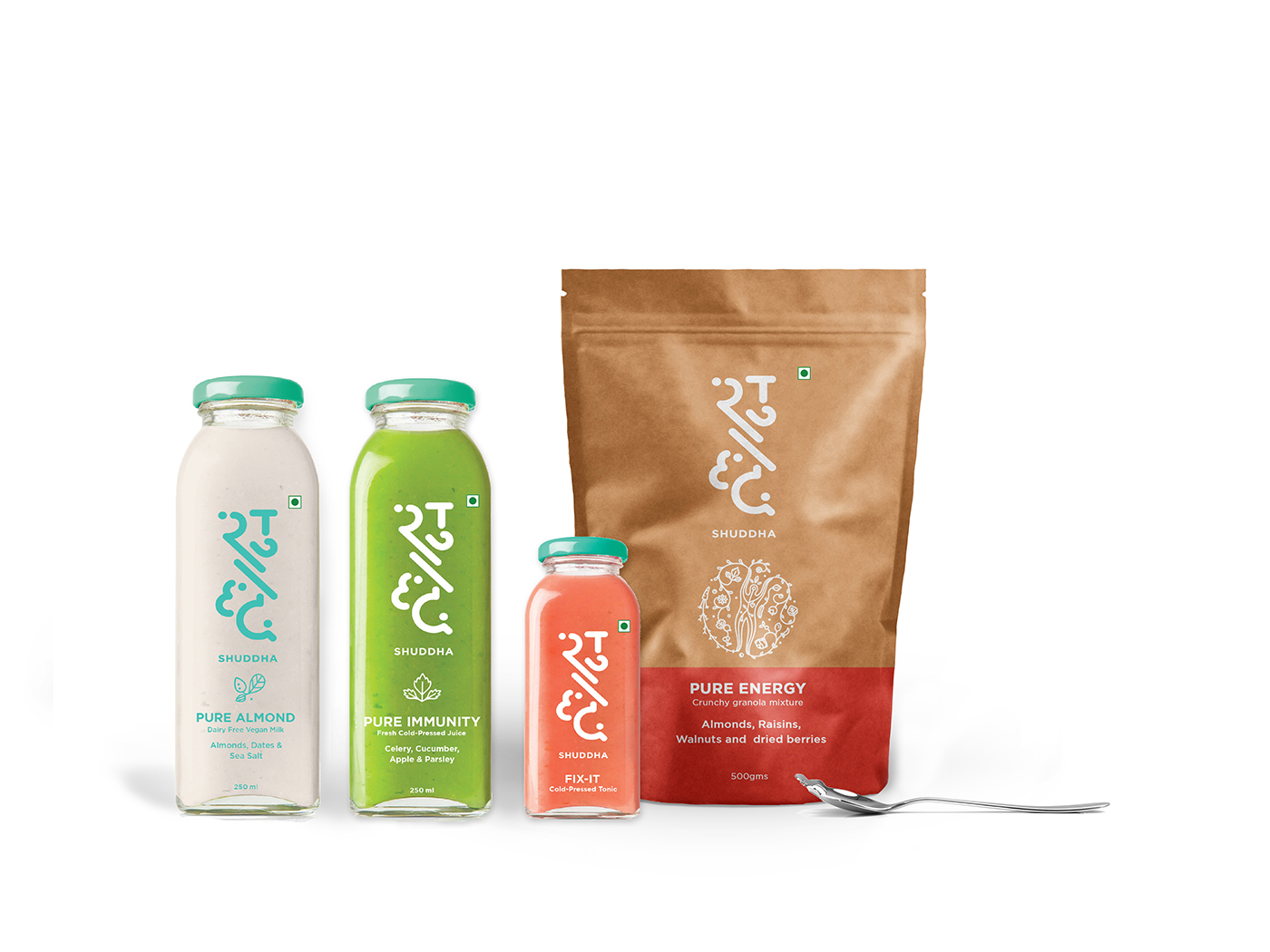
The full range of products

Badges as promotional material

Cloth bags for the products
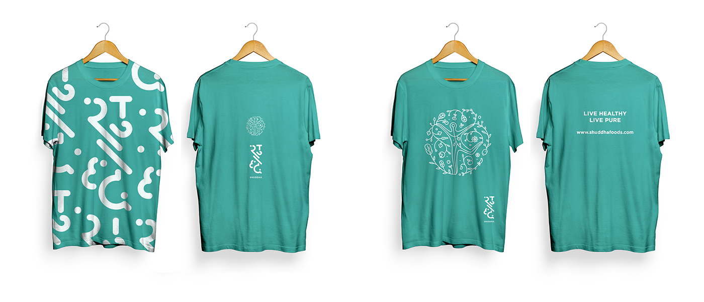
Promotional shirts and Employee shirts


Wrought iron wall mountings for retail spaces

Posts for Instagram

Facebook cover

Read the entire branding process here.
This project was guided by Mr. Tarun Deep Girdher, Sr. Graphic Design faculty, NID.
I was also mentored by Mr. Sudeep Chaudhuri, Creative Director, Green Goose Design.
Credits to the entire team at GGD; VR Mukund, Prateek Bhargava, Sakshi Babbar, Vinay Gupta, Bhagirath Vagamshi and Jasvinder Singh.


