––––
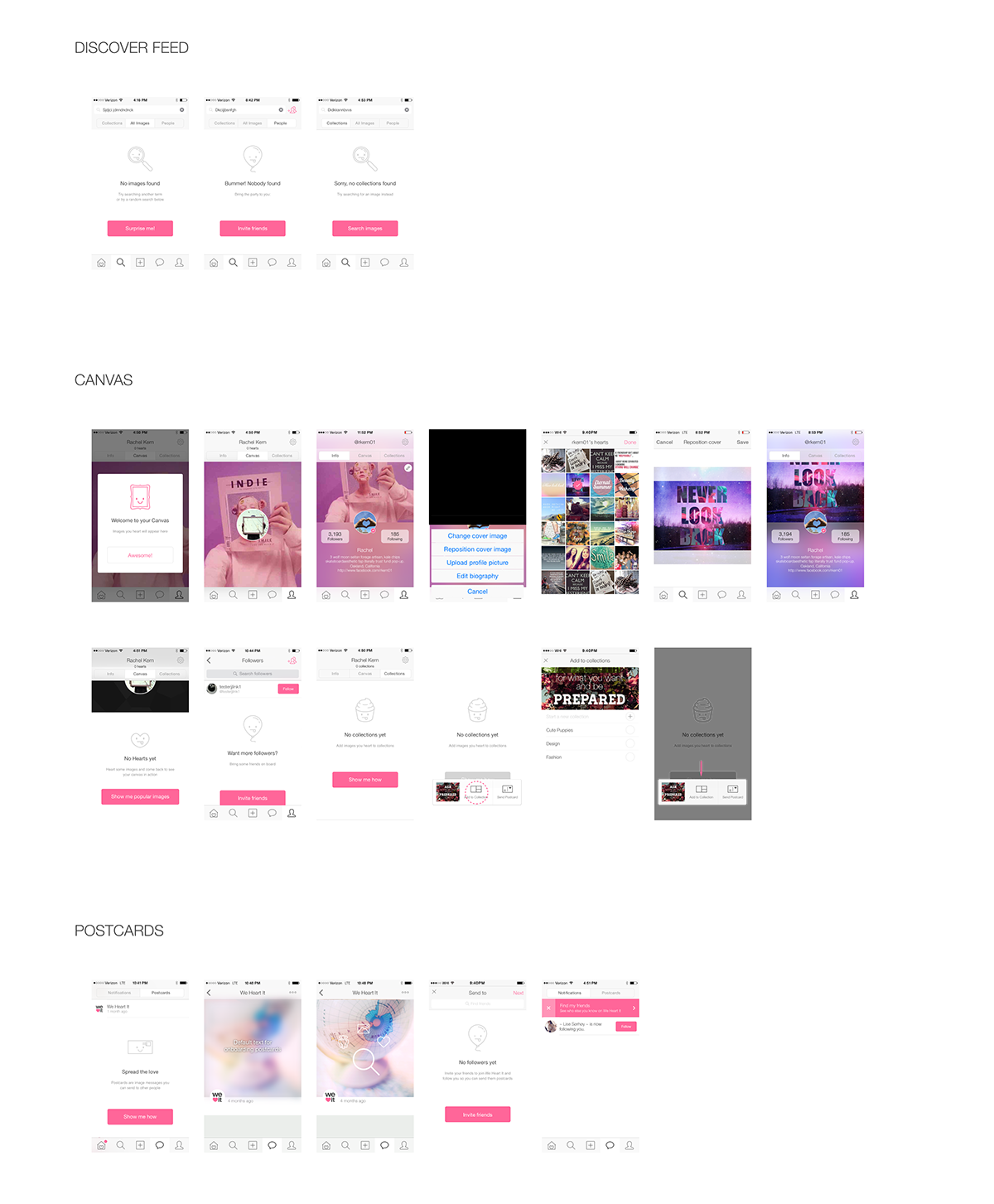
Problem:
As a user, dead-end screens are a bummer, and it leaves me feeling stuck.
Process:
1. Created a directory of all possible dead-ends and empty states.
Process:
1. Created a directory of all possible dead-ends and empty states.
2. Worked with marketing to create a series of CTA's that were playful, informative, and relevant to each screen they pertained to.
3. Sketched/mocked user flows to show the results of each action
4. Curated a series of playful icons to complement the message and create a more visually engaging experience.
5. Ensured designs corresponded with brand voice and guidelines.
Solution:
Engaging designs that allow the user to move seamlessly through the app, while suggesting actions which would help the user avert similar instances in the future.
Engaging designs that allow the user to move seamlessly through the app, while suggesting actions which would help the user avert similar instances in the future.