Brand design to promote the transport services offered by Antonio Mejías as a lorry driver of marble stone in Spain.
The aim of this project is to combine in only one visual concept the three main elements of this service: "transport", "marble" and "Mejías" (lorry driver surname).

BRAND DESIGN · Mejías Transportes
As a result, I have designed a minimalist and modern design which is immediately related to transport services because of the dynamism expressed by "transportistas" (in italics), but also by the arrow which comes from the marble stone symbol, placed on the right side of the brand. The lorry driver is clearly identified by the surname "MEJIAS", which is shown in capital letters in order to stand out the importance of the driver. This relevance is also stressed by the color code. The blue tone is linked to male features and, at the same time, to the lorry driver position (traditionally associated as a male job). Over the background the brand in white recalls to one of the main elements of this brand: the marble stone.
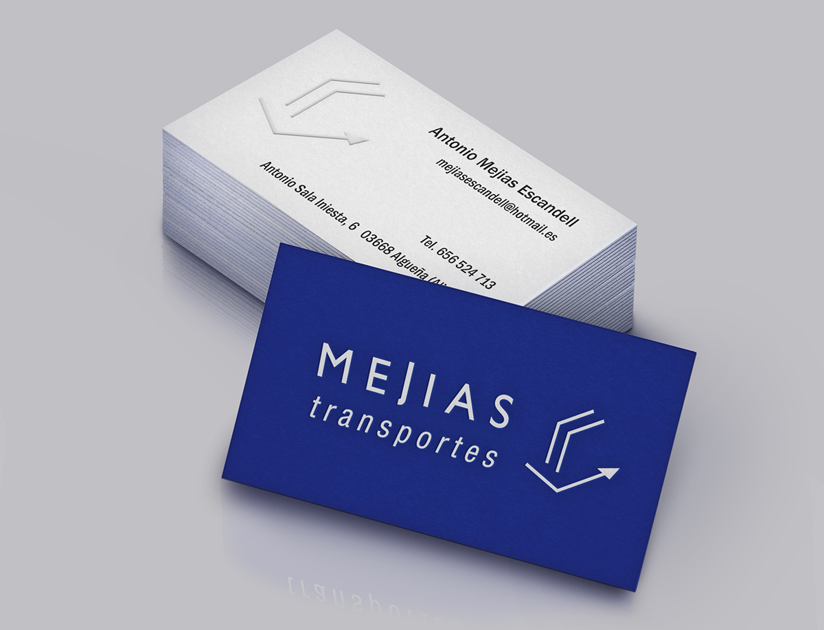
Business Card Design

Brand Applications: Uniform

Brand Applications: Stationery

Brand Applications: vinyls to be applied on the lorry


