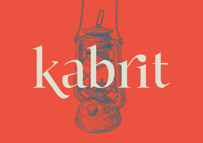
The below typeface was designed during the Type@Paris program in June 2015.
It is not finalized and still needs to go through the kerning process to say the least.
Kabrit is a serif typeface designed for text. The typeface evolved from calligraphic drawings
based on the humanist model and aims to retain the angle of the broad nib tool while still
incorporating modern typographic features, giving it both a traditional and a contemporary persona.
This is translated throughout the letters through harsh diagonal shoulders and finials, cornered
counters and unilateral serifs. Kabrit was then developed to include a Bold and a Display with highly
contrasted letters that can be used for titles, quotes, headlines, etc.
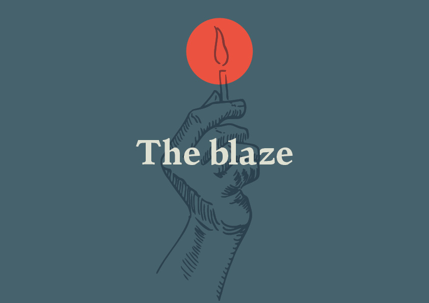
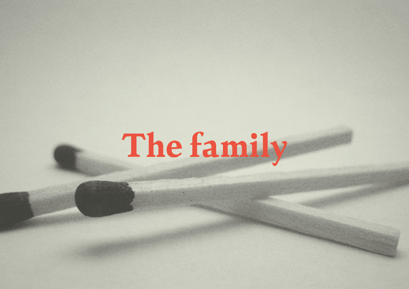
I chose to name the typeface “Kabrit” which is Arabic for “Matches” because it represents a new
beginning, it is the first spark on the journey to designing typefaces. The decision to base the
typeface on a calligraphic model comes from the fact that I intend to work on Arabic typefaces
at a later stage so I was interested in learning that process in order to later apply it on Arabic type design.