Logo Love
Over the years, I have developed a knack (and love) for identity design. Having designed an untold number of logos, it's impossible to show them all, but here's a glance at a few of my favorites... Enjoy!
Over the years, I have developed a knack (and love) for identity design. Having designed an untold number of logos, it's impossible to show them all, but here's a glance at a few of my favorites... Enjoy!
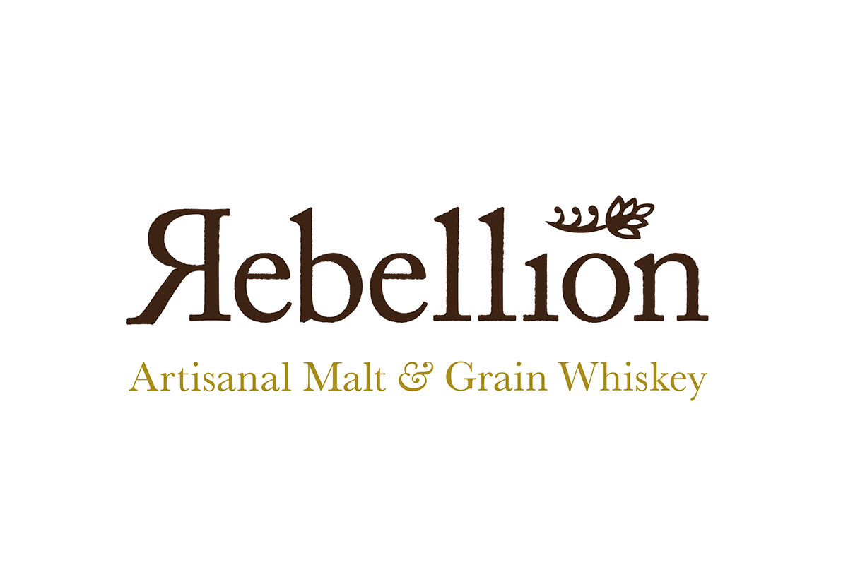
REBELLION ARTISINAL MALT & GRAIN WHISKEY
Every now and again a logo will sort of just design itself. In this case, the "R" practically asked me to flip it over. And, like the famed whiskey rebellion of 1796...the rest is history.
Every now and again a logo will sort of just design itself. In this case, the "R" practically asked me to flip it over. And, like the famed whiskey rebellion of 1796...the rest is history.

LINK TO WELLNESS
The lotus is a common image for wellness, balance, and healing, making it good fit for client Debbie Hark's therapeutic massage practice. But in taking inspiration from the word "link," the mark takes on a unique graphic quality, which balances nicely against the warmth of the type.
The lotus is a common image for wellness, balance, and healing, making it good fit for client Debbie Hark's therapeutic massage practice. But in taking inspiration from the word "link," the mark takes on a unique graphic quality, which balances nicely against the warmth of the type.
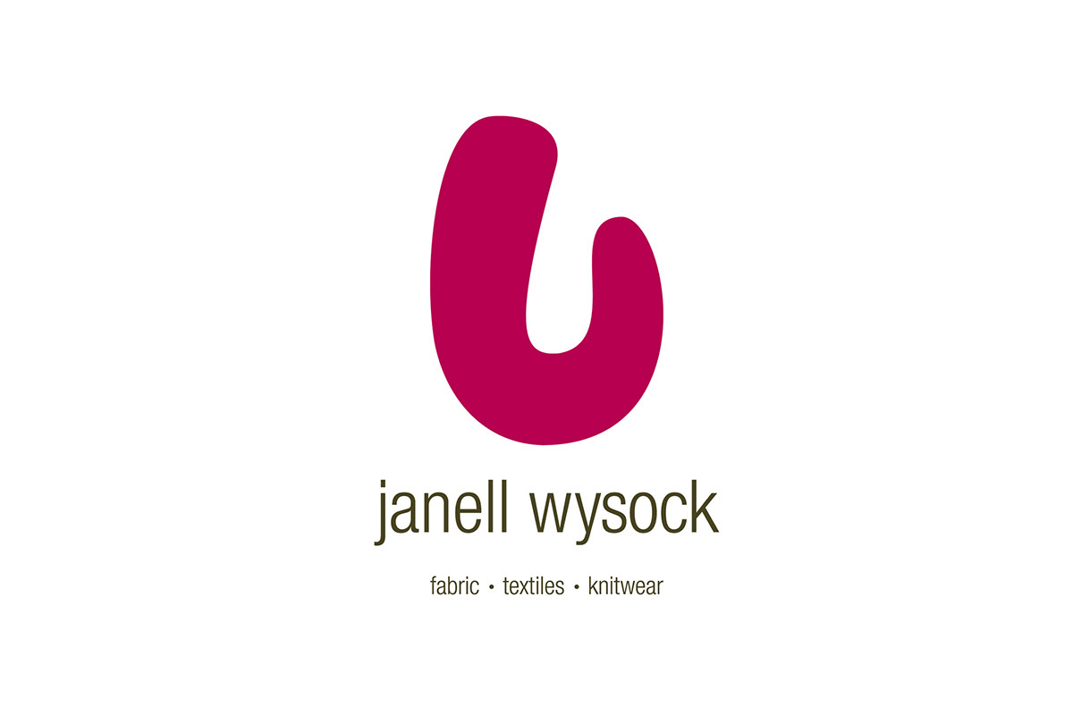
JANELL WYSOCK TEXTILES
This mark is an abstract, graphic representation of the unique weaving styleclient Janell Wysock employs to create many of her signature hand-woven works of art. It captures the gesture of her hands as she works and, like Janell, it makes a bold statement.
(Designed with Lisa A. May at Bliss & White)
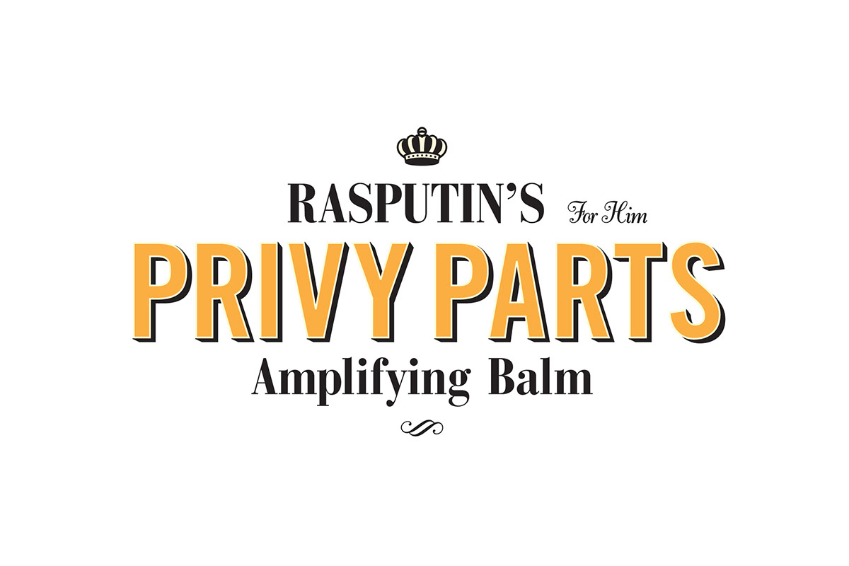
RASPUTIN'S PRIVY PARTS AMPLIFYING BALM For Him!
A parody of today's marketing for erectile dysfunction pharmaceuticals and the attempt by their makers to be nuanced and clever. The logo is over the top with plenty of opportunity to read into the details.
A parody of today's marketing for erectile dysfunction pharmaceuticals and the attempt by their makers to be nuanced and clever. The logo is over the top with plenty of opportunity to read into the details.
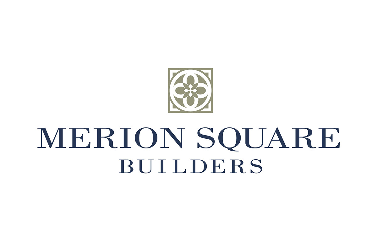
MERION SQUARE BUILDERS
This design draws inspiration from the rosette; an architectural element that alludes to fine craftsmanship and affluence. It's treated in a minimal yet bold style, to bridge the client’s traditional ideals with their contemporary philosophies.
(Designed with Lisa A. May at Bliss & White)
This design draws inspiration from the rosette; an architectural element that alludes to fine craftsmanship and affluence. It's treated in a minimal yet bold style, to bridge the client’s traditional ideals with their contemporary philosophies.
(Designed with Lisa A. May at Bliss & White)
SOAPTOPIA DOG GROOMING SUPPLY
The corporate mantra reads: "In the real world, dogs are messy. In Soaptopia, dogs are spotless." This pooch is so clean, you can see this mantra reflected perfectly in him!
The corporate mantra reads: "In the real world, dogs are messy. In Soaptopia, dogs are spotless." This pooch is so clean, you can see this mantra reflected perfectly in him!
CLINTEXT, LLC
This logo was designed for a medical publications company. The request for a bold, colorful, and modern mark that would appeal to their scientifically-oriented clientele, was achieved with the clever play on negative space and counter form.
This logo was designed for a medical publications company. The request for a bold, colorful, and modern mark that would appeal to their scientifically-oriented clientele, was achieved with the clever play on negative space and counter form.
HALFMOON VALLEY BREWERS CO-OP
This logo is rather literal with its use of bold color, simple shapes, and a glowing crescent moon, but yet is still sophisticated and interesting.
This logo is rather literal with its use of bold color, simple shapes, and a glowing crescent moon, but yet is still sophisticated and interesting.

BERNARD KATZ GLASS
This logo contrasts the hot, dynamic process of the sculpting process, with the cool, fragile
final product.
(Designed with Lisa A. May at Bliss & White)
This logo contrasts the hot, dynamic process of the sculpting process, with the cool, fragile
final product.
(Designed with Lisa A. May at Bliss & White)

THE GREAT AMERICAN SEED CO.
This garden supply store provides a blend of utilitarian goods and tools, and eclectic finds for the inside and outside of the home. The vintage modern design channels this enchanting mix.
This garden supply store provides a blend of utilitarian goods and tools, and eclectic finds for the inside and outside of the home. The vintage modern design channels this enchanting mix.
KALLARI COMMUNITY CO-OP
This logo is a refresh of an existing logo for an Amazonian co-op located in Ecuador. The mark is a graphic interpretation of a native symbol that represents the sun. Reduced to the most basic shape, it was then combined with custom type that is also simple and graphic.
This co-op is comprised of nearly 90 community farms in the Amazon basin who sustainably harvest and produce cocoa, coffee, and other crafts made from reclaimed rainforest hardwoods.
SACHA PREMIUM ORGANIC COCOA PRODUCTS
This wordmark was designed for Kallari's premium line of chocolate products. For brand unity, it uses the custom type created for Kallari, but is then combined with hand written type, which nods to the individual farmers who produce the premium products.
This wordmark was designed for Kallari's premium line of chocolate products. For brand unity, it uses the custom type created for Kallari, but is then combined with hand written type, which nods to the individual farmers who produce the premium products.
THE FLYING SCAZZINI SISTERS
This vintner produces a series of premium varietals all branded using the best of vintage circus. The Scazzini Sisters were a famous, high-flying trapeze act, which is cleverly depicted in the letter form.
This vintner produces a series of premium varietals all branded using the best of vintage circus. The Scazzini Sisters were a famous, high-flying trapeze act, which is cleverly depicted in the letter form.
FILIBUSTER: THE GAME OF MONEY, POLICY, AND INFLUENCE
I love creating my own letter forms! The word mark consists of five, custom drawn layers which were inspired by the type used on our US currency.
I love creating my own letter forms! The word mark consists of five, custom drawn layers which were inspired by the type used on our US currency.
DISCONNECT FOR A DAY
This logo was designed for a public awareness campaign that encourages us to unplug from our technology-obsessed lifestyles and spend some time in a more analog—and authentic—way of life. The message is simple: if you disconnect from all your gadgets (and gadget-driving habits), you will reconnect with all the other things in life that make you happy.
This logo was designed for a public awareness campaign that encourages us to unplug from our technology-obsessed lifestyles and spend some time in a more analog—and authentic—way of life. The message is simple: if you disconnect from all your gadgets (and gadget-driving habits), you will reconnect with all the other things in life that make you happy.
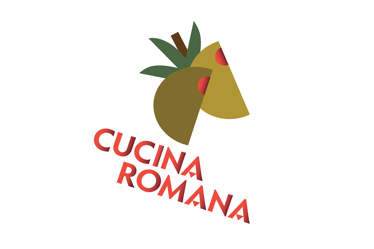
CUCINA ROMANA: ITALIAN EXTRA VIRGIN OLIVE OIL
Simple, graphic shapes combine with custom type to create a logo that references the Italian Futurism design movement—one of my favorites. I loved figuring out the threshold for how far I could reduce the amount of detail in the olives, but have them still read as olives!
Simple, graphic shapes combine with custom type to create a logo that references the Italian Futurism design movement—one of my favorites. I loved figuring out the threshold for how far I could reduce the amount of detail in the olives, but have them still read as olives!
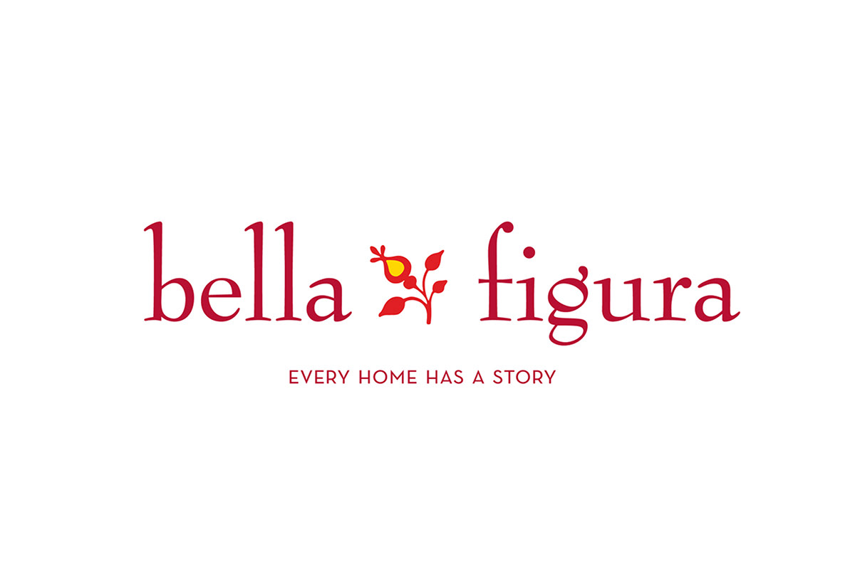
BELLA FIGURA INTERIOR DESIGN
Modified type and a whimsical dingbat are a simple, yet effective combination to convey the warmth that client Dana Loundas strives to bring out in every home.
Modified type and a whimsical dingbat are a simple, yet effective combination to convey the warmth that client Dana Loundas strives to bring out in every home.


