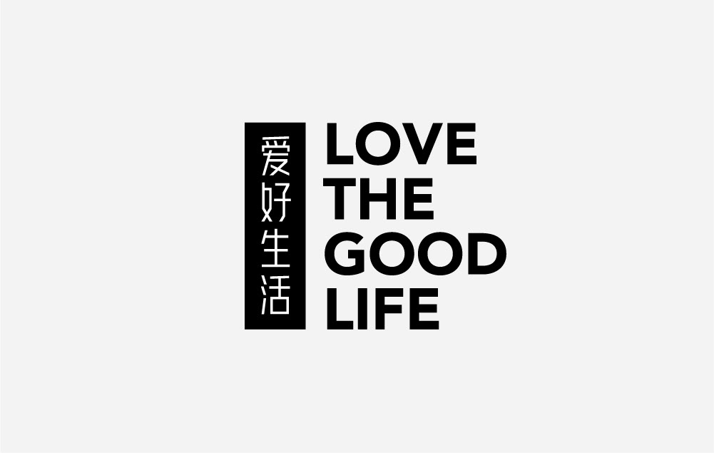
早安字体的雏形源于早安设计logo中的标准字,起初把它作为一个案例让同事们练习,了解汉字的设计方式,慢慢越练越多,就产生了把它做成一套完整字体的想法,并且坚持到了现在,完成了一千多个字包含500个常用字。
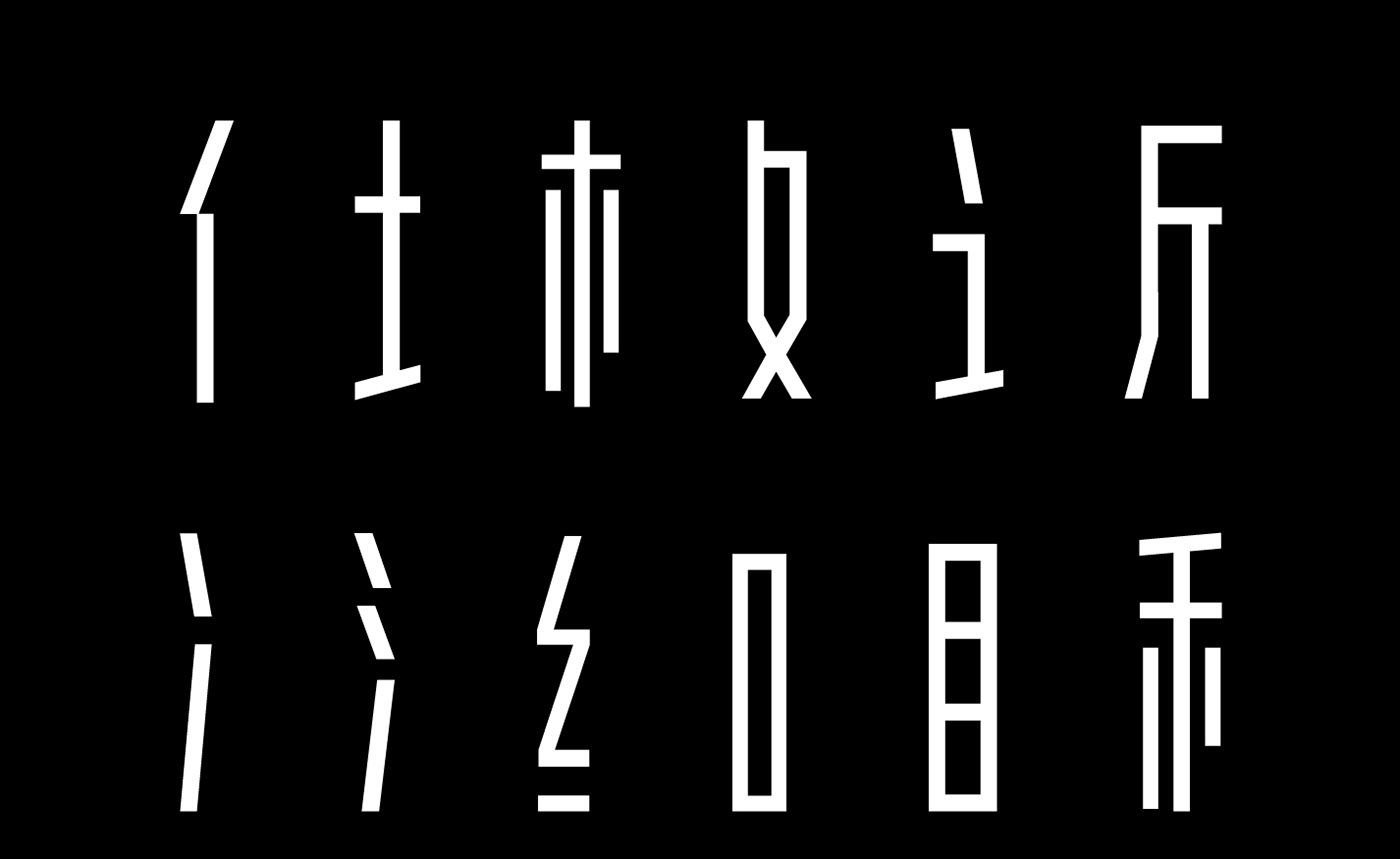
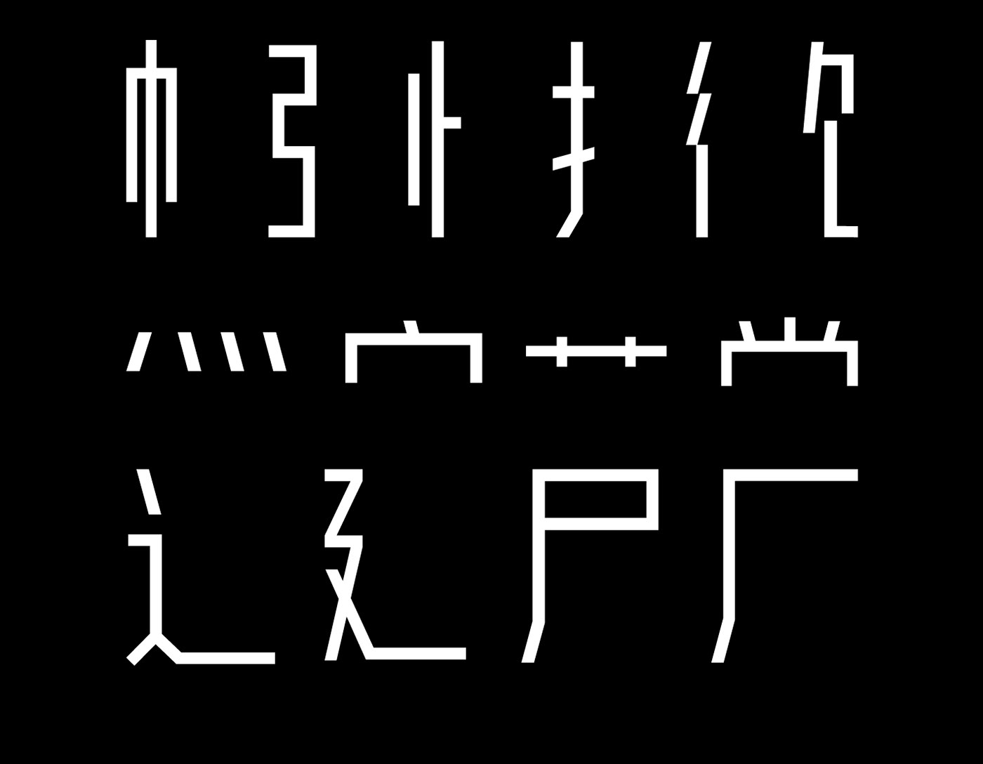
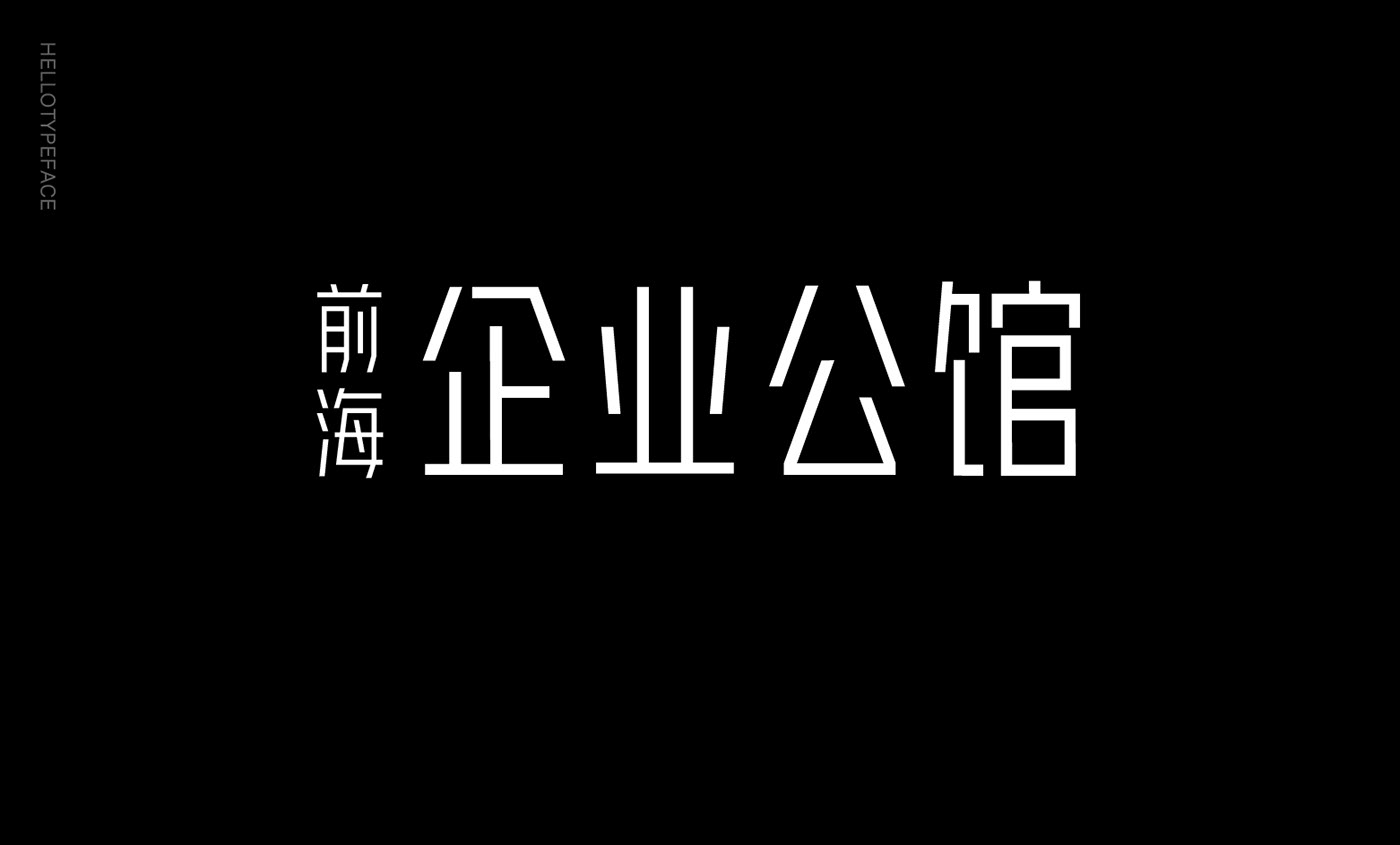
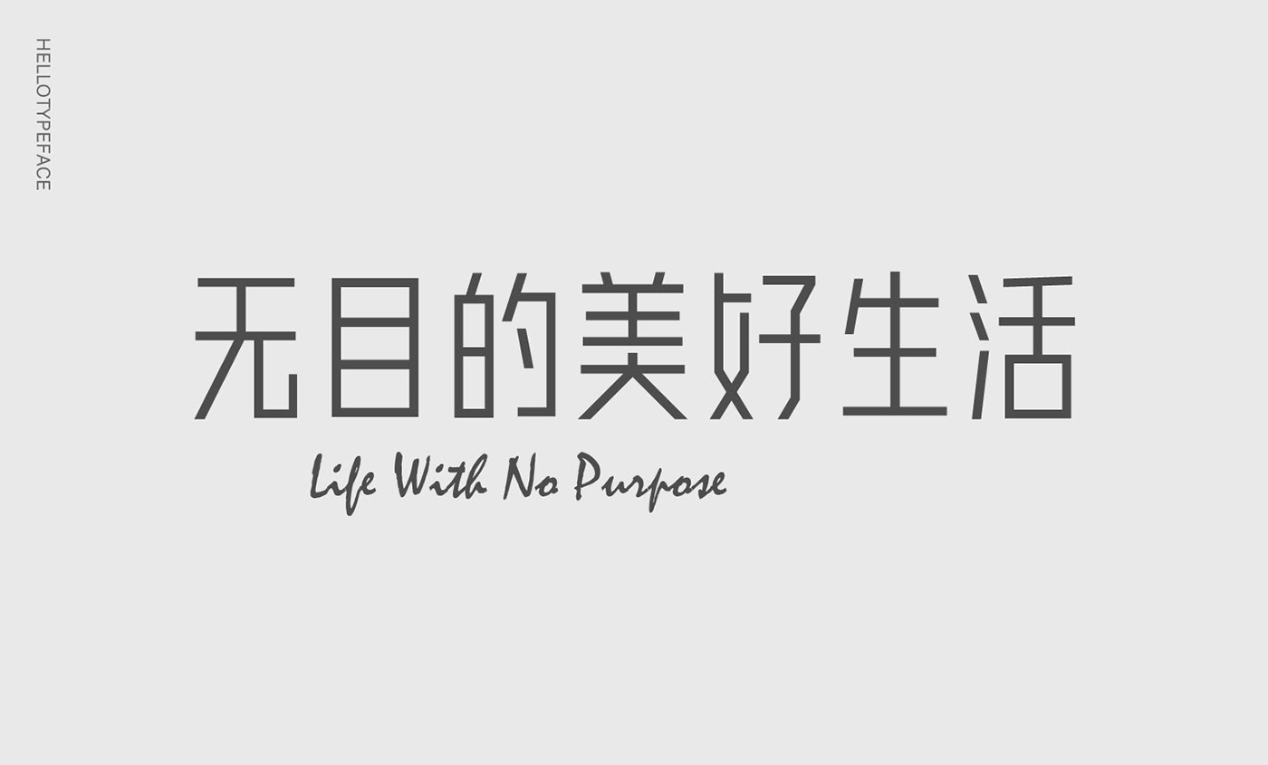
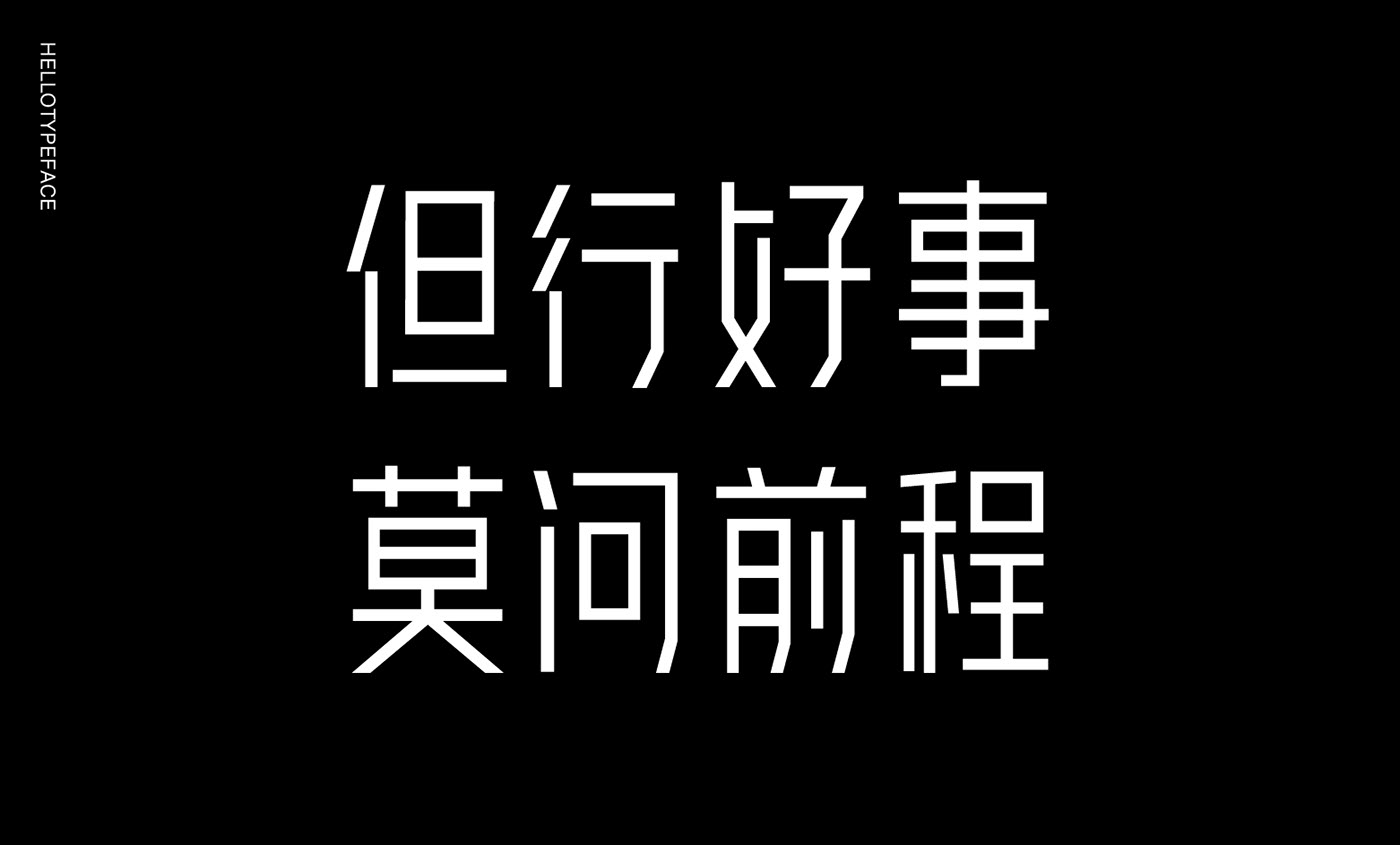
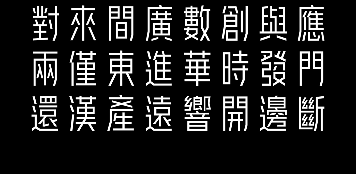
它是一款简洁干练的无衬线标题字体,区别于黑体,字体的笔画没有任何弧度,相对于目前所见的字体来说,字体的风格相对纯粹,采用等宽的笔画最简单的折角去塑造。
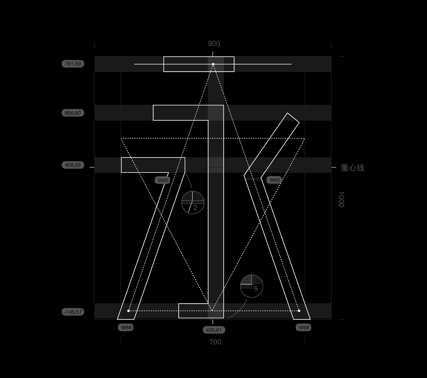
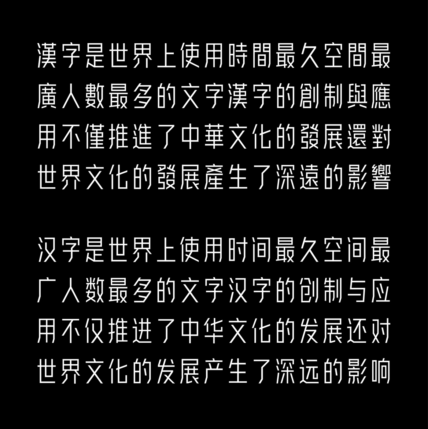
早安字体对于字体结构的处理要求苛刻,笔画的粗细、笔画的位置、斜线的角度等都要求非常严谨,看上去粗细都相同的字,它可能每个笔画粗细都会有1-5个单位的区别(单字为700x1000个单位),有些笔画的两端都会有粗细不同。
它是一款简洁干练的无衬线标题字体,区别于黑体,字体的笔画没有任何弧度,相对于目前所见的字体来说,字体的风格相对纯粹,采用等宽的笔画最简单的折角去塑造。
早安字体对于字体结构的处理要求苛刻,笔画的粗细、笔画的位置、斜线的角度等都要求非常严谨,看上去粗细都相同的字,它可能每个笔画粗细都会有1-5个单位的区别(单字为700x1000个单位),有些笔画的两端都会有粗细不同。
Hellotypeface sourced from the logotype of Hello-design agency. At first, i just want to lead my team to understand Chinese characters through the case only, out of the emotions of typeface design and Hello-design agency, an idea was be borned in one night, i decided to make the case a whole set of fonts. Of course, this is very difficult certainly, but since it has been on the road, why not go far away and look farther.
It is a serif sans-serif font for title. Different from boldfont, strokes without any radian, and it’s very pure, use the same width of strokes and directly angle to shape. So it’s very strict requirements of font size, strokes position and Inclined Angles. Compared to other font, the font looks so difficulty. looks like the same strokes, the width of each strokes it may have difference between 1-2 units (words for 700x1000 units), and even some of the words in the two ends of an stroke,the width will have difference.
Work in graphic design for some years, I always think that the font design is the most basic and the most essential part in graphic design, i want to make friends with more people who love and focus on font design, regardless of the simplified characters or Traditional Chinese characters or English, this is a very interesting and meaningful things.
早安字体,注重笔画与空间的平衡,结构相对饱满,重心靠上,经数次的反复对比使字体给阅读者最舒适的重心位置,由于有没有很好的基础字体做参考,这个工作显得非常困难。
字体中笔画的两端采用两种方式去设计,一种为直角,一种是平行于横纵轴的斜角,按照常理应该只能出现一种方式,但在有些字中会同时采用两种方式,为了使字体更加协调。


Thanks for watching
Wechat: swz330436719


