RGD DesignThinkers 2015 Conference - Process
Final materials, applications and images from the conference can be found here.
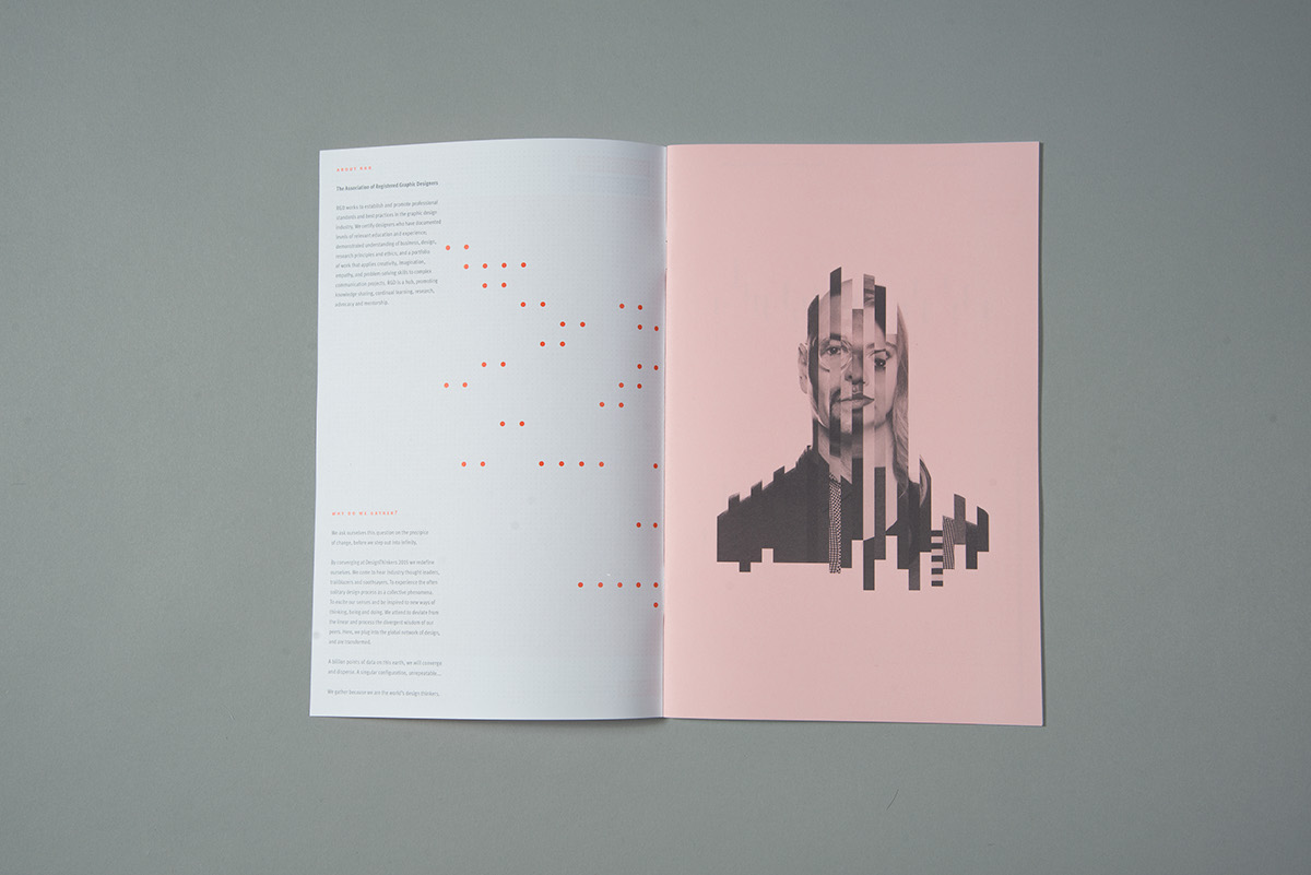
Concept
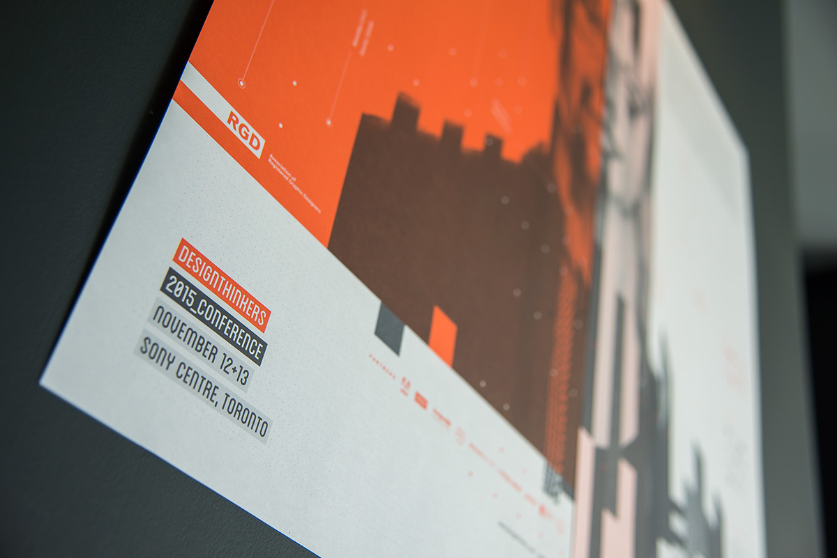
RGD DesignThinkers, Canada's largest annual conference for the communication design industry, is a two-day event where International and Canadian creative visual communicators converge in downtown Toronto. Registrants have the opportunity to attend high-profile speaker presentations, panel discussions, network with colleagues, attend workshops and participate in a variety of other programs related to the design industry. This year the event is held on November 11 through the 14th.
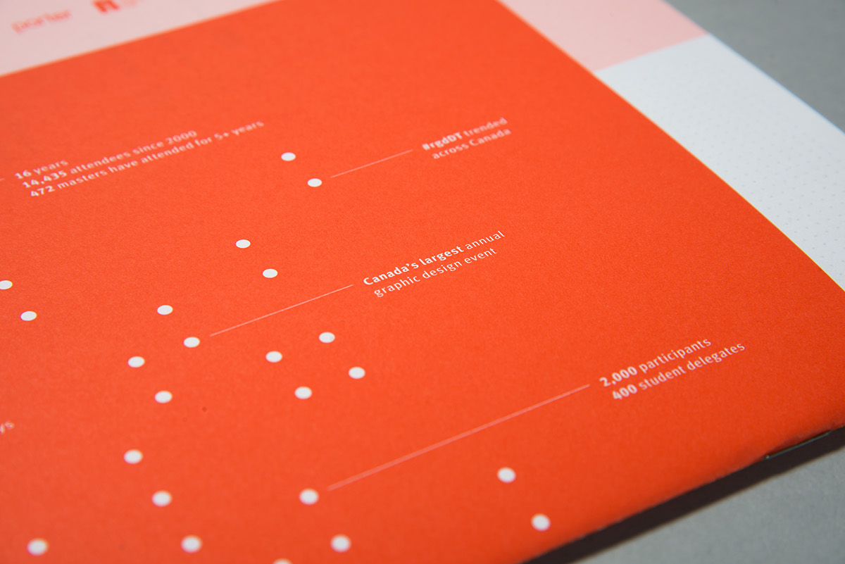
Each year the RGD selects a different local design firm or agency to be the Design Partner for the conference and in 2015 Overdrive was commissioned for thIs honour and privilege. The scope of the project is a complete communications and marketing campaign involving visual identity, on and off-line collateral, video, photography and this year… a piece of epic sculpture. Always up for a challenge and the pure joy of all-nighters, the team's first objective was to create a visual campaign focused on the variety of speakers and attendees at the conference. By creating a single image from many images the intent was to represent the bringing together of different skillets, opinions, backgrounds and geography in one location, at one point in time, that would be memorable. Underlying this approach we’ve incorporated the notions of data and craft. Data, because it is everywhere and because data visualization is becoming an important part of what designers do. Craft, because designers make things - often in methodical and meticulous ways. To sum up, the direction we chose was about Speakers. Attendees. Points of data. Layers of information.
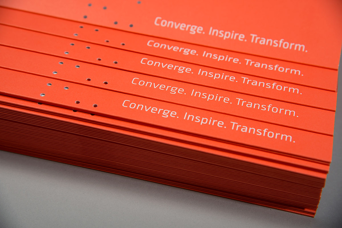
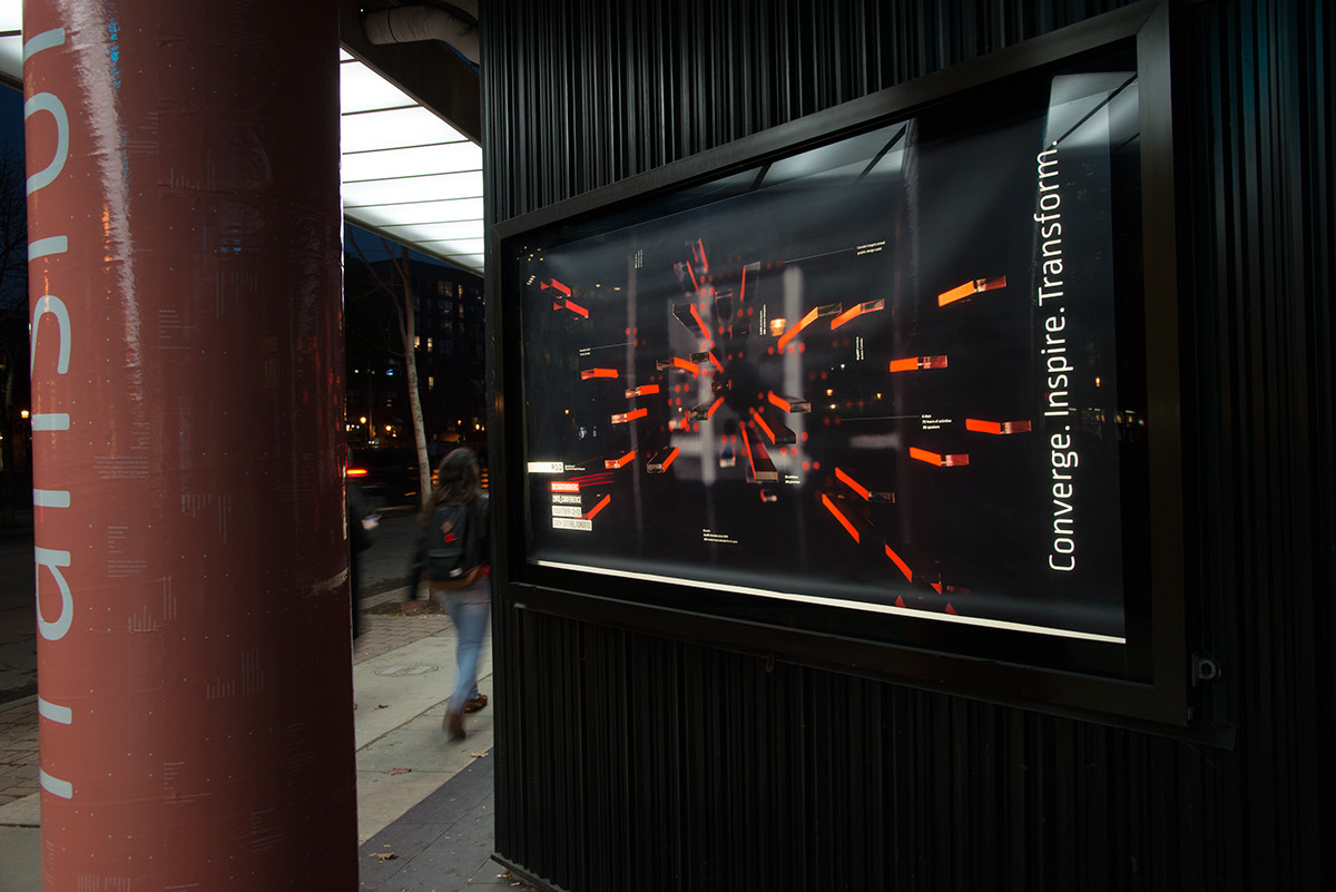
"Converge. Inspire. Transform” became the tagline for the event. “Converge", because of people coming together physically at one location with unity of purpose. “Inspire", because of the exchange of new ideas and ways of thinking. And lastly, “transform” because of emotional or intellectual change after attending the conference. Visually, we wanted the branding to encapsulate the digital feel of data but in contrast to something tactile and hand-crafted. To this end we executed the visuals by moving between making things by hand and finishing them off in the computer or by generating assets off the computer and finishing them by hand.
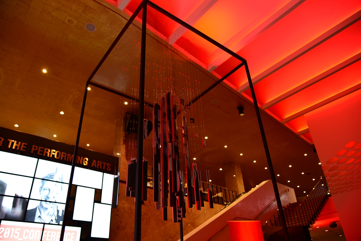
Visual Focus: The SuperSpeaker
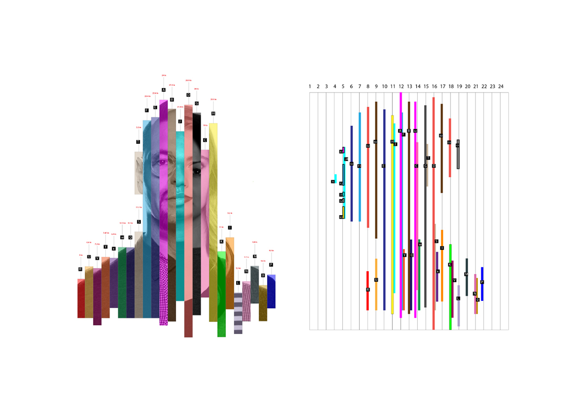
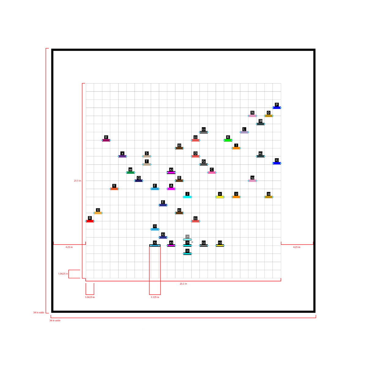
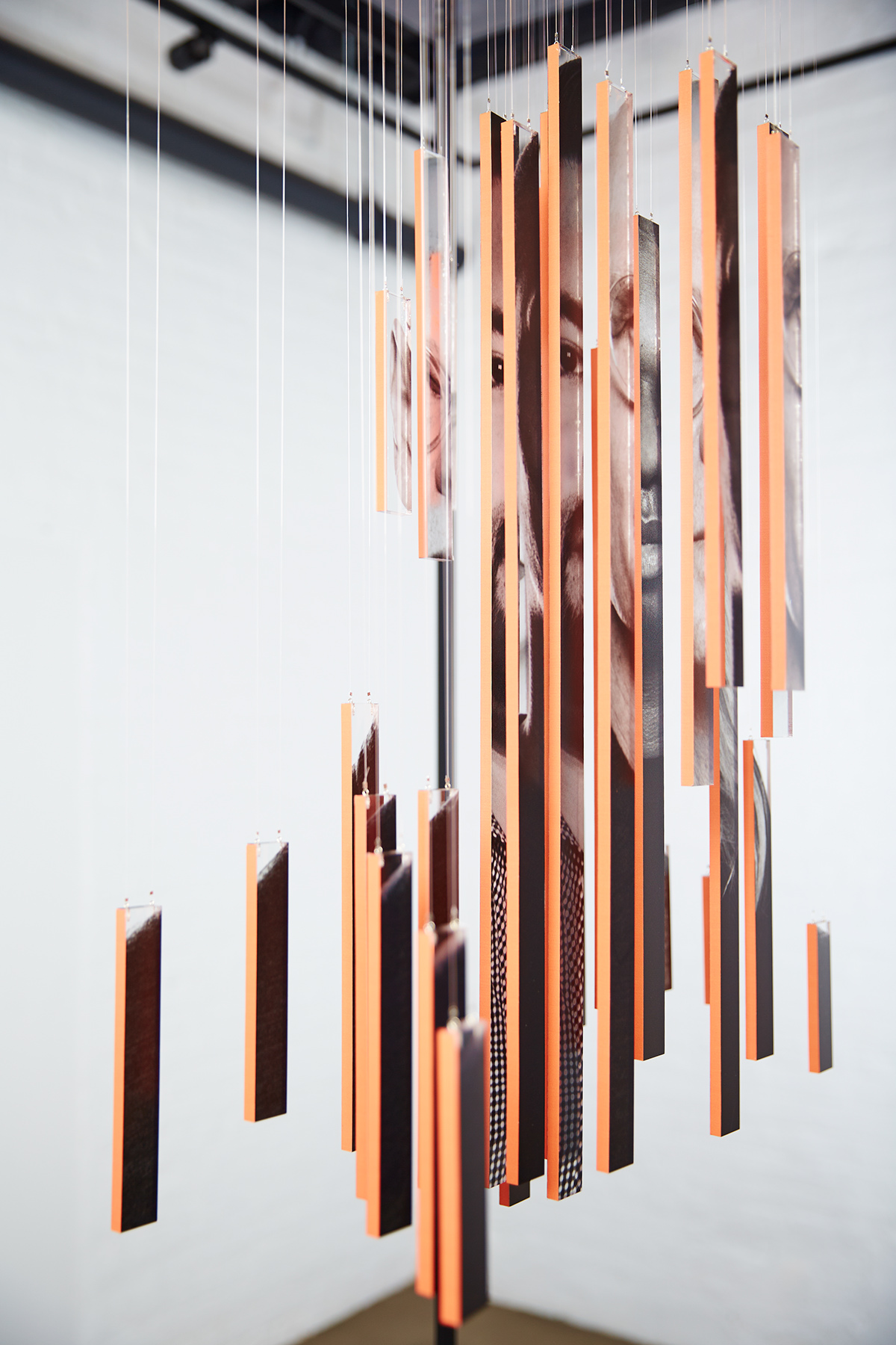
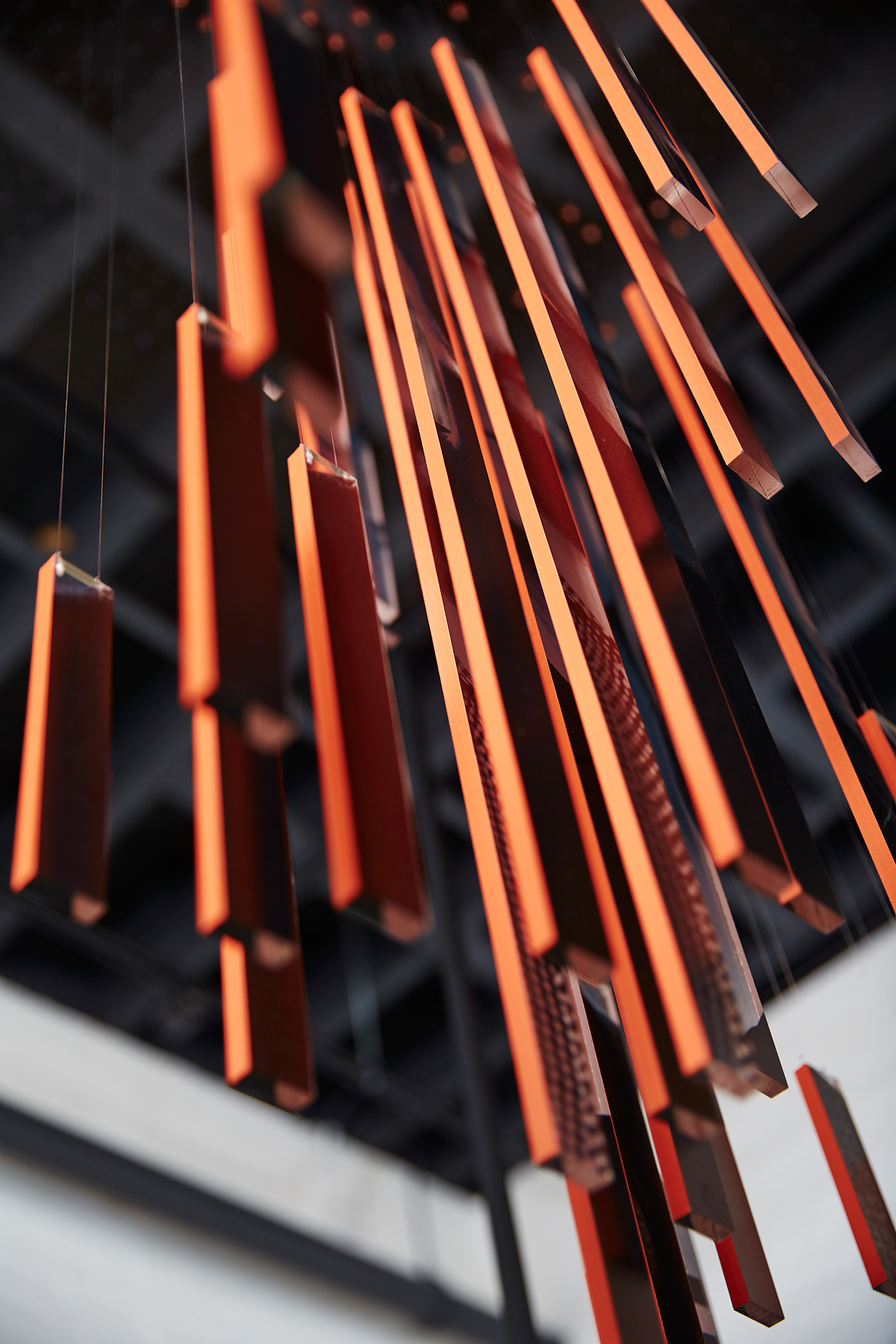
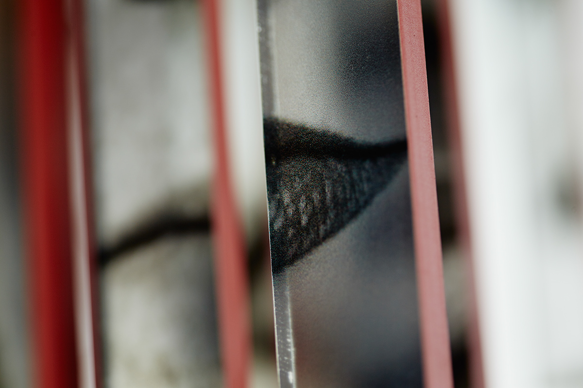
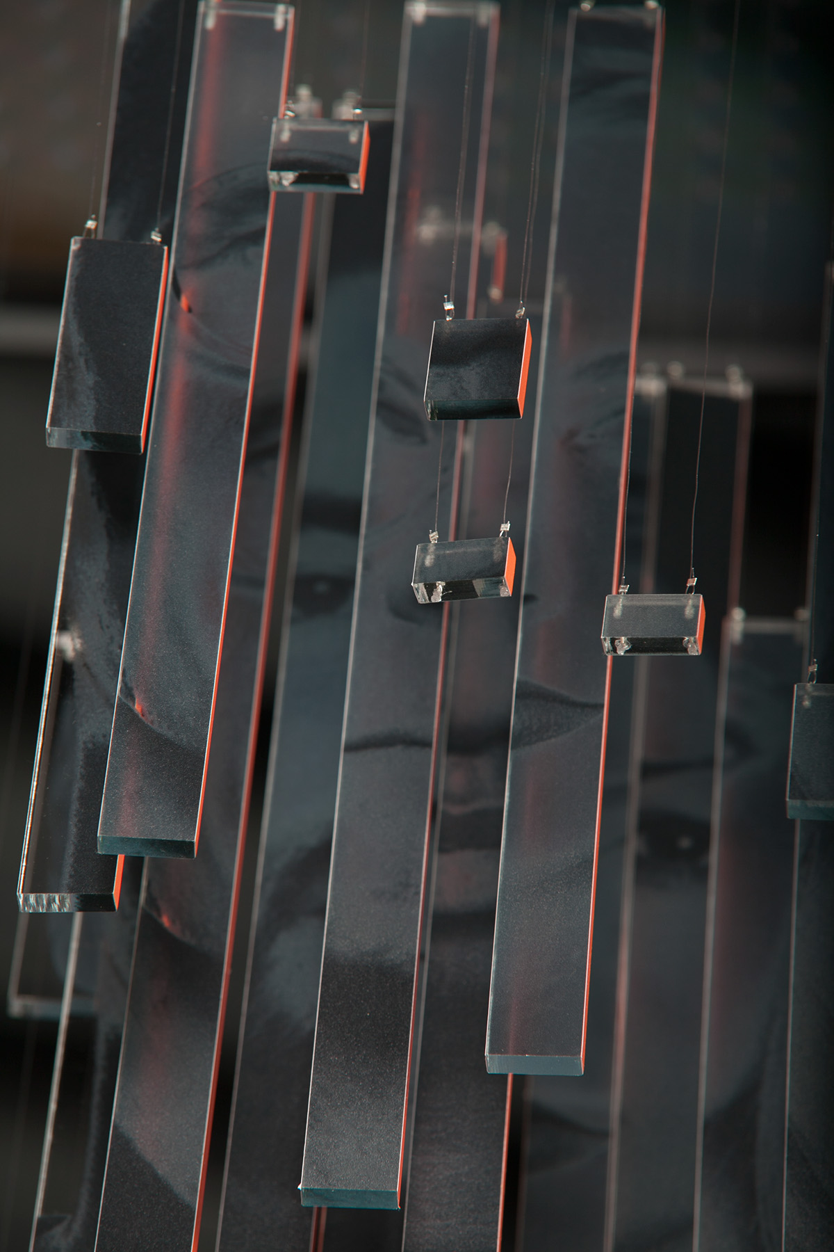
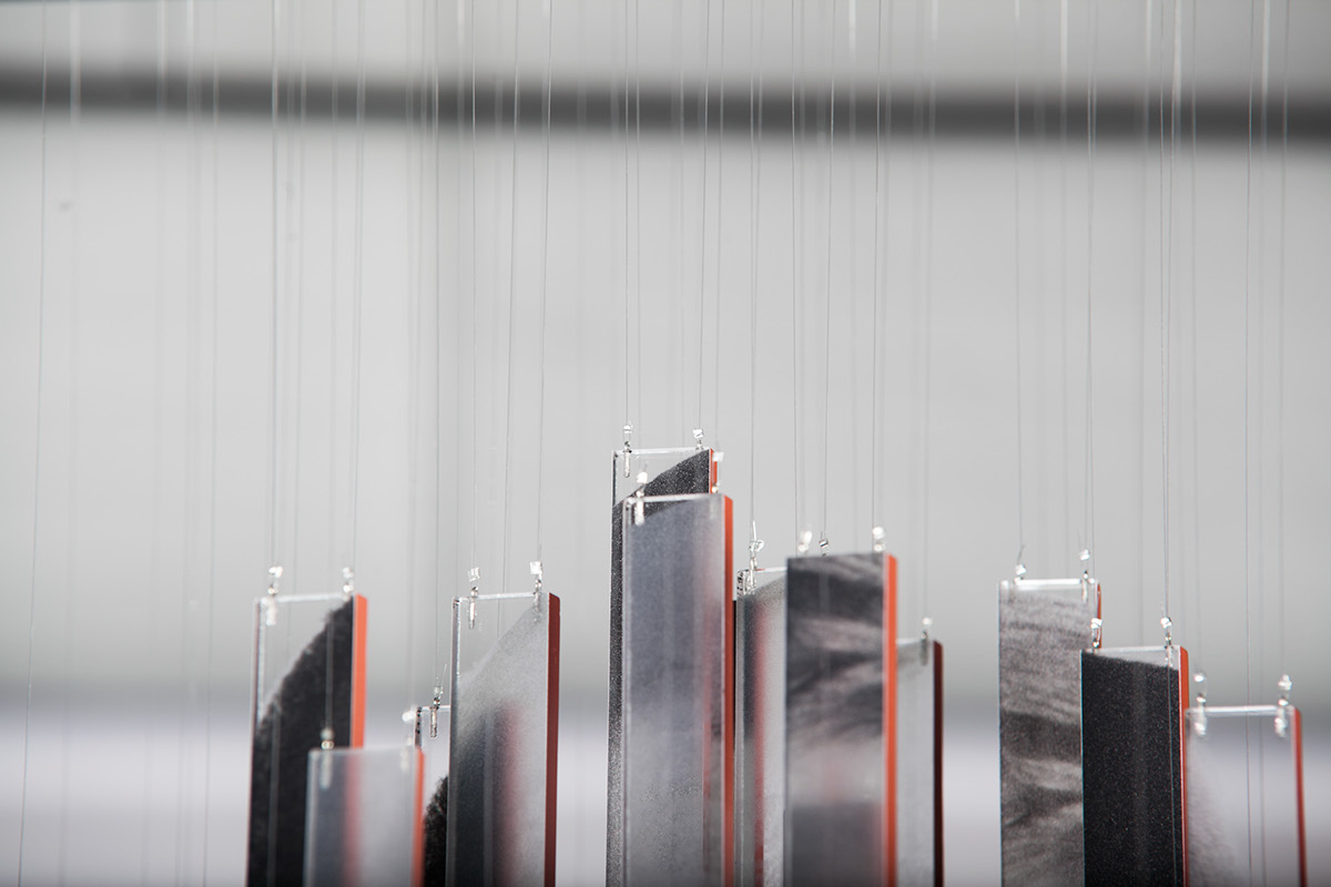
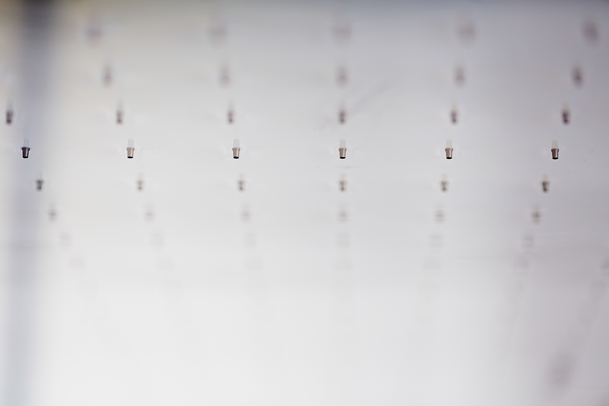
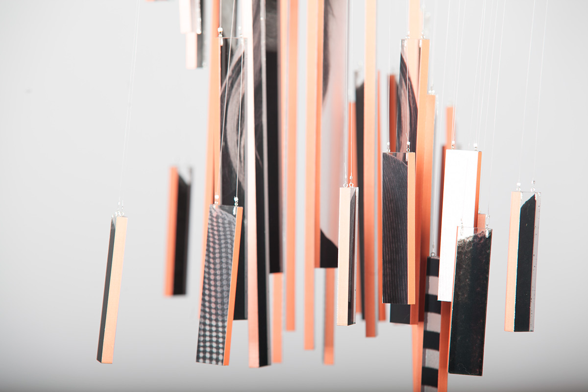
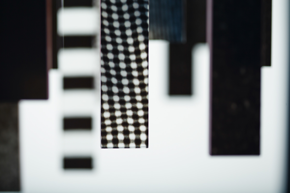
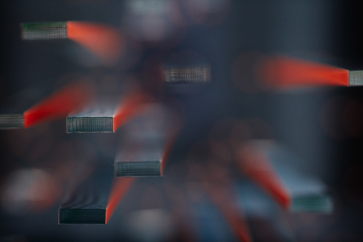
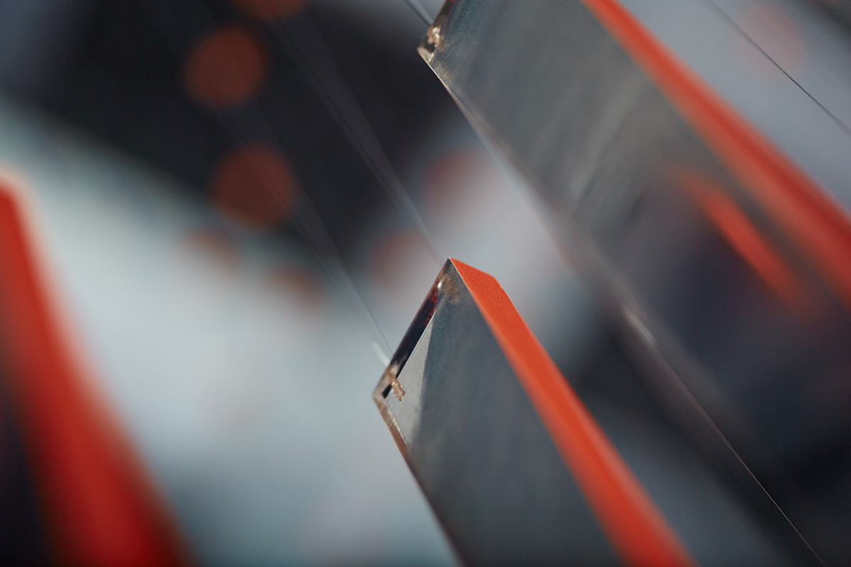
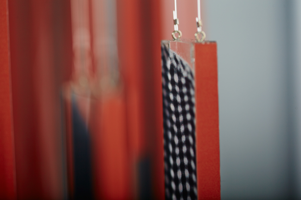
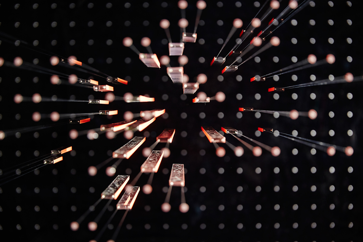
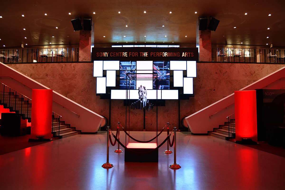
From the beginning, we envisioned that a piece of three dimensional work would become the visual centrepiece of the campaign. In the end, it took the form of a piece of sculpture, painstakingly yet lovingly assembled inside of a custom-fabricated 8 foot high metal framework. The sculpture itself was digitally printed on 44 pieces of 3/8” acrylic (not 43 or 45) . Each piece was then hand drilled, epoxied and fastened to fishing line via miniature hardware. The acrylic strips then had coloured side pieces attached and were then suspended from an acrylic laser drilled ceiling plate attached to the top of the framework.
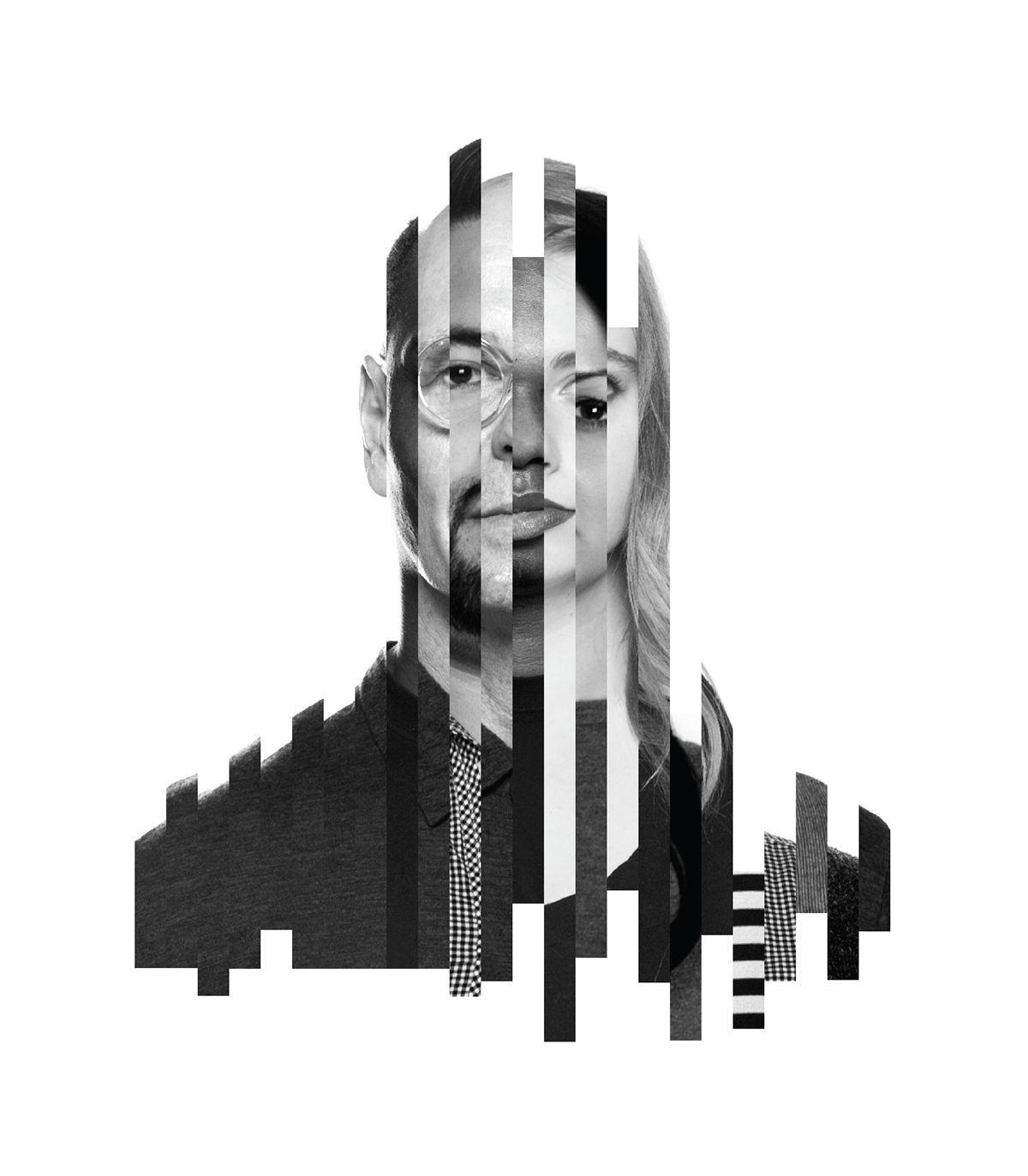
At the time that we began to design this piece, we had no idea how many speakers would be attending the conference or who they might be. No names, no data, no information, no nothing. The sculpture needed to be abstract, but at the same time it needed to be representational. In the absence of speakers images, we creating assets by photographing members of the studio and our friends to act as stand-ins for the real thing. Then we sliced and re-assembled the images in such a way that the the front view appeared as a recognizable human face and from the side, the profile of a human head and shoulders. By viewing the sculpture at angles other than straight on, the form dissolves into something abstract, resembling bits of data or bar charts or pixels.
From its conception to finished product, the sculpture took the studio team more than 9 months to complete but with full knowledge that it would be used in many different ways. For instance we knew that we would shoot it as still photography and use it in a variety of print collateral. We also knew that we could use it in video and for motion graphics. Lastly we knew that it would be displayed as a centrepiece at the conference to make a final connection with the marketing materials that people had seen leading up to the conference.
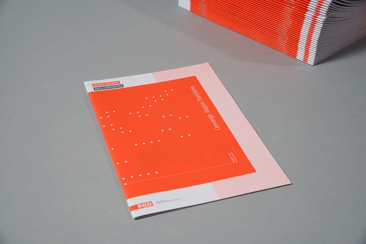
Colour Palette
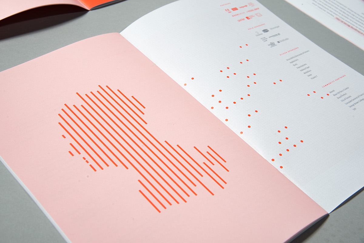
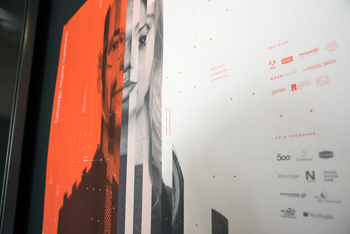
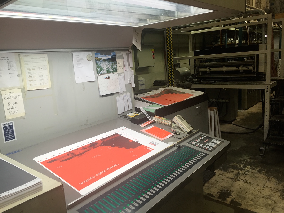
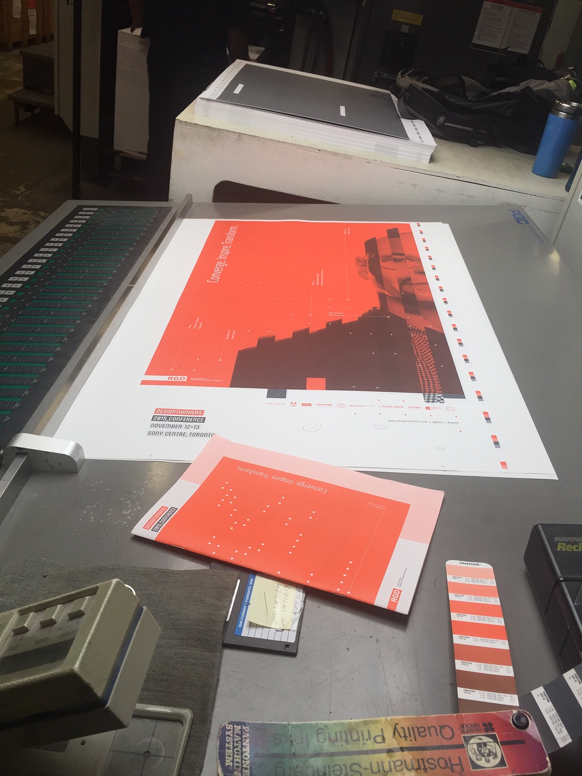
It was decided very early on that black and white photography would be the focus of the visuals and for that reason we decided on a minimal palette so as not to distract from it. Colour was used either as a full coverage background to attract attention from a distance or to accent detail close up. We chose salmon because we were looking for a strong, warm, advancing colour - but nothing too aggressive. We also chose grey both as a compliment and transitional colour between the black and salmon. Likewise tints of both served as transitional colour between the two. Tints were also used to create light, defined spaces to hold body copy or other assists like sponsor’s logos.

Typography
Meta
We chose Meta for its versatility. It’s modern, has a large family, a complete range of figure set options and advanced features such as ligatures, alternate characters and case-sensitive forms. The lower case letterforms also have a reasonable x-height therefore legible at small point sizes. Of course, there’s not a designer in the known universe who doesn’t want to make type smaller, but our intent was to take advantage of small type sizes in expressing data as detail that not every viewer would see at first glance. i.e. part of conceptual subtext but also representative of the ubiquitous invisible data in our everyday lives.
Blanch
Blanch was used as a contrasting face to Meta. The font has a modern and technical feel that fit with the data concept we were infusing into the overall approach. As a condensed face it also proved to be a practical solution for longer titles and subtitles. We also used it in the logo because of its bold, graphic feel.
RopaSoft
RopaSoft was chosen for its light and open letterforms. The typeface worked well at large type sizes but where we needed it to have less footprint in the information hierarchy.
Logo
The logo was intended both as visual identifier for the conference and to provide at-a-glance information about the venue based on what, when and where. What: DesignThinkers 2015 Conference, When: November 12+13, Where: Sony Centre, Toronto
The logo could be described as minimal but its form was 100% informed by the SuperSpeaker visual. The logo was also intended to be modular so that, depending on the application, the logo could be used used either in its entirety or in pieces with colour being applied to create additional hierarchy.
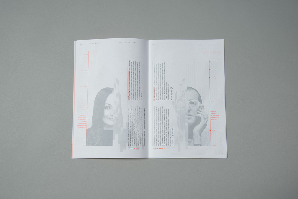
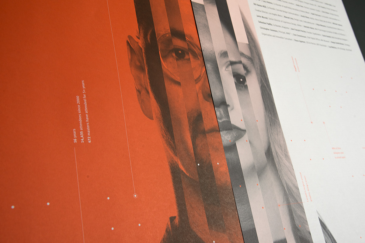
Speaker Photography
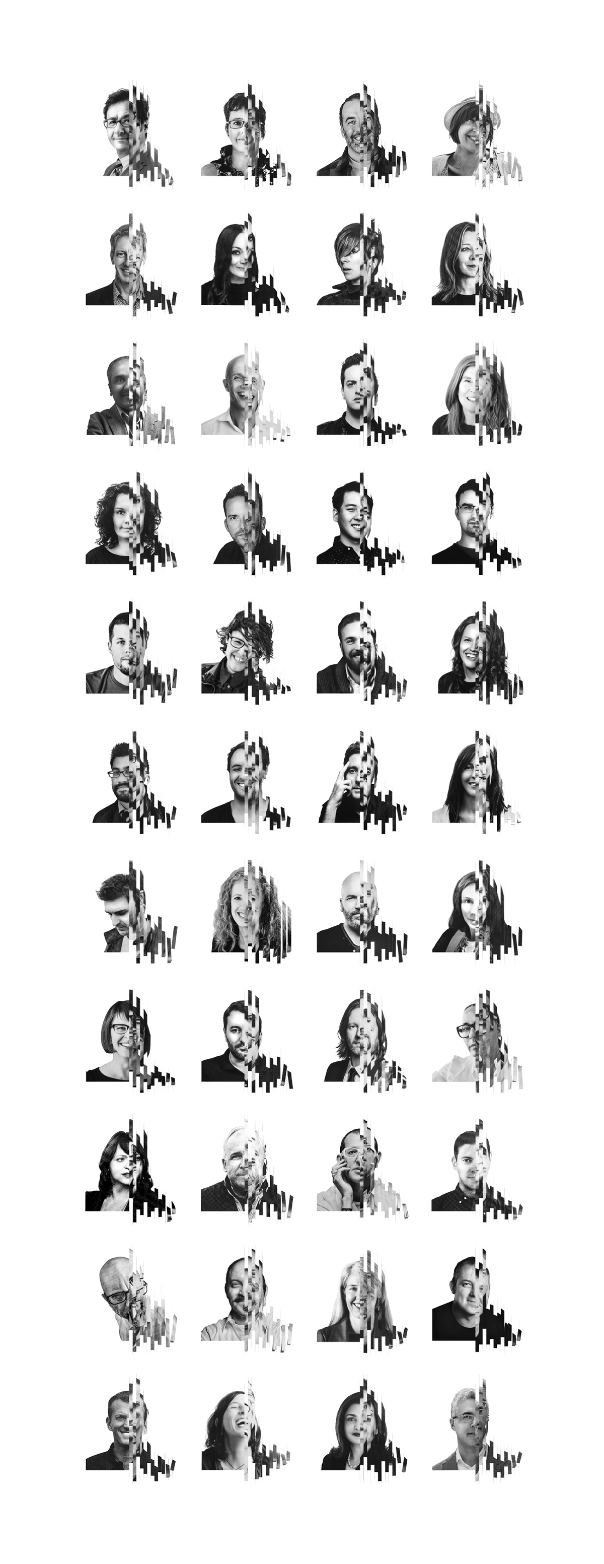
One of the biggest challenges that we faced was photography. We wanted the pieces of photography to look like they belonged to a family but to also stand alone. As well, the images needed to relate back to the SuperSpeaker sculpture and to a “sum of its pieces” concept. The biggest roadblock to achieving this was inconsistency in source material with regards to quality, size, colour and composition. The solution offered no hope of shortcuts.
Firstly we converted all portraits to black and white, then manually adjusted tone, highlights and shadows, then clipped the images and applied white backgrounds, then cropped the images so that the proportions of heads and shoulders were comparable, then printed the images on our studio printer, then surgically sliced the output into "tiny little strips with x-acto knives", then hand assembled the slices and glued them back together on substrate, then taped them to a wall and photographed the paper assemblies, then did a final cleanup. Repeat the process for 44 individual images, add several weeks of man hours and… voila! Because none of us have children, families or lives and it fulfilled the creative vision why do it any other way?

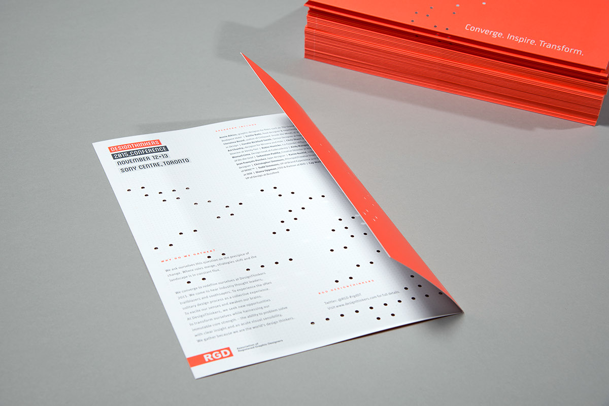
Postcard
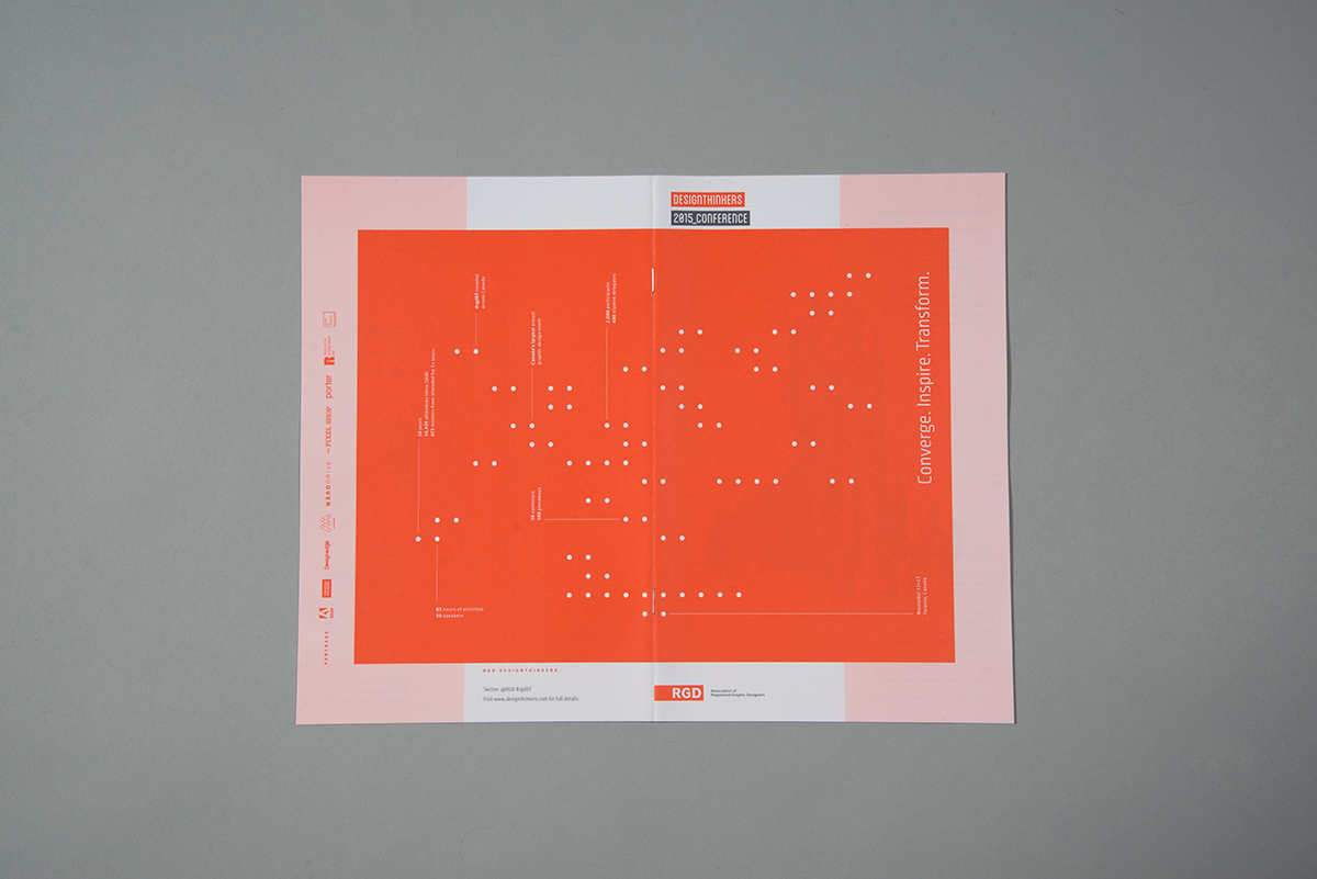
The first printed piece was a postcard but at that point in time, the branding was in development and the sculpture was in progress so we had less than nothing for imagery. What we did have however was a concept, a bit of data about the conference and while we hadn’t finished the sculpture, it had been completely planned on paper and involved “hanging points” on a particular grid. This formed a pattern which can be seen in many of the collateral materials for the conference.
Since the postcard was the first point of contact for the 2015 conference we wanted it to be something more and with this in mind we decided that it had to be short folded and bear a direct reference to the aforementioned grid - which of course, had to be diecut. Somerset Graphics, (conference print sponsors) quickly rose to the occasion and did everything possible to achieve our vision. And… we applaud them, however the diecut portion of the project ended up needing a bit of help. The result? Enlist the team: friends, family, others. Ply the team with beer and pizza and get them committed. Grab some toothpicks. Then… manually remove the diecut pieces that haven’t released with said toothpicks. The result is 4 days x 6 people x 10,000 pieces of print which = 960,000 pieces of confetti which = commitment!

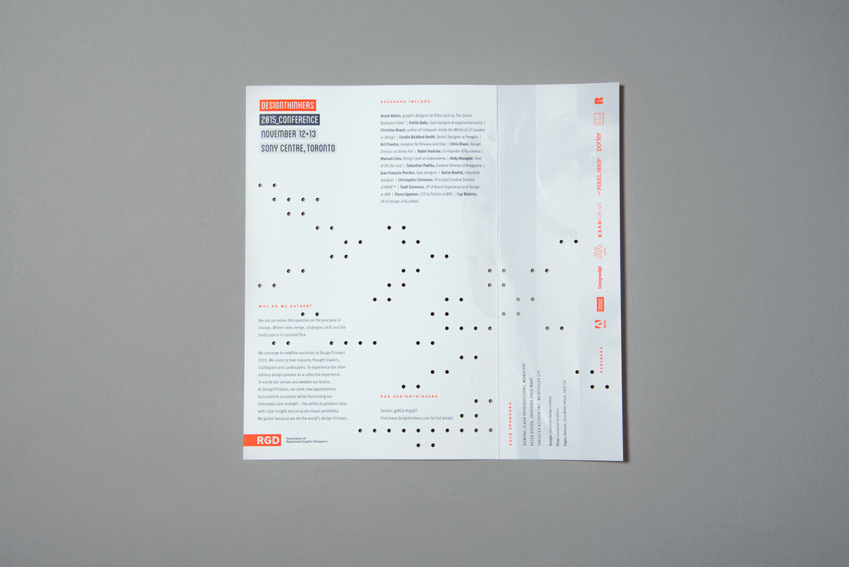

Brochure
Objective: design the principal pre-event marketing piece to announce speakers and events at the conference to encourage early signup.
Parameters: finished piece weighs no more than 60 grams to meet mailing requirements.
60 grams isn’t much and from conception to completion, the variables for the brochure were in continuous flux because planning was in its early stages. i.e. new speakers being announced or rescheduled and additional events added. Although not the largest piece of collateral by any means, it proved to be the most difficult piece to complete in terms of revisions and sheer hours. Nonetheless, we wanted people to notice it, so we made a consorted effort to mirror the sculpture that we had built in the form of vertically aligned type. We knew that this would be uncomfortable, but we also knew that this would receive attention.
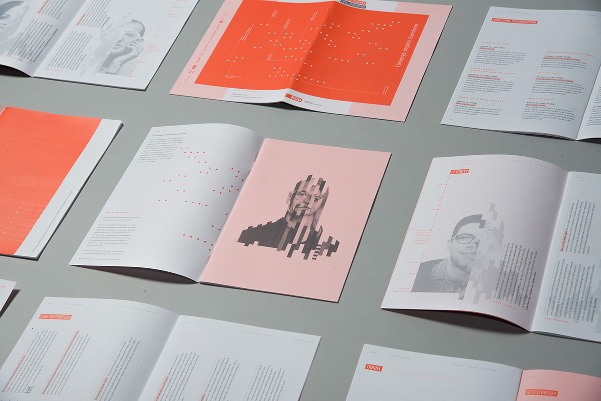
Poster
Successful posters need to be able to be understood at different distances. The first vantage point is… at a distance. In order to accomplish this we used photography and a big hit of colour to make the image recognizable. Details were then drawn out using colour and contrast at closer vantage points. The poster was a turning point in when the studio began to use the Superspeaker in the way that it was intended - as the hero of the visual identity. When the front and back of the poster are put together side by side, they form the SuperSpeaker image in its entirety defined by the grid used to build the sculpture.
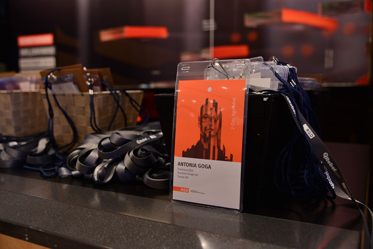
Tags
Tags needed to be kept simple, in order for the staff at the conference to be able to easily differentiate the three types of attendees: 1-Day Thursday, 1-Day Friday, 2-Day Attendee. Colour and imagery were used in a large way to highlight type and names of each attendee.

Website
Our task was to expand on the existing templates that Pixel Shop, the conference digital partner, had created for previous DesignThingers conferences. In contrast with previous years, each speaker would have their own dedicated page in which a more detailed description of their presentation and biography would be presented. On the speaker page, an archive for previous speakers is now in place. A special thank you goes out to The Pixel Shop for their time and effort.
Photo Shoot
When the SuperSpeaker sculpture was completed, it was time for photography and video. A 30-hour photo shoot. Enough said. A special thank you to Brian Pieters, Thomas Lee, and Russell Wu, for doing an incredible job at capturing the essence of what the studio was trying to achieve. Thank you as well to Marc Alcide for the process photography.

Video + Teasers
The video was created with the express purpose of revealing the story behind the conference. Data, speakers and beautiful footage of the sculpture are juxtaposed throughout the video representing the overall concepts of the visual identity. The story is built using light visuals, clean contemplative music and soft movements to a reveal the sculpture in its entirety.
Two teasers were also created and released to the public prior to the main video to help the buildup to the final reveal.
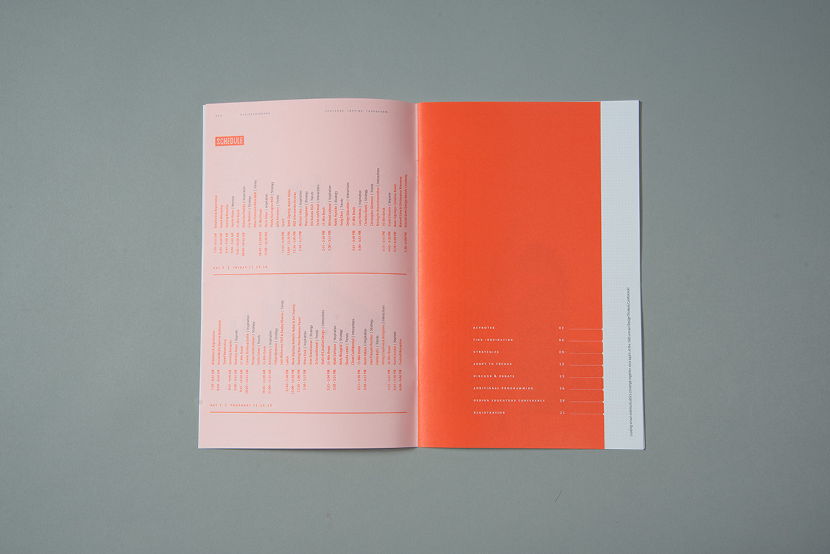
Program
When everything comes together…
This was the last and most extensive piece of collateral the studio designed and by this time even though the project was physically larger in scope than anything we had designed previously, we understood the visual identity, had built and photographed the sculpture, had the schedule of speakers in our possession, their data and... had all of the assets that we needed at our disposal to create this piece. Chapter openers and photography were used to separate the sections of the book and to organize the content. Speakers were given their own pages and keynotes given spreads, allowing for their photography to be used in a substantial way and for their stories to be given the focus they deserved. The format of the program was kept on brand with the previous print collateral: square in shape when open, resembling strips when closed. Wire-O binding was used to allow the book to open flat. Different types of papers and paper finishes were used to help organize and separate content, and to reinforce an aspect of hand crafting. With regards to that, at the last minute we discovered that specialty paper only available at Ariva could be used in the publication to reinforce an underlying concept of layering. At the time, Ariva was not considered an official sponsor but we approached them and they kindly stepped up to the plate which greatly contributed to the overall quality of the publication. This piece was then printed equivalent of the video in terms of telling the story behind the brand.
The studio designed and oversaw the production of a wealth of collateral. Mohawk papers was indispensable in terms of us being able to produce this material. They not only gave us access to a high quality product, they gave us access to anything we required to get the job done. Many thanks.
*Program to be revealed at the conference*
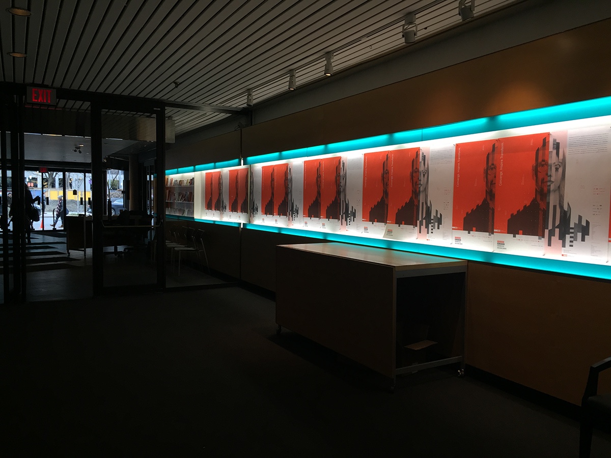
Venue Signage
Sony Centre
- Doors
- Outside Screens
- Feather Banners
- Registration Area (program, tags, buttons, screens, foam boards)
- Photo Backdrop Wall
- SuperSpeaker Sculpture
- Bubba Banners
- Main Screens
- Wayfinding
- Easels
- Main Stage
- Lower Lobby
- O’Keefe Room
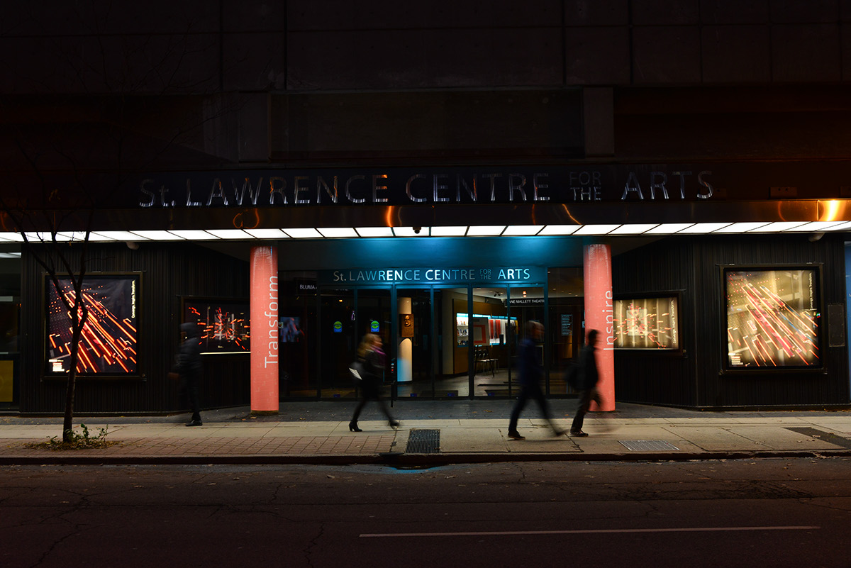
St Lawrence Centre
- Pillars
- Lightboxes
- Screens
- Magnetic Wall
- Theatre


In Summary
We want to thank RGD for giving us the opportunity to be the Design Partner for the conference. It’s been an honour and a privilege to be part of the DesignThinkers legacy. But, when you sign up for something like this you go in with your eyes wide open because projects of this size are painful. Not because of the people but because of the scope - the people are committed from the outset. For anyone that’s been through projects like this though, I would liken it to childbirth. From that perspective, the pain of childbirth makes one say: “I’ll never do that again” but then the joy of having a child supersedes the pain. Likewise, we as designers always look for new challenges. And even though some of those projects have made us think: "I’ll never do that again", we attack them with refreshed vigour.
The point is, it was worth it.
We would like to thank Somerset Graphics, The PixelShop, Mohawk and Resource Integrated for making our designs come to life on print and on screen. As well, thank you to everyone involved in the project: partners, sponsors, supporters, family and friends. We couldn’t have done it without you.
Many thanks to the following professionals and organizations who collaborated to produce the campaign Converge. Inspire. Transform.
Overdrive Design Limited: Creative and Art Direction; James Wilson RGD, Antonia V. Goga Prov. RGD, Alexander Rosa, Katrina Densmore Prov. RGD, Rob Krete Prov. RGD, Leslie Jennings, Bryn Wilson, Zak Hannah, Trina De Souza, Voicu Goga.
Russell Wu: Lead editor, video footage.
Christian Castel RGD of Tango Media: Lead animator, editor.
Bruce Fleming of Mach Sound Studios: Sound editor.
Brian Pieters Photography: Still photography, video footage and loaners of really expensive cameras, lenses and lights; Brian Pieters and Assistant Thomas Lee.
Marc Alcide: Still photography and behind the scenes photography.
McWood Studios: Sculpture fabrication and unfettered access to their fully equipped wood shop and facilities for assembly; Mac Thomas and Greg Hefford.
Plas-Tech Inc: Sculpture fabrication and acrylic image printing.
Structure Corporation: Generous landlords and a suburb planning and contracting company who provided a fantastic space to shoot in.

