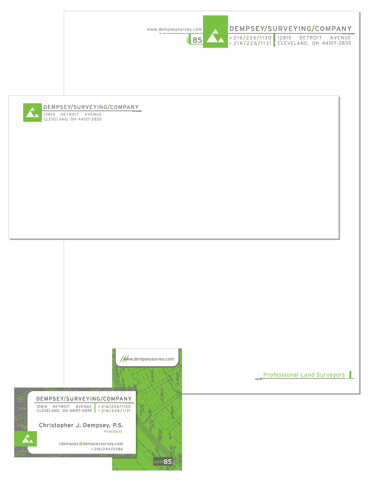
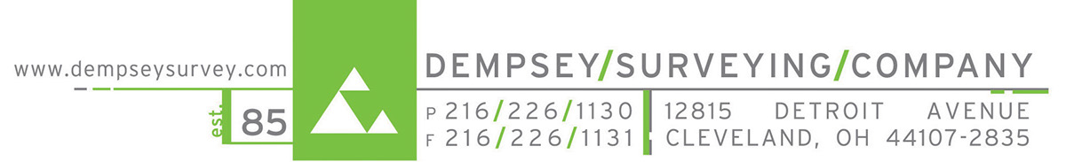
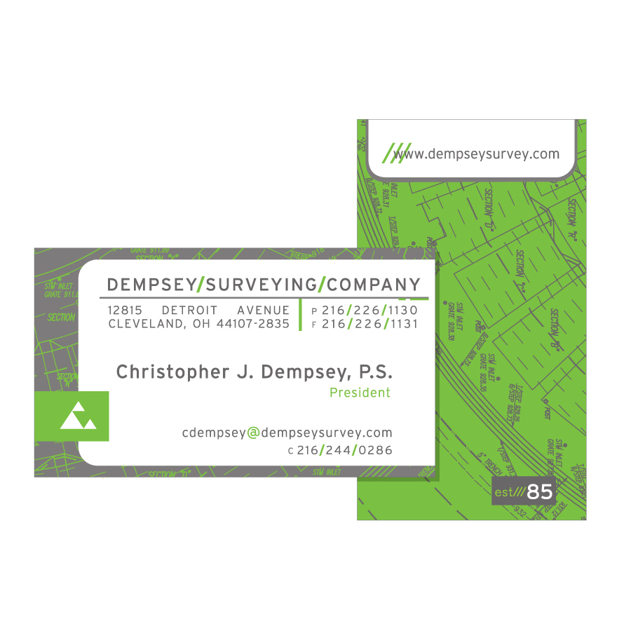
The client wanted a fresh take on its existing identity system without losing the essence of the original mark. A new color palette and type treatment along with the incorporation of survey map elements took this company's image from tired and static to energetic and forward thinking.