
LatitudeSouth is a new enterprise offering a fresh direction in legalservices outsourcing. Working with clients all over the world, their South Pacific origins were of importance to the company. The identitysolution is that of an dynamic arrow shape which was inspired by aboomerang and also has the shape of a simplified New Zealand contour.
Please see http://www.dache.ch/thedacheboard/article/latitudesouth_logo/ for the full article.
Please see http://www.dache.ch/thedacheboard/article/latitudesouth_logo/ for the full article.
Visual inspiration
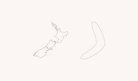
New Zealand contour | Boomerang

Color scheme inspiration

The finalised color scheme.
Logo development
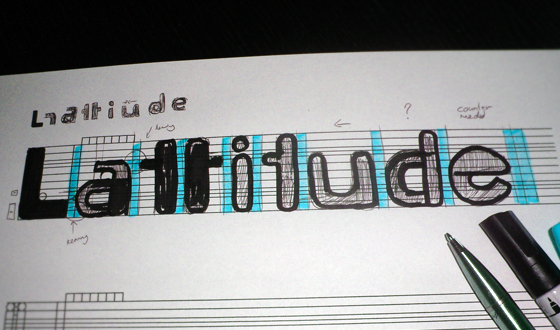


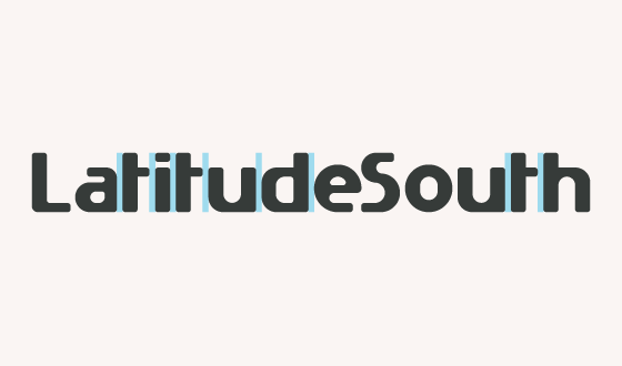
Kerning

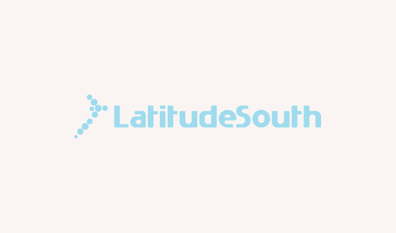
Final solution
Thanks for taking a look, hope you enjoyed the process.
Kind regards,
David Pache
www.dache.ch
Kind regards,
David Pache
www.dache.ch

