Foster & Rye™ is an assortment of trend-forward and gift-ready items that inspire a desire to adventure every day. It is a collection of masculine-forward giftables that also appeal to women. Brash sarcasm, discovered elements of wit, and humor define the personality of the brand and remind consumers not to take themselves too seriously.
I was brought on as the Design Lead for the Foster & Rye™ project, and challenged to redesign the brand logo, packaging and overall aesthetic. The new branding was to embody a spirit of adventure, allude to the millennial hipsters' lifestyle, and appeal to men without isolating or neglecting the women within the target demographic. The visuals were to be clean and modern, but versatile enough to be used across social, web and tangible print and packaging platforms.

There were months of development, team critiques, refinement and tweaking. After several versions, countless meetings and brainstorming sessions, we chose the semi-finalists. A few tweaks later, I was able to finalize a logo everyone agreed fit the brand's new direction, outfitted with a monogram and icon﹣ the latter of which was taken from the original Foster & Rye™ logo.

Previous Logo

Redesigned Logo


Packaging Ideation Phase
Packaging Ideation Phase
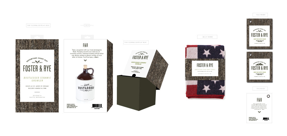
Redesigned Packaging
After flushing out a few concepts and explorations, we all agreed that the designs still weren't quite "there" yet. We took a recess from the design process to revisit the marketing strategy and paint a vivid picture of the target demographic. As the marketing and management teams went to work on drafting a revised strategy, I ventured out on the town. One of my favorite things to do, whether I'm working on a project or not, is to go to different boutiques and stores to do on-foot research about what's current, what exists in different market segments, and what's missing from shelves.
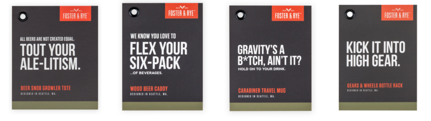
In this specific market, the personality would be key to the success of the new F&R. My on-foot research confirmed that theory, as none of what I'd seen on shelves really spoke to consumer personality. When the marketing team had nailed down the new overview and documents, my manager came to me and said, "I want you to push it. Scratch everything you've done so far, and really push it. Something completely new." That's just what I did. I mentally discarded all of the versions I'd done before and started with a blank slate. The result was a really bold, wit-laden design concept with eye-catching contrast and humor as the main design element. I'd come up with a couple of witty tag lines to pitch the concept and mockups to the team, and it worked. The feedback was really positive; it went over well for both the sales and creative teams.

Redesigned Packaging
Once the concept was approved by all levels of management, I began the production design process. There were over 60 packaging files to design, redesign, layout, spec and format for vendors to produce. The production design process was tedious but with long days, a few weekends, and a whole lot of focus, I was able to complete all of them a month and a half before the intended deadline.

View the full Foster & Rye project here.


