Bloomsday 2011
Winning Shirt Design
Winning Shirt Design
My winning design for Bloomsday 2011 In Spokane Washington. Chosen out of hundreds of designs. Two years in a row as a design participant. This is a race and fun run with 56,000 participants this year.

The Process: (preliminary sketches coming soon)

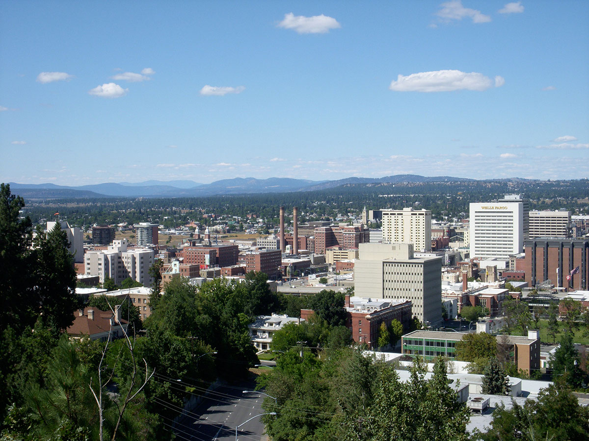
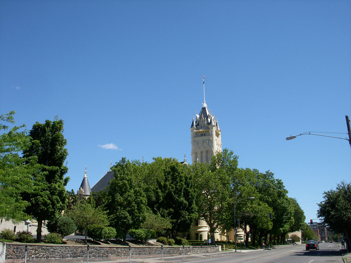
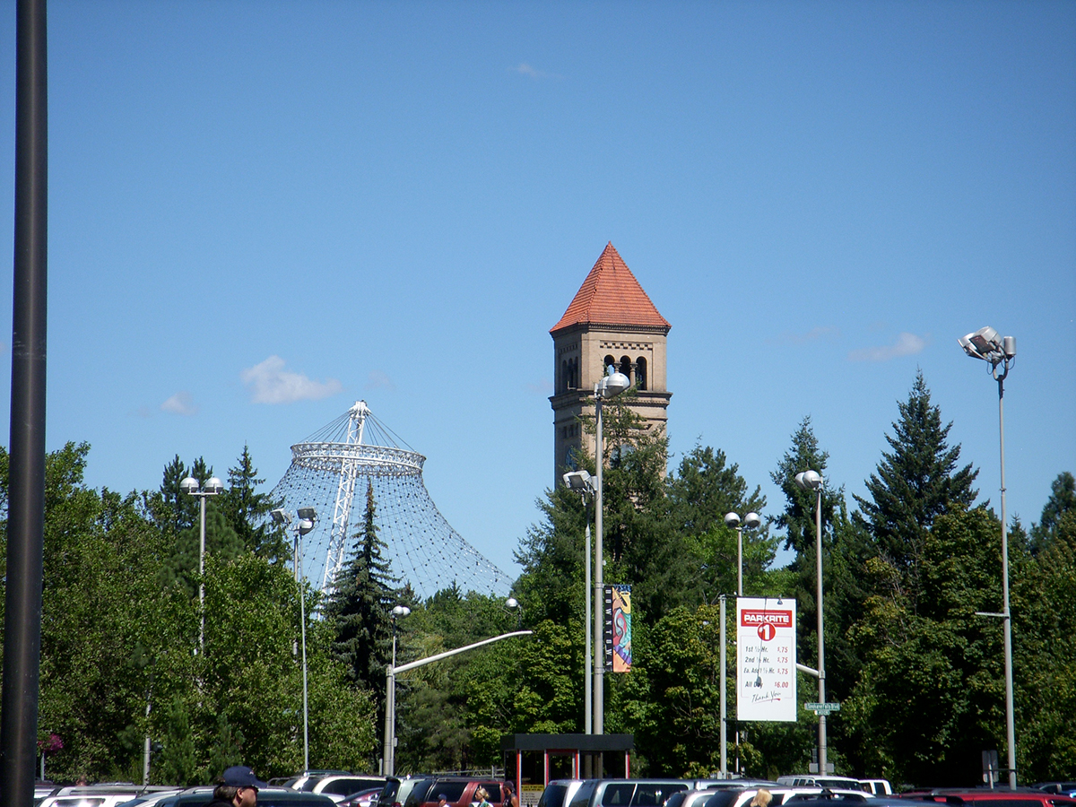
After a major brainstorming session, I drove to Spokane, WA to get started. I took hundreds of photos of the entire Bloomsday course and organized them roughly by mile.


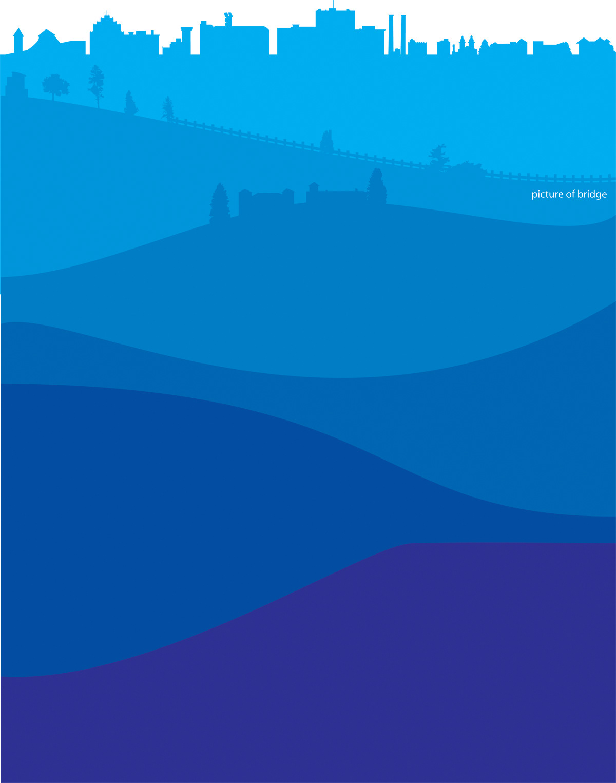
Now that I had all these photos, I did a "mock up" of the course. I used data off of the Bloomsday website to figure out the varying heights along the course.
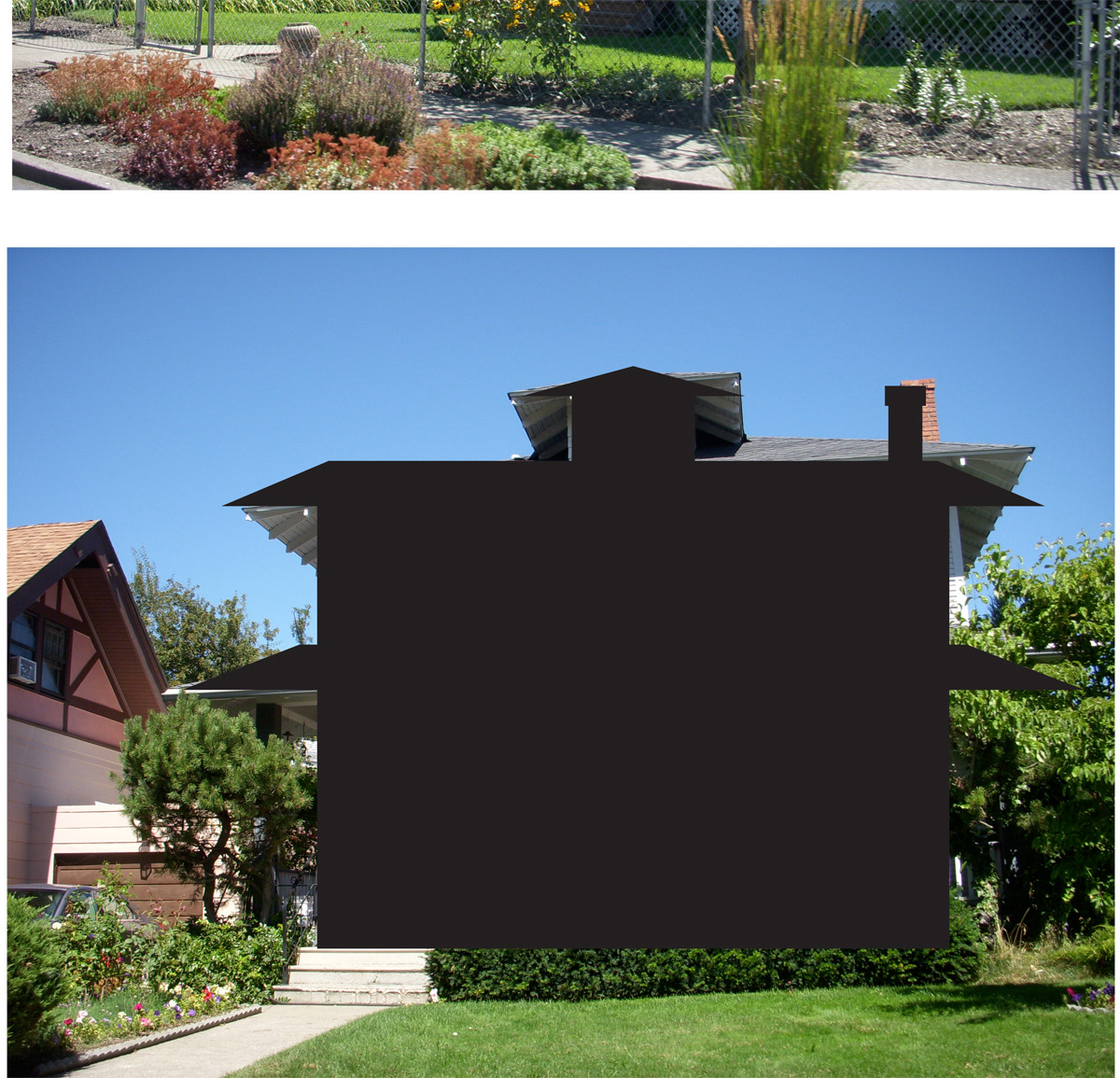
I also started mocking up and vectorizing a lot of buildings, trees, landmarks; anything that related to Spokane or Bloomsday that I thought would be fun or relevant. Some objects were just to give a feel of what a given stretch of the course is like.

Traced trees that I took pictures of along the course.

Another "mock up" of the elevation as the course progresses.

It took a long time to build all these individual objects the way I did. In retrospect, I would have probably done them by hand and scanned them, and then "live traced" them in Illustrator. It took me several days to do this part. I began dabbling in color here, but more just to differentiate the layers. I think I tend to use "blue" as my "grayscale" palette.
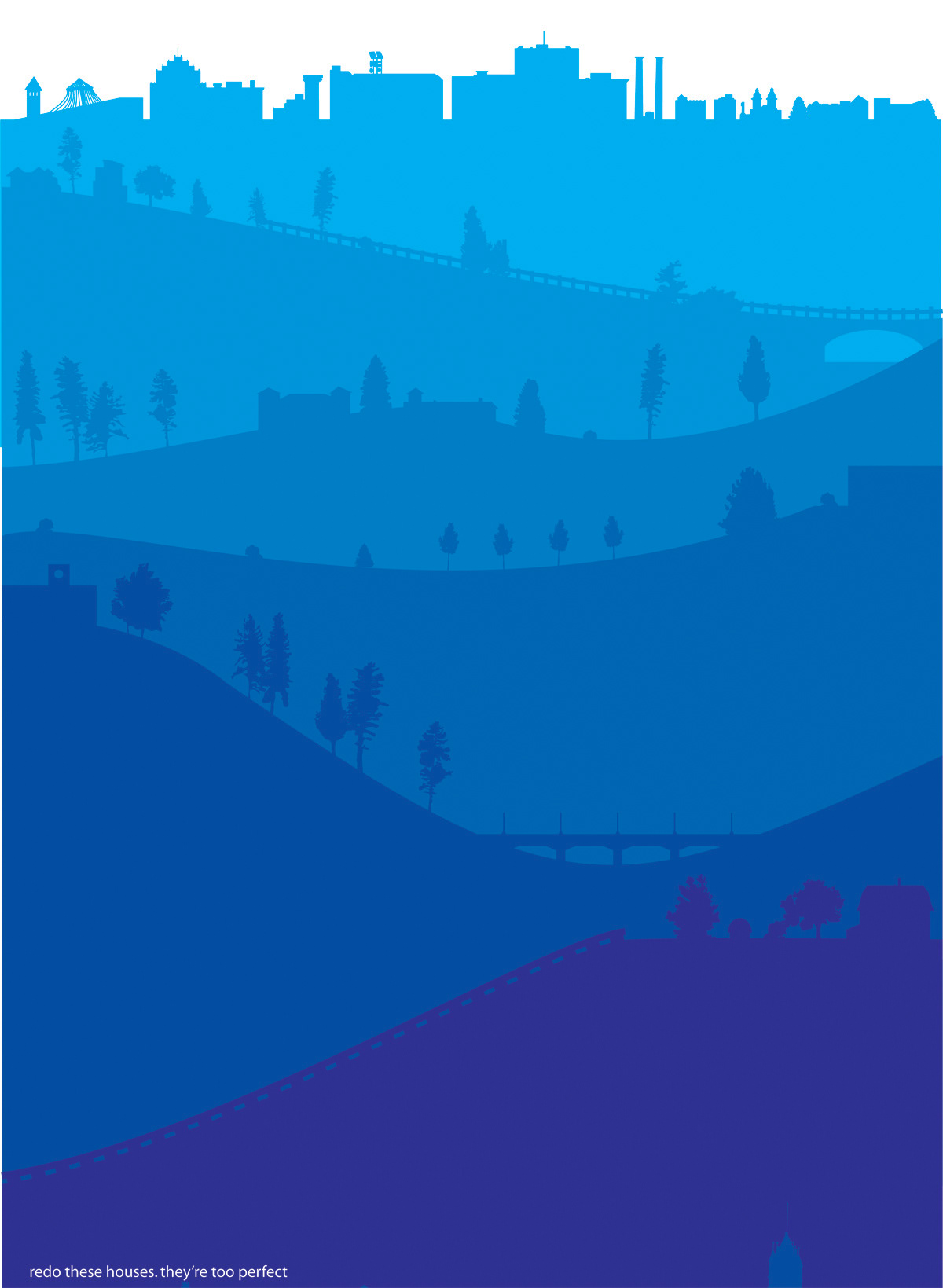
The bottom row is cut off in this picture, but at this point I had most of my objects laid out. I think at this point, I was trying to think of how to make this cool pseudo "info graphic" more energetic. It needed to feel like it had a sense of direction, energy and movement...
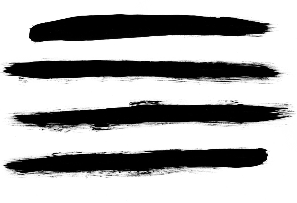
Paint strokes!! That was perfect! I played around with different strokes, and scanned them all into the computer...


I also wanted to try to use paint strokes as a textural element as well. I didn't end up using this particular one, but I still scanned it in!
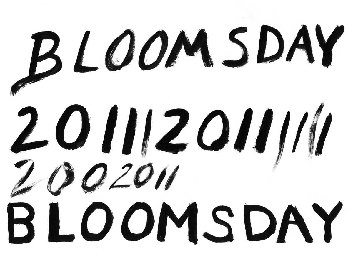
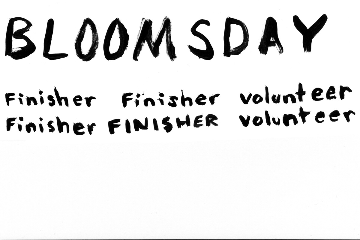
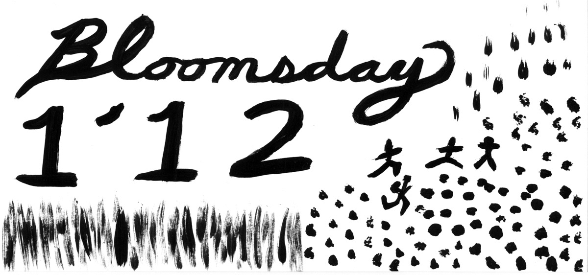
While I was painting, I played around with some "freehand typography". It just seems to match the spirit of the race over the years.
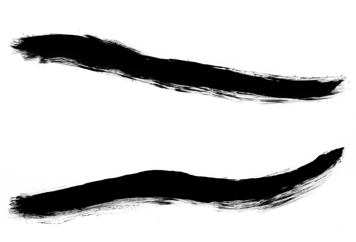
This is truly a page of "goofing off", while trying to brainstorm. I wanted to represent racers somehow as well. When you watch or participate in Bloomsday, there's a "river" of people for miles. It's pretty amazing to see! This is what the various lines and strokes begin to experiment with.

so I switched out the solid shapes, with brush strokes. It felt naked comparatively, but I new it was a much stronger, clearer direction. It's like someone made broad strokes downward, creating the course; one mile of the race (give or take) with every brush stroke.

When I design, my brain is everywhere, so I often end up trying several different things at once. I "dummied" up "people" to see how it would look. Kinda hard to see... I also tried adding more weight to the bottom part of the course, so that the eye ended there, rather than the top. It of course also helped emphasize direction. Slowly, I'm starting to play with color as well. Most would probably wait until they were further along, but from doing the volunteer shirt the year before, I learned that color takes a lot of trial and error, and for this particular project it is better to get thinking about it!
Still playing with text and color. I made more strokes as seen above, and layered them with two colors. It kind of reads as trees as well as people, which I was okay with; there's a lot of trees along the race!
Adjusted the placement of a lot of objects. I went back and forth quite a bit with having the strokes being close together or a little more spread out. In the end, I decided it was already busy and chaotic enough with all the brush strokes. One of the tricky things about shirt design is layering. I hadn't quite figured out how I wanted to "layer" the runners. You can see it overlaps some paint strokes here.
I added a "whitewash" background. Kind of like priming the canvas with a layer of paint...This "Bloomsday" type grew on me. I vectorized it and made it white. I started playing with the rest of the type. Hmm...maybe I could make it look "sketchy" somehow...

More color play. I wanted to emphasize direction more. I played a lot with adjusting the layer colors so the bottom was heavier than the top. I spent several hours, and a couple days just playing with different gradients and effects including halftones (they're often used in screen printing where screen colors are limited).

This is the halftone color gradient I went with. I can't find some of the stages of this, but it's a brush texture super imposed over the silhouettes of the course. It's a gradient from lighter to dark that I then converted into bitmap halftones. The size of the halftones was a struggle, but this one turned out perfect!
I was getting really, really close! Here's where I really started playing with color; all color. I always try a decent range of colors, so I'm not just being narrow minded and sticking to what I know or like.
Not quite it.... I was still going back and forth with the look of the type.
Hmm... not really.

I kinda dig it, but I was afraid it read to much like "August" or "September". It has a nice level of energy though!

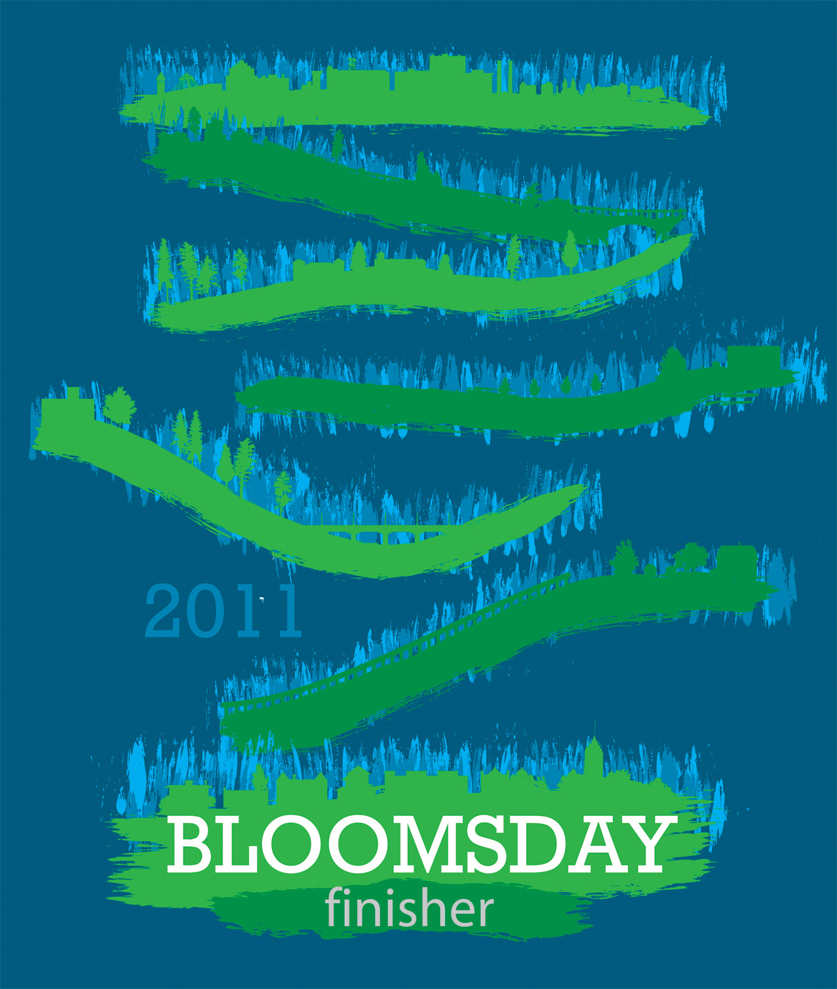
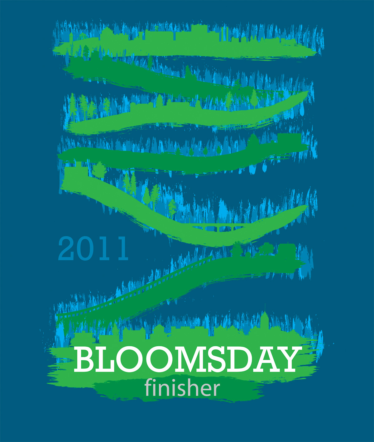
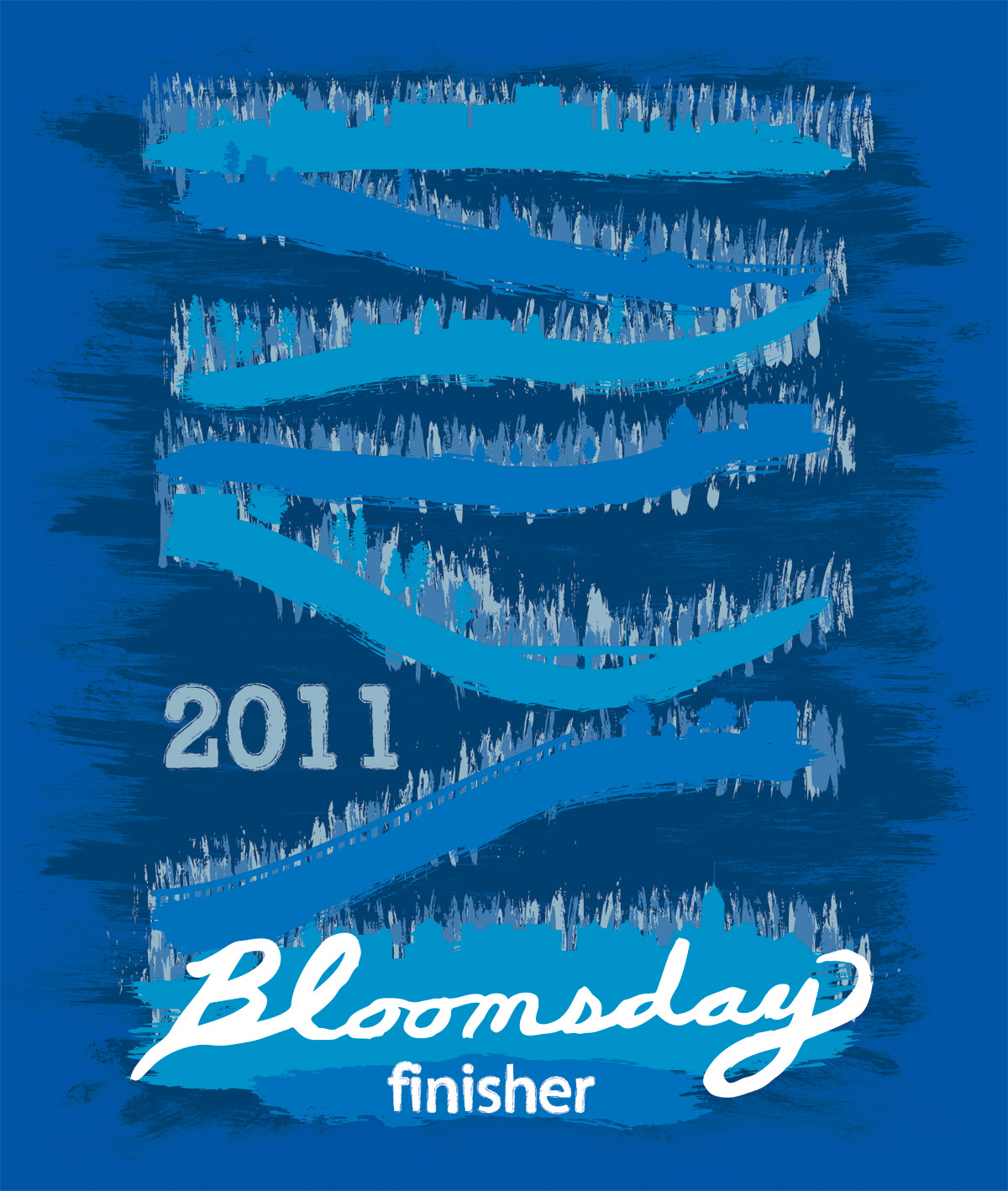
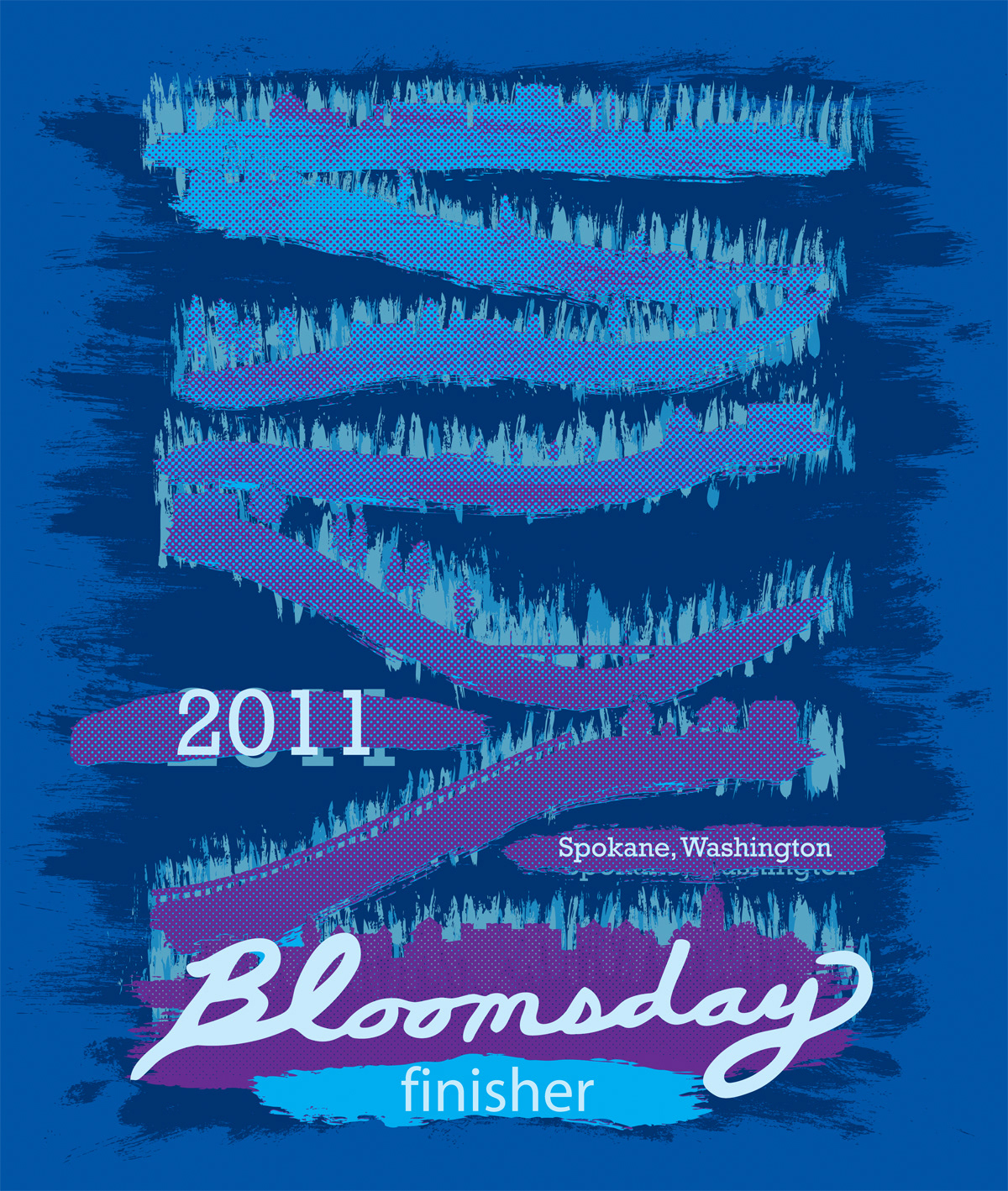
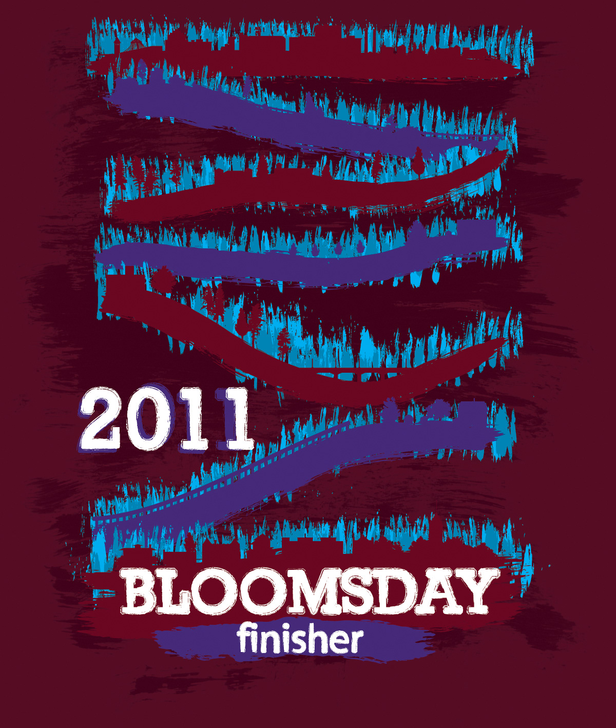
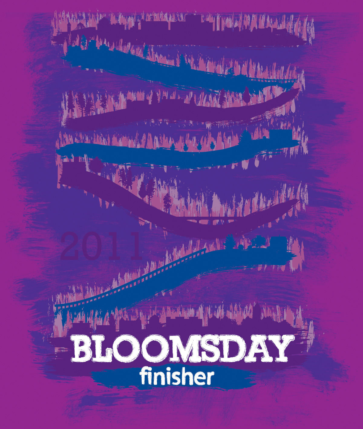
This is more or less the end product. I gave the Bloomsday Board the following four color options. Why? because I knew that the shirt color wasn't guaranteed. I wanted to convince them it could work on almost any color shirt.
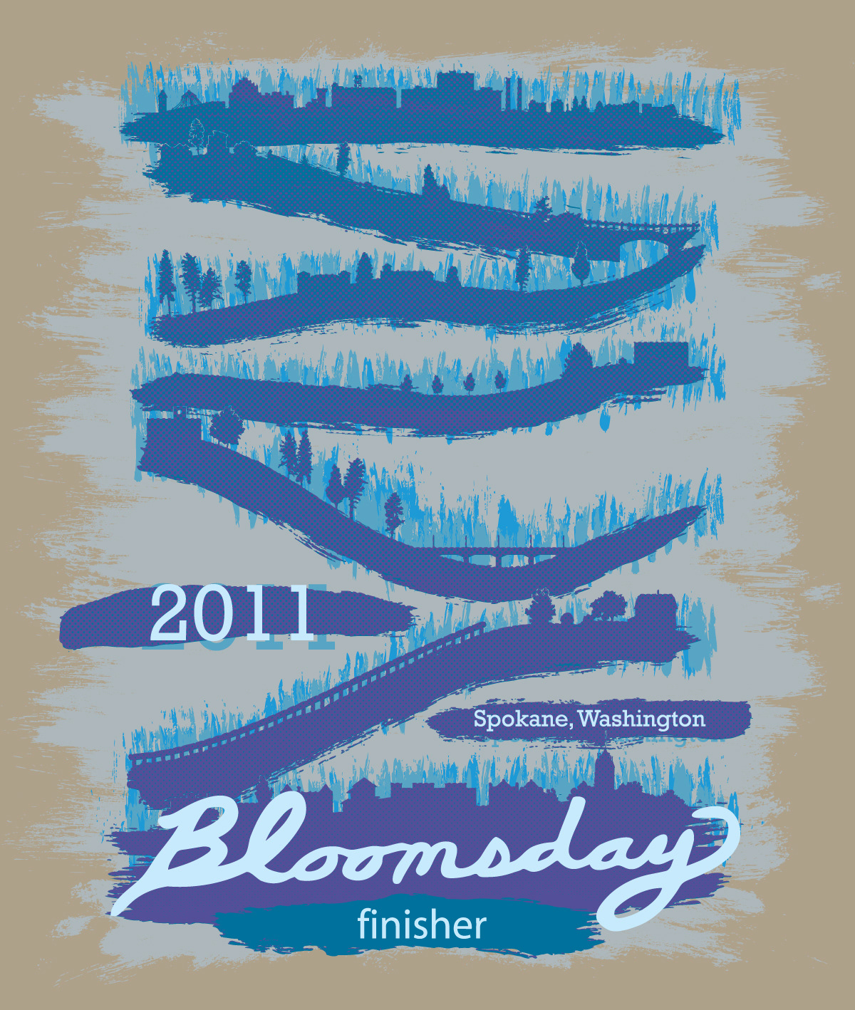


So in the end, I contrasted the "race course 'Bloomsday' " type with a nice sturdy semi egyptian, sans serif font because something needed to be more structural. The color scheme is fairly analogous. There's simply too much going on for it to be anything else. I suppose in the end, I tried to make sure all these fun, crazy elements weren't "in your face".
I was so excited when I got a letter saying I had won! I've ran Bloomsday over 20 years and its a traditional race to my family.
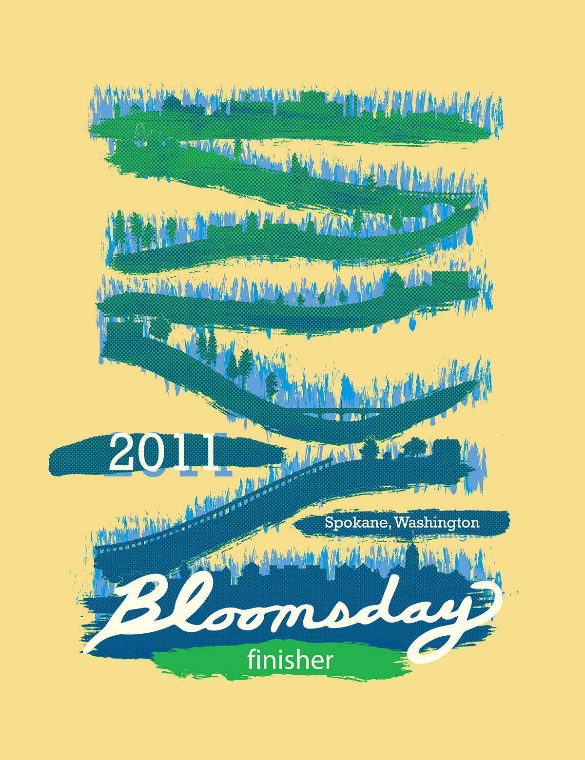
By the way, the shirt color was not optional. Because of the increased price of cotton, shirt suppliers did not have 60,000 shirts available. This was more or less the only choice we had, so I had to try to tweak the colors to make it work. I know they look similar, but I tried to incorporate more "yellow" to all colors to match the shirt color. It was a process, believe me! We removed the background color, because the screen printers were concerned too many of layers of color would result in what is called a "frisbee effect", where the built up ink is thick and heavy, and wears out the shirt quicker. Turns out the colors ended being a little off as well. I did my best to color match, and gave them pantone swatch colors for mixing so I'm not sure what happened. Maybe the shirt color caused it to be off.