Hospital Dona Estefânia
Corporate Identity - redesign
2011
(H)STORY
- the story behind the hospital
This 19th century Hospital receives its name in honour of Queen D.Estefânia, the wife of one of the most cherished kings of Portugal, D.Pedro V "The Hopeful".
The Queen was very much into charity and after visiting the Hospital de S.José, she was very impressed that adults and children were treated in the same space, so she offered her dowry to build a hospital dedicated to poor and sick children.
Unfortunately, she died before she could see her wish come true, but D.Pedro builds the Hospital da Bemposta in her honour, but he also died before seeing it finished.
His successor, his brother, would finish the hospital and open it on July 17th, 1877, the Queen's death anniversary day.
The people would be responsible changing its name, to honour the Queen, so loved by its people.
Ever since 1877, the hospital Dona Estefânia is dedicated to women and children.
BRIEF
Ever since 1877, the hospital Dona Estefânia is dedicated to women and children.
BRIEF
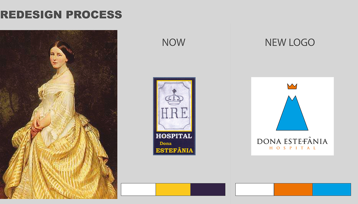
It's an old hospital and so is its corporate identity.
The colours used on the logo are Navy Blue, Gold and White.
White is a symbol for Peace, Purity and Charity; Gold a symbol of Wealth and Good Health and Navy Blue is a symbol of royalty, power, integrity, and seriousness.
White is a symbol for Peace, Purity and Charity; Gold a symbol of Wealth and Good Health and Navy Blue is a symbol of royalty, power, integrity, and seriousness.
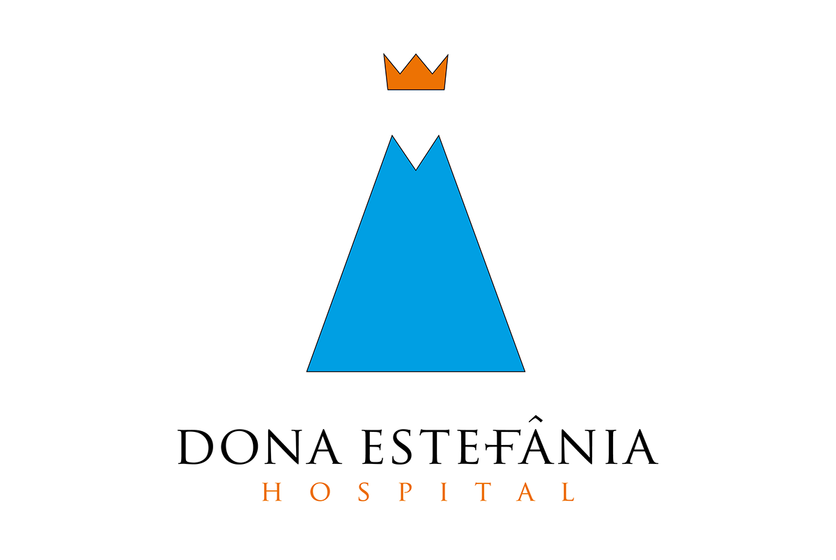
I wanted to modernize the logo, still keeping its reference to the Queen, but also referring to the fact that it is a hospital dedicated to women and children.
The design is formed by a simplified image of a Woman and Queen and the colours have changed to White, Orange and Blue.
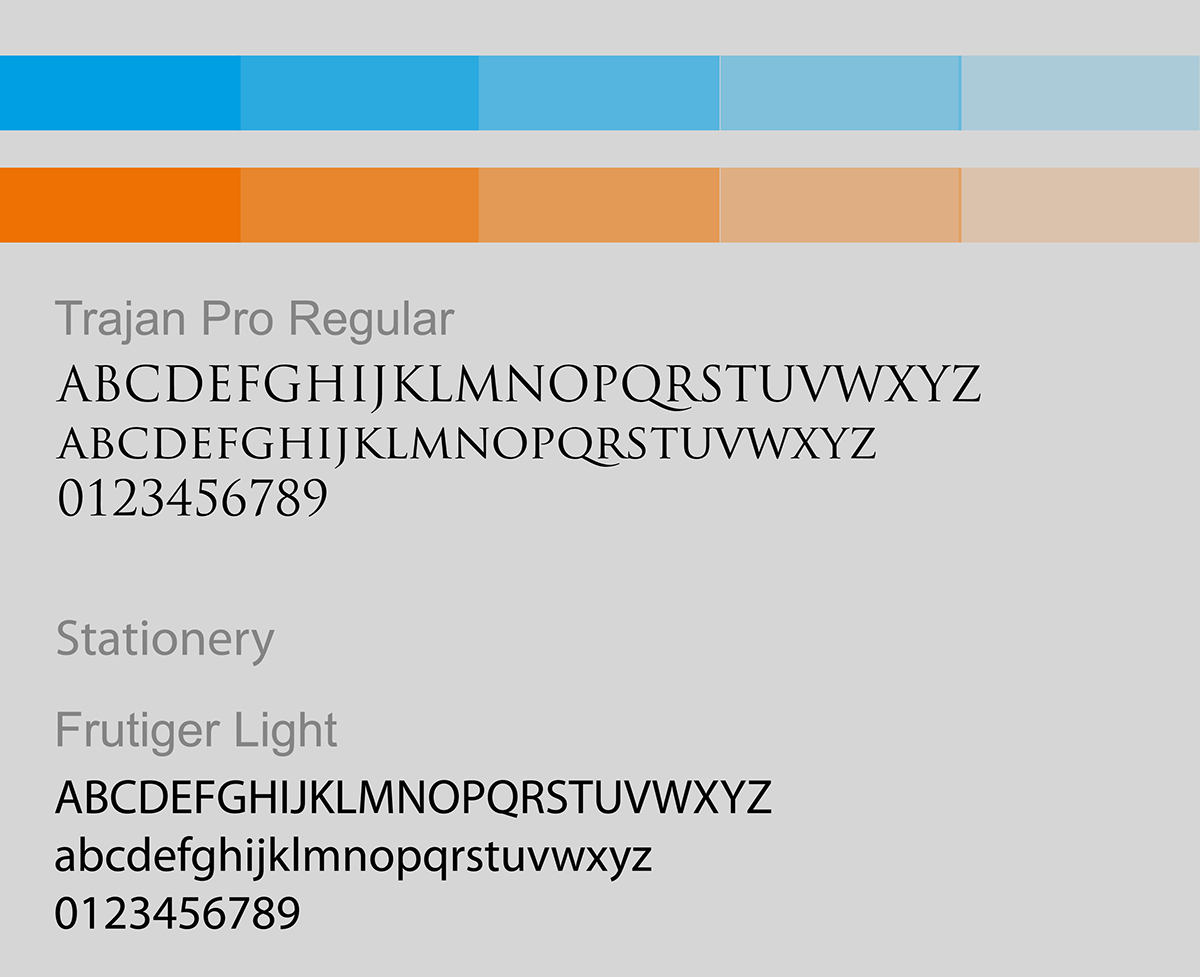
Orange is a symbol for happiness, enthusiasm and success, and is often related with childhood. Blue is strongly associated with tranquility and calmness, health and healing.
Orange is a symbol for happiness, enthusiasm and success, and is often related with childhood. Blue is strongly associated with tranquility and calmness, health and healing.

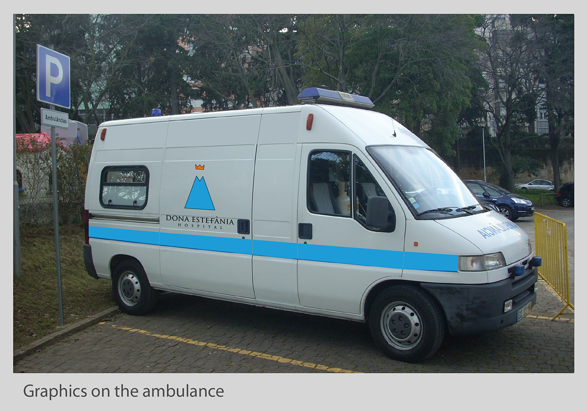
APPLICATION

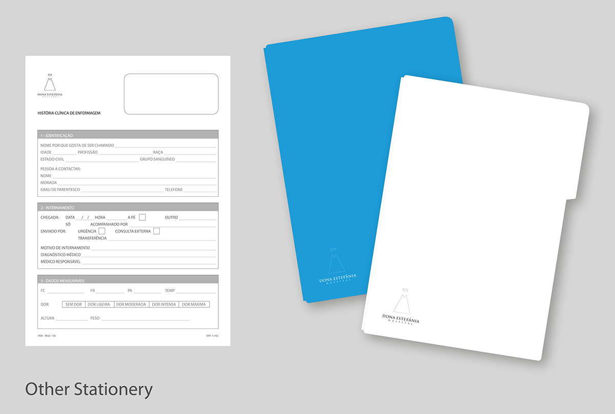
Patient Forms
Patient File (Blue: Active, White: Non Active)
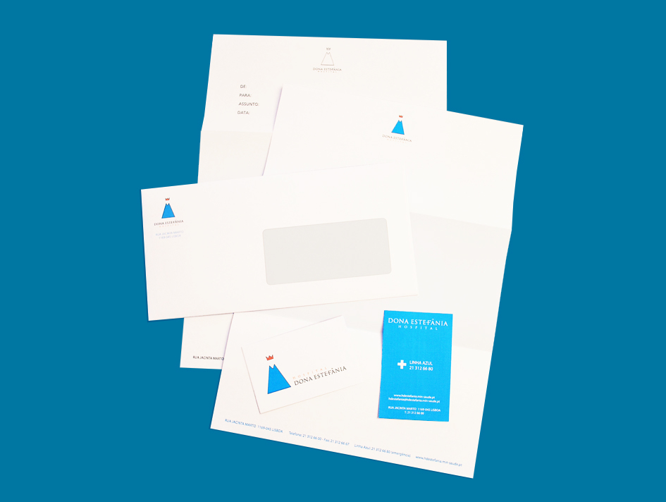
Prototyped Stationery