Client: White October
Project: Corporate Identity
Project: Corporate Identity
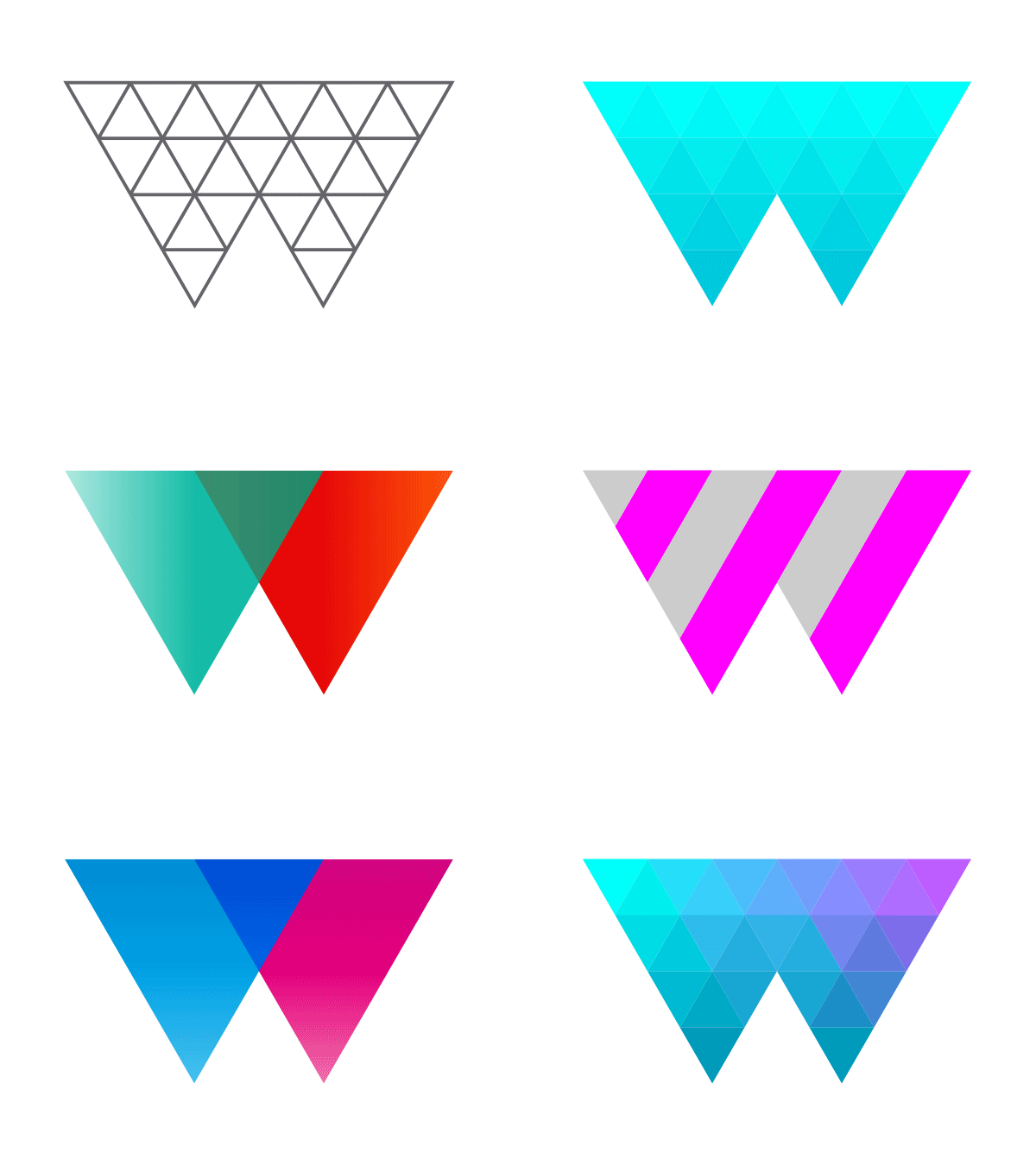
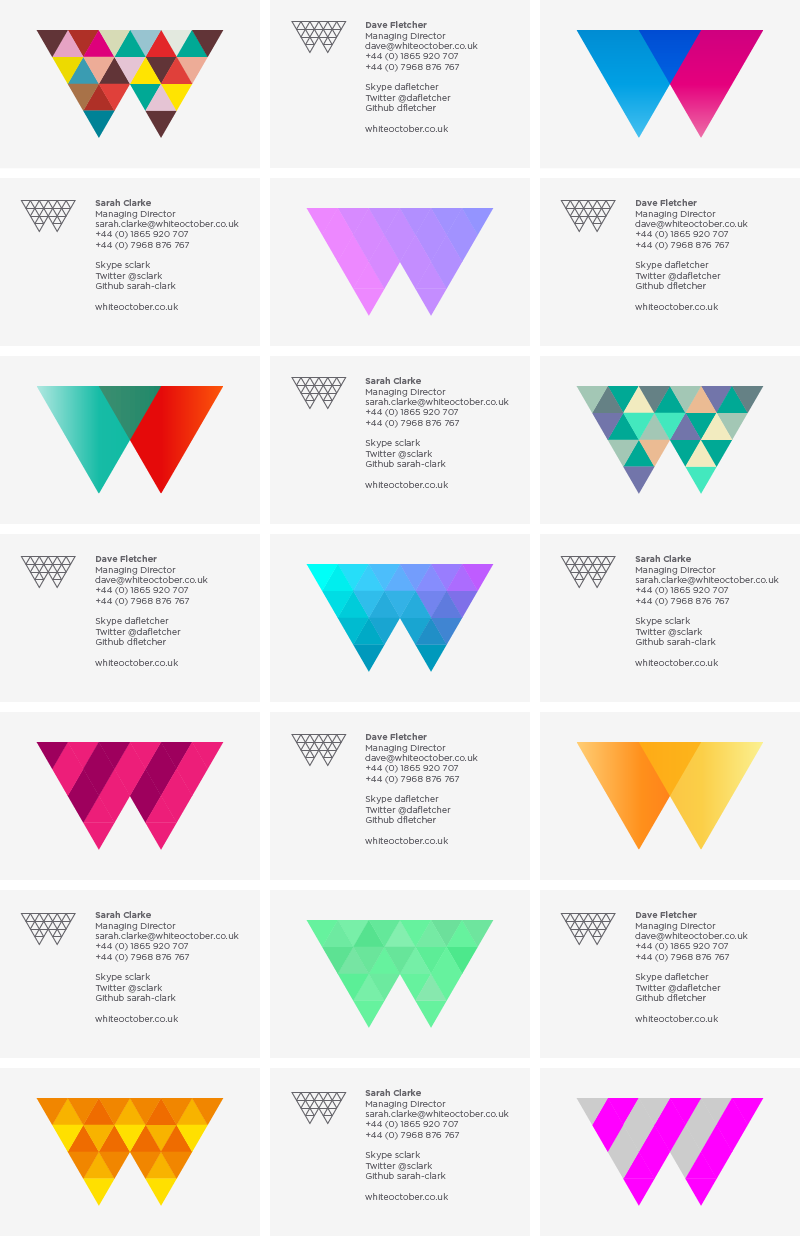
An identity for White October, an award-winning digital media agency based in Oxford. The mark, intended to be both flexible and playful, is derived from an isometric grid which forms the letter ‘W’. This structure allows for limitless variations of the logo – sometimes bright and vibrant, at other times retained and monochromatic.
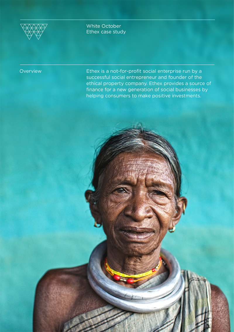
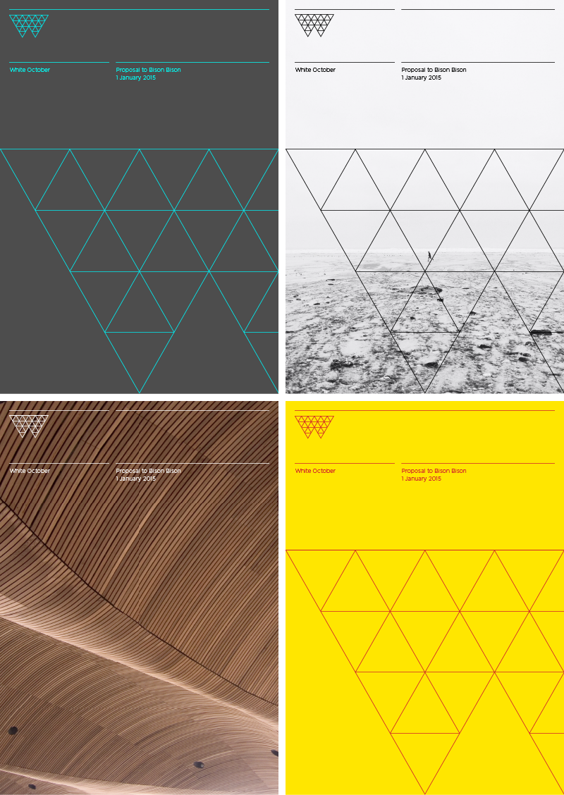
The project covered everything from stationary, business cards, banners, email campaigns, case-study templates, presentation templates, proposal documents and an animated version of the logo to top-and-tail their video work. We also designed a comprehensive set of brand guidelines for on-going use.


