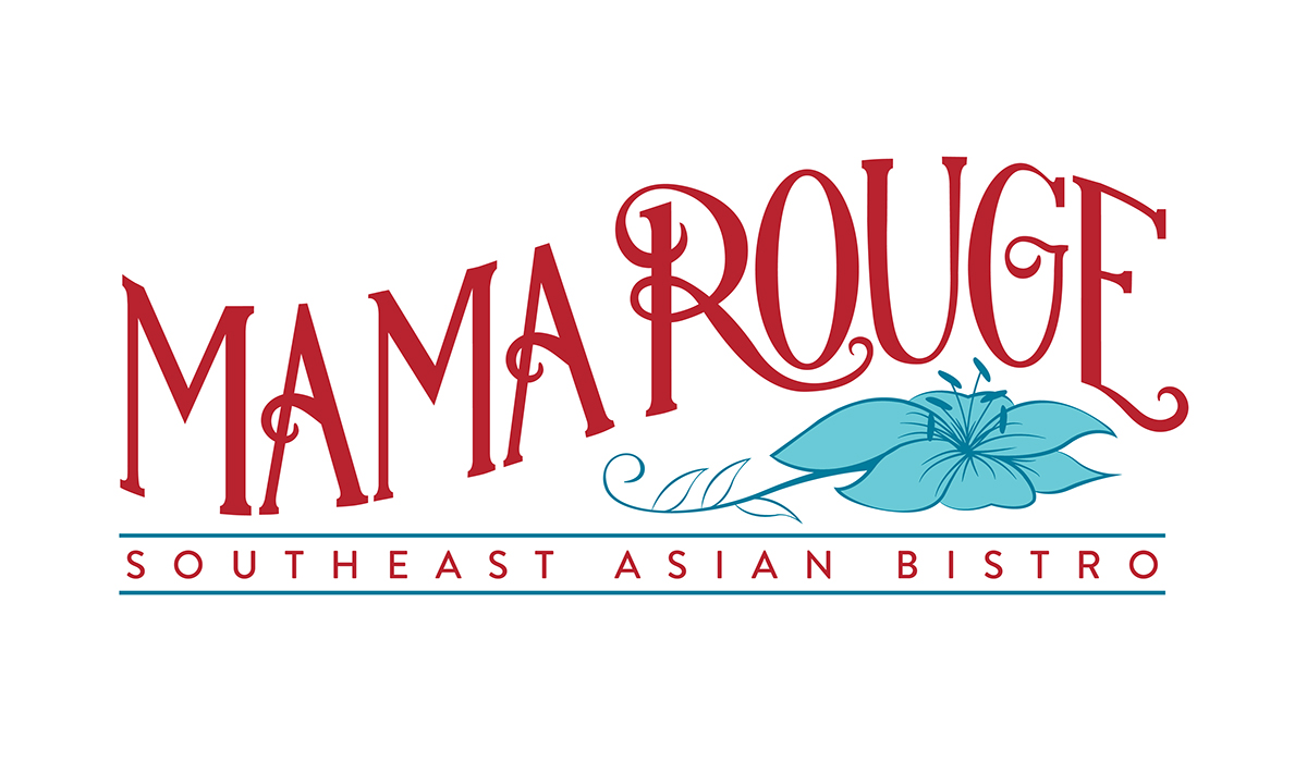
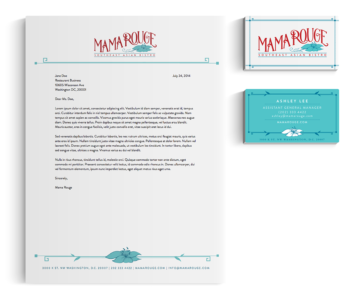
The Mama Rouge logo attempts to bring together French and Southeast Asian cultures in the same way the restaurant does: not mashing them together but having them exist in harmony to create a unique and dynamic experience. The whimsical hand-lettering evokes Parisian bistro awnings, and sits on top a lily flower (an homage to Chef Aulie, whose name means “lily flower” in Thai) and bold, geometric linework inspired by the architecture of Southeast Asia. The bright colors were influenced by the interior of the restaurant, the restaurant’s name (of course), and the bright colors found in the flora of Southeast Asia.
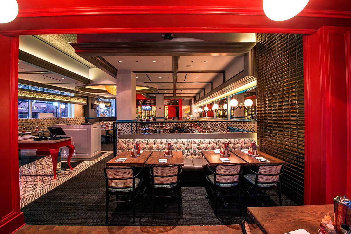
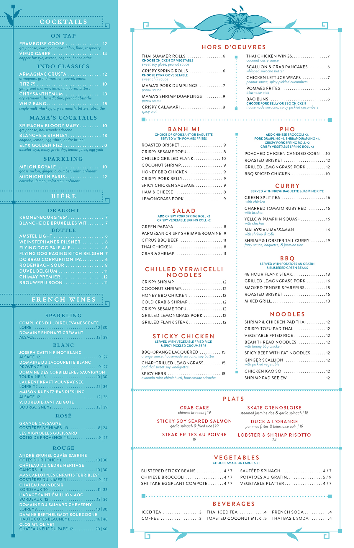
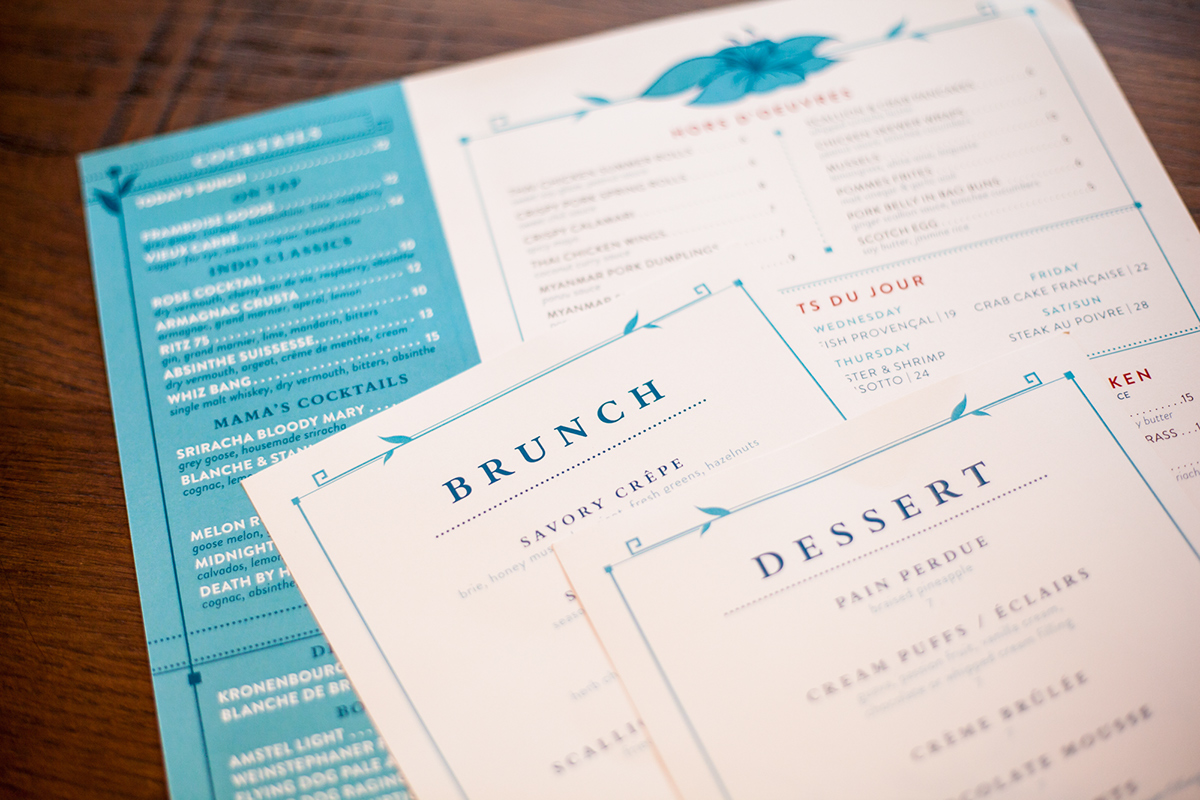
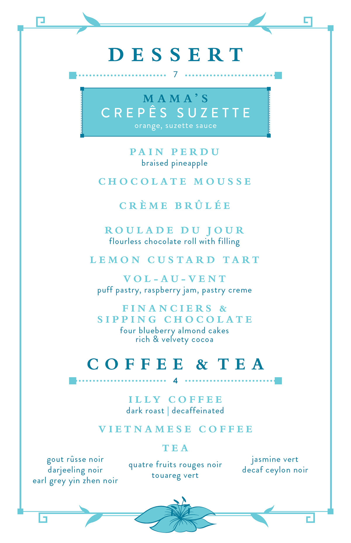
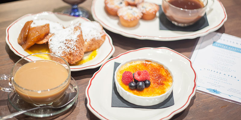
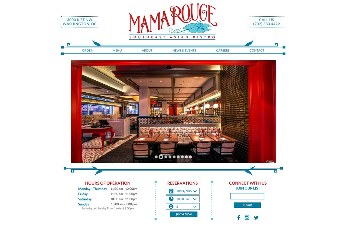
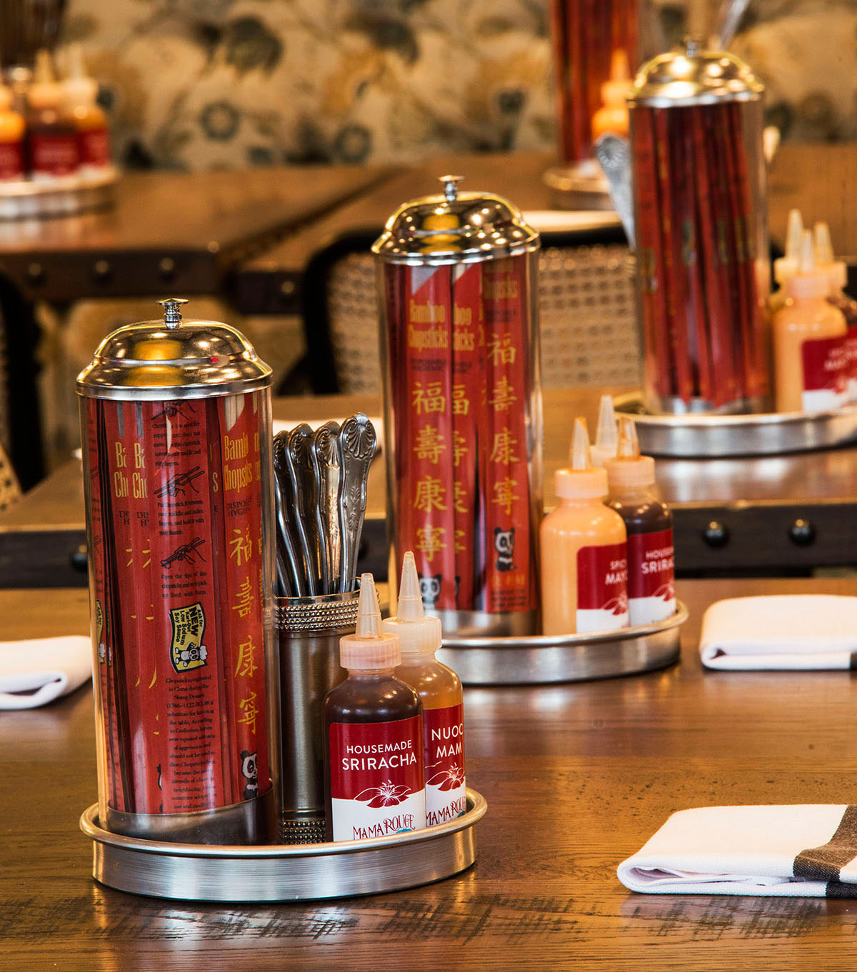
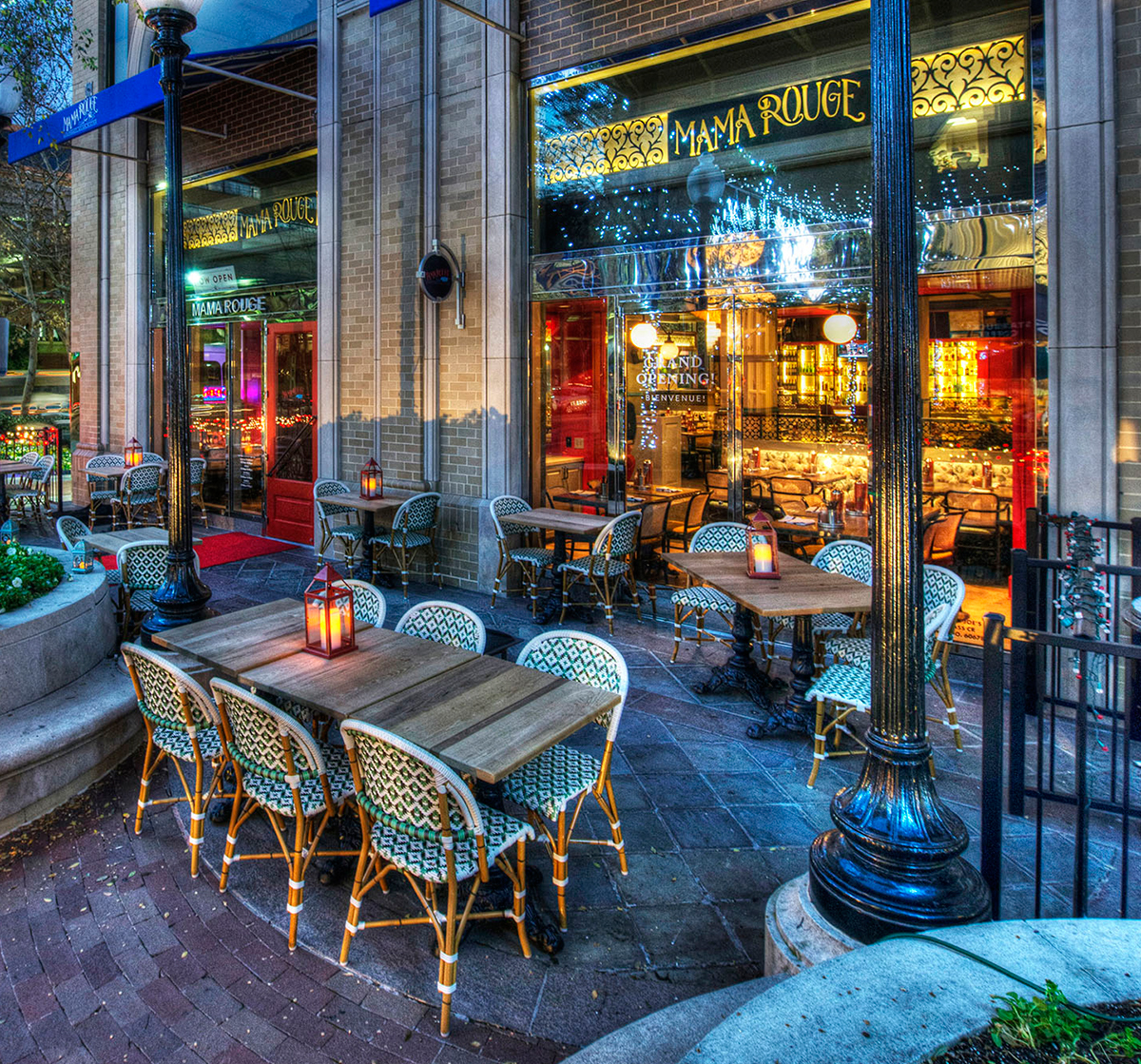
Mama Rouge showcases Southeast Asian cooking traditions, modernizes them for the American palate, adds in a dash of classic French cuisine with specialty selections, and brings the experience together in a contemporary French bistro setting. The menu highlights the strong cultural and culinary background of Chef Aulie and her family, while embracing the sophisticated flavors and rich presentations and processes of both Southeastern Asian and French cuisine. This is not about fusion or melding; it’s about mixing and matching flavor profiles of the different dishes for a dining experience unlike any other in DC. The ambiance and setting of the restaurant and bar evoke memories of a journey to an exotic destination, with a contemporary yet vintage feel. Southeast Asian colors, patterns, and materials balance with classically styled French and European tables and seating, lighting, textures, and details. The name was conceived in honor of Chef Aulie’s grandmother, the original ‘Mama Rouge,’ and the inspiration for many of the recipes that appear on the Southeast Asian sections of the menu.