


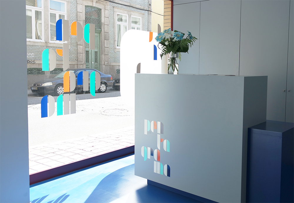
This branding project for the PENTAGRAMA learning center had as a conceptual graphic point of departure, the typographic development studies by Josef Albers for the Bauhaus school of design and architecture. Using 10 basic shapes builted from the circle and the rectangle, this artist created an efficient, readable, easy to learn and inexpensive to produce, typesetting system.
The visual identity starting point for the PENTAGRAMA learning center, comes through the construction of an alphabet, with subtle interpretative changes on the work of Josef Albers.
The creation/adoption of a trade name should arise from the relationship between the associations set establish with consumers and the project team creative efforts. Thus, the name PENTAGRAMA purpose came from its five commitment pillars (Education; Music; Emotions; Arts and Method).


If you get the chance, visit our Instagram. Thank you!


