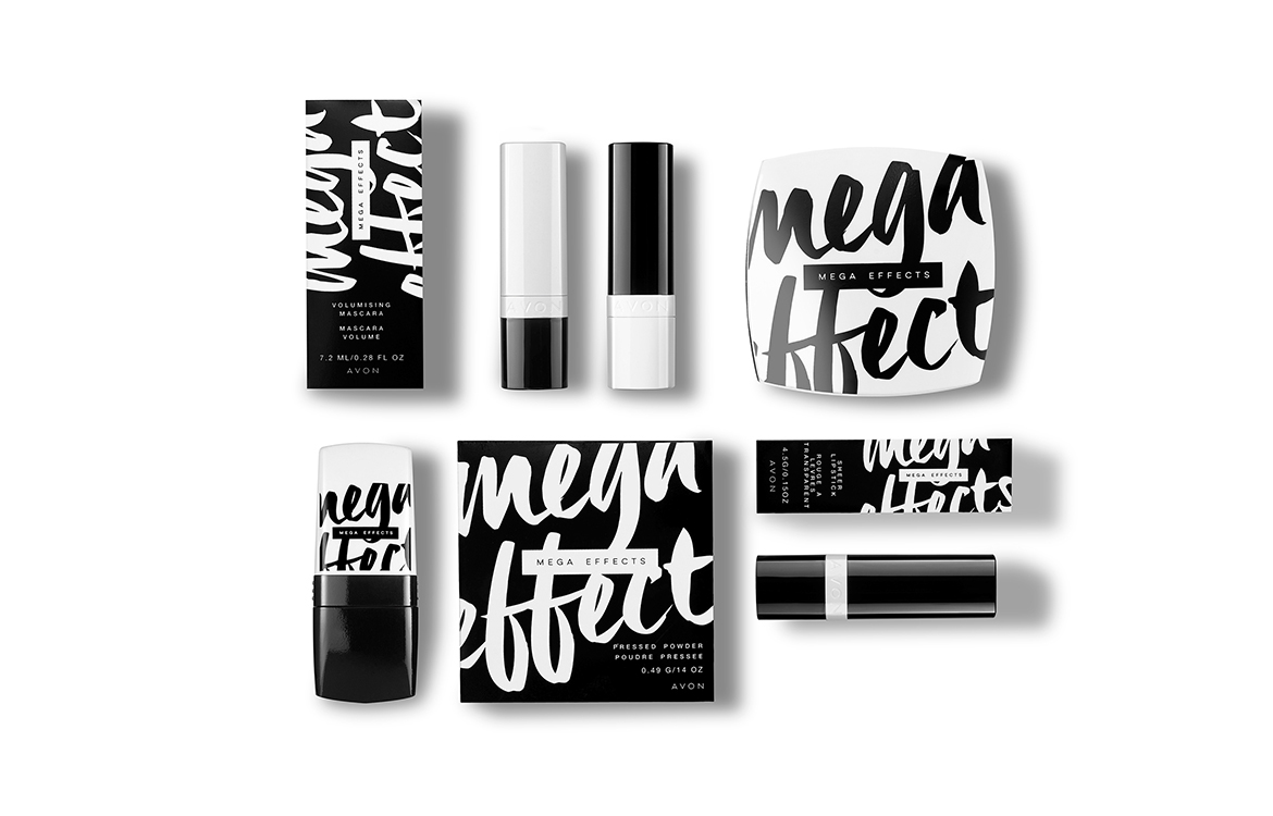


Branding and packaging case study for the relaunch of Avon’s brand Mega Effects. The design remains true to its young, experimental and trendy customer, while it also gives the brand a fresh update fitting to the marketplace and its competition. The contrast of the black and white colour palette and the brush-stroke typography mimics the nature of the unique beauty products the line offers, such as the volumising mascara.
Creative direction by Rachel Mikoylski
Art Direction and Design by Natalia del Rivero
Art Direction and Design by Natalia del Rivero


